
Photos taken in my compound


CONNECTING
Mood Board

Mind Map

Statement of intent:
The working title of my project is “Movement”. I want my audience to feel how beauty can be shown by the movement of individuals. I will get inspiration and develop my ideas by looking for photographs by Alexey Titarenko, Ernst Haas, and Tom Ziebinski that show sthe movements of humans.
SET 1
ALEXEY TITARENKO
Alexey Titarenko was born on Vassilievsky Island in Leningrad and identifies as a Russian American artist. He discovered an interest in photography at the age of nine and graduated with a degree in photojournalism. He also received a master’s degree in cinematic and photography arts. All of Titarenko’s images are black and white. He has more than 30 personal exhibits and won numerous awards from institutions such as the Mosaique program of the Luxemburg National Audiovisual Centre.


The topic I would like to work on would be “Movement” To capture the movement of people, the shutter speed is really important. I am planning on using a shutter speed of 1 second.
His images inspired me to look for depth with images and to have a certain focal point for the pictures. I really enjoy his photography since most of them have a really conflicting mood and repressive atmosphere.
Contact Sheet:


Finals:


Critique of red:
These photos are chosen because they are the movements that portray the movement of ballet the best. My photographs communicate the idea that beauty can be captured by movement. Within these photographs, I was trying to create an atmosphere of conflicted feelings. Especially using the movements of ballet, the mood portrayed is loneliness. However, the theme shown is how art can help dissolve the feelings of loneliness, sadness, and depression.
My first set was inspired by Titarenko by the unique atmosphere his works created. His technique in some pictures of having the background still and capturing the movement of the characters deeply interests me. Therefore, in my set, I wanted to capture the movement of one persona. However, when I finished my set, I realized that the movement of one persona made the photos look too empty. Therefore, I photoshopped the movements together.
Most of Titarenko’s photos are street photography. I really appreciate how he can portray the beauty of movement only in a normal setting (streets). Hia images are also clear and do not have other disturbing elements. So I chose my setting to be in the HS theatre with a clear background. I told the model in my photographs to dance ballet, therefore I may also capture a specific ballet movement. The shutter speed I used was all 1 second.
SET 2
ERNST HAAS
Ernst Haas was an Australian American color photographer and photojournalist. He was born in Vienna and was claimed as one of the most influential and celebrated photographers of the 20th century. He also received the Hasselblad award in 1986. Haas is known for producing colored images during a period when only black and white images are produced.


Ernst Haas uses shutter speed and blurred effects to create a sense of movement within his photographs. “Haas’s photographs are held in the collections of The Museum of Modern Art in New York, the National Portrait Gallery in Washington, D.C., and the Museum Modern Kunst in Vienna, among others.” (Artnet)
His images inspired me to take images from sports. Also, Haas was known for intentionally making his camera out of focus. I also did the same for most of my photographs and used a shutter speed of 1.3 seconds.
Contact Sheet:


Finals:


Critique of red:
Since, for my project, I want to capture a certain moment where movement is fully shown, these images best cooperate with my theme. Since the background of these photographs are messy and takes the focus off my models and their movements, so I cropped them. Therefore, now there is a more obvious focal point.
As you can see from my contact sheet, the images were primarily colored. However, Mr.Dawson suggested that Photoshopping them in black and white would give a better effect. Connecting to Haas’s work, I was really influenced by his idea of putting the camera, not on focus. However, my images were just slightly not focused whilst Haas’s images are really off focus.
This set was created to show the energy and passion of high schoolers for basketball and to show their active vitality through motion. This set is made to also promote and engage students in participating in different sports and be more energetic. Overall I want the viewers of my photographs to feel the passion and energy these students present which can furthermore engage the audience to also participate in sports.
SET 3
TOM ZIEBINSKI
Tom Ziebinski is the creator of the modern drag-down series. He was born in 1984 and is a Poland photographer. Ziebinski was fascinated by the depiction of movement in photography and visual arts. Since he is not a really famous photographer, there is not much information about himself online. He claimed that he does not believe in contests and gallery exhibits “Let the images speak for themselves.” (Tom Ziebinski).
His series named “Modern drag downs”


I was really inspired by how he made the movement in his images have the texture of liquid. Also, his images generally give the audience a creepy and unsoothing feeling. The layers adding up in these photographs give it texture and a unique type of atmosphere. Therefore, I am planning on also playing around with the shutter speed to create liquid-like movements.
Contact Sheet:


Finals:


Critique of red:
I really like this set since I wanted to create a creepy feeling however using bright colors. Similar to the movie “IT” even though it had bright contrasting colors, it still portrayed a spooky mood. Most horror films or movies have classical scenes in forbidden or old playgrounds. I was also trying to create that feeling through this set. Here, I used different shutter speeds for each scene. For example, the slide one was 0.5 seconds.
The liquid-movement feeling makes my model look like a ghost that is roaming through the playground. Therefore, I believe that my set successfully created a creepy atmosphere. Connecting to Ziebinski, the liquid-like motion was mostly shown through my last photograph of my model sliding down the slide.
I would like the audience to feel a sense of mystery or chill when they look at this set. I named this “Liquid Tracy” since it really looks like she’s becoming liquid. A unique part I realized is how the colors in the playground really contrast with each other and my model, wearing a white jacket, stands out from the background. This also allows the audience to focus on my model but not the vibrant colors of the playground.
FINAL PRESENTATION:
my final presentation would be my set 3.
I would like these photos to be 32×24 and be placed horizontally next to each other on the wall. The photos have a 5cm space between each other.

I chose this set as my final presentation because it is the most unique one. Most people could not think of how movement may portray a feeling of spook or creep, however, I feel like this set successfully gave that feeling. Also, the liquid-like texture of the movement is also really interesting and the colors within are vibrant and vivid. Therefore, I chose this set as my final presentation.
FINAL PRESENTATION – “FEETS”

This presented piece is going to be 100cm by 20cm.
I chose this set to be the presentation of my final work because I feel like it is the most creative and reflective one in my community. This is the set that is most related to the people surrounding me and their own personal values and interpretations. By presenting it in the hallway, the audience themselves can be linked to the theme of this set and the models within.
I like this way of presenting it since it is most artistic and unique. By having two rows of different feet of people, it can most likely show my aesthetic. The process of making my photography set was also really enjoyable.
SET 4
This set is inspired by Vicky Grout.
He is an inspirational photographer who focuses on fashion, design, and clothing. He has a series where he also took multiple photos of models’ shoes.
I do not have a contact sheet since I used all of my taken photos in this set. This set is called “Feets” since it shows the feet/shoe that people wear. This is a project that can relate to the idea of reflection on personal values. Since shoes are items that are pretty daily and needed for people to travel to different places. Personal values can be seen from this series since everyone has their favorites and taste in different shoes and how they look.
This series of photos did not really use any particular techniques since most of them were taken not by notice. However, most of them were taken from a high angle. I point the camera down in order to show the whole view and look of the shoes. This is also a set that shows “reflection” more on the mental and thinking levels. When people wear multiple colors and types of shoes cooperated with different socks, each person portrays a different perception of beauty.
The format of my final is also thought deeply since it uses a lot of photographs. with only two columns, it presents my photography in a more artistic way. I used many photographs because may be able to show each individual’s value and illustrate variety.
SET 3
This set of photographs are all inspired by Naoya Hatakeyama. A Japanese photographer that focuses on street photography. I realized that most of his images have creative lighting that varifies from natural light to colored lights.


The green photos I chose all use the element lighting in a unique way. They all have different lighting from different angles and perspectives. I wanted the lighting to create a soothing and calm atmosphere. These photos chosen may all portray mood and tone which revolves around the idea of hope. The theme of this set of my photography is “Hope”.
I used a black background in order to make my model stand out. The background also creates a setting that gives the audience an endless, mysterious feeling. In contrast with that feeling, the strong lighting that shone on my model portrays an abstract idea that it represents “hope” in the mysterious and unknown environment.
Most of my lighting is from the back of my model, even though this my model’s face is blurry, however, the light outlines my model. This is also a technique to present to my audience my theme of “hope”. Lighting is the main element for this set and I also cooperated with the idea of perspective, I would have to deal with the angle many times since I need my model to block the main light source but allow the rest to be shown.
CRITIQUE OF RED

I chose this photo as my red one since I feel like it is the one that fully established my theme of hope. The source of light from the back is glowing through my model’s palm. My model is looking at her palm which shows her interest in the light. This source of light gives my a feeling of a firefly which is the guidance for people in the darkness. The mood of this photo is soothing and calm which can also establish my theme of hope.
SET 2
This set was inspired by Naoya Hatakeyama who is a street photographer who usually takes pictures of famous architecture in Japan. Some of his images used the technique of focusing on unusual objects or parts of a setting which is what I am trying to follow.

In this image, he focuses on the water drops rather than the architecture behind them. This is the technique I would like to collaborate with my photos.


These photos are taken in ISB with my SET 1. The perspective I tried to communicate is the idea of focus and aperture. Since most people would like to focus on objects in the center of the environment, I decided to do the opposite. I focused on the objects on the side and are surroundings of the main object.
In this set, the images all have an atmosphere of two different layers or dimensions. The audience would usually pay attention to the center of a setting and the focused object. However, in this set, they would be confused about which their usual focal point has changed. This supports my theme of perspective since it is different from the usual and common sense in photography.
Critique of red:

This photo is really unusual since most photographers would like to focus on the objects more than the surrounding or unimportant things. However, I tried to reverse the concept by focusing on the door rather than the main objects inside. This creates a curious mood for the audience.

I enjoy this image since it also used a similar concept as the one I said before. It focuses on the side object rather than the center of the setting. This reflection is also really interesting since it looks like two totally different dimensions have collaborated with each other.

This image also uses my theory of focusing on parts where it is not usually focused on. I like this picture since it has a strong color contrast of blue and green which can benefit my color correction, and it also contains a lot of reflection from different angles.
SET 1


Analysis of green
The green photographs follow my artistic intention because they all fulfill the idea of perspective. Most of them are taken from unique angles and objects. They all have soothing color coordination with allows me to better portray my idea of color correction.
The pictures are similar to my photographer, Lee Friedlander because they all used the element ‘reflection’. Some of my green photos also include my own shadow which idea is borrowed from a lot of Friedlander’s photographs. I also used glass to be my reflecting object which is similar to Friedlander. He tried to use his photos to implicate modern society whereas I also did the same. The pictures are all taken in a lively and smooth environment.
Even though some of the concepts match my photographer however the theme portrayed should be different. I would like to show my audience the importance of perspective change and how different people view places differently. My photographs are going to use the idea of color correction the establish a unique atmosphere where it will establish my theme. However, Lee Friedlander’s photographs are all black and white. His theme is to mostly show a turbid and unorganized society.
My images have improved since I was able to control the focus and aperture better. By focusing on objects that are not commonly being focused on in a place, I also present the idea of perspectives. With a lower aperture, the blurry parts allow the audience to put their attention on the focused parts. Also, I was more careful with my settings since it needs color correction afterward, I wanted places that have a brighter and more vivid color scheme.
Critique of red

This picture has a blurry effect and can portray a type of feeling whereas the audience may interpret different layers. Its focus is obviously on the glass and people inside which allows the audience to pay attention to the setting. I like this picture because the layers within are very uncommon and unique.

I like this image because I feel like it has a lonely and emotional atmosphere. It looks like a person’s hobby and dreams have been caged. The angle of the photo is also from above which is interesting. The cello reflects daylight which is also an interesting type of reflection.

I chose this picture since it has a reflection with color which can cooperate with my color correction afterward. It is also a picture where the setting is kind of split in half and I really like this structure.
FINALIZED PIECES AFTER COLOR CORRECTION


PHOTOGRAPHS


Analysis of Lee Friedlander
Lee Friedlander


Lee Friedlander is an American photographer and artist. He usually uses a unique visual language to portray modern society and creates influential work. Most of his photographs include mirrors or glasses of stores. Friedlander was born in Aberdeen, Washington. He did not have much of an enjoyable childhood though. When he was only seven, his mother died of cancer. Friedlander then developed an interest in photography at the age of fourteen and was already earning some pocket money. He studied photography for 2 years in the Art Center School of Los Angeles. Friedlander’s photos often include a shadow of himself which creates an uncomfortable and creepy atmosphere. All of his photographs are black and white and somehow portray the “Social Landscape”. Friedlander is a classical street photographer and follows traditional documentary photography which is also practiced by Walker Evans and Robert Frank.
Friedlander has the ability to organize multiple visual devices into one photograph and uses a humorous way of showing the city life through his lens. The highly influential 1967 New Documents exhibition included his work and multiple art galleries such as the Whitney Museum of American Art exhibited his photograph.
When I look at his images they mostly give me a complex feeling. Even though they are black and white but their structure and focus of objects make the setting vivid. However, the photos give the audience a depressing and creepy feeling because of their lighting and color. Especially the series he took with his own shadow. Those pictures suggest a disturbing and gloomy state of mind.
My perception of Lee Friedlander’s photographs is that it uses a depressing and unease atmosphere however the objects and setting of the photos are lively and vibrant. This creates a comparison whereas the place the photos took itself is bright and jolly however the feeling it expresses is creepy and low-spirited. This can be related to the sarcasm of the status quo the society conveys whereas on the outside it seems cheerful and normal, though on the inside there are global issues and difficulties the society would have to face.
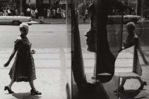
Select ONE image and analyze it:
The lighting of this photo is most likely natural light. As we can see, the focus of this image is the two people. Both walk in different directions. The glass on the revolving door also somehow reflected portions of their environment and surrounding. The dominant line in this photograph would be the one in the middle which is the center of the revolving door. The lines also separate the men and the women creating two “places/spaces”. The objects in this image all look three-dimensional since they have shadows and are built up by shades of color. Being a black and white image itself, it creates a complicated tone whereas it feels low-spirited and down. Most of the darker colors are on the left side of the photo and the light colors are on the right. This creates a contrast between spaces. Furthermore, the character on the left is obviously larger than the character on the right which diverges the people. Walking in different directions also creates suspicion and leaves a blank space for the audience. This allows them to think more and wonder if these people know each other, where are they going, and think more about the happenings after that. The viewpoint of this photograph is also interesting since it is from an angle in which both people can be seen from one perspective. Without using the motion blur, it still portrays the idea that these people are moving.
In this photograph, I understood that this photographer is interested in using the element of contrast. This image is different from the others since it leaves a question mark for the audience. I believe this photo is communicating the idea of gender and societal differences. It can also be seen to show how people all live different lives however strangers may even be presented vividly in one photo. This work may influence me to also use the element of contrast and focus more on the viewpoint of pictures. I also learned that natural light can also be a unique atmosphere and create a more smooth feeling.
This image inspires me to be careful about the focus and the structuralization of characters. It also tells me to capture the right moment for me to be able to communicate my topic or idea.