

I used my phone to take both photographs from a camera to create this effect.
I used my phone to take both photographs from a camera to create this effect.


Vision and Statement of Intend:
In this unit, my working title is movement. I wish to capture people’s everyday movements and let my audiences feel that there is always movement, specifically in a school setting. The purpose of this project is to recognize the movement in a school that shows a mood or a group of people. I will look into photographers such as Bill Kourins and Ernst Haas for inspiration for this unit.
I will try to capture movement from different angles and settings in this unit.
Mind map
Mood Board
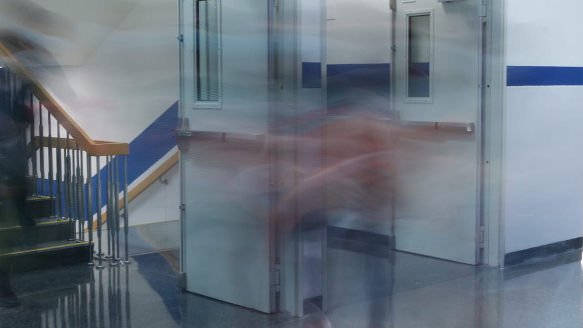
Set 1 – Bill Kouirinis
This set demonstrates the movement of people walking from an angle from a high up diagonal. There are the blurry parts of people’s feet as they are walking and parts that are more clear due to the stop while stepping. This was inspired by Bill Kouirinis. I used a 1/8 shutter speed to present the moving effect in this set of pictures. The images also vividly illustrate the objects ad students walking in the hallway.


I decided to turn the three final pictures into black and white to reduce the messy background in this set. However, I think that the final presentation of each image could be better if there is a more explicit focus on a still object. This set presents a busy feeling. It is interesting capturing the walking movement of people from a low perspective. This illustrates that the focus of these images are on the lower body while walking or running. In the photographs, we can see differentiate the speeds of each person walking through looking at the longer or shorter shadow. The pictures show a blurry surrounding with a still object which further suggests a busy mood.
Set 2 – Ernst Haas
In this set, I used 1ms shutter speed to present the ghosting effect with the double shadow. Also, the object is comparatively tiny in this setting, giving the photographs a sense of emptiness and a feeling of melancholy. The sharp contrast of colors also emphasizes the vacuum of the space and reminds the audience of a lonely feeling and isolated mood. This set is inspired by Ernst Haas.


In this set, the person is dancing and moving freely across the theater stage. The movement and surrounding itself already sets a sense of freedom. However, as we look closer, the contrast between stage and the person suggests a rather lonely and empty feeling. For example, the first image shows the person reaching their hands up and spinning around. This movement gives the audience a feeling of freedom. While the person looks like they are enjoying their time, seeing from a broader range, the person looks rather empty and alone. I personally really like this set’s outcome due to the mood it suggests.
However, if the angle of shot can be lifted a bit higher, so it cuts the black part on the top might be worth trying next time. By leaving the negative spaces all grey and the person darker it will show a better contrast between the two.
Set 3
In this set, I used a 1ms shutter seep to capture the relatively shower movement of the people. This set was shot from a distance. Therefore, there are some difficulties focusing on the objects. Also, due to the bright sunshine, some silver materials in the back were hard to concentrate. They were too bright due to the reflection of the sun’s lights.


In this set, I decided to photoshop the pictures into black and white, zooming in on the people to present my two red images. Since the background was too messy and the light and focus were not as controlled as I took the picture, turning them into black and white will help reduce the messiness. Similarly, cropping the image and zooming it in will allow the focus to be on the people rather than the background.
However, next time, I could move closer to the objects so that the focus is better and the image’s quality can be better (there won’t be the need to crop or zoom in on photographs).
Set 4 – Frank Machalowski
This is a set inspired by Frank Machalowski and his works of people walking stairs. In this set, I used a 1/8 shutter speed to create blurry, somewhat long exposed shadows of people moving. This was shot during a break between classes.


This set has many colors due to the colorful clothes each person wears. It is interesting to see the contrast between colors in each photograph. Also, as different people walked at different speeds and did various things while walking, they had other goals that motivated them to walk. Therefore, we can see the comparison between people’s shadows. There are longer and comparatively shorter shadows illustrating people’s walking speed. People are walking in different directions as well, which further suggests busy feeling.
However, next time, I could try different shutter speeds to get different outcomes in one setting.
Set 5 – Alexey Titarenko
In this set, I used a combination of 1/4 and 1/8 shutter speeds to try out how different shutter speeds can present different outcomes. This set was inspired by Alexey Tiarenko and his technique of giving a blurry effect.


The final presentation of this set is all zoomed in. Zooming into the people or the main focus of each picture will allow the image to have a more explicit direction. I notice that these pictures all have people walking at different speeds. Therefore, the photographs show people’s shadows in various lengths. It is also interesting how the people walking have different postures or do other things while walking. This allowed each photograph to have shades of varying heights.
However, since I zoomed in on the pictures, the quality of each photograph was not the best. Next time, taking the photos closer to the objects might be a better choice.
Reflection —
Overall, I can improve on the composition and the accuracy of the focus for each photograph.
Final Presentation
I personally like this set a lot, therefore, I will use the three red pictures from set two as my final presentation.

In the final presentation of this unit, I chose three photographs in my second set. These three pictures from the second set have the same theme, color, and style. I chose to format them in a straight line as it best presents and contrasts the three pictures in similar styles. This formate most clearly allow viewers seeing the similarities in style and contrast in perspectives.
This set intends to focus on yourself or the theme of ‘self-reflection.’ It is inspired by the Japanese photographer Naoya Hatakeyama’s utilization of light, color, and simplicity in a way. Since his photographs, all have a very clear focus which is often in the middle of the photograph.
In this set, the green photographs all have a shadow of the model in the background demonstrating the theme of self-reflection. Also, the model is placed in the middle area of the photographs to emphasize the focus in the center inspired by the photographer Naoya Hatakeyama.

This is a picture I labeled red. It looks interesting to me because of the background light colors, shadow, perspective. I like this photograph particularly because of the use of colors, perspective, angle of the light source, and model. In this picture, the background is created by the colors yellow (on the left side) and blue (on the right side), it is a clash of colors from the warm color scheme and from the cold color scheme, creating contrast. The model is on the right side under the blue color, while her shadow is on the left side under the yellow light. The blue background color was from a light source behind the model, shinning directly to the backdrop from the side. The yellow light was a more focused light source placed in the model’s 45-degree angle in the front. Then, the yellow light source allowed the shadow of the model to look like a side profile whereas the model was actually on the diagonal. Its color implies the two personalities or two sides or two selves. The blue color may symbolize how others view a person as “cold-blooded” “unkind”, etc., on the outside. (since the model is on the right side, under the blue background, it shows the surficial understanding.) However, the yellow side with the shadow of the model implies the inner self or the side that people don’t usually see or won’t see until they actually try to understand. May be then known as “warmhearted” “caring”, etc.
As shown in my contact sheet, in the beginning, I tried to adjust and balance the exposure and brightness but I could be more careful with adjusting it next time.
Naoya Hatakeyama


Naoya Hatakeyama is a Japanese photographer. His famous reflection works display a reflection in the water of the buildings/structures/architectures. His use of light and color is also interesting.
In 1984, Hatakeyama, a Kiyoji Otsuji student, completed his graduate studies at Tsukuba University. Since then, Hatakeyama has been based in Tokyo, which has served as a model for his body of work, which is primarily focused with the link between nature, the city, and photography. Hatakeyama’s photographs can be found in public collections around the world, including the National Museum of Modern Art in Osaka, the National Museum of Modern Art in Tokyo, the Tokyo Metropolitan Museum of Photography, the Museum of Fine Arts in Houston, the Yale University Art Gallery in New Haven, the Swiss Foundation for Photography in Winterthur, la Maison EuropEéenne de la Photographie in Paris, and the Victoria & Albert Museum in London.
This set was inspired by Naoya Hatakeyama’s use of color and light.
Laurence Philomene’s bold colors and the close-up in focus photographs inspired me to create my set two with the focus on colors, texture, and a close-up focus. Expressing the idea of ‘usual places.’ This set mainly focuses on recognizable places in the school or recognizable signs and materials to demonstrate the focus on small things in everyday life.
The green highlighted pictures all show color, contrast, and texture somehow. The images give the audiences a mixture of a unique yet casual feeling. Also presented with an abstract style.

This red-label photograph shows a sharp red color, giving depth through the vague and looming effect, making this picture more abstract. From a plastic case, we can see the faint reflection of a more expansive space creating a multi-dimensional perspective or view. In some way tricking the audiences’ eyes and make them think in more depth trying to figure out what, where this photograph was taken.

This photograph uses an interesting angle to reflect the green light emergency exit sign. Like the usage of mirrors in some interior designs, the reflective surface on the left easily but vaguely reflects the sign; making the sign look like it is extended and that the spaces are also extended. creating an allusion in which the space is enlarged. Furthermore, this photograph to my photographer’s usage of consideration of making the focus closely in the middle of the image.
Laurence Philomene


Laurence Philomene is a non-binary artist from Montreal. Philomene creates colorful photographs inspired by experiences as a chronically ill transgender person. These photographs celebrate trans existence and explore identity as a space in constant flux via highly saturated, cinematic, and vulnerable images.
This photographer gained interest in image-making early in their teenage years and treated photography as a space in which they could experiment and document identity when it comes to expressing gender. While also utilizes photography to achieve its aim of humanizing identities that have been historically marginalized and breaking stereotypes towards genders. Due to their creation aim, these photographs often include the themes of bold colors, some textures, space and are closely focused.
Laurence Philomene’s bold colors and the close-up in focus photographs inspired me to create my set two with the focus on colors, texture, and a close-up focus. Expressing the idea of ‘usual places.’ This set mainly focuses on recognizable places in the school or recognizable signs and materials to demonstrate the focus on small things in everyday life.
Green photographs:
In this set, the pictures highlighted green are all closely connected to the theme of perspective and focus. It matches with my chosen photographer, Lee Friedlander’s style. As an inspiration, I liked how this photographer utilized angles to create interesting shots and perspectives. The green photographs I labeled all have interesting perspectives. Although, my intention was to take 3 photographs from the same angle to show the passing of time through the shadows and lights. I also noticed that the green pictures I labeled all have a level of depth and layers. Through the contrast of natural light from the left side and the shadow, it demonstrates the different times of the day.
Red photograph:

Out of all the photographs, I think this photograph best shows the contrast that the natural light and shadow create and is shown in a unique perspective. It suggests a feeling of emptiness and distance as the objects are all far away and all the objects are still. However, the composition of this image also suggests a level of contrast. The bottom part of the picture is empty and with geometric lines created by the sunlight and the building. It shows a very simple and abstract feeling. While the top (about 1/3 )of this image is filled with more still objects. It looks more like a painted illustration rather than a photograph, presenting a feeling of being in an illusory illusion.
To improve, I could be more careful with the balance of the aperture and iso to control the exposure. Also, I could be more careful with where I am manually locating the focus.
Lee Friedlander


Lee Friedlander is an American photographer known for his creative photographs presenting everyday city streets and nature. He features signs, people, and himself on street window reflections. His use of depth and layers in his pictures inspired me, as he presented pictures with multiple elements reflecting off the street windows. His techniques, such as angle of the shot, perspective, focus, etc., well illustrate his style and represents his time. His photographs often allow viewers to think in-depth about the formation, composition, and creation process of each picture. Inspiring younger photographers to think more creatively while creating their images.
Due to an unhappy childhood, Friedlander developed an interest in photography and started making money from it at around the age of fourteen. After studying at the Art Center School of Los Angeles, he began seeking more into developing his own style and incorporating more techniques.
The black and white colors used in his photographs show simplicity; however, his unique incorporation of depth, layers, and perspective adds an extra layer of complexity. The clash of these two concepts forms his photographs and his distinct style.
In this photograph, Friedlander used his classic black and white setting to again emphasize his style. While the shades of black to white illustrate the lighting, shadow of which this picture was taken. We can see that this reflects a car as the main focus and some buildings, streets, trees at the back. Inside the window, there are sofas lights.
Color – Monochromatic, shades between black and white, in other words, following his style. Stressing the concept of simplicity yet demonstrating light source and further details.
Depth, perspective, shot angle – This shot is slightly diagonal. The natural light and contrast in the reflection allow more depth and layers to this photograph.
Space, composition, focus – According to the shades of colors between black and white demonstrate an approximate time in a day in which this shot was taken, giving the viewers an idea of the time and space. (day time, morning, or afternoon in a city) Then, the composition of this photograph made the reflection of the car in the middle, slightly to the left. Allowing the viewer’s attention to be drawn by the car. This photograph is also divided into three vertical parts by the light standing inside the window, and horizontally by the sky, the car, then the sofas. As mentioned, the immediate focus of this image is drawn to the car in the center. Vaguely blending objects inside the window and from the reflection. Resulting in a fascinating and unique outcome.
This photograph presents an everyday scene in the style of the photographer which adds an extra layer of uniqueness and complexity. Also, with very influencing techniques such as balance between objects physically in front of him and the objects reflected.