


Beijing Through the Lens: Day 2 798


Beijing Through the Lens: Day 1 红螺寺


Testing
I’m Clarence, a 15-year-old high school student attending ISB. To me, photography may be one of my core interests when working with digital media. However, other than this media, I have a loving passion for art, specifically digital art.
Designers Concept Statement
Introduction
Over the past few weeks, we had begun a new project which was eventually our last summative assignment. In this project, we were tasked to plan, create, communicate, and reflect on our final product, a scaled-down set design based off of an existing phobia. As a starting point for this project, I decided to base my stage design off of Oneirophobia and Nostaphobia, (More info about both below) with these two phobias, I began collecting photos related to both topics to create a mood board which was later used as inspiration for my design. After developing ideas and inspiration for my project, I began the process of planning and creating concept sketches of my own stage set. Once my drafts were drawn and my final sketch was finalized, I began collecting materials as well as considering what texture I was going for in my design. From there, I began assembling my stage set according to the finalized sketch to produce my 3D set design.
Nostophobia: Nostophobia is repugnance or dislike of the past
Oneirophobia: Oneirophobia is a fear of nightmares.
Part A and Part B
When house lights are switched on you will be able to see most of the props and layers on the stage, the audience is situated in a cozy warehouse barn with panels floating around (RED ARROWS AND WORDS ARE NOT SUPPOSED TO BE VISIBLE). Even though the lighting is not visible on my stage set when house lights are on, the doorway at upstage center would have been illuminated with yellow warm light shining on the top of a black screen. The 3 doorways on upstage center to center to downstage center slowly increase in size giving the perspective that the doorway at upstage center is far away.
When house lights are switched off we can see words and arrows appear on the panels located close to the legs of the stage (I planned to use a special red glow in the dark paint to achieve this effect but couldn’t find some) to give off an odd disturbing feeling to the audience, it acts as a distraction where the audience begins to wonder and notice that the words and arrows foreshadow what will possibly happen next. (it’s like the inner thoughts of the character) The panels are also there to replicate the character entering the surreal world on the other side of the odd doorway which it seems to show a grass hill with a perfectly blue sky. The grass hill in the background is the focal point of the stage, it looks perfectly natural to the point it’s disturbing (suggested by the dark surroundings, bold red words, and arrows isolating the door). In my design, I tried to express the feeling of nostalgia by creating a portal to an illuminated grass hill (I used my phone for the light source), but instead of evoking cute or comforting emotions, I decided to use the panels as a warning for the audience about the disturbing dangers of the doorway while the character on stage cannot sense it (dramatic irony).
As I had explained in my previous blog post I looked at some photos which have really inspired me in the making of this set design. The genre I’m focusing on is categorized as dream core and is defined as an aesthetic that revolves around weird imagery and objects that trigger nostalgia. You can see from the bright doorway at upstage center was inspired by the picture with a circular portal in addition to red labels and arrows pointing at it, to express the weirdness of the atmosphere. I decided it would be a great idea to incorporate two different universes onto the stage, the grassy hill, and the warehouse with panels (Refer to 1st inspirational picture). The distinct red color used for my arrows and words in my set is special to this genre, essentially the color grabs the viewers’ attention giving them a sense of shock. (However, if I could have used a red glow paint it would have been better)
As you can see from the pictures below, I had tested with lighting as well, I went with a few lighting choices, angled lighting, front spotlight, and back spotlight. For my front spotlight idea, I used a warm-toned light (flashlight from iPad and tape + sharpies to make the film) and adjusted it to the position where it casts a shadow for the first doorway to dramatize the height of the doorway making it look tall and large to the audience. For my angled lighting idea, I tested by adjusting the angle light would shoot from right to left, or left to right shining light through some sections of the hanging panels revealing some of the arrows and words. Finally, I also tested my back spotlight idea where I paced the spotlight at upstage center to help isolate the last doorway on my set design. (It would be great for a scene where the character on stage stares at the mysterious doorway)
Overall, I am pretty proud of my product in which I had included the basic elements of a stage set even when the pandemic limited the materials I had access to. In my opinion, I feel like I successfully designed my set based off of my chosen phobia by using the distinctive red color and light to deliver a sense of disturbing nostalgia to the audience.
Picture 1 (Houselights off) (Front elevation):

close up:

Picture 2 (Houselights on) (Birds eye):

Picture 3 (Houselights on)(Angled side view):

Picture 4 (Houselights on) (Front Elevation):

Picture 5 (Houselights off) (Lighting 2 Downstage center):

Picture 6: (Houselights off) (Lighting 3 Sidelight):
Downstage left:

Downstage right:

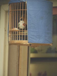
Inspirational Photos:


Photo used for final model:

Translating the Mood Boards into SPACE Final Design


Essentially this design is a combination of both the two rough designs. The wording framing acts as a cabin or a house making it more obvious to the audience that the bedroom in the back is situated in the room. The reason why the two roof panels do not meet is that it allows panels hanging to be placed easily and to be easily seen.
Translating the mood board into SPACE
Design 1

Info about the genre:
This stage design focuses on the genre of dreamcore. Dreamcore is a surrealist aesthetic that uses motifs commonly associated with dreams, daydreams or nightmares, portrayed through media such as images, videos and, on occasion, music.
Stage Design
This stage design forces the audeince to wonder and focus on the center spot, which is the dark door in the distance of the stage. In the background on the right is a small bedroom half-hidden behind panels floating in the air. These panels create the feeling that the character is leaving the bedroom into another universe which in this genre it is referred to as “dreamland”. The bold red wording and arrows are a style used in this genre, it acts as the character’s thoughts (what the character is thinking) but is displayed.
Inspirational Images:
Design 2

This design is inspired by one of my other inspirational pics, this focuses on liminal space. Liminal space is a transition between two different places or states of existence. A mall at 4 a.m. or a school hallway over the summer, for example, are typically deserted and often vacant. This gives it a frozen, unpleasant vibe, yet it’s also familiar to our brains. In this case, the house would be situated in a rather bright stage however it feels disturbing as the space inside the house is empty and somehow familiar.
Inspirational picture

Mood Board
Scenic Design Practice: Sketching Space

Front Elevation of my living room

Birdseye/ Groundplan of my living room
Scenic Design Vocabulary
Scenic Design – The aspect of production that gives a sense of space or location. Can be realistic or symbolic. Aids in creating atmosphere
Mood Board (Concept) – A poster that contains imagery that will help focus’s the design or conceptual weight of a piece of theatre
Thumbnail Sketch – a quick sketch or drawing that becomes the starting point for a design
Stage Configuration – The layout of the stage in the theatre you are producing in the play
Ground plan/ Birds Eye View – The top down look of the design. Gives you an idea of WHERE things are on the stage
Elevation – the FRONT look of the design. Gives you an idea of what you will see when you are looking at the stage
Flat – A scenic piece that is used to build doorways or walls. Light, flexible, and can be built to order
Sight Lines – The view of an audience onto the stage. Sight Lines are taken from many different seats to see what they see
Masking/Masking Flats – flats or curtains designed to hide the elements of the stage we don’t want the audience to see