Category: Abstraction (page 1 of 2)

Girl’s Night

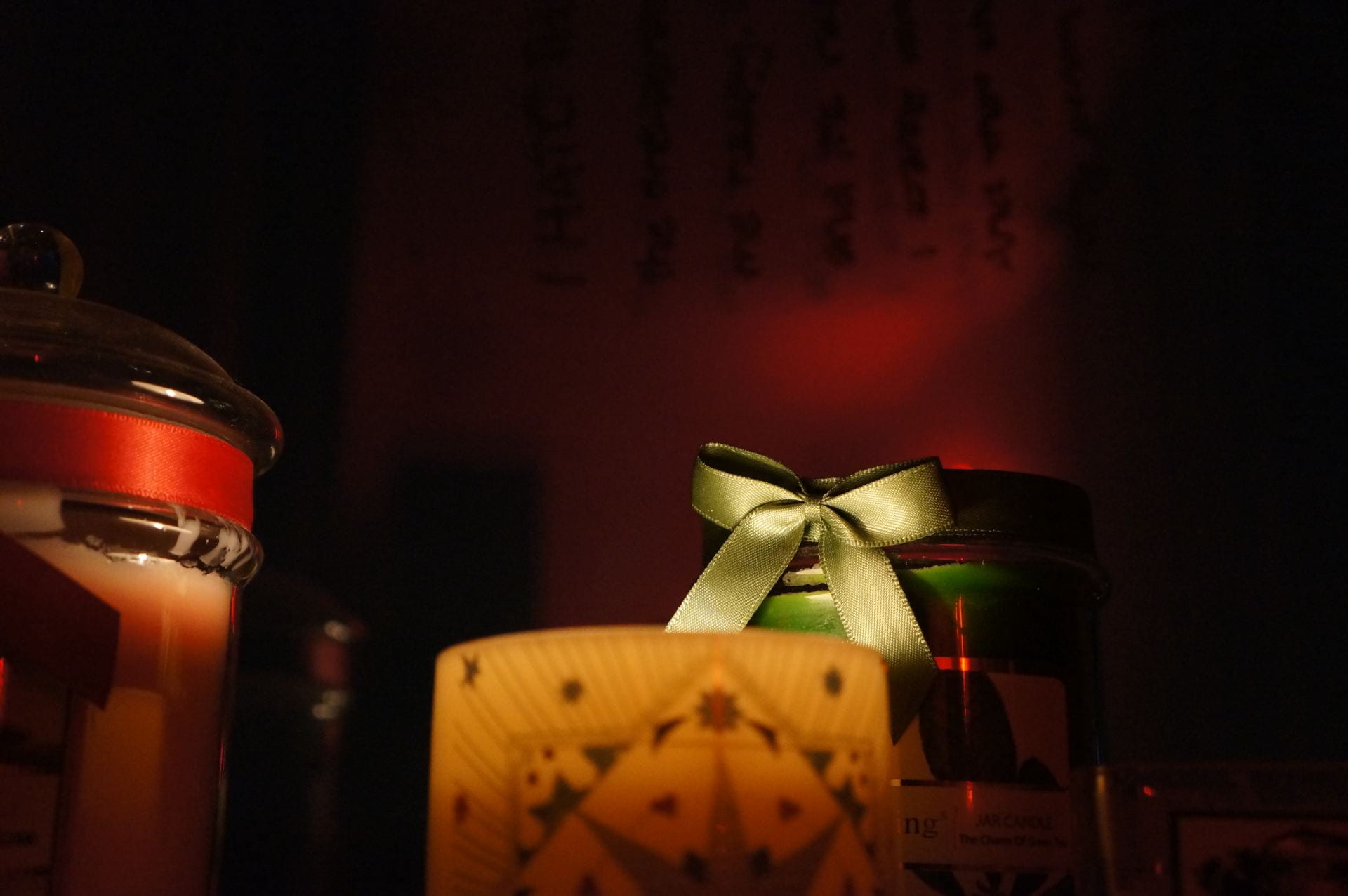
The title of my project is ‘Girl’s Night’. An artist that inspired me was Alex Webb, as I loved his use of color. My images connect to my inspirational images because they use contrast and different tones and shades of color to emphasize the different subjects within my photos. In my photos now, I have used the vibrance of color as well as shades, to emphasize my subjects instead of the use of focus on detail. I created my final series of images by using different lightings and angles as well as playing with the colored leds. I think a strength of this project is the use of color. The emphasis was on the vibrance and different hues, using shade to bring out certain subjects, and use shapes to add onto the different elements within each photograph. In future projects, I wish to work with a lighter background, as the color black helped focus my items much more. I can perhaps use colors itself instead of shade for the emphasis of my subjects.

Set 2

SET 2

RED PHOTOSSS

My images link to the inspirational images because they use color to bring the energy out of the subject. Elements emphasized are color, repetition, and shape. I think color is really important in my photographs, as they set the tone and mood of the setting. For example, in picture 3, the pink contrasted on the blue, corresponding with the slight blur, shows a sense of “busyness”. The contrast of colors bringing out the subject and focusing on the key elements. In photo #4, it’s extremely dark, and you can see a bit of reflected color on the lipsticks allowing you to focus on them. The vibrance of the phone’s screen’s color captures the things “brought to life”, which in this case you can see the music playing on the phone. In picture #5, you can see the use of circles. There are multiple subjects in the photo, one being the eye pallet, and the other being the earrings, hoops to be specific. The 2 subjects are brought together by the use of repetition of shape. I didn’t use a certain photography technique, and line isn’t an element of my photographs.

I hope for my audience to feel a sense of excitement when they see my photographs. Perhaps they will ask what event is the person attending. The colors and darkness set a tone of nightlife. The last 3 photos, I hope for the audience to get the idea of a “Girl’s Night”, or perhaps just a night out with friends. Using the darkness of the photo to capture the nighttime, and the vibrance of colors to “bring things to life”.

Alex Webb’s photos really show the complexity of the world, and most importantly to use colors to show that. I try to use color and the vibrance, shades, and tones to really show the “busyness”, relating to the complexity Webb tries to show. I think it worked well in my images, as the primary colors set a lonely or perhaps tired tone, and the vibrance of colors brought my subjects to life. Something I can perhaps improve on to use different elements of color inside my photographs. They can perhaps use more shadows, value, and vibrance.

Alex Webb [Set 2]

5 Characteristics that define these photographs, are tone, hue, color, vibrance, and contrast. Alex Webb works alot with color, especially focusing on his subjects with contrast between color, and the boldness and vibrance of primary colors. I would like to use the boldness of colors into set 2, with color contrast, vibrance, and the difference of hue and tone to focus on the subject within my photos.

One quote of Alex Webb that really allowed me to understand his work, was:

“Color is very much about atmosphere and emotion and the feel of a place.”

This really allowed me to understand Webb’s work because in his photos, the more vibrant and the different the hues are, it shows a sense of business, at least in my opinion. Warm tones show the warmth and how welcoming a place is. The boldness of a primary color really allows you to feel peace or how empty the place is.

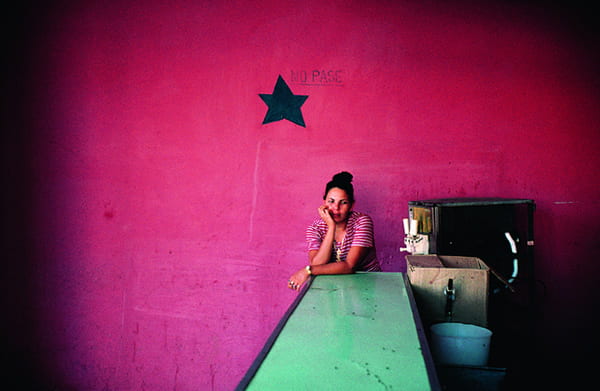
My favorite image of Alex Webb is the image of a woman with giant earrings standing behind a wall with her back to the ocean. Webb’s photographs try to capture the complexity and how inexplicable this world is within his images. A formal element used in this photograph is color in general. Webb has used cooler colors to add to the excitement in the photograph. As his photographs try to capture the complexity, he tends to capture multiple events and subjects in his photographs which make them exciting. He uses color to add for the complexity, for example he uses the brown red as a nice background color to slightly separate his subjects, and create excitement within just one of his subjects. Webb also tends to use vibrant colors that adds as energy.

Webb’s photographs aren’t abstract photographs, and they don’t tend to fall under any formal element. What I really like about Webb’s style, is that his photographs are able to capture the complexity of this world just within the lens of his camera. He’s able to capture all of a subject’s excitement and energy just with the vibrance of the color, and the contrast of the subject’s colors with the background colors.

I want to use color in my photographs. I really want to be able to capture the excitement of the subjects within my photos with color, as well as the complexity of the world. I want to use vibrance to enhance the energy within the subjects, I want to use the contrast between colors to capture the different events and subjects within my photographs. I want to use his style of photograph into my future abstract photographs.

My vision is to capture the complexity and excitement of the world with color, through the lens of a camera.

I am particularly inspired by Alex Webb’s photographs and will try to take pictures that have vibrant colors, or perhaps play around with color, specifically the contrast between colors.

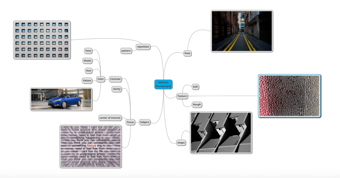
Mind Map

The Unordinariness of the Ordinary

The message will be to capture the uniqueness of everyday items, and see the beauty in them and I want the audience to feel the warmth or the iciness of each subject. I will get inspiration and develop my ideas by looking for photographs that uses focus and color contrast to capture the audience’s attention of everyday objects. In my opinion, all ordinary objects can be unique, as long as you capture it from the right angle and clarity.

Red Photos

CONTACT SHEET

ALL PHOTOS SET 1

A.

B.
C.
My images, like the inspirational images, try to capture the audience’s attention of everyday objects. A few elements emphasized in the photographs is focus and color. The attention to detail and the bold color usage within the subject captures the audience’s attention, especially from the particular angle, as it really bring’s out and emphasize the ordinary object. I didn’t use a particular technique, though as you can see in photo A and C, I tried to angle the camera where the subject hides behind another object, and let the focus lay on the subject itself. This made the subject seem “hidden”, yet it was still seen in full detail. In photo B, I tried to angle the subject and focus on a part of the bike that isn’t usually focused on. This could bring out the ordinariness of the simple subject. I didn’t use line in the photographs, as shape would possibly be more of what I have used.
I really wish for the viewer to feel interested in the ordinary object, and ask questions about the subject when they see the photo.
The photograph works pretty well as the elements work together to emphasize the specific subject. The next thing I’m going to take is to continue taking photos of subjects with bold colors, bold details, and good contrast between the colors, to really emphasize the subject and possibly bring the ordinariness out of it.

Albert Renger-Patzsch

5 Characteristics that really define my chosen photographs, is focus, contrast, texture, shape, and shade. Many of Albert’s photos focus on one particular subject, and use different shades and textures of the subject to create focus, as well as the contrast between the subject and the background. Some of his photos also include shape and pattern, as there is a repetition of a shape to make up the subject. I chose this photographer because I found his use of focus on ordinary objects, interesting. It relates to my vision as alot of my photos include the quality of his. A quote that of his that really allowed me to understand his work, was, “Nature, after all, is not so poor that she requires constant improvement”. In my understanding, Albert meant that nature is in-fact beautiful, you just need to see it from different or perhaps, right,  angles. I think that’s why his photos focus on ordinary subjects, though his way of photographing them allows us to see the beauty in them.

My favorite photo by Albert is the photo of the dandelion . I chose this image because I liked how it focused on the dandelion from an interesting perspective. Something I find unusual of the photograph, is the focus point on the dandelion, which in this case is towards the center where the seeds are. Usually people like dandelions for the fluff feels of the dandelion. A formal element within the photograph is focus. It is important because the attention to detail within the photo allowed you to focus on the subject, and one specific area of the subject, in this case being the center of the dandelion.

Albert’s photos are abstract, as his photos capture the subject from a usual view one would usually not consider.  What I like about his style is that he’s able to capture a mood within his photographs, and his photographs are all of ordinary subjects, and a perspective you would never see it in, I think this is what takes the ordinariness out of the subject. I want to be able to capture ordinary objects from different angles, I think that something that he does well that really inspires me.

My vision is to show the beauty of everyday objects.

I will take photos in the style of Albert Renger-Patzsch. I am particularly inspired by his photo of a dandelion, and will try to take photos that capture an ordinary subject from an interesting perspective that one doesn’t usually see the subject from. I really want the audience to be able to get the same idea of “taking the ordinariness out of a subject”, as I did when I saw his photos.

Contact Sheet 798

CONTACT SHEET 798

Photo Safari

I think this is a good representation of #4. The lighter lines that are contrasted against the darkness behind, in the photo, represent the contrast of the black lines with the white background in #4. I think it’s a good representation as it clearly shows the lines as it does in #4. Some elements are the use of line and tone. As the lines of the lighter color and black shows and the lighter colors contrasted against the darkest color, show the use of tone and value.

This is a example of #11, though I don’t think it’s the best representation as the lighting was awful. Though, a good part of this representation, is the darker parts really contrasted the slightly lighter parts allowing a clear view of the supposed focus part, which is the center of this image. As the focus is the end of the hallway, the hallway or ceiling itself is like the black bit in #11. I think this image shows the element, focus. As the word “theatre” and the lighter areas at the end of the hallway, allows you to really focus towards the center of the image.

I think this is a good representation of #7. The white parts of #7, may represent the subjects in the image. The black lines being the diversion between each subject. An element used in the image may be focus, as the most detailed parts may be the subjects itself, which in this case is frozen yogurt containers. They stand out, which allows them to represent the white parts of #7.

This is a representation of #3. I think this is not the best representation of #3, as I thought of this image as the closeup of #3. Each of the black dots on #3 may represent each popcorn, or subject within the image. As this is only a small portion of it being captured, I think it may represent #3. An element used may be repitition. There is no certain focus on one certain subject within the photo, as there are many of the same subjects.

This image looks like #2. It includes the element of value, as there are multiple shades of the same color. I don’t think this is the best representation of #2 because despite how the airpods seem like the black contrast in #2, there’s also part of the keychain that diverses the focus. Instead of being just 1 point of focus, there is now 2 or possibly more.

This image looks like #9. I think this one worked well as the black lines that seperated each square is like the gray lines within the the image. A element that it corresponds with is perhaps patturn, as its a repition of squares.

This image is a representation of #6. I think its a good representation as it really shows the circular spot where the white and black contrasts. Some elements within the image may be texture, as you can see in the different woods that one has many details in color and highlights, showing the rough surface. As well as the circular cut, where the cut wasn’t an exact circular edge, showing some bumps and and sharp edges which represented a rough surface. Another perhaps was the different tones that contrasted the two, as one type of wood was lighter while the other was much of a redder tone. The textures between the 2 types of wood also contrasted between the circular piece and the “square” piece.

I don’t think this is the best representaton of #12, as the lines in #12 are considerably straight and seem practically identical to eachother, whereas in the image, the lines aren’t straight, and each is different from eachother. The only similarity between lines are that they contain barely noticable bumpy edges which is what made me want to use this as a representation of #12. A element used may be line, as there is a repetition of line within the image.

This is a pretty good representation of #1. The colors contrasted between the walls replicates the contrast between the black and white in #1. It shows a clear diversion between the different colors. An element within the image may be value and tone, as the key parts of the image allowing it to represent #1, is the use of colors that differentiate the different parts of the wall.

This image represents #8. I think it worked well, as the blue and green ciricles are the circle representations within #8. An element shown is perhaps pattern, as there is a repitition of circles within the image.

This image looks like a zoomed out version of #5. It shows alligned items and the black lines on the drawings being the division between the objects. Though, it didn’t work too well as the drawing’s spaces aren’t parralel, unlike the image itself. An element in the image may be repition as there is a repition of the subject within the photo.

This image is alot like #10. I think it’s an alright representation as the exterior walls is a sideways focus of an rectangular surface. A element within this image, is perhaps line representing focus. As the distance between each line, and the length of each line decreases, it shows that the subject with the lines is going further away, creating a focus point.

798 – Aaron Siskind

ELEMENTS – PHOTOGRAPHY

Formal Elements in photography, are visual features that can make a simple subject, into something extraordinary.

6 elements:

Line – It is a center point that continues. It can also lead to the interesting part of the photo.

Shape – A shape is a form or outline of a subject. It is a geometric figure, which includes of rectangles, circles, and more.

Pattern – A pattern is a the repetition of a subject, form, or decoration.

Texture – The feeling and appearance of the surface of the subject

Tone – The level of brightness in photographs/photography

Focus – Its to show particular attention to usually one subject in the visual representation.

No, an image can show multiple elements. For example, in the image below, there’s focus, and the use of focus is with lines, as the lines all lead to the point in the center, allowing viewers to focus on the center of the image.


Older posts

© 2025 HANNARNARNAR

Theme by Anders NorenUp ↑

Skip to toolbar