CHOICES UNIT: Set 3

General information

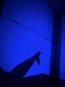
This set has 20 photos in total. These photos have a similar motive, such that there are silhouettes of legs and feet over a violet background. The artist that I used for inspiration is Nicolas Bouvier, who is a French writer and photographer. I was previously inspired by him in past photography projects. Bouvier takes photographs of silhouettes in exotic backgrounds, but I simplified that by making the background just one color. Overall, this set exemplifies my starting point for the CHOICES unit because it shows signs and messages that a person can convey with their silhouettes. This set can be categorized into three sections: the green section, the blue section, and the red section. There are 9 green photos, 7 blue photos, and 4 red photos. Green photos need better resolution, and the visual messages presented are not unique or interesting. Blue photos appeal to the eye, but they are not the best at representing the starting point, as opposed to the red photos, which are the best demonstration of the starting point and are the most interesting. Due to playfulness and mimicry of this set of photos, I decided to name this set the “Game of Shadows.”

Analysis of a red photo

I decided to categorize the above photo as a red photo because it demonstrates the qualities of a red photo. This photo incorporates the formal elements of line, color, and shape. The silhouette of the legs and feet are very distinct because the violet background contrast and juxtaposes the dark silhouette. The gesture of the silhouette of the feet is also clear. The audience may see that the silhouette resembles the tail of an aquatic mammal, namely the whale or the dolphin. This photo exemplifies my starting point of signs and messages because it shows that human gestures can resemble gestures of animals, hinting at the idea that all animals originated from one common ancestor. With this being said, however, all of the photos in this set are open to interpretation.


Creating+Critique of Red Photos: Set 2

In total, there are 69 photos. Unlike the previous set, this set primarily focuses on the starting point of signs. The photographer of inspiration is Rob Hann. These photos were taken in a natural environment because I believe there are signs in nature worthy of our attention. I categorized these photos using the green, blue, and red selections. My criteria for a good photo are whether it relates to my starting point and whether the photo is aesthetically appealing.

In total, there are 40 green photos, 17 blue photos, and 12 red photos.

Example of a Green Photo

The above is an example of a green photo. The camera alignment in this photo needs to be improved. There isn’t a distinct subject in the photo. All of the elements in the photo are randomized. Although randomness is a sign of nature, this photo does not present randomness in an aesthetically appealing way. There are better representations of my starting point. Therefore, I put this photo in the green selection.

Example of a Blue Photo

The photo above is a blue photo. It includes the elements of line and depth. The lines created by the trees and their shadows look very intriguing. Depth is created when the sandy ground’s light portions are contrasted with the shadows’ dark portions. In the photo, the ground gets darker the farther you look into the photo. In addition, there is a triangular shadow in the bottom right corner of this photo. There is a long shadow next to it. These shadows make the audience curious because they are unlike the regular shadows of the trees. It could be the shadow of an animal, of the photographer, or of something else. This aspect gives off an ominous feel. This photo connects to my starting point because it shows that nature is mysterious, has depth, and can contain almost anything. This photo is very good, but I decided not to put it in the red selection because it could be more aesthetically appealing. Furthermore, it does not have any particular stylistic choices.

Example of a Red Photo

The photo above is a red photo. This is one of the 12 photos that best represent this set and my starting point of signs and messages. The most important elements of this photo are color, depth, and line. The first thing the audience would see in this photo is the red car in the upper center. This is because the car is red, an eye-catching color. In addition, the red color contrasts with the other less vivid colors in the photograph, so it stands out more. Therefore, color is a critical aspect of this photo. Then, there is depth and line. These two aspects are related since lines create depth. Near the center of the photo, a distinct vertical line defines the side of a bamboo bridge. This bridge directly points to the red car in the distance. However, it is the depth that makes the red car seem small. On the other side of the central line, there is a more diagonal line that is another side of the bamboo bridge. It is also angled towards the car. The distance between these two lines decreases as they both approach the car, giving the photo a sense of depth. The most important formal elements are shown in the diagram below. This photo connects to my artist of inspiration, Rob Hann, because it has the theme of human intervention in nature, where man-made structures are put in natural environments. In many of Hann’s photos, man-made structures are isolated in a natural environment. For example, Hann takes photos of abandoned buildings and vehicles in the Desert.

Diagram:

Red photo 2

The photo above is another red photo that differs from the one I previously analyzed. This photo is much more simplistic in nature. This photo was taken beside a mountain next to a river. It incorporates the formal elements of color, shape, and texture. Firstly, there is a large contrast between the water’s green color and the rocks’ grey color. This color contrast emphasizes the shape of each side of the photo. On each side, the texture is varied: the rocks have a rough texture; however, there are wavy white lines that mimic water; on the other hand, the water has a smooth, flowing texture, but small bubbles in the water mimic the small sediments on rocks. Between the rocks and the water, there is an S-shaped line. This line represents the conflict between the two elements as one element is trying to intertwine with the other. This photo connects with my starting point because it shows the sign that different elements in nature can be equally appreciated. The contrasting nature part of this photo is inspired by Rob Hann since he takes photos of two or more landscapes simultaneously.

Creating+Critique of Red Photos: Set 1

An old saying: “Pictures are worth a thousand words.” Although it sounds cliché, it is true in the context of photography. Photos are used to convey messages to the audience in a non-textual fashion. However, photos can be made stronger when certain words are added. These words can give the audience an interpretation of the photo they never expected. Using Barbara Kruger as inspiration, I took a total of 22 studio photos. 22 may seem like a limited amount, but each studio photo is taken after detailed posing directions.
There are three differently colored selections. The green selection: photos that are not aesthetic or hard to express a message. The blue selection: photos that are decent but could be stronger in expressing a message. The red selection: photos that have good aesthetics and can strongly convey a message.
Green photos are photos that would definitely not be considered for the final presenting part of this project. They are photos with no subjects. They are photos with failed or blurry poses. There are 5 green photos out of the 22 photos.
The blue photos are good photos, but they are not the best in exemplifying my starting point of signs and messages. The poses of the subject might be relevant to the message in mind, but they are not the most convincing. There are 8 blue photos out of the 22 photos.
The red photos are the best photos because they have good aesthetics and lighting/tone. The poses of the subject are to the point and accurately convey the message I am trying to communicate. I will consider these photos for my final presentation project. There are 9 red photos in total. There are so many red photos because each photo belongs to a collection of similar photos. For example, the first 3 red photos looking down from the top of the contact sheet belong to 1 collection. Red photos 4-8 looking down from the top are also a part of 1 collection. After selecting photos from the red selection, I decided to edit my photos based on my starting point: signs and messages. In total, I have three different photo collections.

  1. High PH

Sometimes, we experience a moment that can be represented in a single color. This photo collection focuses on the color pink. The main elements that were focused on are color, form, and depth. Color is the main aspect of this photo collection since the entire photo collection is based on one color. Aside from the pink background, the most interesting aspect of the photo is the subject in the middle of each photo. They give the photo more character as opposed to just a pink background. Noticeably, the subject in each photo has a different opacity or depth. In the photos at the side, the opacity is low, while in the middle photo, the opacity is high. This emphasizes the middle photo. In addition, each photo has a single word with an exclamation mark, giving each word a little bit more excitement. However, the photo collection only makes sense when photos are put together side in a particular order so the individual words form a sentence. This photo collection relates to my starting point of signs and messages because it conveys a specific emotion and message to the audience. It relates to my inspiration for Barbara Kruger because it has text captions, something you will rarely see in photography. These photos were taken with a Nikon D750 in the studio at ISB. I named this photo collection “High PH” because the photo collection looks like a PH-level testing paper when placed in acid, which turns pink. This is very applicable because the audience of these photographs is most likely going to be students. So, they will need prior knowledge in order to understand how the name of this photo collection correlates with its visual appearance.

2. Reality Show!

Using photography, we can communicate issues in our society with fewer repercussions than if we were to communicate them verbally. Out of the three photo collections, this one is the most prominent because its messages are heavy in nature and make the audience think critically. The main elements used in this set are color, form, and shape. The color of all of the photos is black and white. This was a stylistic choice since brightly colored photos would allow the audience to be distracted from the messages. There, the black and white color was used to highlight textual messages. The form is very important in these photos since it is what gives each photo a story. The characters in each photo have a distinct poses. These poses help convey the message in each photo. Characters’ positions/actions in each photo are symbolic of certain events that happen in reality. However, when accompanied by the black-and-white tone and critical text caption, these everyday events seem all the less ordinary. They become somewhat surreal. Furthermore, the shape is an important part of this photo collection because it is how the form of the subjects relates to the text captions. Randomly putting text captions on the photo will make the photos lose their aesthetic appeal. Therefore I decided to place text captions at a place on each photo that looks the most cohesive. For example, I put text captions vertically in photos with a portrait or square frame. I put text captions horizontally in photos with a landscape frame. Overall, these photos are the most representative of Barbara Kruger’s style since they have a black-and-white tone with red and white captions. They connect to my starting point because they convey messages about society and psychology. As a result, I decided to call this photo collection the Reality Show!

3. Only human

For this photo collection, there is only one main subject. I decided to take photos of him while he showed different facial emotions. To accompany his emotions, I used different color filters that were available to me. For example, the first on the left has the subject showing a neutral expression. In this photo, he is wearing a mask, so his facial experience is even more indistinguishable. In the middle, he is showing a hearty expression. This can be interpreted in many ways, but this photo’s main purpose is to show that the subject has the ability to show emotions. Also, the subject is not wearing a mask in this one, so the audience can see their facial expression. Lastly, the photo on the right shows the subject’s angry face. This is supposed to represent a human’s ability to express strong emotions, something that essentially makes us human. I believe color, form, and line are elements that play a big role in this photo collection. The color is important because it emphasizes the emotion being conveyed in each photo. The subject’s facial expression and position have everything to do with form, so therefore it is also an important part. Finally, line plays a role in the cohesiveness of the photos because the text caption is aligned directly above the subject’s head. This photo collection relates to my starting point because it conveys the message that all humans have the ability to feel emotions at different levels. The inspiration that was used when taking these photos is Barbara Kruger’s use of text captions.


Choices Unit: Connecting

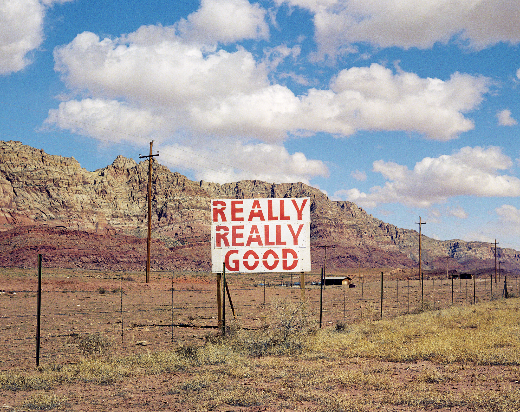
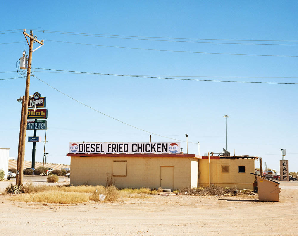
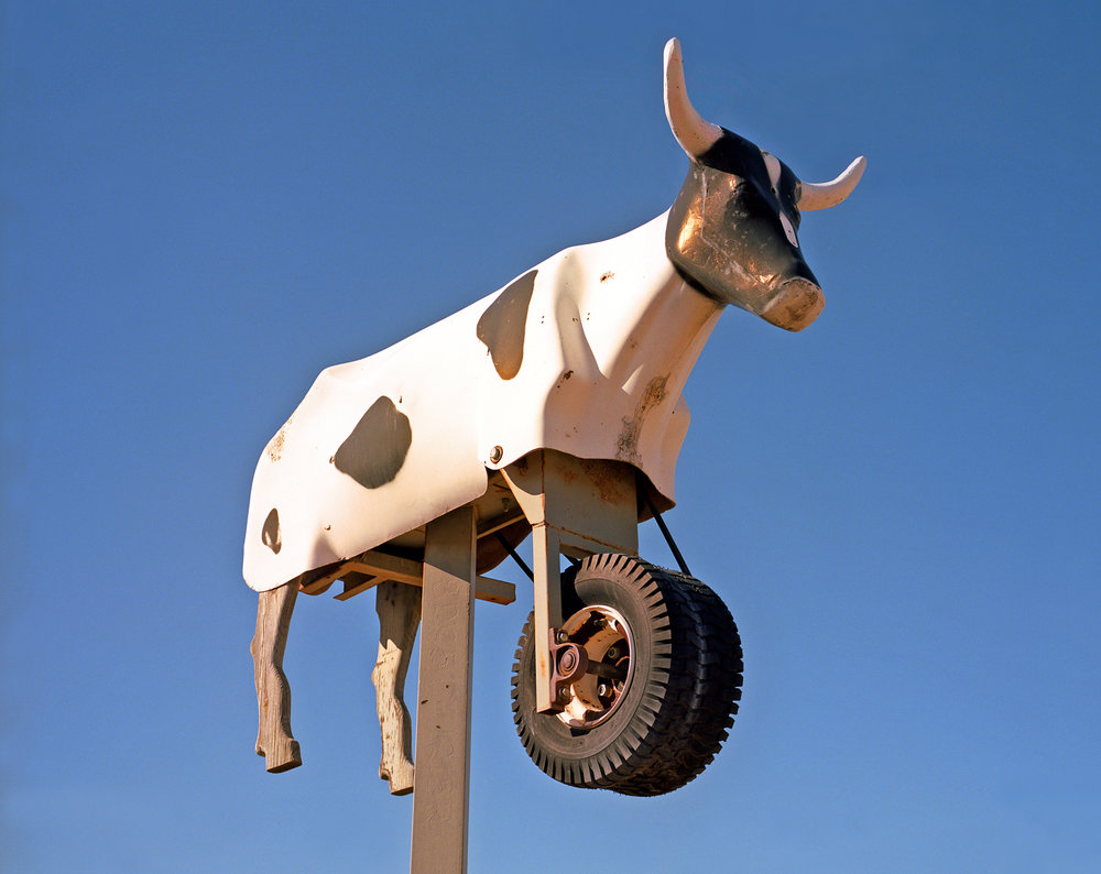
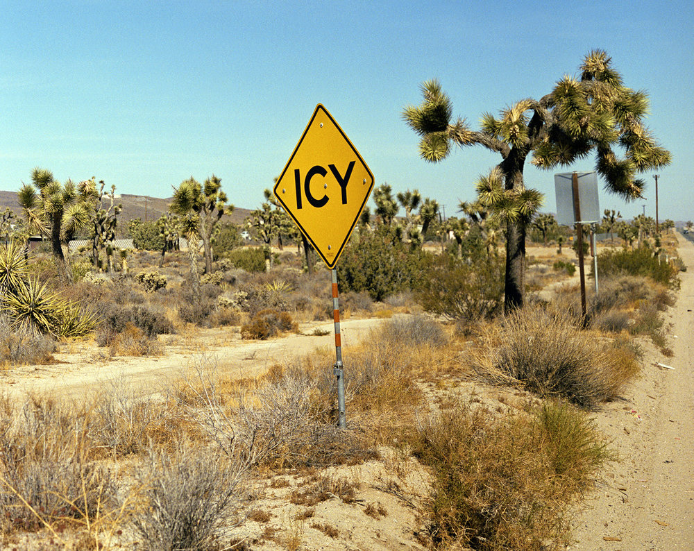
My project for the choices unit is focused on capturing photos of signs with messages. If there are no signs in the photo, I will put text captions on the photo as my own interpretation of a message. Since the starting point, I have narrowed down my inspiring photographers. For the signs aspect, I will be taking inspiration from photographer Rob Hann. For the aspects of the message, I will be taking inspiration from artist and photographer Barbara Kruger. Rob Hann is very inspiring as most of his photos contain both a sign and a message. The message can be interpreted as humorous on many occasions. He takes his photos in desert terrains in California, Texas, and Utah, where there are little to no people. This makes the audience feel isolated. This is beneficial because seeing other people in the photo can distract the audience from the sign and message. In my own photos, I will try to keep the scene clear of people if they distract the audience from the message. However, I might include people in the photo if it emphasizes the message. In Rob Hann’s photos, the background usually shows a natural environment. Using a natural environment as a background is very effective because it contrasts the man-made signs. It draws the audience’s attention to the sign. His photos are very bright and colorful; therefore, the exposure of the camera should be very high. The aperture of these photos is very low since the background is in full detail (F/22). In my own photos, I will use a low aperture to bring the background into view if necessary.

Highway 131, UtahHighway 89, Arizona

Van Horn, TexasMarathon, Texas

Yucca Valley, CaliforniaAmarillo, Texas

For the messages aspect of my project, I will be taking inspiration from Barbara Kruger. I find her photos hilarious. The photos themselves are open to interpretation, but the aspect that really makes the photo relevant to the audience is the caption stuck onto the photo. They seem like questionable statements related to the modern virtues of society. For example, “Money can buy you love” is very questionable but is true to a certain extent when applied to someone’s life. Barbara Kruger also links the subject of the photo directly to the message she is trying to convey. For example, in the photo on the bottom left, a woman covers her face with her hands. The caption says, “Don’t look now.” It is humorous to a certain extent and might relate to the audience on a personal level. I will think of relatable messages and put them in my photos. The photo quality of Barbara Kruger’s works vary. The tone and lighting of each photo are different for each photo. In my photos, I will incorporate this by making each photo’s tone and lighting correspond to the message.

What font is used in Barbara Kruger’s art? – Public DeliveryPin on Barbara KrugerProfile: Barbara Kruger on Trump, Supreme, & Harassment

Barbara-Kruger-Exhibition-poster-1989 - Swann Galleries NewsFemale Iconoclasts: Barbara Kruger | Artland MagazineExposición de Bárbara Kruger, la más grande en 20 años

Overall, the works of Rob Hann and Barbara Kruger inspire me for the choices, choices, choices unit. They help me better define my project. I can connect their works to my own works by including similar aspects. Hopefully, applying these aspects will evoke a similar reaction in the audience.

Choices Unit Starting Point: Signs and Messages

My starting points for CHOICES CHOICES CHOICES are Signs and Messages. I am planning to take photos of signs. This could be any kind of sign. For example, these signs might include street signs, restaurant signs, logos, and product labels. After taking these photos, I will insert text when editing each photo. The text I will be inserting is going to be the message I am going to tell the audience. It could be in the form of a joke or a call to action. My statement of intent is going to be “the interpretation of what a sign could represent.” I am going to draw inspiration from photographers such as Stephen Gill, Stephen Shore, and Rob Hann. These photographers are my inspiration for the “signs” aspect of the project. I am going to draw inspiration from artists such as Barbara Kruger, Martha Rosler, and Lorna Simpson, who combine words and phrases with their photographs to convey messages. These artists are going to be my inspiration for the message part of my project. A possible plan to take photos would be to take photos of signs while sitting in a car. This causes motion blur and will make the photo seem more dynamic.

Reflections: Presenting and EVALUATION of FINAL project

After I took photos for set 1 and set 2, I decided to create my final project based on photos from my set 2 red selection. These photos show the interiors of the Jinmao tower in Shanghai. The triptych featuring these photos is shown in the first image above. However, more than a simple triptych is needed to make this an interesting project. It wouldn’t show the 3D dimensional aspect of architecture. As a result, I chose to create a 3-dimensional project to display my photos. The second image above shows a blueprint of my 3-dimensional project. You can see how the photos in the original triptych are arranged. The dimensions of the 3D display are going to be 150mm x 200mm x 200m. I will stick the separate faces together using glue or clear tape. There will be three sides in total, as there are three photos. This special arrangement links back to my statement of intent because it shows how humans are influenced by living in modern infrastructure. I will attach a photo of the final product when I complete it.

Reflections: SET 2 Red photo analysis

*Note: Couldn’t provide link to original PDF as it was too large to upload.

The above photos are the ones I selected to be a part of the red selection for set 2. As mentioned in a previous post, these photos were selected based on their correlation to my statement of intent and their overall aesthetic appeal. They are all taken in Shanghai.

Firstly, photos 1,2, and 3 focus on buildings at the banks of the rivers during nighttime. In these photos, most of the light is concentrated in the middle of the photo. This is where an imaginary line splits the water and sky. The tone of these photos is mostly dark in the surrounding perimeters, while there is a strong contrast between these dark parts and colored lights, causing a large tonal range. The range of view of these photos varies as some are taken in portrait, and some are taken in landscape. In general, photos 1,2 and 3 illustrate the reflections of light on water. It shows how modern technology can impact the beauty of nature.On the contrary, photo 4 focuses on the reflection of a shoe on the metallic side of a boat. The photo’s focal point is the light that shines on a white shoe. Apart from the focal point, the rest of the elements in the photo are not centered seemed positioned randomly. The tone and colors of the photo vary greatly, with no apparent pattern. I think this photo reflects the need to focus on one’s own identity and footprints in a society where everyone is reliant on technology and innovations. Next, photos 6,7, and 9 focus on the vast interiors of the Jin Mao Tower, one of the tallest buildings in Shanghai’s Pudong business district. The reflections in these photos mostly involve glass and light. Distinct geometrical shapes are defined in the architectural design of the building. These shapes are emphasized by the white line of light circulating around each layer. Photo 6 mostly displays the horizontal view of the Hyatt Hotel lobby. Lights from the interior and exterior of the building reflect on the spacious glass windows, creating abstract patterns and distortions. Photos 7 and 9 show the vertical layers of the building’s many stories. With a low ISO, even the uppermost layers of visible floors are distinct. The white line of light from each layer reflects off of the glass elevator shaft, creating a mesmerizing reflection. Overall, photos 6,7 and 9 display the beauty that can be found in the manmade structures. Next, photos 5, 8, and 12 show reflections of colored lights in different parts of the city. Photo 5 shows the reflections created by a purple structure by the sidewalk. The structure itself is clearly defined as a combination of 3-dimensional shapes by the purple light. In the dark lighting of the night, the purple light from the structure is reflected on surrounding objects, creating a completely purple biome for people walking by. Photo 8 is similar to Photo 5, but it displays subjects on a much larger scale. At a high elevation, I was able to capture a wide range of buildings. Using a low exposure, lights from the buildings were not overwhelming for the eyes and could be distinctly seen. Buildings reflected their light off of one another, but the most intriguing aspect of this photo is the subtle rainbow aura in the sky, created by the reflection of light on the air particles. This effect is created by using a narrow aperture, as all elements of the photo are in focus. In addition, photo 12 uses traffic lights and car lights to create an atmosphere of red. This effect is achieved by using extremely high exposure. In the foreground, a white car is captured at full speed, reflecting bright light off of its side and wheels, slightly blurry. This motion blur was achieved through a slow shutter speed. Overall, this photo shows the rapid bustle in the city. Altogether, photos 5,8,12 show reflections of light amidst different parts of the city and can be related to the photos of Craig Whitehead, my artist of inspiration. Lastly, there are photos 10 and 11. These photos depict reflections in areas that are less developed but still affected by modern infrastructure development. For example, Photo 10 shows the aerial view of a section of a hotel. Through a glass window, we can see a large green clover and the repetition of small wooden boards that form a section of the roof. Near the top of the photo, there are distinct rectangular shapes representing solar panels or small facility buildings. Above all, an unidentifiable object is reflected at the top left of the photo, making the seemingly normal aerial view feel surreal and uncanny. Photo 12 is also unique as it gives another perspective on the city’s suburban areas. The photo features a glimpse of an unclean back alley of a restaurant. However, filling up the entire space of the window is a reflection of the restaurant’s interiors. Reflections of perpendicular Chinese architectural designs can be seen along with a reflection of a silhouette. Combined with these reflections, the shadows of the spiraling stairs give an abstract feeling. Overall, the entirety of set 2 reflects the idea of how humans are influenced by modern innovations and carry-over techniques used by Craig Whitehead.

Reflections: SET 2 Contact Sheet

This is my contact sheet for my set 2 on reflections. In this set, there is a total of 47 photos. Some of these photos were inspired by the photos of Craig Whitehead. Similarly to set 1, I have decided to categorize photos based on how much they relate to my statement of intent and their aesthetic appeal. Photos might be very related to my statement of intent, but if their aesthetic appeal isn’t the best, it wouldn’t be considered a red photo. For the set as a whole, a portion of the photos was taken at ISB, a portion was taken at home, and a large portion was taken in Shanghai. At ISB, the photos were mostly of mundane objects that emitted light or had a glassy surface since they were capable of reflection. The photos taken at home are similar to the ones taken at ISB. The best quality photos were taken in the Pudong business district in Shanghai. They consist of reflections on modern architecture, which are made of glass and have LED lights, making them a great source of reflections when the lighting is dark (night hours). In this set, the categories of yellow, green, and red still apply. The yellow selection consists of photos that have little relation to my statement of intent and do not show interesting reflections. There might be some photos that show reflection, but they lack quality in other aspects, such as focus, angle, or clarity. There are 19 yellow photos in total. The green selection consists of solid photos related to my statement of intent. Some photos might qualify for the red selection but might not be that interesting to the audience. There are 16 green photos in total. Finally, the red selection consists of photos that fit my statement of intent and have excellent aesthetic appeal. These photos were all taken in Shanghai. We can see the majority of the photos in the red selection have a dark backdrop, as they were taken at night. There are 12 red photos in total. I will analyze these photos in a subsequent post.

Reflections: Artist Analysis SET 2

  Craig Whitehead (Sixstreetunder) - NFT PhotographersCraig Whitehead (@sixstreetunder) on Instagram: “Taking a day off shooting while I work on som… | Street photography, Aesthetic photography, Photography inspirationCraig Whitehead (@sixstreetunder) | Ello

For set 2, my inspiring artist is Craig Whitehead. He is a British photographer based in Cambridge. His nickname is Sixstreetunder. This is probably because he mostly takes street photos. He was born in the 1980s, so he experienced the rising pop culture of that time period, probably using those experiences as inspiration in his photography. According to MPB, “Craig Whitehead is one of those photographers. Craig’s photos are beautifully colored, all candidly shot with a unique sense of composition and humor. He has been compared to other photographers, like Saul Leiter and Ernst Haas, who paved the way for color in street photography” (MPB.com). In this quotation, it is revealed that Whitehead is a photographer who involves a lot of color in their works while having a unique sense of composition and humor at the same time. The humor in his photos is unlike those of others, making him extremely influential in the field of street photography. Me, I chose Craig Whitehead as my inspiration because his photography reflects my vision statement very well. Although not all of his photos include technology, the general context of his photos suggests many aspects of urban life. His photos are very fun to look at since they show things that may seem quite unrealistic or uncanny, despite everything being from real life. In his photos, he uses varied types of reflections, such as water reflections and glass reflections. According to Whitehead himself: “My biggest influence comes from my background in Illustration; the way I work now and my obsession with textures and layers are exactly how I would construct my illustrations. My love of Saul Leiter and Ernst Haas reflects that. I also take inspiration from the lighting work of Gregory Crewdson and Ryan Schude. I strive to find situations with dynamic, dramatic light and their sensitivity to color. With regards to social media, I take most of my inspiration from minimal and abstract photographers. I would always favor a smart composition with a mediocre character than a photo of a real character poorly composed.”(The Raw Society). This quotation lets us see many aspects of Whitehead’s work ethic in the different stages of photo taking. We can see the photographers he selects for his inspiration in the connecting stage, how he incorporates inspiration in the responding stages, and how he uses techniques in the creating stage. Many of Whitehead’s photos can be found on his Instagram page, where he shares his work with the rest of the world.

Photo: à g. © Craig Whitehead ; à d. © Joshua K Jackson

I am going to analyze the photo above because I think it incorporates more than one element of reflection. At first, this photo seems extremely abstract because it is hard to see a subject and background within vivid colors. However, upon closer inspection, it can be seen that there are two distinct silhouettes in the mess of colors. The shape of the object that is shadowed on top of the silhouette appears to be an umbrella in the given context. Circular patterns on the left of the image seem like ripples of water, the kinds of ripples that seem like rain splashing on the ground. Also, on the left of the image, there is a red shape that is eye-catching. Due to the spacing of the photo, it seems like this red shape is behind the silhouettes. In the context of this photo, this red shape is most likely a telephone box due to the fact that Whitehead was probably in a British city where telephone boxes are common on the street. In addition, there are distinct white/yellow lines that divide the photograph into sections. The positioning of the lines makes the photo seem like there is a three-dimensional form. This is odd because it seems like the rest of the photo is two-dimensional, and the lines are out of place. In general, this photo can be divided into halves. The halve on the right is dark colored, so the only clearly visible objects are the 3-dimensional lines. The texture of this half is rocky and rough, like the texture of gravel pavement. It gives the photo a hard and empty feeling. In contrast, the left half is brightly colored purple, displaying the two silhouettes and the red telephone box. The texture of this half is watery and smooth, probably full of motion in real life. This half of the photo contrasts the other half by being full of life and colors. The contrasting halves create a strong contrast and a wide tonal range. In terms of technique, this photo was most likely taken during the evening or at night. The context suggests that the photo was taken in the streets. The extreme clarity of the photo means that is photo was likely taken with a narrow aperture of around f/16. Parts of the photo around the silhouettes are not blurred. Since the photo doesn’t look extremely grainy, the ISO was most likely around 200-400. The white balance of the photo seems to be fairly moderate, as the photo does not look too warm or too cold. I can connect this photo to the concept of silhouette photography. For example, photographer Nicolas Bouvier often takes silhouette photos of people in an evening setting. My own photography from photo 1 also has a set that focuses on silhouettes. The difference between this photo and the photos of Bouvier and I are that it shows a reflection of silhouettes and not the actual silhouettes themselves. Overall, I think this photo conveys the concept that love is full of complexity and mixed emotions because the photo shows a vivid half and a dark half around the silhouettes of a couple. Through the white/yellow lines, it shows that people often have unique differences in relationships. In my interpretation, the little ripples created by the rain can symbolize how little things are important in relationships because many little ripples can cause a smooth puddle of water to become full of motion, beautifying the reflection of the silhouettes in the once smooth puddle of water.