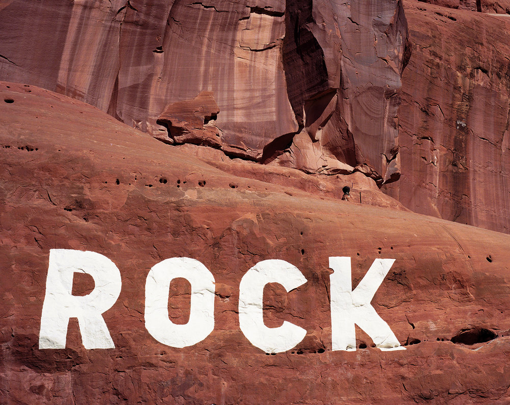
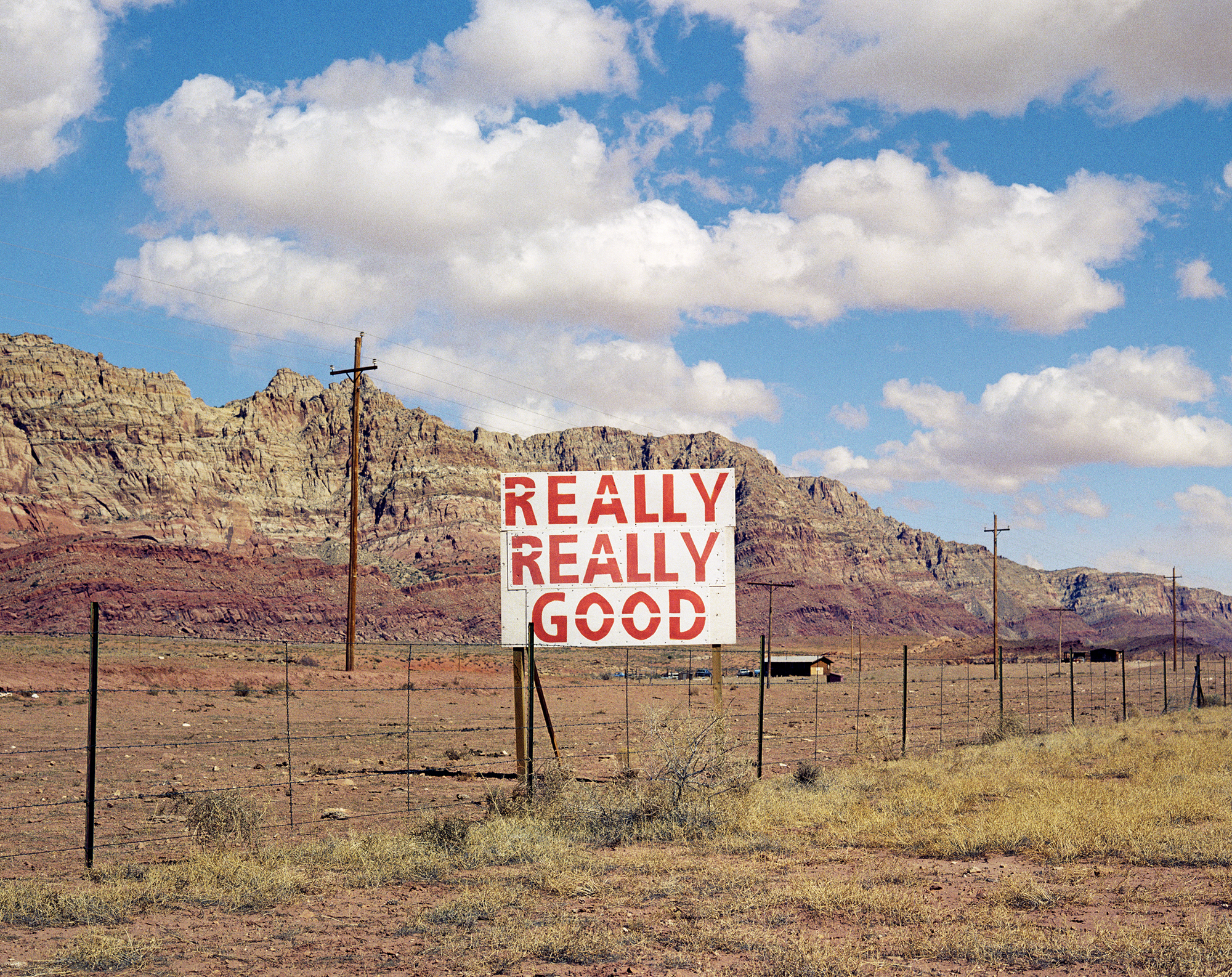
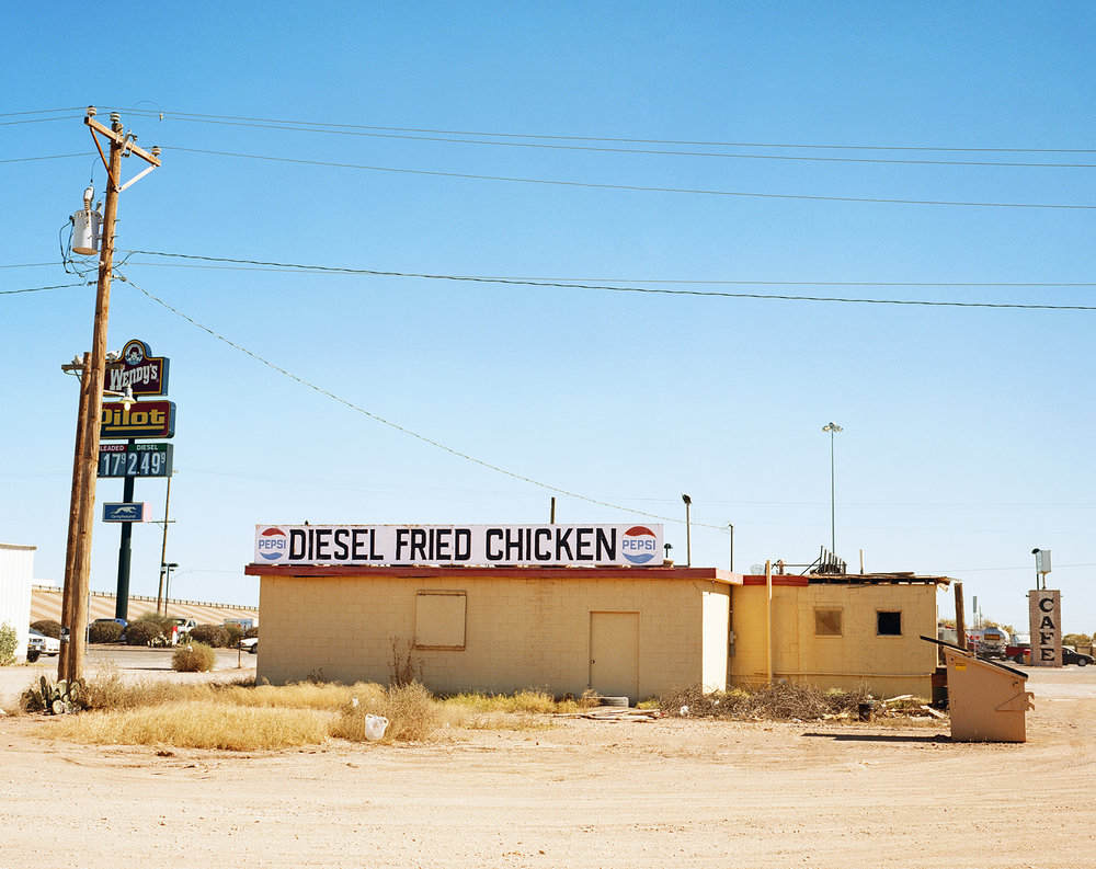
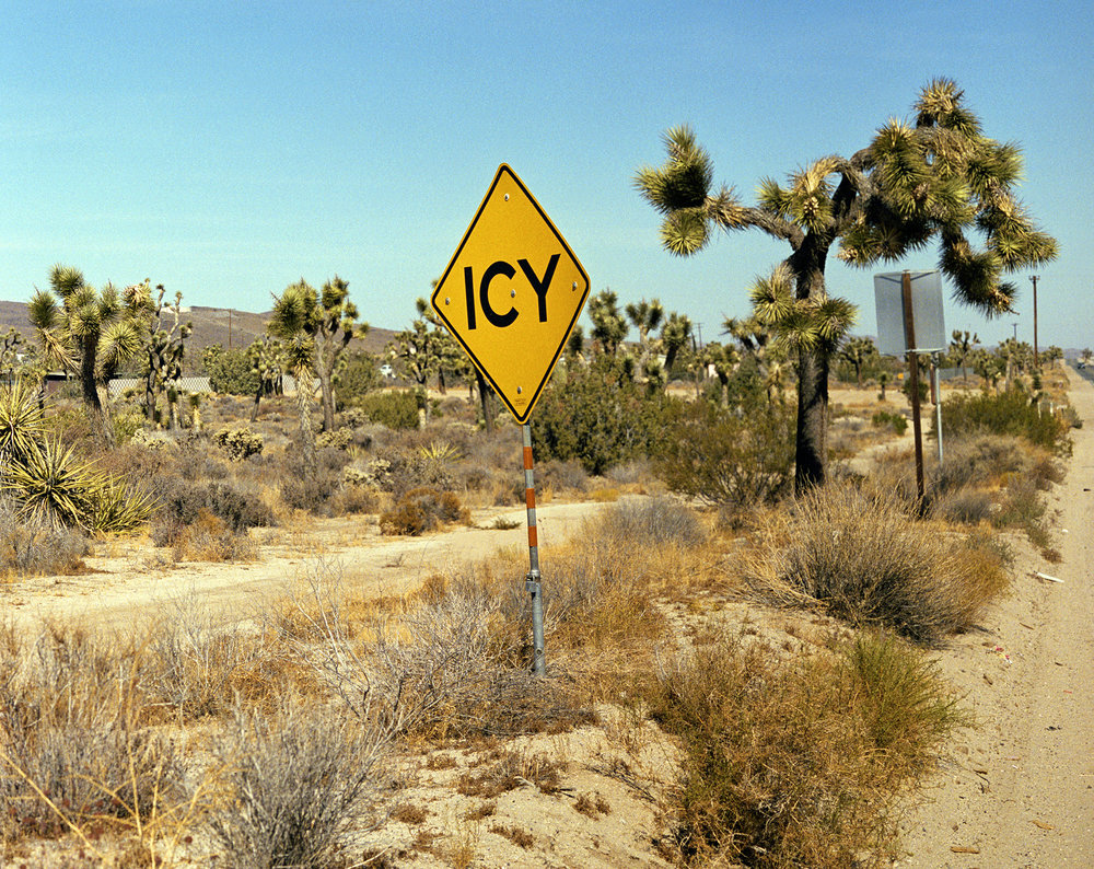
My project for the choices unit is focused on capturing photos of signs with messages. If there are no signs in the photo, I will put text captions on the photo as my own interpretation of a message. Since the starting point, I have narrowed down my inspiring photographers. For the signs aspect, I will be taking inspiration from photographer Rob Hann. For the aspects of the message, I will be taking inspiration from artist and photographer Barbara Kruger. Rob Hann is very inspiring as most of his photos contain both a sign and a message. The message can be interpreted as humorous on many occasions. He takes his photos in desert terrains in California, Texas, and Utah, where there are little to no people. This makes the audience feel isolated. This is beneficial because seeing other people in the photo can distract the audience from the sign and message. In my own photos, I will try to keep the scene clear of people if they distract the audience from the message. However, I might include people in the photo if it emphasizes the message. In Rob Hann’s photos, the background usually shows a natural environment. Using a natural environment as a background is very effective because it contrasts the man-made signs. It draws the audience’s attention to the sign. His photos are very bright and colorful; therefore, the exposure of the camera should be very high. The aperture of these photos is very low since the background is in full detail (F/22). In my own photos, I will use a low aperture to bring the background into view if necessary.
For the messages aspect of my project, I will be taking inspiration from Barbara Kruger. I find her photos hilarious. The photos themselves are open to interpretation, but the aspect that really makes the photo relevant to the audience is the caption stuck onto the photo. They seem like questionable statements related to the modern virtues of society. For example, “Money can buy you love” is very questionable but is true to a certain extent when applied to someone’s life. Barbara Kruger also links the subject of the photo directly to the message she is trying to convey. For example, in the photo on the bottom left, a woman covers her face with her hands. The caption says, “Don’t look now.” It is humorous to a certain extent and might relate to the audience on a personal level. I will think of relatable messages and put them in my photos. The photo quality of Barbara Kruger’s works vary. The tone and lighting of each photo are different for each photo. In my photos, I will incorporate this by making each photo’s tone and lighting correspond to the message.
Overall, the works of Rob Hann and Barbara Kruger inspire me for the choices, choices, choices unit. They help me better define my project. I can connect their works to my own works by including similar aspects. Hopefully, applying these aspects will evoke a similar reaction in the audience.