Reflections: Presenting and EVALUATION of FINAL project

After I took photos for set 1 and set 2, I decided to create my final project based on photos from my set 2 red selection. These photos show the interiors of the Jinmao tower in Shanghai. The triptych featuring these photos is shown in the first image above. However, more than a simple triptych is needed to make this an interesting project. It wouldn’t show the 3D dimensional aspect of architecture. As a result, I chose to create a 3-dimensional project to display my photos. The second image above shows a blueprint of my 3-dimensional project. You can see how the photos in the original triptych are arranged. The dimensions of the 3D display are going to be 150mm x 200mm x 200m. I will stick the separate faces together using glue or clear tape. There will be three sides in total, as there are three photos. This special arrangement links back to my statement of intent because it shows how humans are influenced by living in modern infrastructure. I will attach a photo of the final product when I complete it.

Abstraction: Final Evaluation

PDF LINK: Final Triptych

Which artists have inspired your project and how?

Ernst Haas inspired my project because his style encouraged me to take colored photographs of urban areas. He also inspired me to use the formal element of focus because he used this formal element in many of his photos in “New York in Color, 1952-1962,” which had stunning effects. 

How do your images link to your inspirational images?

My images link to Ernst Haas’s images because they are vividly colored photographs that consist of multiple focal points. Furthermore, they are taken in the bustling places of urban areas. 

What have you experimented further with to help you develop your ideas for the project?

I experimented with different saturation levels to see which lighting best enhances my photos. 

How have you built on what you have done before?

I built upon my skills with snapshots. During the first time in photography class, I learned how to use sport mode to capture objects in motion. The first two photos in my triptych have distinct moving objects. The moving objects are slightly blurred because it wanted to create more contrast with the focal points in the photo. In addition, it also gives the photo a surreal vibe. 

What is the idea behind your final series of images and how does it bring together the best parts of your previous projects?

The main idea in my final series of images is the transition from day to night and the transition from suburban to urban. Starting from the photo on the left of the triptych was taken in the afternoon at around 4-5 pm from the inside of a car. I was entering the city at that point, and the sky was still blue, and the sun was visible. Then, the middle photo was taken around 7-8pm in the middle of a crosswalk in downtown Beijing. Lastly, the photo on the right was taken at about 9-10 pm in a populated commercial area. Overall, my final series of images illustrates the transition from day to night because of the chronological order in which the photos were taken; the transition from suburban to urban because of the change in location of where the photo was taken. To answer the second part of the question, my final series of images brings together the best parts of my previous projects because it was the outcome of learning and improving from set 1 and interpreting the style of a new photographer. All in all, my final series of images demonstrates the best of my photography for now. 

How did you create your final series of images?   

First of all, I was quite puzzled about which photos to choose for my final series. Since I was interpreting the style of Ernst Haas, all of my ‘good’ photos had a variety of main focuses. There were some photos that contained the same objects; however, they were not the best photos to display the influences of Ernst Haas. After finishing my red selection, I looked at the photos to see if there were any connections. After rearranging the photos to see if there was a pattern, I noticed that there was a common idea of transitions in three of my photos. Essentially, that’s how I came up with my final series of images. 

What are the overall strengths of your project and why?

The main idea is quite intriguing because it makes the audience interpret a relationship between three seemingly unrelated photos. 

What are your areas for development – what do you need to work on in future projects?

I would need to learn more on how to use aperture and exposure, so I can use them right in the moment of taking the photo. This way, I can take quality photos that are more specific to my statement of intent. Also, I might focus on taking more photos of a single scene or object, so I have more to choose from in the end. 


Full Contact Sheet+Yellow Selection+Green Selection+Red Selection

The Full Contact Sheet:

The full contact sheet consists of 32 photos in total. I took the photos in various places, so the scenery in the photos can appear quite diverse. All of the photos are colored and mostly abstract. Most of the photos target the formal element of focus through optical effects.

The Yellow Selection:

For the yellow selection, I discarded 12 photos of the 32 photos from my full contact sheet. They were discarded because they didn’t align with my vision or because they didn’t fully incorporate the formal element of focus. For this selection, I chose 20 photos.

The Green Selection:

In this selection, I chose 10 photos that really demonstrate my vision. In these photos, the use of the formal element of focus is demonstrated by diverting the viewer’s attention to a certain part of the photo. For example, in the 10th photo with the cello bow and notes, the viewer is intended to on focus the elements of the photo separately. They either see the bow first or the notes first. At least, that is my interpretation. Different people might see the photo in a variety of ways.

The Red Selection:

  1. The photo is in the top left corner. I chose this photo to include in my red selection because it relates to my vision and uses the formal element of focus uniquely. At first glance, you might not recognize that the photo depicts a night sky. The photo consists of one very bright red light and another very bright yellow light; they greatly contrast the whitish light near the middle of the photograph (the moon). These are the most appealing elements within the photograph. They catch my attention almost immediately when I look at the photo. I tend to ignore the clutter of buildings, cables, and clouds in the background and only focus on the lights. Realistically, the viewer’s eyes should focus on the lights first, but again, the photo is abstract and is open to interpretation. I would call this photo: ” Vision.”
  2. The photo is in the top right corner. I chose this photo because it highlights the formal element of focus very abstractly. The photo does not focus on any element, as it’s an array of transparent spaces in a commercial building. Thus, the viewer must use their interpretation and focus on an element that holds their attention. It is similar to choosing an item from a store in the mall. Instead of selecting items, you will have to choose what to focus on in this photo. Due to the fact, there is a huge number of possible interpretations for focus, this photo is abstract and aligns with my vision. Because of the above, I would call this photo: “Selection.”
  3. The photo is in the bottom left corner. I selected this photo for the red selection because the elements in this photo because it consists of a variety of lines and shapes that split the photo into different sections. The focus on the different sections is part of my vision statement. I took these photos at the gym in the corner between two mirrors; the objects in the mirror are actually in the opposite position in real life. The large brown portion in the middle of the photograph looks as if it split the photograph into two pieces. A muscular man is walking on the right side of the photo; he looks as if he walked through the large brown portion in the middle. All the possible interactions between the man, room, and large brown portion make this photo abstract. I would call this photo: “The Barrier.”
  4. The photo is in the bottom right corner. This photo is special because it appears to be an ordinary picture of a horizon but has extra elements that hook the viewer’s attention. First, the photograph aligns with my vision because it is abstract and focuses on many elements. The different elements include the sky, the buildings, the trees, the river, the bridge, the motorcyclist, and the finger. Each unique element is made imperfect because another element is interfering with it. For example, the buildings block the view of the sky, and the finger blocks the view of the bridge and the river. The fact that you can’t focus on one element without focusing on another makes this photograph abstract. I would call this photo: “Cohesion.” The reason behind this name is up to the viewers. 

The Red Selection

These are the photos I chose for the red selection. They are photos that best represent my statement of intent. They represent my statement of intent because they are black and white and show strong contrast to bring out the subject. Negative space is present in all photos, emphasizing sharp lines and shapes. They somewhat relate to the style of chosen photographer Albert Renger-Patzsch. However, the fact that the photos had to be abstract made me focus on abstraction rather than straight photography.

The first photo is a close-up of the side of a train. It contains a variety of complex machinery and mechanical contraptions. The shapes and features of the machinery are brought out through the shadows from things behind. The white negative space gives the shadows a variety of shapes. The main focus would be the large wheel that takes the center of the photograph. I could improve this photograph by making its shapes and features more abstract. If I were to give this photograph a name, it would be called “Space mechanics.” The reason for this name is open to interpretation.

The second photo is taken by leaning back with the camera. It contains two triangular edges of buildings and a large complex industrial funnel that emerges in between them. The triangles’ simplicity really brings out the middle funnel’s complexity. There is nothing in the background except for negative white space. This makes the focus of the photograph extremely obvious. However, there are still areas for improvement. It would have been better if the triangles at the bottom of the picture were symmetrical, so the formal element of the repetition would be more clear. Also, there seem to be small things that distract the viewer from the main focus. For example, there is a thin line at the top of the triangle to the left and a small block beside the triangle to the right. One of the edges of the triangle to the right doesn’t seem smooth. It makes the shape imperfect. If I were to give this photograph a name, it would be “The Junk King.” The reason behind the name is up to the viewer because it is an abstract photograph.

The third photo shows electricity lines. This photo mostly focuses on the formal elements of shape, line, and repetition. There is a thick black vertical line towards the slightly right of the middle of the photograph. It contrasts the mass repetition of thin black horizontal lines. In addition, there are two circles that have a cross in the middle. They are virtually identical in shape. Therefore, they emphasize the formal element of repetition. The white background and negative space bring out the shapes of the main subjects. To be honest, there are not that many areas of improvement for this photograph because the features are already oversimplified. All in all, this photograph is pretty simple in nature and requires the viewer’s interpretation. I would call this photograph “Lines and Circles.”


Formal Elements-Paul Strand


  • List 3 things the photographer might have been interested in capturing in this picture? 

The photographer might have focused on the contrast between light and shadows in this photograph. The photographer could have been interested in capturing the sandstone-like texture of the structure in the frame of the picture. He could have also tried to compare the abstract shapes present in the photograph.

  • If you were the photographer, what title would you give it? Explain why. 

If I were the photographer, I would call this photograph “Lines and Shadows” since there is an emphasis on a pattern involving lines and shadows.  

  • Name one thing you think is unusual about the photograph. 

This photograph is unusual in that the structure captured in the picture is abstract in shape. It makes the audience wonder what the shapes in the picture are.  

  • Describe the use of line, shape, pattern, texture, tone, and focus 

Lines can be seen as light strips in between the shadow. There are multiple lines that have an approximate distance from one another. Lines appear on more than one surface. It seems like there is a pattern formed by lines. The texture resembles the surface of either sandstone or limestone because there seem to be little sediments in the shadowed parts of the photograph. There are sharp contrasts in tone as there are sharp fragments of light in an area of shadow. However, at the borders of the shape in the photograph, the tone transition seems smoother. The focus of this photograph is neither extremely sharp nor extremely blurry, perhaps somewhere in between.

  • What do you think is the best thing about this photograph? 

In my opinion, the best thing about this photograph is that it makes you feel as if you are trapped in an obscure dimension where there are only abstract shapes made of sandstone that cast odd shadows on one another from the sun above. 

Researching the Starting point

How can photography change our relationship with things?  

Photography can change our relationship with things by capturing something/someone in a moment when the captured object changes in real life; the photographed version would be preserved forever in time.   

What is pictorialism?  

Pictorialism is a form of photography that primarily focuses on beauty, tonality, and composition. Instead of being used for scientific and recording purposes only, pictorialism brings photography to a level to which it could be comparable to art.   

What is abstract photography?  

Abstract photography is similar to abstract art because the subject presented is unclear. The audience must personally interpret the meaning behind the features in the photograph. This is what makes abstract photography so compelling. It is often sold for millions, despite not representing anything realistic.   

About Albert Renger-Patzsch:

Albert Renger-Patzsch was born on June 22, 1897. He was associated with the New Objectivity movement. This was a German art movement during the 1920s, intending to react to expressionism, a form of art where the writer seeks to express emotional experience rather than impressions of the external world. One of his most famous quotes is: “The secret of a good photograph—which, like a work of art, can have esthetic qualities—is its realism… Let us, therefore, leave art to artists and endeavour to create, with the means peculiar to photography and without borrowing from art, photographs which will last because of their photographic qualities.”  

From looking at his images above, what types of subjects do you think Albert Renger-Patzsch preferred to photograph?  

By looking at the images, we can see that Albert Renger-Patzsch preferred photographing natural elements or manufactured objects with a particular pattern or texture. There is usually an aesthetic feature to his photographs.   

Why do you think he entitled his famous book, ‘The World is Beautiful’?  

I think he titled his book “The World is Beautiful” because he wants to present the beautiful things we regularly miss with our eyes. Through his photographs, we can see the profound effect that even the most mundane things have on us.   

Why do you think Edward Weston moved away from the soft focus of pictorialism to the new Straight photography movement? – the idea that ordinary objects and scenes can be photographed to reveal their beauty  

I believe Edward Weston shifted his focus towards the new Straight photography movement because he realized that the photographic industry was changing. Weston noticed that the hazy aesthetic style adapted by Victorian-era painters was no longer prominent to him. In addition, his new relationship with Margrethe Mather encouraged him to assimilate into modernism.  

One of Weston’s pictorialist images and one of his straight images.

Pictorialist image: Maud Allen with Century Plant 

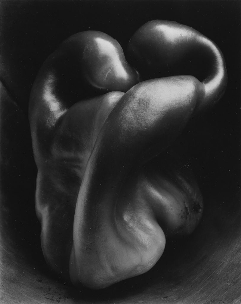
Straight image: Pepper No.30


How has Aaron Siskind been influenced by the Straight Photography Movement?  

Aaron Siskind’s works involve the details of a subject and are abstractly presented on a flat surface. The excellent resolution and the amount of detail in his photographs explain that the Straight Photography Movement influences him.   

Some other photographers that have been influenced by straight photography:  

Alfred Stieglitz, Paul Strand, Berenice Abbott, Imogen Cunningham  

What makes the work of Andreas Gursky and Uta Barth abstract. Are they straight photographers? Why?  

Gursky’s and Barth’s works are abstract since they all contain a motif that cannot to immediately noticed upon seeing the subject within the frame. Both are not straight photographers because they do not focus on details or focal points. Gursky focuses on large-scale panoramic photography that captures a wide range, for example, Rhein II. On the other hand, Uta Barth focuses on perception, optical illusion and non-place. For example, the blurred texture of Barth’s field no.20.   


Works Cited:

Pictorialism: 

https://boshamgallery.com/blog/30-what-is-pictorialism-in-photography-when-photographs-looked-like-paintings-1880-1915/ 

https://www.theartstory.org/movement/pictorialism/ 

Abstract art and representational art:  

https://study.com/academy/lesson/abstract-representational-art-definition-examples.html 

Albert Renger-Patzch: 

https://www.tate.org.uk/art/artists/albert-renger-patzsch-2709 

Edward Weston: 

https://urth.co/magazine/edward-weston-photography 

https://www.invaluable.com/blog/edward-weston-photography/ 

Andreas Gursky: 

https://www.tate.org.uk/art/artists/andreas-gursky-2349 

Uta Barth: 

https://www.tate.org.uk/art/artists/uta-barth-2678 

Pepper No.30: 


Maud Allen with Century Plant: 

https://d7hftxdivxxvm.cloudfront.net/?resize_to=fit&width=554&height=800&quality=80&src=https%3A%2F%2Fd32dm0rphc51dk.cloudfront.net%2FOgmhjxsAob4wjxCwHW6tJw%2Fnormalized.jpg