CHOICES UNIT: Set 3

General information

This set has 20 photos in total. These photos have a similar motive, such that there are silhouettes of legs and feet over a violet background. The artist that I used for inspiration is Nicolas Bouvier, who is a French writer and photographer. I was previously inspired by him in past photography projects. Bouvier takes photographs of silhouettes in exotic backgrounds, but I simplified that by making the background just one color. Overall, this set exemplifies my starting point for the CHOICES unit because it shows signs and messages that a person can convey with their silhouettes. This set can be categorized into three sections: the green section, the blue section, and the red section. There are 9 green photos, 7 blue photos, and 4 red photos. Green photos need better resolution, and the visual messages presented are not unique or interesting. Blue photos appeal to the eye, but they are not the best at representing the starting point, as opposed to the red photos, which are the best demonstration of the starting point and are the most interesting. Due to playfulness and mimicry of this set of photos, I decided to name this set the “Game of Shadows.”

Analysis of a red photo

I decided to categorize the above photo as a red photo because it demonstrates the qualities of a red photo. This photo incorporates the formal elements of line, color, and shape. The silhouette of the legs and feet are very distinct because the violet background contrast and juxtaposes the dark silhouette. The gesture of the silhouette of the feet is also clear. The audience may see that the silhouette resembles the tail of an aquatic mammal, namely the whale or the dolphin. This photo exemplifies my starting point of signs and messages because it shows that human gestures can resemble gestures of animals, hinting at the idea that all animals originated from one common ancestor. With this being said, however, all of the photos in this set are open to interpretation.


Creating+Critique of Red Photos: Set 2

In total, there are 69 photos. Unlike the previous set, this set primarily focuses on the starting point of signs. The photographer of inspiration is Rob Hann. These photos were taken in a natural environment because I believe there are signs in nature worthy of our attention. I categorized these photos using the green, blue, and red selections. My criteria for a good photo are whether it relates to my starting point and whether the photo is aesthetically appealing.

In total, there are 40 green photos, 17 blue photos, and 12 red photos.

Example of a Green Photo

The above is an example of a green photo. The camera alignment in this photo needs to be improved. There isn’t a distinct subject in the photo. All of the elements in the photo are randomized. Although randomness is a sign of nature, this photo does not present randomness in an aesthetically appealing way. There are better representations of my starting point. Therefore, I put this photo in the green selection.

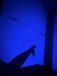
Example of a Blue Photo

The photo above is a blue photo. It includes the elements of line and depth. The lines created by the trees and their shadows look very intriguing. Depth is created when the sandy ground’s light portions are contrasted with the shadows’ dark portions. In the photo, the ground gets darker the farther you look into the photo. In addition, there is a triangular shadow in the bottom right corner of this photo. There is a long shadow next to it. These shadows make the audience curious because they are unlike the regular shadows of the trees. It could be the shadow of an animal, of the photographer, or of something else. This aspect gives off an ominous feel. This photo connects to my starting point because it shows that nature is mysterious, has depth, and can contain almost anything. This photo is very good, but I decided not to put it in the red selection because it could be more aesthetically appealing. Furthermore, it does not have any particular stylistic choices.

Example of a Red Photo

The photo above is a red photo. This is one of the 12 photos that best represent this set and my starting point of signs and messages. The most important elements of this photo are color, depth, and line. The first thing the audience would see in this photo is the red car in the upper center. This is because the car is red, an eye-catching color. In addition, the red color contrasts with the other less vivid colors in the photograph, so it stands out more. Therefore, color is a critical aspect of this photo. Then, there is depth and line. These two aspects are related since lines create depth. Near the center of the photo, a distinct vertical line defines the side of a bamboo bridge. This bridge directly points to the red car in the distance. However, it is the depth that makes the red car seem small. On the other side of the central line, there is a more diagonal line that is another side of the bamboo bridge. It is also angled towards the car. The distance between these two lines decreases as they both approach the car, giving the photo a sense of depth. The most important formal elements are shown in the diagram below. This photo connects to my artist of inspiration, Rob Hann, because it has the theme of human intervention in nature, where man-made structures are put in natural environments. In many of Hann’s photos, man-made structures are isolated in a natural environment. For example, Hann takes photos of abandoned buildings and vehicles in the Desert.

Diagram:

Red photo 2

The photo above is another red photo that differs from the one I previously analyzed. This photo is much more simplistic in nature. This photo was taken beside a mountain next to a river. It incorporates the formal elements of color, shape, and texture. Firstly, there is a large contrast between the water’s green color and the rocks’ grey color. This color contrast emphasizes the shape of each side of the photo. On each side, the texture is varied: the rocks have a rough texture; however, there are wavy white lines that mimic water; on the other hand, the water has a smooth, flowing texture, but small bubbles in the water mimic the small sediments on rocks. Between the rocks and the water, there is an S-shaped line. This line represents the conflict between the two elements as one element is trying to intertwine with the other. This photo connects with my starting point because it shows the sign that different elements in nature can be equally appreciated. The contrasting nature part of this photo is inspired by Rob Hann since he takes photos of two or more landscapes simultaneously.

Creating+Critique of Red Photos: Set 1

An old saying: “Pictures are worth a thousand words.” Although it sounds cliché, it is true in the context of photography. Photos are used to convey messages to the audience in a non-textual fashion. However, photos can be made stronger when certain words are added. These words can give the audience an interpretation of the photo they never expected. Using Barbara Kruger as inspiration, I took a total of 22 studio photos. 22 may seem like a limited amount, but each studio photo is taken after detailed posing directions.
There are three differently colored selections. The green selection: photos that are not aesthetic or hard to express a message. The blue selection: photos that are decent but could be stronger in expressing a message. The red selection: photos that have good aesthetics and can strongly convey a message.
Green photos are photos that would definitely not be considered for the final presenting part of this project. They are photos with no subjects. They are photos with failed or blurry poses. There are 5 green photos out of the 22 photos.
The blue photos are good photos, but they are not the best in exemplifying my starting point of signs and messages. The poses of the subject might be relevant to the message in mind, but they are not the most convincing. There are 8 blue photos out of the 22 photos.
The red photos are the best photos because they have good aesthetics and lighting/tone. The poses of the subject are to the point and accurately convey the message I am trying to communicate. I will consider these photos for my final presentation project. There are 9 red photos in total. There are so many red photos because each photo belongs to a collection of similar photos. For example, the first 3 red photos looking down from the top of the contact sheet belong to 1 collection. Red photos 4-8 looking down from the top are also a part of 1 collection. After selecting photos from the red selection, I decided to edit my photos based on my starting point: signs and messages. In total, I have three different photo collections.

  1. High PH

Sometimes, we experience a moment that can be represented in a single color. This photo collection focuses on the color pink. The main elements that were focused on are color, form, and depth. Color is the main aspect of this photo collection since the entire photo collection is based on one color. Aside from the pink background, the most interesting aspect of the photo is the subject in the middle of each photo. They give the photo more character as opposed to just a pink background. Noticeably, the subject in each photo has a different opacity or depth. In the photos at the side, the opacity is low, while in the middle photo, the opacity is high. This emphasizes the middle photo. In addition, each photo has a single word with an exclamation mark, giving each word a little bit more excitement. However, the photo collection only makes sense when photos are put together side in a particular order so the individual words form a sentence. This photo collection relates to my starting point of signs and messages because it conveys a specific emotion and message to the audience. It relates to my inspiration for Barbara Kruger because it has text captions, something you will rarely see in photography. These photos were taken with a Nikon D750 in the studio at ISB. I named this photo collection “High PH” because the photo collection looks like a PH-level testing paper when placed in acid, which turns pink. This is very applicable because the audience of these photographs is most likely going to be students. So, they will need prior knowledge in order to understand how the name of this photo collection correlates with its visual appearance.

2. Reality Show!

Using photography, we can communicate issues in our society with fewer repercussions than if we were to communicate them verbally. Out of the three photo collections, this one is the most prominent because its messages are heavy in nature and make the audience think critically. The main elements used in this set are color, form, and shape. The color of all of the photos is black and white. This was a stylistic choice since brightly colored photos would allow the audience to be distracted from the messages. There, the black and white color was used to highlight textual messages. The form is very important in these photos since it is what gives each photo a story. The characters in each photo have a distinct poses. These poses help convey the message in each photo. Characters’ positions/actions in each photo are symbolic of certain events that happen in reality. However, when accompanied by the black-and-white tone and critical text caption, these everyday events seem all the less ordinary. They become somewhat surreal. Furthermore, the shape is an important part of this photo collection because it is how the form of the subjects relates to the text captions. Randomly putting text captions on the photo will make the photos lose their aesthetic appeal. Therefore I decided to place text captions at a place on each photo that looks the most cohesive. For example, I put text captions vertically in photos with a portrait or square frame. I put text captions horizontally in photos with a landscape frame. Overall, these photos are the most representative of Barbara Kruger’s style since they have a black-and-white tone with red and white captions. They connect to my starting point because they convey messages about society and psychology. As a result, I decided to call this photo collection the Reality Show!

3. Only human

For this photo collection, there is only one main subject. I decided to take photos of him while he showed different facial emotions. To accompany his emotions, I used different color filters that were available to me. For example, the first on the left has the subject showing a neutral expression. In this photo, he is wearing a mask, so his facial experience is even more indistinguishable. In the middle, he is showing a hearty expression. This can be interpreted in many ways, but this photo’s main purpose is to show that the subject has the ability to show emotions. Also, the subject is not wearing a mask in this one, so the audience can see their facial expression. Lastly, the photo on the right shows the subject’s angry face. This is supposed to represent a human’s ability to express strong emotions, something that essentially makes us human. I believe color, form, and line are elements that play a big role in this photo collection. The color is important because it emphasizes the emotion being conveyed in each photo. The subject’s facial expression and position have everything to do with form, so therefore it is also an important part. Finally, line plays a role in the cohesiveness of the photos because the text caption is aligned directly above the subject’s head. This photo collection relates to my starting point because it conveys the message that all humans have the ability to feel emotions at different levels. The inspiration that was used when taking these photos is Barbara Kruger’s use of text captions.


Choices Unit: Connecting

My project for the choices unit is focused on capturing photos of signs with messages. If there are no signs in the photo, I will put text captions on the photo as my own interpretation of a message. Since the starting point, I have narrowed down my inspiring photographers. For the signs aspect, I will be taking inspiration from photographer Rob Hann. For the aspects of the message, I will be taking inspiration from artist and photographer Barbara Kruger. Rob Hann is very inspiring as most of his photos contain both a sign and a message. The message can be interpreted as humorous on many occasions. He takes his photos in desert terrains in California, Texas, and Utah, where there are little to no people. This makes the audience feel isolated. This is beneficial because seeing other people in the photo can distract the audience from the sign and message. In my own photos, I will try to keep the scene clear of people if they distract the audience from the message. However, I might include people in the photo if it emphasizes the message. In Rob Hann’s photos, the background usually shows a natural environment. Using a natural environment as a background is very effective because it contrasts the man-made signs. It draws the audience’s attention to the sign. His photos are very bright and colorful; therefore, the exposure of the camera should be very high. The aperture of these photos is very low since the background is in full detail (F/22). In my own photos, I will use a low aperture to bring the background into view if necessary.

Highway 131, UtahHighway 89, Arizona

Van Horn, TexasMarathon, Texas

Yucca Valley, CaliforniaAmarillo, Texas

For the messages aspect of my project, I will be taking inspiration from Barbara Kruger. I find her photos hilarious. The photos themselves are open to interpretation, but the aspect that really makes the photo relevant to the audience is the caption stuck onto the photo. They seem like questionable statements related to the modern virtues of society. For example, “Money can buy you love” is very questionable but is true to a certain extent when applied to someone’s life. Barbara Kruger also links the subject of the photo directly to the message she is trying to convey. For example, in the photo on the bottom left, a woman covers her face with her hands. The caption says, “Don’t look now.” It is humorous to a certain extent and might relate to the audience on a personal level. I will think of relatable messages and put them in my photos. The photo quality of Barbara Kruger’s works vary. The tone and lighting of each photo are different for each photo. In my photos, I will incorporate this by making each photo’s tone and lighting correspond to the message.

What font is used in Barbara Kruger’s art? – Public DeliveryPin on Barbara KrugerProfile: Barbara Kruger on Trump, Supreme, & Harassment

Barbara-Kruger-Exhibition-poster-1989 - Swann Galleries NewsFemale Iconoclasts: Barbara Kruger | Artland MagazineExposición de Bárbara Kruger, la más grande en 20 años

Overall, the works of Rob Hann and Barbara Kruger inspire me for the choices, choices, choices unit. They help me better define my project. I can connect their works to my own works by including similar aspects. Hopefully, applying these aspects will evoke a similar reaction in the audience.

Choices Unit Starting Point: Signs and Messages

My starting points for CHOICES CHOICES CHOICES are Signs and Messages. I am planning to take photos of signs. This could be any kind of sign. For example, these signs might include street signs, restaurant signs, logos, and product labels. After taking these photos, I will insert text when editing each photo. The text I will be inserting is going to be the message I am going to tell the audience. It could be in the form of a joke or a call to action. My statement of intent is going to be “the interpretation of what a sign could represent.” I am going to draw inspiration from photographers such as Stephen Gill, Stephen Shore, and Rob Hann. These photographers are my inspiration for the “signs” aspect of the project. I am going to draw inspiration from artists such as Barbara Kruger, Martha Rosler, and Lorna Simpson, who combine words and phrases with their photographs to convey messages. These artists are going to be my inspiration for the message part of my project. A possible plan to take photos would be to take photos of signs while sitting in a car. This causes motion blur and will make the photo seem more dynamic.

Reflections: Presenting and EVALUATION of FINAL project

After I took photos for set 1 and set 2, I decided to create my final project based on photos from my set 2 red selection. These photos show the interiors of the Jinmao tower in Shanghai. The triptych featuring these photos is shown in the first image above. However, more than a simple triptych is needed to make this an interesting project. It wouldn’t show the 3D dimensional aspect of architecture. As a result, I chose to create a 3-dimensional project to display my photos. The second image above shows a blueprint of my 3-dimensional project. You can see how the photos in the original triptych are arranged. The dimensions of the 3D display are going to be 150mm x 200mm x 200m. I will stick the separate faces together using glue or clear tape. There will be three sides in total, as there are three photos. This special arrangement links back to my statement of intent because it shows how humans are influenced by living in modern infrastructure. I will attach a photo of the final product when I complete it.

Reflections Unit: Set 1 Red Selection Critique

The above photos are the photos I selected for my red selection. They all represent my vision statement from the beginning of the project. In general, they include reflections on technology. For example, the first photo at the top left of the contact sheet features a reflection of a book through a camera lens. The camera is the technology being used, and in the reflection, the book cover has a cut-off word “dig,” the abbreviation of “digital,” therefore, I think this photo strongly relates to my vision statement. This photo incorporates the techniques of Lee Friedlander, my chosen photographer. When I analyzed one of his photos, I realized that there was a focus on the reflected parts of the photo. In my photo, I decided to draw attention to parts of my photo by making the rest of the photo dark colors such as black, grey, and brown. In this red selection, this photo relates most with my vision statement and my chosen artist. However, my favorite photo in this red selection is the photo at the top right of the contact sheet. In my opinion, the aesthetics of this photo are the most eye-catching compared to the rest of the photos I have taken throughout this set. The natural red tinting of the entire photo gives the feeling of heat, intensity, and wickedness. I like how the photo is blurred on the borders and is extremely clear around the main subject. This creates clarity around the subject and makes the eyes of the audience immediately focus on it. In addition, the main subject of this photo is a pair of AirPods, which is considered one of the most popular technologies in modern society. Therefore, the popularity of the subject can be symbolized by the red tinting of the photo. The rest of the photos relate to my statement of intent because they also feature a type of technology. For example, lights, audio mixers, fountains, taps, and security cameras. Overall, I selected these photos for my red selection because they resemble my original vision statement the most.

Reflection Unit: Set 1 Contact Sheet


This is my first contact sheet for the reflection unit. Most of these photos were taken throughout the school. In general, the main subject of these photos are mundane installments scattered throughout the school. Some of these photos fit with my statements of intent because they include reflections of different types of technology. In some of these photos I used reflection techniques inspired from my artist of choice, Lee Friedlander. However, unlike Friedlander, all of my current photos are colored. At the moment, these are all of the photos I have on the topic of reflection but I will gradually take more photos in subsequent sets and select photos that fit better with my statement of intent. The color categories for this set are yellow, green, and red. Yellow photos are the ones that lack quality or do not fit with my statement of intent. Green photos have quality, but may or may not be related to my statement of intent. Red photos have quality and strongly relate to my statement of intent. They are the best photos of the entire set. I will do an analysis specifically on the red photos in the next post.

Reflections: Reflection on Connecting

I learned that various artists use different types of reflections in their photos to display unique effects that intrigue the audience. Furthermore, a particular type of reflection can represent a certain mood or/and message the photographer is trying to convey to the audience. The types of reflections in photos are often associated with the time and place the photographer was living in. I also learned that photographers use different techniques to capture reflections. These techniques depend highly on their personal style and purpose, so it is hard to find two photographers who use the same techniques in their photographs. Photographers can change the type of surface the subject is reflected in. They can also adjust the camera’s aperture to focus on minuscule reflections/large reflections. In the sub-genres of reflections, some artists inspire me because they use the concept of reflections as only a part of their photos. They use concepts from multiple other genres and combine them with the concept of reflections to create something truly authentic. Likewise, I will incorporate this in my photos.