Reflections: Presenting and EVALUATION of FINAL project

After I took photos for set 1 and set 2, I decided to create my final project based on photos from my set 2 red selection. These photos show the interiors of the Jinmao tower in Shanghai. The triptych featuring these photos is shown in the first image above. However, more than a simple triptych is needed to make this an interesting project. It wouldn’t show the 3D dimensional aspect of architecture. As a result, I chose to create a 3-dimensional project to display my photos. The second image above shows a blueprint of my 3-dimensional project. You can see how the photos in the original triptych are arranged. The dimensions of the 3D display are going to be 150mm x 200mm x 200m. I will stick the separate faces together using glue or clear tape. There will be three sides in total, as there are three photos. This special arrangement links back to my statement of intent because it shows how humans are influenced by living in modern infrastructure. I will attach a photo of the final product when I complete it.

Reflections: SET 2 Contact Sheet

This is my contact sheet for my set 2 on reflections. In this set, there is a total of 47 photos. Some of these photos were inspired by the photos of Craig Whitehead. Similarly to set 1, I have decided to categorize photos based on how much they relate to my statement of intent and their aesthetic appeal. Photos might be very related to my statement of intent, but if their aesthetic appeal isn’t the best, it wouldn’t be considered a red photo. For the set as a whole, a portion of the photos was taken at ISB, a portion was taken at home, and a large portion was taken in Shanghai. At ISB, the photos were mostly of mundane objects that emitted light or had a glassy surface since they were capable of reflection. The photos taken at home are similar to the ones taken at ISB. The best quality photos were taken in the Pudong business district in Shanghai. They consist of reflections on modern architecture, which are made of glass and have LED lights, making them a great source of reflections when the lighting is dark (night hours). In this set, the categories of yellow, green, and red still apply. The yellow selection consists of photos that have little relation to my statement of intent and do not show interesting reflections. There might be some photos that show reflection, but they lack quality in other aspects, such as focus, angle, or clarity. There are 19 yellow photos in total. The green selection consists of solid photos related to my statement of intent. Some photos might qualify for the red selection but might not be that interesting to the audience. There are 16 green photos in total. Finally, the red selection consists of photos that fit my statement of intent and have excellent aesthetic appeal. These photos were all taken in Shanghai. We can see the majority of the photos in the red selection have a dark backdrop, as they were taken at night. There are 12 red photos in total. I will analyze these photos in a subsequent post.

Reflections: Artist Analysis SET 2

  Craig Whitehead (Sixstreetunder) - NFT PhotographersCraig Whitehead (@sixstreetunder) on Instagram: “Taking a day off shooting while I work on som… | Street photography, Aesthetic photography, Photography inspirationCraig Whitehead (@sixstreetunder) | Ello

For set 2, my inspiring artist is Craig Whitehead. He is a British photographer based in Cambridge. His nickname is Sixstreetunder. This is probably because he mostly takes street photos. He was born in the 1980s, so he experienced the rising pop culture of that time period, probably using those experiences as inspiration in his photography. According to MPB, “Craig Whitehead is one of those photographers. Craig’s photos are beautifully colored, all candidly shot with a unique sense of composition and humor. He has been compared to other photographers, like Saul Leiter and Ernst Haas, who paved the way for color in street photography” (MPB.com). In this quotation, it is revealed that Whitehead is a photographer who involves a lot of color in their works while having a unique sense of composition and humor at the same time. The humor in his photos is unlike those of others, making him extremely influential in the field of street photography. Me, I chose Craig Whitehead as my inspiration because his photography reflects my vision statement very well. Although not all of his photos include technology, the general context of his photos suggests many aspects of urban life. His photos are very fun to look at since they show things that may seem quite unrealistic or uncanny, despite everything being from real life. In his photos, he uses varied types of reflections, such as water reflections and glass reflections. According to Whitehead himself: “My biggest influence comes from my background in Illustration; the way I work now and my obsession with textures and layers are exactly how I would construct my illustrations. My love of Saul Leiter and Ernst Haas reflects that. I also take inspiration from the lighting work of Gregory Crewdson and Ryan Schude. I strive to find situations with dynamic, dramatic light and their sensitivity to color. With regards to social media, I take most of my inspiration from minimal and abstract photographers. I would always favor a smart composition with a mediocre character than a photo of a real character poorly composed.”(The Raw Society). This quotation lets us see many aspects of Whitehead’s work ethic in the different stages of photo taking. We can see the photographers he selects for his inspiration in the connecting stage, how he incorporates inspiration in the responding stages, and how he uses techniques in the creating stage. Many of Whitehead’s photos can be found on his Instagram page, where he shares his work with the rest of the world.

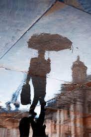
Photo: à g. © Craig Whitehead ; à d. © Joshua K Jackson

I am going to analyze the photo above because I think it incorporates more than one element of reflection. At first, this photo seems extremely abstract because it is hard to see a subject and background within vivid colors. However, upon closer inspection, it can be seen that there are two distinct silhouettes in the mess of colors. The shape of the object that is shadowed on top of the silhouette appears to be an umbrella in the given context. Circular patterns on the left of the image seem like ripples of water, the kinds of ripples that seem like rain splashing on the ground. Also, on the left of the image, there is a red shape that is eye-catching. Due to the spacing of the photo, it seems like this red shape is behind the silhouettes. In the context of this photo, this red shape is most likely a telephone box due to the fact that Whitehead was probably in a British city where telephone boxes are common on the street. In addition, there are distinct white/yellow lines that divide the photograph into sections. The positioning of the lines makes the photo seem like there is a three-dimensional form. This is odd because it seems like the rest of the photo is two-dimensional, and the lines are out of place. In general, this photo can be divided into halves. The halve on the right is dark colored, so the only clearly visible objects are the 3-dimensional lines. The texture of this half is rocky and rough, like the texture of gravel pavement. It gives the photo a hard and empty feeling. In contrast, the left half is brightly colored purple, displaying the two silhouettes and the red telephone box. The texture of this half is watery and smooth, probably full of motion in real life. This half of the photo contrasts the other half by being full of life and colors. The contrasting halves create a strong contrast and a wide tonal range. In terms of technique, this photo was most likely taken during the evening or at night. The context suggests that the photo was taken in the streets. The extreme clarity of the photo means that is photo was likely taken with a narrow aperture of around f/16. Parts of the photo around the silhouettes are not blurred. Since the photo doesn’t look extremely grainy, the ISO was most likely around 200-400. The white balance of the photo seems to be fairly moderate, as the photo does not look too warm or too cold. I can connect this photo to the concept of silhouette photography. For example, photographer Nicolas Bouvier often takes silhouette photos of people in an evening setting. My own photography from photo 1 also has a set that focuses on silhouettes. The difference between this photo and the photos of Bouvier and I are that it shows a reflection of silhouettes and not the actual silhouettes themselves. Overall, I think this photo conveys the concept that love is full of complexity and mixed emotions because the photo shows a vivid half and a dark half around the silhouettes of a couple. Through the white/yellow lines, it shows that people often have unique differences in relationships. In my interpretation, the little ripples created by the rain can symbolize how little things are important in relationships because many little ripples can cause a smooth puddle of water to become full of motion, beautifying the reflection of the silhouettes in the once smooth puddle of water.

Reflections Unit: Set 1 Red Selection Critique

The above photos are the photos I selected for my red selection. They all represent my vision statement from the beginning of the project. In general, they include reflections on technology. For example, the first photo at the top left of the contact sheet features a reflection of a book through a camera lens. The camera is the technology being used, and in the reflection, the book cover has a cut-off word “dig,” the abbreviation of “digital,” therefore, I think this photo strongly relates to my vision statement. This photo incorporates the techniques of Lee Friedlander, my chosen photographer. When I analyzed one of his photos, I realized that there was a focus on the reflected parts of the photo. In my photo, I decided to draw attention to parts of my photo by making the rest of the photo dark colors such as black, grey, and brown. In this red selection, this photo relates most with my vision statement and my chosen artist. However, my favorite photo in this red selection is the photo at the top right of the contact sheet. In my opinion, the aesthetics of this photo are the most eye-catching compared to the rest of the photos I have taken throughout this set. The natural red tinting of the entire photo gives the feeling of heat, intensity, and wickedness. I like how the photo is blurred on the borders and is extremely clear around the main subject. This creates clarity around the subject and makes the eyes of the audience immediately focus on it. In addition, the main subject of this photo is a pair of AirPods, which is considered one of the most popular technologies in modern society. Therefore, the popularity of the subject can be symbolized by the red tinting of the photo. The rest of the photos relate to my statement of intent because they also feature a type of technology. For example, lights, audio mixers, fountains, taps, and security cameras. Overall, I selected these photos for my red selection because they resemble my original vision statement the most.

Reflection Unit: Set 1 Contact Sheet


This is my first contact sheet for the reflection unit. Most of these photos were taken throughout the school. In general, the main subject of these photos are mundane installments scattered throughout the school. Some of these photos fit with my statements of intent because they include reflections of different types of technology. In some of these photos I used reflection techniques inspired from my artist of choice, Lee Friedlander. However, unlike Friedlander, all of my current photos are colored. At the moment, these are all of the photos I have on the topic of reflection but I will gradually take more photos in subsequent sets and select photos that fit better with my statement of intent. The color categories for this set are yellow, green, and red. Yellow photos are the ones that lack quality or do not fit with my statement of intent. Green photos have quality, but may or may not be related to my statement of intent. Red photos have quality and strongly relate to my statement of intent. They are the best photos of the entire set. I will do an analysis specifically on the red photos in the next post.