CHOICES UNIT: Set 3

General information

This set has 20 photos in total. These photos have a similar motive, such that there are silhouettes of legs and feet over a violet background. The artist that I used for inspiration is Nicolas Bouvier, who is a French writer and photographer. I was previously inspired by him in past photography projects. Bouvier takes photographs of silhouettes in exotic backgrounds, but I simplified that by making the background just one color. Overall, this set exemplifies my starting point for the CHOICES unit because it shows signs and messages that a person can convey with their silhouettes. This set can be categorized into three sections: the green section, the blue section, and the red section. There are 9 green photos, 7 blue photos, and 4 red photos. Green photos need better resolution, and the visual messages presented are not unique or interesting. Blue photos appeal to the eye, but they are not the best at representing the starting point, as opposed to the red photos, which are the best demonstration of the starting point and are the most interesting. Due to playfulness and mimicry of this set of photos, I decided to name this set the “Game of Shadows.”

Analysis of a red photo

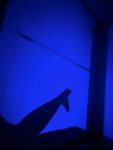
I decided to categorize the above photo as a red photo because it demonstrates the qualities of a red photo. This photo incorporates the formal elements of line, color, and shape. The silhouette of the legs and feet are very distinct because the violet background contrast and juxtaposes the dark silhouette. The gesture of the silhouette of the feet is also clear. The audience may see that the silhouette resembles the tail of an aquatic mammal, namely the whale or the dolphin. This photo exemplifies my starting point of signs and messages because it shows that human gestures can resemble gestures of animals, hinting at the idea that all animals originated from one common ancestor. With this being said, however, all of the photos in this set are open to interpretation.


Choices Unit: Connecting

My project for the choices unit is focused on capturing photos of signs with messages. If there are no signs in the photo, I will put text captions on the photo as my own interpretation of a message. Since the starting point, I have narrowed down my inspiring photographers. For the signs aspect, I will be taking inspiration from photographer Rob Hann. For the aspects of the message, I will be taking inspiration from artist and photographer Barbara Kruger. Rob Hann is very inspiring as most of his photos contain both a sign and a message. The message can be interpreted as humorous on many occasions. He takes his photos in desert terrains in California, Texas, and Utah, where there are little to no people. This makes the audience feel isolated. This is beneficial because seeing other people in the photo can distract the audience from the sign and message. In my own photos, I will try to keep the scene clear of people if they distract the audience from the message. However, I might include people in the photo if it emphasizes the message. In Rob Hann’s photos, the background usually shows a natural environment. Using a natural environment as a background is very effective because it contrasts the man-made signs. It draws the audience’s attention to the sign. His photos are very bright and colorful; therefore, the exposure of the camera should be very high. The aperture of these photos is very low since the background is in full detail (F/22). In my own photos, I will use a low aperture to bring the background into view if necessary.

Highway 131, UtahHighway 89, Arizona

Van Horn, TexasMarathon, Texas

Yucca Valley, CaliforniaAmarillo, Texas

For the messages aspect of my project, I will be taking inspiration from Barbara Kruger. I find her photos hilarious. The photos themselves are open to interpretation, but the aspect that really makes the photo relevant to the audience is the caption stuck onto the photo. They seem like questionable statements related to the modern virtues of society. For example, “Money can buy you love” is very questionable but is true to a certain extent when applied to someone’s life. Barbara Kruger also links the subject of the photo directly to the message she is trying to convey. For example, in the photo on the bottom left, a woman covers her face with her hands. The caption says, “Don’t look now.” It is humorous to a certain extent and might relate to the audience on a personal level. I will think of relatable messages and put them in my photos. The photo quality of Barbara Kruger’s works vary. The tone and lighting of each photo are different for each photo. In my photos, I will incorporate this by making each photo’s tone and lighting correspond to the message.

What font is used in Barbara Kruger’s art? – Public DeliveryPin on Barbara KrugerProfile: Barbara Kruger on Trump, Supreme, & Harassment

Barbara-Kruger-Exhibition-poster-1989 - Swann Galleries NewsFemale Iconoclasts: Barbara Kruger | Artland MagazineExposición de Bárbara Kruger, la más grande en 20 años

Overall, the works of Rob Hann and Barbara Kruger inspire me for the choices, choices, choices unit. They help me better define my project. I can connect their works to my own works by including similar aspects. Hopefully, applying these aspects will evoke a similar reaction in the audience.

Choices Unit Starting Point: Signs and Messages

My starting points for CHOICES CHOICES CHOICES are Signs and Messages. I am planning to take photos of signs. This could be any kind of sign. For example, these signs might include street signs, restaurant signs, logos, and product labels. After taking these photos, I will insert text when editing each photo. The text I will be inserting is going to be the message I am going to tell the audience. It could be in the form of a joke or a call to action. My statement of intent is going to be “the interpretation of what a sign could represent.” I am going to draw inspiration from photographers such as Stephen Gill, Stephen Shore, and Rob Hann. These photographers are my inspiration for the “signs” aspect of the project. I am going to draw inspiration from artists such as Barbara Kruger, Martha Rosler, and Lorna Simpson, who combine words and phrases with their photographs to convey messages. These artists are going to be my inspiration for the message part of my project. A possible plan to take photos would be to take photos of signs while sitting in a car. This causes motion blur and will make the photo seem more dynamic.