February 6

Photography: Rule Breakers

When taking photos, we break the rules without even noticing, and some look good despite considering the regulations. Do we even know if we are breaking the rules? Pictures can be regarded as good if they bring some message. Although quality and the aesthetic the pictures produce to the viewers are essential, no photo can be considered wrong if there is a specific message the artist wants to inform.

This picture can be considered a lousy photo. Firstly, the person is not in the center and is cropped at an awkward length. Moreover, the image is blurred out. With all the colorful background, it overall makes the viewers question what the intention of this picture is. However, as previously mentioned, only some photos can be good. Even if the artist (myself) took the picture with no intention, it is always possible for them to insert meaning into it. For example, this colorful picture can have the meaning of “the perspective of a person with bad eyesight.” See?

Next, this is a picture that the artist took with intention. Of course, this photo breaks various rules. First of all, the purpose of this picture seems vague. Cutting out the objects and leaving out only the legs of the furniture makes the viewers guess and question what those objects might be (which can be interesting, though it has not much meaning). Moreover, the angles formed between the two sofas don’t create any parallel or right angle. Additionally, the picture is blurred out, which could make the viewers unable to see clearly, and even feel uncomfortable. The surprise is that the artist intended to take a picture of ‘bad picture’ to make the viewers feel miserable and uncomfortable.

Picture # 3: This is a bad picture because it crops out the person, and its focus is not explicit except for the arrow sign and its surrounding blocks, while the ratio between the ground and the ceiling also makes viewers question the picture’s intent: is it the arrow sign?… or the person walking by? However, that question can be its purpose, as this picture produces certain moods and vibes, leaving the viewers ambiguous can be the artist’s intention.

Same for this photo. The ratio between the ground and the ceiling is uneven because most pictures considered visually pleasing have the top longer than the bottom, leaving the viewers miserable. However, the artist can argue that she wanted to focus on the dark moods the image produces, hence, titling it: “the perspective of a lonely depressed student walking by the hallway.” It sounds cringy, but that is just one way to help the viewers interpret.


  . The lighting of the three pictures is too dark; the viewers can barely see anything. Even more, the titles of the books aren’t observable; it is hard to read them. The ratio and the angle of the image are all uneven. Some of them still need to fully show what the category and the books are, which is blurry overall. Namely, only a few meanings are in these photos. However, the three images all produce a similar mood, perhaps “dark academia” aesthetics or specific scenes in a horror film, which can all be the artists’ purpose.


The minor details are an incredible factor in pictures that break the rules but look aesthetically pleasing. For example, the artist took this picture because of the shadows the canvas stand produced and the formation of parallel angles with three canvas stands. These minor factors can make a visually pleasing photo even if it breaks the rule.


The first thing I see is the smiley face and the canvas sticking out of each corner. This breaks the rule of photography. However, among those distractions, the origami may get viewers’ attention, especially the red one. Moreover, the angle at that the picture was taken- slightly upwards- can be interpreted that intended to portray the message of “insightful” among other significant objects.


Lastly, this is a picture of one of the filmmaking classrooms. This image produces some cool vibes; however, it breaks various rules, such as the lack of lighting (however, if that is the intention, then the lighting is not a rule breaker), the uneven ratio, and the lack of message.
February 1

Photography: Wrong!

 “Wrong” – John Baldessari

[Photo Evaluation]

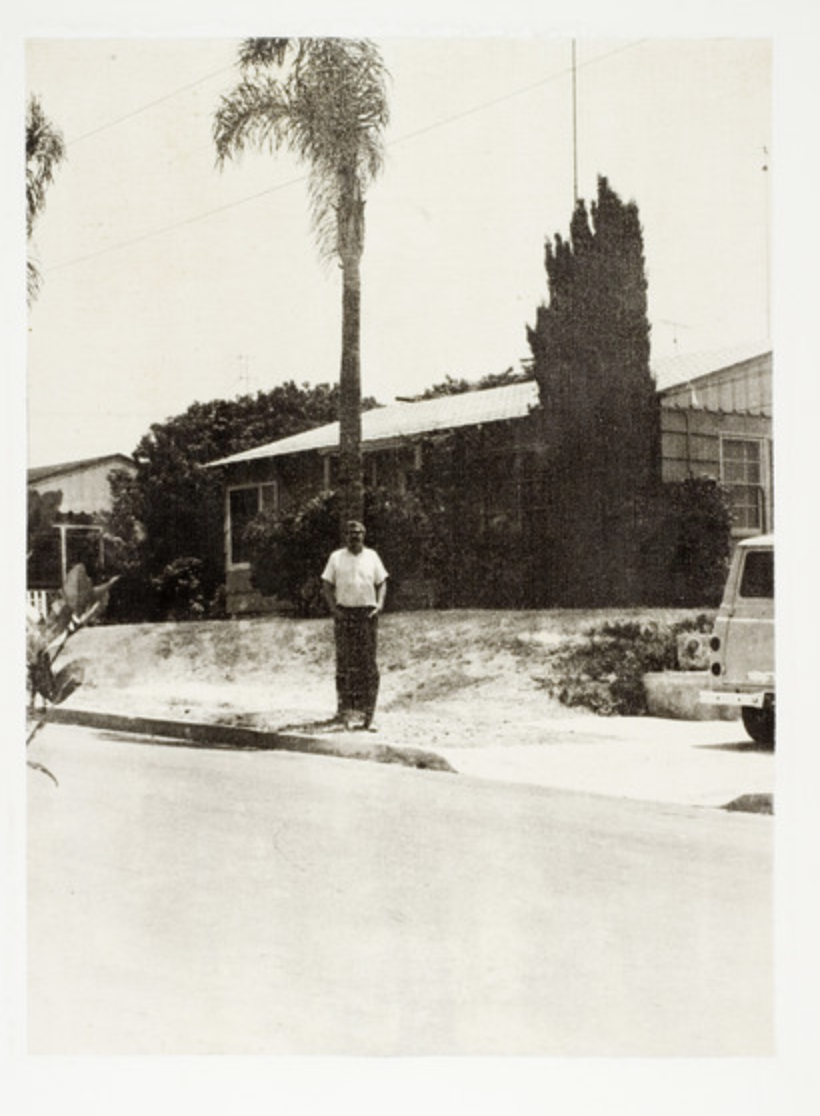
This picture’s purpose and message seem vague because the photographer didn’t emphasize any particular objects. Moreover, the image appears unbalanced, mainly because the photographer didn’t remove small obstacles and made the proportion of the ground and the sky uneven. However, this could also be interpreted as a vintage-like filter, simultaneously giving the effect that someone new to photography deliberately created an awkward composition. 


[ How is context important in photography? ]

Most artworks are accepted from various perspectives depending on how the viewers comprehend them. Context is an essential factor in photography since it unfolds the artist’s actual message and intention. Hence, John Baldessari’s artwork made much more sense when he named the title “Wrong.” 

May 17

Independent Project

FINAL PRODUCT(S):

The last unit was an independent project where we had to make our own product. After thinking for a while and looking at some examples from the padlet the teacher shared with us on Pinterest, I came up with three ideas: stickers that can be also used as a  bookmark, re-designed school ID cards, and designing Logo design.   

-FINAL CHOICE—->> RE-DESIGNING ID CARD(S)

After I chose my product to be making ID cards, these were my design briefs.

-LIST OF ARTISTS THAT I THINK I COULD GET INSPIRATION FROM-


– ACTUAL ARTISTS THAT I GOT INSPIRATION FROM-

https://padlet.com/kangleepark1/as84evir9yovso2i


-DESIGN #1-

Collaboration with Keith Haring’s artwork.

-DESIGN #2-

Collaboration with Andy Warhol’s artwork.

FEEDBACK(S) I GOT FROM MY PARTNER:

One feedback I got from my partner was to make sure I leave space to include the student’s ID card number. After I applied that feedback, I also added more detail.

– FINAL DESIGN #1-

– FINAL DESIGN #2-

Reflection:

  • How is your design successful and what needs to improve?
    • I was able to apply all the conditions I wanted to in the ID card (the activities, name, year of when students are graduating, etc.). I also really liked the idea of showing how much money has left on their ID card ( => I did not instantly come up with this idea.).  One thing I could improve on is to gather more ideas (from artists, Pinterest, etc.) and draw more sketches since both two designs were my first and last drawings. Although I thought of it after I finished my products, I think it would be cool if I think of other ways to put the ID cards than just a phone case.
March 18

Wearable

https://padlet.com/kangleepark1/oy8nlmvwn3d42grn

A hand-made chest bag is for anyone who likes to buy fashionable items but cares about fast fashion.

lists of examples that inspired me

sketches I did before choosing the final product that I want to make


Feedback I got:

  • what is the size of this bag?
    • A: I didn’t think about the scale until my friend asked me. The size of the bag is 20cm in width and 30cm in length. 


  1. 2.

The first picture is when I first started designing bags. While I was sewing it on the skin-colored fabric, I didn’t like the green fur texture, so I changed it to a thinner fabric. It came out as I wanted.

Reflection:

Through this project, I enjoyed sewing the cloth without using a sewing machine. Although it took me quite a time, it made me patient and focus throughout the class time. Personally, I was extremely excited about this project because I never designed things that are wearable. Because it was my first time making a wearable project, I definitely faced some weaknesses throughout the process. Although I enjoyed sewing, it was also the hardest and most time-consuming part of my project. However, one of my strengths was … my patience and perseverance.

March 16

Pavilion Project

What is the project about?

  • the project was to make a pavilion that can be built in ISB.

My process:


(practiced drawing creative pavilions)

(first pavilion made with paper)

(gathered all ideas and made my own pavilion)

materials used: paper and glue gun

inspiration from: everyday objects and other great pavilions

What key decisions did you make and why? (What do you want your audience to feel/ experience?)

  • Few of the classmates asked how the person going to get out of the chair. At first, I thought of re-designing my pavilion so people can sit and get out easily. However, in the end, I decided to follow the “Form Follows Function” because re-designing would destroy my intention of making an “em fan chair.”

How is your design successful?

  • I think my design was successful. Drawing is a good practice before I make something. However, I don’t always draw because what I draw never comes out exactly as I expected. Most of the time, I first imagine what I want to build, and when new ideas come to my mind, I sketch or write them down. One of my strengths was not to be stressed out just to draw a perfect model on the paper, but to think briefly and turn them into action.

What needs to improve about your product/process? Why?

  • One of the feedback I got was “How are the tips going to handle the weight of a person?” Although I didn’t apply it to my pavilion, I will add a base under the three tips to make the pavilion stable.