Leo

Tag: Product design

Lamp

Padlet with inspirations

Made with Padlet

The padlet helps us put together ideas we found online for inspiration and our user profile so we can go through it was we are designing the light.  Some ideas aren’t lamps but some random items from nature or items I think are cool.

Developing Ideas
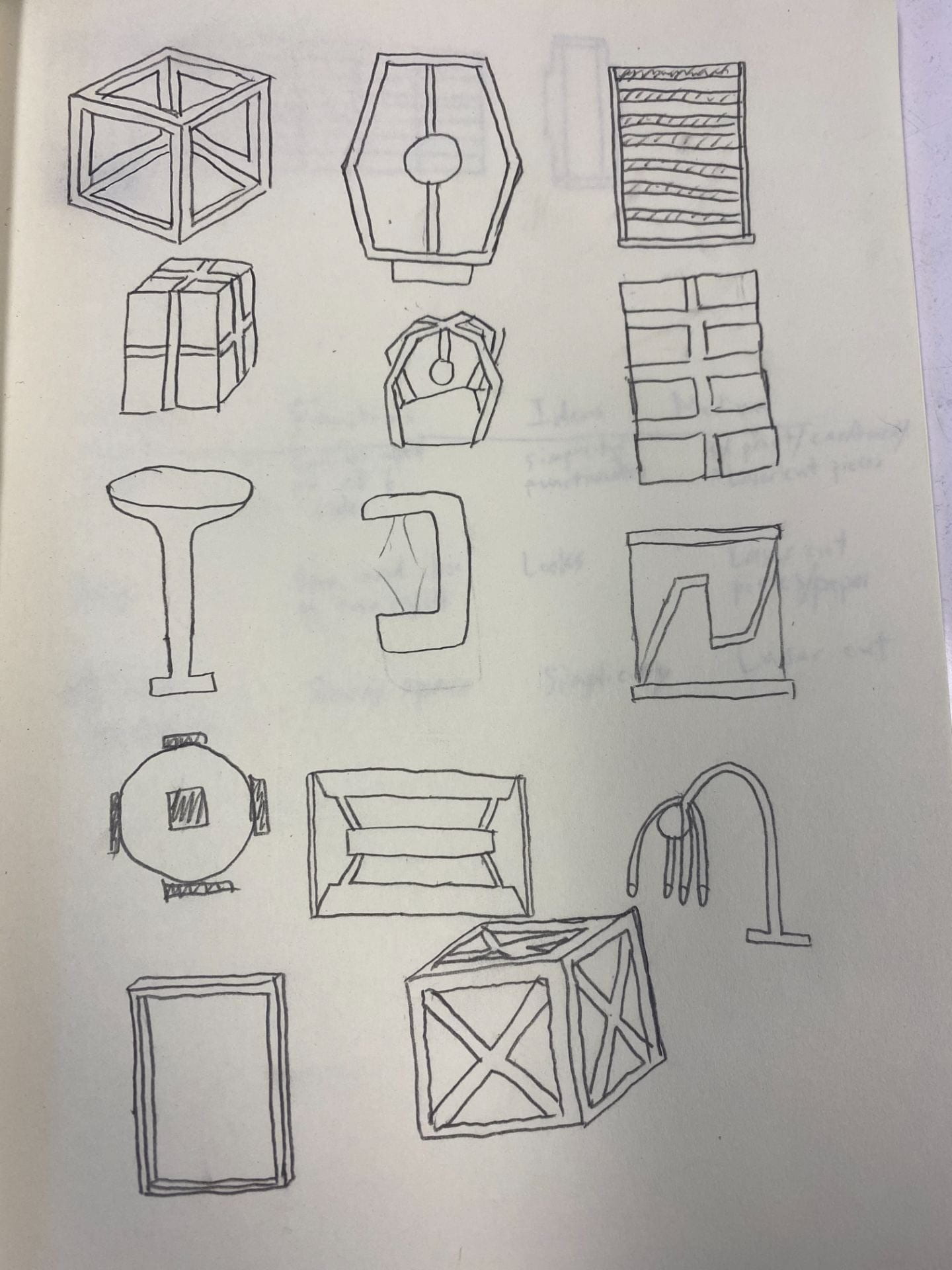
The ideas were quickly thought up so we could have as many as possible. The ideation matrix was also made to help me come up with more ideas for lamp designs. At this point, I wasn’t set on a certain design yet so I sketched as many as possible. (Forgot to get the drawings on the iPad)

Models

The design is simple and has enough space where the lighting is able to escape. It also looks spacious with the gaps between each layer. I’m not sure where to put the lights in the design or whether I would make it so that you could take off/put on layers. The design of the lamp somewhat resembles a bookshelf.


Cardboard prototype and Affinity design

The cardboard prototype helped me visualize my final design and make any changes that were needed to make the light work.  The size and pieces were all the same as my final product so that it is easier to make sure everything fit correctly.  The problems weren’t that important as my design could be taken apart or add/take away layers as needed. This also helped me with deciding on my final materials with some feedback from teachers; for example, the frosted acrylic for my top layer.

Final Product

My target user would like my lamp design because it is a simple but also complicated design. The lamp achieves lighting up an area with a unique design. The lamp has layers so that light can go through and so it doesn’t look plain. The layers can be taken apart and changed (adding on or taking away layers).

In the end, the lamp was the way I wanted it to be. I was able to make sure everything fit together. If I made this again, I would change the material because I wasn’t aware how bright it would be with the clear acrylic.

Insulation design

Design Problem

The MSHS Design Center in ISB is a wonderful space, and we are all appreciative of the ways it enhances our learning of Design, Engineering, and Visual Arts! However, the open plan of the space has created some challenges for teachers and students, and we are looking for creative solutions to the problems of:

  • acoustic insulation: There is too much disruption caused when multiple classes are being held in the open areas
  • visual distraction: When multiple groups of students or teachers are active in the area it can be difficult to focus

Process

During the design process, we drew some ideas in our sketchbook. For inspiration, we went through design websites and put links onto a padlet to record designs we found inspiring. We chose our favorite designs (around 3) then but eventually finalized on one.  There were different ways to draw the design like perspective or using a grid paper. For a better quality drawing, we used procreate and traced the drawing. We also made a cardboard model to see what our design looked like. There were things we had to include on the drawing like the texture and scale.

Reflection

Drawing my final idea was the most successful part in my opinion as I already knew what it would look like and its functions. However, coming up with ideas was a bit difficult even with the inspiration from the websites. Making the model was also a bit challenging due to the fact that I have no experience with making things like this.

Pouch (Product Design)

For product design, we were challenged to think of a problem and solve it with a piece of faux leather around the size of an A4 piece of paper. The bag can help keep the earphones in a way so it doesn’t get tangled up. I learned how to use contact cement and other techniques to put the bag together such as  sewing the bag together and putting on the snaps so the bag can be closed up.

If I made this again, I would cut out the leather with the laser cutter to the patterns can be more accurate. I would also measure out the places where I put on the snaps so that it looks better. I may also change the shape of the bag so that it is smaller and more portable.

I struggled most on the sewing part so the line isn’t very neat. If it is possible, I would also hand sew it since I can control it more easily compared to the machine.

The hardest decision I had to make was cutting out the size of the leather since I had to make it bigger just in case it didn’t fit in.

Smell Detector Prototype

The way my smell detector works is you press the button on the right at the top of the detector. After you turn it on, just hold the smell detector/identifier where the smell is and press the process button on the screen. The smell will go in the other small rectangle on the left at the top of the identifier/detector. The object the smell is coming from will show on the screen with its name. If you want to see what smells have been detected before when using the identifier, you can press the History button the screen. To scroll through history, just swipe on the screen like a mobile phone. There is also settings where you can change the brightness of the screen, turn on low power mode, turn on or off the voice feature where it can say the name out, and the volume of the voice if it is on. The black tiles on the side are grips where you can put your fingers in between to get a better hold on the detector. There are speakers on the bottom and a charging port in the middle. The hole is for you to hold it another way or make it easier to get it out of your pocket.

My inspiration came from my phone. I made the shape similar and the screen. The charging ports and speakers also came from a phone. The handle or hole came from a staple gun. The grips on the side were from the handle of a temperature gun.

If I made this again, I would make the measurements more accurate to there are so messy edges.


Lightbox

For product design, our task/challenge was to create a lightbox of a place that we missed and couldn’t visit during the pandemic. For my lightbox, I chose a lake view in Canada. The lake view my lightbox is based on has abnormally blue water and high mountains surrounding it.

I learned new techniques and skills while making this lightbox like using Adobe Illustrator to make the layers and box. Most of the project was done on Adobe Illustrator. There were skills like joining shapes, importing images from TheNounProject and changing the line color so that the laser cutter receives different messages. Some Illustrator tools were needed like expanding/tracing, group/ungroup, and rounding corners. There were also skills like acrylic painting where we used a card with a dad joke written on it then hid the answer with paint so it can be scratched off and revealed as an example. There were also pieces like the LED where we needed to customize it ourselves for length, where it went in the box, or how compact it needed to be so it can hide behind a layer.

There are also some things I would change about my lightbox. First of all, I would change the mountains in the back layer so it would be more obvious and not nearly completely blocked by the other layer. Another thing I would change is the hill layer. Instead of using semi-circles, I would find a good hill shape to replace it so overall the lightbox would be more realistic. The last thing I would change is the color of the sky layer and lake. They are the same color but if one of the layers had a lighter shade, there would be more contrast and show that the color of the lake is abnormally blue.

One piece of advice I would give is to check your layers before you laser cut them since some pieces could be too thin and snap off or some details could be too difficult to

Overall, I think my project was successful with a few minor details here and there. My biggest success was that the layers came out the way I wanted and the details were there. An obstacle I faced was painting the mountain details since I needed to tape them, paint it, then take off the tape for some small details.

© 2024 Leo

Theme by Anders NorenUp ↑

Skip to toolbar