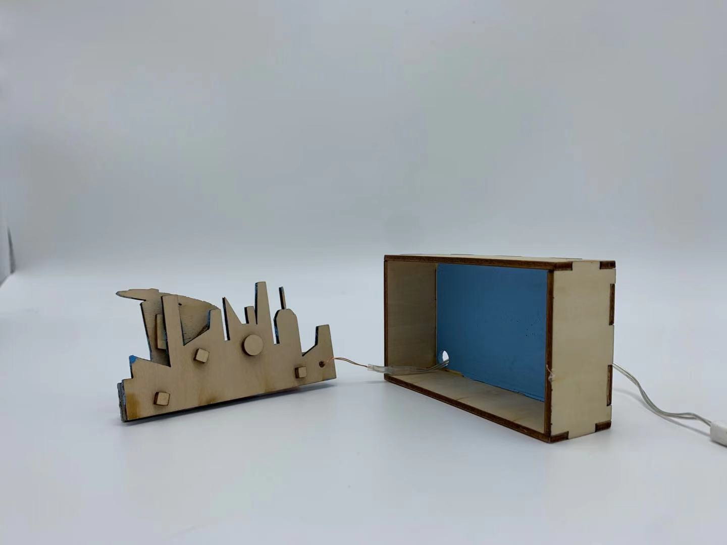
My first unit in Product Design is for something called a “Lightbox”, a box that I made to remind me of a location that I’ve designed myself. In other words, you can call it a “3D picture”. I decided to choose Singapore and two landmarks there because it has been my home for a big portion of my life.
Pictures of finished product


Although I had several obstacles in the process of making this Lightbox, my biggest obstacle to me is the painting part. I had trouble trying to thin out Acrylic paint, resulting in a rough texture on some of my pieces. To try to solve this problem, I decided to use my fingers to wipe off excess paint to smoothen the texture (which actually worked!). In addition, I did not properly plan out the painting while referencing pictures of the landmark in real life (In real life, the Merlion, statue with water coming from its mouth, is supposed to be somewhat silver colored and parts of the Marina Bay Sands, the building to the right, should be grey and not silver). Because of this, the colors in my Lightbox is not very realistic compared to what it is like in real life.

My biggest success in this unit is planning the layers in Adobe Illustrator. I managed to use complex designs, convert them from images to lines in Adobe Illustrator then matching them together to form the outline of my layers. I also tried to add my own additions to the complex designs. For example, the “water arc” from the mouth of the Merlion was added in manually by using the arc tool, scissors tool for it to combine with the bottom pieces and fine-tuning the direction of the arc so that it goes directly into the mouth. Although I have failed due not realizing that a portion of a layer is double-layered, leading to me needing to replan the layer, I have mostly succeeded in this phase of the unit.

One piece of feedback I’ve gotten on my Lightbox is that I should’ve been more careful when using hot glue to secure the wires of the LEDs to the back of the Lightbox. Once again, I did not plan properly enough and ended up covering my own name! Although to me this is a minor issue, this could have been easily avoided by better planning and asking feedback from my colleagues before I started to secure it to the back.

One of the skills I learned or developed includes the use of “spacers” and superglue for a feel that my layers “pop out” instead of it being a flat picture. To achieve this effect I used “spacers”, small wooden pieces to distance my layers. Combined with superglue to stick the spacers on, I added it to my layers. I like how that via the usage of spacers I managed to add distance between the layers yet it is not visible when looked from the front.