Abstraction: Triptych Final Evaluation

Ultimately, I decided to use my Red Selection photos from my 2nd Set for my final triptych for presentation. I think that my pictures effectively demonstrate and fit the vision that I have envisioned, in which objects could be able to exhibit abstract properties due to the perspective or shadows that they express. I also think that these pictures manage to showcase my photography abilities in my process of envisioning, creating and editing photographs as well as the artistic vision that my photographs pertain with.

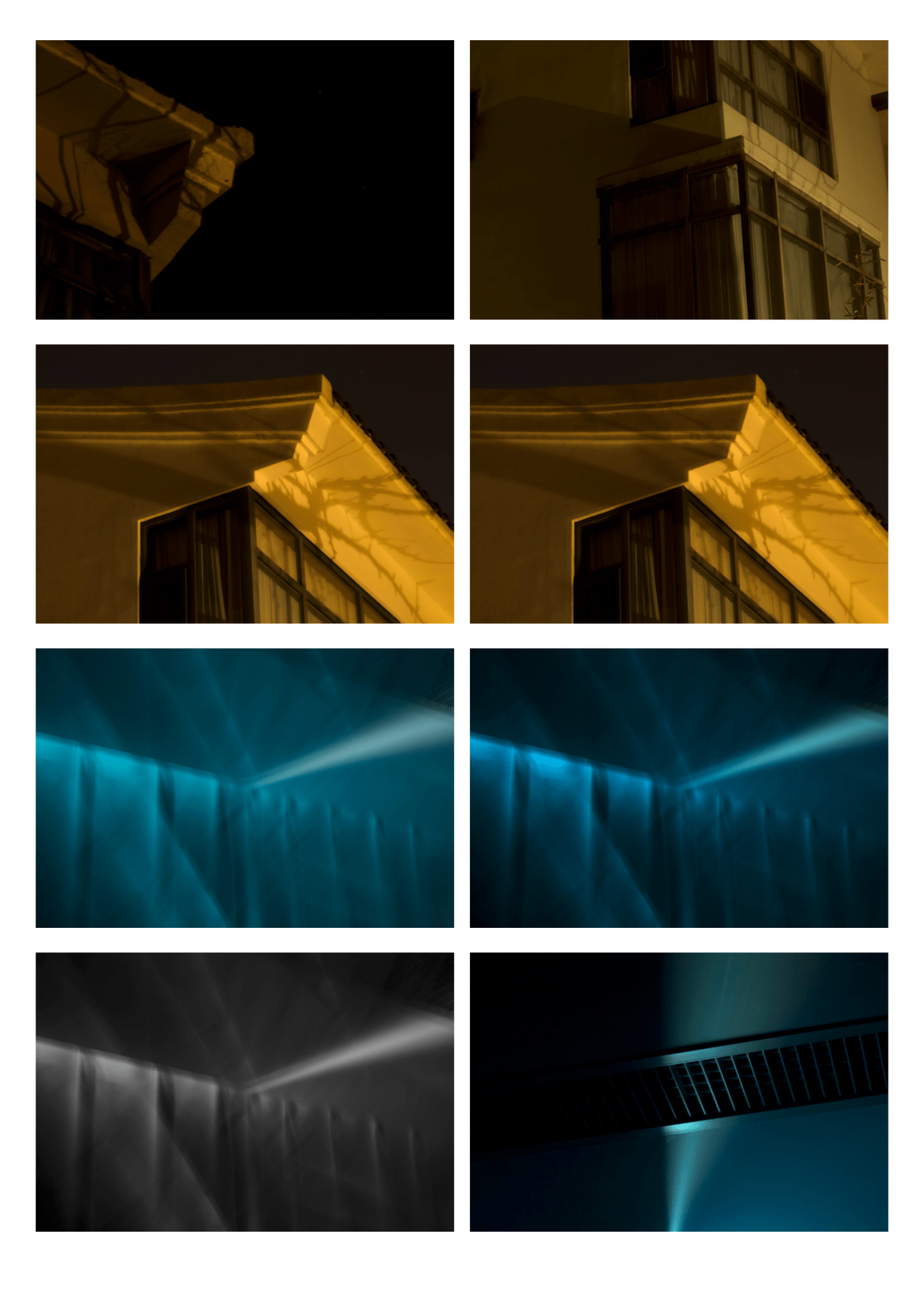
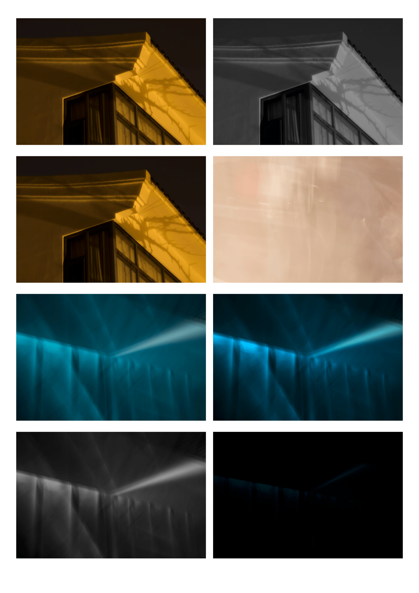
One of the main elements is tone, since in all three images the dominant color is red, green and blue respectively, the three primary colors. In all three images, the dominant color used predominantly within the image could be seen within all colors of the image through the means of tint, which primarily limits tone to this interpretation.

All three images focus on different elements as well. For example, the leftmost image utilizes pattern, lines and shape (see another blog post for analysis), the middle image focuses on pattern, lines and tone, and the rightmost image focuses on line and shape.

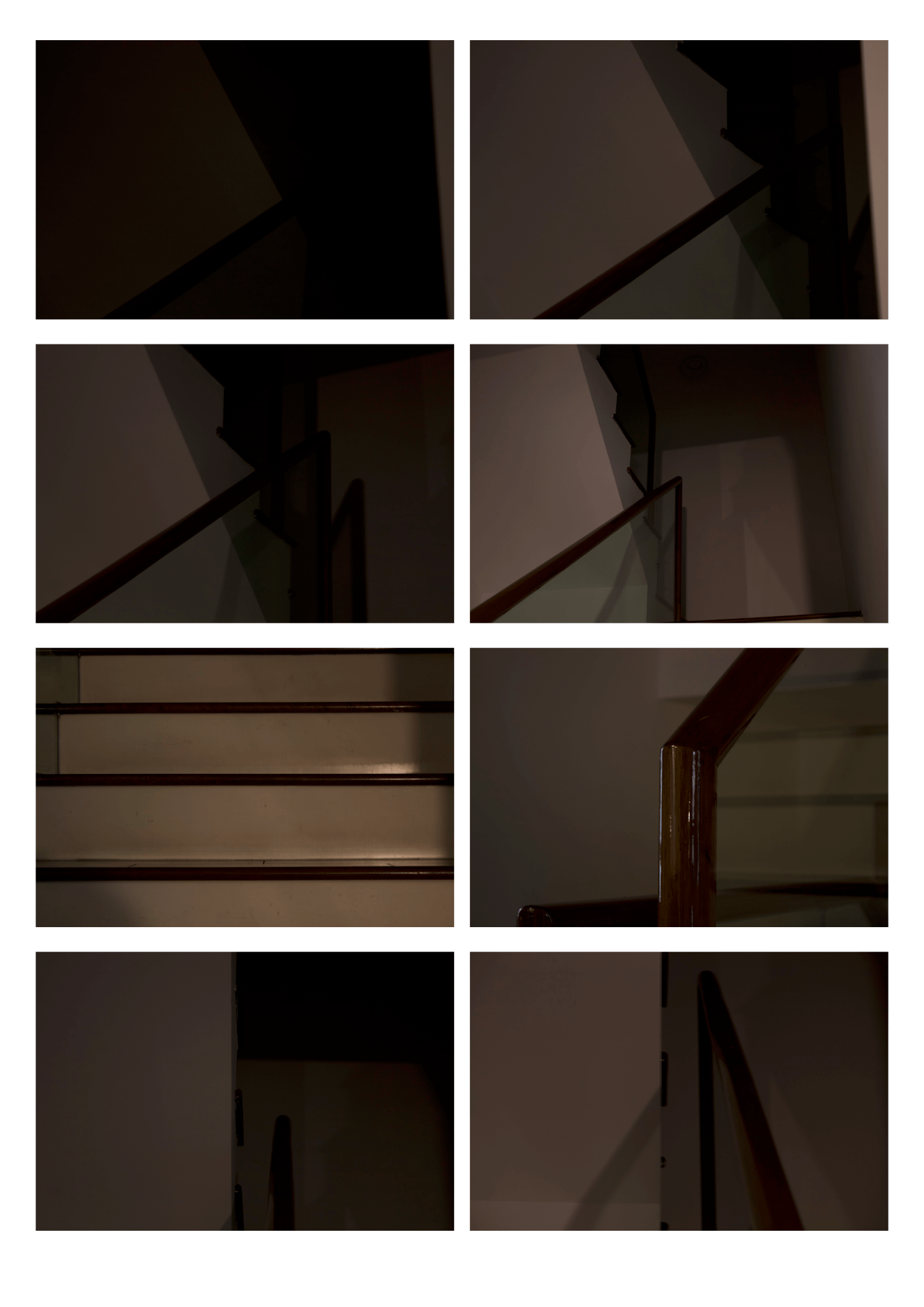
For these three photos, my process for taking these photos is also (in my opinion) quite interesting. For these three photos, I used a large tripod combined with a ladder to be able to take pictures without obstruction from the walls of the backyard and to achieve a unique perspective/angle that I normally wouldn’t be able to get with a normal tripod or no tripod. In addition, the use of a tripod allows me to do long-exposure shots that, because of the limitation of my camera, would be difficult to capture a clear or proper picture without decreasing the quality of the image.

Abstraction: Response to “Ground #57”

“Ground #57” – Uta Barth

I decided to analyze this photograph because it utilizes some aspects very successfully, specifically of which line, shape and tone. Although this photo is somewhat different from the environment and images I have envisioned, my use of certain elements would be similar to how Barth employed them in this photograph.

Lines are uniquely used within this image. On the right side of the image, three dominant lines can be seen. They seem almost parallel but slightly tilted when looking at the top-rightmost line, whereas the two lines below are parallel. These three lines are connected to a perpendicular line that splits between a view of what seemingly is a wall and the extending background, which adds varying layering within the picture. The use of lines in perfect order yet in a slightly skewed manner could be for showing how one’s perspective may change how one thing is perceived, which is the case in which this perspective has resulted in a slight disorder amidst the uniformity of the lines.

The element of shape is used rather frequently in the image. The green shape in the background near the left resembles a square on what seems to be a rectangular wall, forming a gap with the green wall on the right. The shapes stand out as differences and details to the seemingly overexposed light in the center-right of the photo, complimenting the light and brightness that this photo exhibits.

Tone is quite significant in this picture because the dominant colors seen are primarily white or a rather pale green that composes most of the image. Using such lighter colors could be related to how the light is expressed within the photo, which is more or less the emphasis of this photograph, in addition to the symbolism that white and green may have. This is contrasted by the silver and brown objects on the left of the image, which stands out as interruptions almost to the picture.

Abstraction: Set 2 Red Selection

Link to PDF

I chose these three images as my red selection because I felt like the combination of these three photographs is complimentary with how the different tones and use of light to convey such light produce an effect of abstraction. All three images utilize the element of line and shape to convey an abstract feel. I also purposely chose these tones within these pictures due to how these three dominant colors (red, blue, and green) are symbolically connected with how RGB is used in the formation of colors.

In this image, I utilized lighting diffused by a curtain to portray the light in a manner that highlights some of the other elements in this photograph. As a result, such a portrayal of light allows for the tone in the left portion of the image to contrast with the right side of the image in which the color is less refined. Additionally, the tone of this picture is digitally modified by decreasing the hue of the photograph while increasing the saturation to modify the original orange color to be redder, which evokes feelings of warmth with some of its shades of orange as well as some degree of hostility due to the symbolistic and connotative aspects of the color red. I changed the tone of the image in this manner to contribute to the complexity of the image.

The lights combined with the columns and parts of the curtain themselves utilize lines to create a pattern of lines, which may contribute to the order and composition of the image by having elements of simplicity contrast with the other complex aspects within the photograph. Although those vertical lines are almost perfectly parallel, the diagonal lines to the top right and bottom of the picture created by the structure are not angled in a consistent manner which disrupts some of the established uniformity by the vertical lines. Even with these lines, the lines are still composed at an angle and are not perfectly horizontal or perpendicular to the framing of the image, which evokes a sense of skewedness and abnormality that could translate to complexity.

Although the texture is certainly not a dominant element, texture elements are involved within the photograph. The contrasting difference between the portrayed texture of the curtain on the left and right of the image, in which the curtain is more sharply defined on the left side of the photo but is largely unclear on the right of the image, creates a sense of contrast and complexity within the image.

Abstraction: Set 2 Green Selection

Link to PDF

I chose these pictures for my green selection because I feel like these pictures are of such a quality that is presentable. I limited my selection by choosing one picture between duplicates which I used criteria based on its tone as well as highlights of specific areas in the photos that I felt were most effective. For example, I chose the last image in this selection because the variants of the picture did not highlight the shine on the top right enough. I chose pictures that are of varying tones and elements to introduce more variety into a potential triptych. Since my vision includes complexity within images, I wanted to evoke this by having images of different qualities which would evoke a greater sense of complexity.

Abstraction: Set 2 Revised Vision

Original Vision:

The message of my triptych is that all objects or environments inherently contain complexities that may be hidden from plain sight but can be revealed from a different angle or perspective. By selecting my photographs so that the objects/environment portrayed is composed of more complex shapes, lines and patterns, I want to emphasize that things may be more complex than it seems. I want to express how what one may regard as simple may inhibit much more complex qualities that invoke interest or appeal through complications. For inspiration, I want to try and find images that are inclusive of complex elements that are created using common objects or structures, for example, created with a significant focus on contrast and the complex elements used within the image.


Although the main premise of my set 2 would be the same as my original vision, for Set 2, I would like to look more into expressing complexity through the combination of objects and light in such a manner that it is unique. In other words, I aim to express my object not only with complexity from its inherent properties but also how it can express abstraction and complexity when combined with other environmental elements, such as light. Thus, the use of light would be pretty significant for the purposes of my set, so I attempt to take my pictures under varying conditions of light, such as with natural light provided by the sun/moon and artificial lighting from varying lighting of the environment.


Abstraction: Set 1 Red Selection

Link to PDF

I chose these 3 photos out of all of the photos because I felt that these photographs are some of the best depictions of my vision and artistic intent in evoking complexity with interconnectedness. Although I feel that there is certainly room for improvement with these pictures, due to the constraints that I was under to take these photos, I still think that they are of enough quality and interest to circumvent the odd texture of the photograph.

For this photo, I attempted to capture how the outline of the trees creates a sense of depth and complexity while maintaining some aesthetic effect with the way that the trees are dividing up the picture. Although not perfect, I am happy with how I managed to capture the lines (seemingly) in the middle layer of trees managed to create outlines of trees, allowing it to be expressed in a complex manner yet resembling something very typical in life. The outline of the trees in both layers also produces a shape that is reminiscent of a squiggly line, which produces an interesting effect. I personally enjoy my use of tone in this picture which, although digitally modified, produces an effect of contrast between the three layers within the photograph, emphasizing its presence and furthering my artistic vision.

Abstraction: Set 1 Green Selection

Link to PDF

Link to PDF (Annotated)

For my Green selection, I chose pictures that are more fitting of my vision and artistic direction in how I want to evoke the feeling of complexity. I also chose pictures that are of higher quality in line with the artistic direction I aim to take with certain photographs.

I also aimed to capture abstraction within these pictures. Most of these evoke the feeling of abstraction through their complexity being depicted in an abstract manner, which is one of the reasons I chose these images over some of the others which, in my opinion, were a bit too realist for the purpose of this unit.

In most of these photos, one element is predominantly portrayed. Although this depends a lot the picture, most of these elements include shape, lines and a bit of pattern.