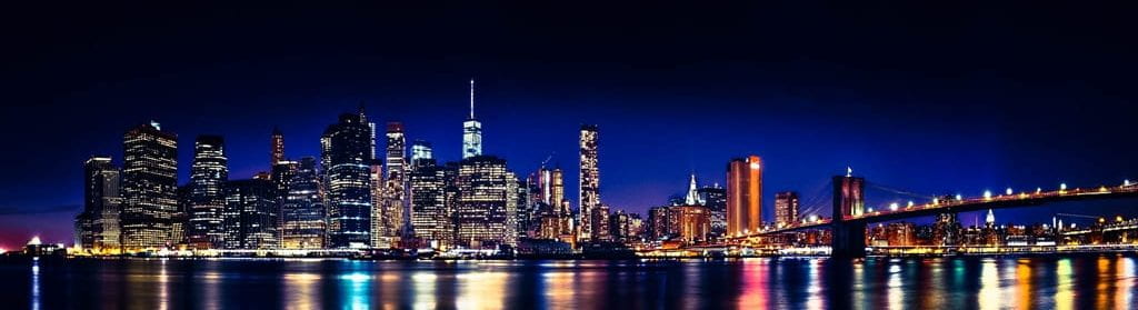

I chose these three images as my red selection because I felt like the combination of these three photographs is complimentary with how the different tones and use of light to convey such light produce an effect of abstraction. All three images utilize the element of line and shape to convey an abstract feel. I also purposely chose these tones within these pictures due to how these three dominant colors (red, blue, and green) are symbolically connected with how RGB is used in the formation of colors.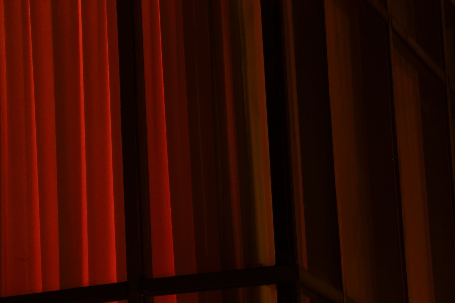
In this image, I utilized lighting diffused by a curtain to portray the light in a manner that highlights some of the other elements in this photograph. As a result, such a portrayal of light allows for the tone in the left portion of the image to contrast with the right side of the image in which the color is less refined. Additionally, the tone of this picture is digitally modified by decreasing the hue of the photograph while increasing the saturation to modify the original orange color to be redder, which evokes feelings of warmth with some of its shades of orange as well as some degree of hostility due to the symbolistic and connotative aspects of the color red. I changed the tone of the image in this manner to contribute to the complexity of the image.
The lights combined with the columns and parts of the curtain themselves utilize lines to create a pattern of lines, which may contribute to the order and composition of the image by having elements of simplicity contrast with the other complex aspects within the photograph. Although those vertical lines are almost perfectly parallel, the diagonal lines to the top right and bottom of the picture created by the structure are not angled in a consistent manner which disrupts some of the established uniformity by the vertical lines. Even with these lines, the lines are still composed at an angle and are not perfectly horizontal or perpendicular to the framing of the image, which evokes a sense of skewedness and abnormality that could translate to complexity.
Although the texture is certainly not a dominant element, texture elements are involved within the photograph. The contrasting difference between the portrayed texture of the curtain on the left and right of the image, in which the curtain is more sharply defined on the left side of the photo but is largely unclear on the right of the image, creates a sense of contrast and complexity within the image.