Identity: What is a Portrait?

What is a portrait?

To me, a portrait is a work of art that focuses on expressing identity. Typically, this is most effective when identity is portrayed directly, where the subject is primarily the centerpiece of the artwork and the message is portrayed in a more focused way.
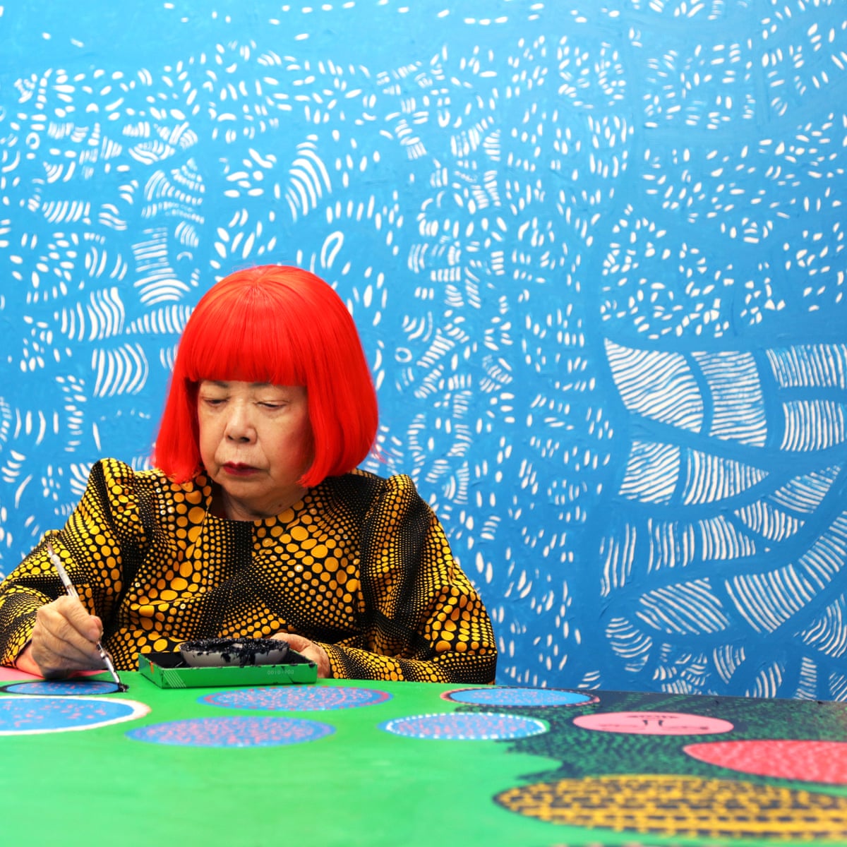
Yayoi Kusama: the world's favourite artist? | Yayoi Kusama | The Guardian

Yayoi Kusama

In my opinion, portraits are not mutually exclusive towards the direct portrayal of individuals within the photograph(s) but could also be an extension of one’s own being or identity. Although it is relatively common for an individual to be portrayed directly in a portrait, in many instances (such as in “Everything I Have” by Simon Evans, where identity is portrayed via the material possessions of Evans), the portrayal of a specific element of someone’s identity, even if that person is not in the photograph, can still be an effective way to express and portray identity.

Everything I Have' and Other Works by Simon Evans – SOCKS

Simon Evans

Likewise, I also think that a portrait does not have to be exclusive to a single photograph, but could be represented in multiple photographs as a single work. In many instances, the use of multiple images to portray an element of identity should also be considered a portrait (such as Zcyklu archiwum gestów by Zofia Kulik with the various, odd poses)

 Zofia Kulik


Street Photography: Definition

I would define street photography as something along the lines of “photography within an uncontrolled environment and inclusive of spontaneous aspects within the process and preparation of producing of the image.”

To me, street photography is intended to be spontaneous, in which many ideas are formed from the discovery of exciting elements, and such ideas are eventually combined when each individual piece falls into place when the photograph is taken. Of course, many times, street photography contains elements of preparation as well, such as fishing/preparing for a shot by waiting or planning, but it still includes spontaneous elements, such as waiting for a person/subject in the picture.

I believe that my definition is more inclusive of the varying styles of street photography. Although this definition does not fully encapsulate the contemporary or “raw” nature of street photography, but I think that this definition allows for greater interpretation with street photography and (possibly) greater interpretation of the purpose of street photography.

Abstraction: Triptych Final Evaluation

Ultimately, I decided to use my Red Selection photos from my 2nd Set for my final triptych for presentation. I think that my pictures effectively demonstrate and fit the vision that I have envisioned, in which objects could be able to exhibit abstract properties due to the perspective or shadows that they express. I also think that these pictures manage to showcase my photography abilities in my process of envisioning, creating and editing photographs as well as the artistic vision that my photographs pertain with.

One of the main elements is tone, since in all three images the dominant color is red, green and blue respectively, the three primary colors. In all three images, the dominant color used predominantly within the image could be seen within all colors of the image through the means of tint, which primarily limits tone to this interpretation.

All three images focus on different elements as well. For example, the leftmost image utilizes pattern, lines and shape (see another blog post for analysis), the middle image focuses on pattern, lines and tone, and the rightmost image focuses on line and shape.

For these three photos, my process for taking these photos is also (in my opinion) quite interesting. For these three photos, I used a large tripod combined with a ladder to be able to take pictures without obstruction from the walls of the backyard and to achieve a unique perspective/angle that I normally wouldn’t be able to get with a normal tripod or no tripod. In addition, the use of a tripod allows me to do long-exposure shots that, because of the limitation of my camera, would be difficult to capture a clear or proper picture without decreasing the quality of the image.

Abstraction: Response to “Ground #57”

“Ground #57” – Uta Barth

I decided to analyze this photograph because it utilizes some aspects very successfully, specifically of which line, shape and tone. Although this photo is somewhat different from the environment and images I have envisioned, my use of certain elements would be similar to how Barth employed them in this photograph.

Lines are uniquely used within this image. On the right side of the image, three dominant lines can be seen. They seem almost parallel but slightly tilted when looking at the top-rightmost line, whereas the two lines below are parallel. These three lines are connected to a perpendicular line that splits between a view of what seemingly is a wall and the extending background, which adds varying layering within the picture. The use of lines in perfect order yet in a slightly skewed manner could be for showing how one’s perspective may change how one thing is perceived, which is the case in which this perspective has resulted in a slight disorder amidst the uniformity of the lines.

The element of shape is used rather frequently in the image. The green shape in the background near the left resembles a square on what seems to be a rectangular wall, forming a gap with the green wall on the right. The shapes stand out as differences and details to the seemingly overexposed light in the center-right of the photo, complimenting the light and brightness that this photo exhibits.

Tone is quite significant in this picture because the dominant colors seen are primarily white or a rather pale green that composes most of the image. Using such lighter colors could be related to how the light is expressed within the photo, which is more or less the emphasis of this photograph, in addition to the symbolism that white and green may have. This is contrasted by the silver and brown objects on the left of the image, which stands out as interruptions almost to the picture.

Abstraction: Set 2 Red Selection

Link to PDF

I chose these three images as my red selection because I felt like the combination of these three photographs is complimentary with how the different tones and use of light to convey such light produce an effect of abstraction. All three images utilize the element of line and shape to convey an abstract feel. I also purposely chose these tones within these pictures due to how these three dominant colors (red, blue, and green) are symbolically connected with how RGB is used in the formation of colors.

In this image, I utilized lighting diffused by a curtain to portray the light in a manner that highlights some of the other elements in this photograph. As a result, such a portrayal of light allows for the tone in the left portion of the image to contrast with the right side of the image in which the color is less refined. Additionally, the tone of this picture is digitally modified by decreasing the hue of the photograph while increasing the saturation to modify the original orange color to be redder, which evokes feelings of warmth with some of its shades of orange as well as some degree of hostility due to the symbolistic and connotative aspects of the color red. I changed the tone of the image in this manner to contribute to the complexity of the image.

The lights combined with the columns and parts of the curtain themselves utilize lines to create a pattern of lines, which may contribute to the order and composition of the image by having elements of simplicity contrast with the other complex aspects within the photograph. Although those vertical lines are almost perfectly parallel, the diagonal lines to the top right and bottom of the picture created by the structure are not angled in a consistent manner which disrupts some of the established uniformity by the vertical lines. Even with these lines, the lines are still composed at an angle and are not perfectly horizontal or perpendicular to the framing of the image, which evokes a sense of skewedness and abnormality that could translate to complexity.

Although the texture is certainly not a dominant element, texture elements are involved within the photograph. The contrasting difference between the portrayed texture of the curtain on the left and right of the image, in which the curtain is more sharply defined on the left side of the photo but is largely unclear on the right of the image, creates a sense of contrast and complexity within the image.

Abstraction: Set 2 Green Selection

Link to PDF

I chose these pictures for my green selection because I feel like these pictures are of such a quality that is presentable. I limited my selection by choosing one picture between duplicates which I used criteria based on its tone as well as highlights of specific areas in the photos that I felt were most effective. For example, I chose the last image in this selection because the variants of the picture did not highlight the shine on the top right enough. I chose pictures that are of varying tones and elements to introduce more variety into a potential triptych. Since my vision includes complexity within images, I wanted to evoke this by having images of different qualities which would evoke a greater sense of complexity.