Abstraction: Set 2 Revised Vision

Original Vision:

The message of my triptych is that all objects or environments inherently contain complexities that may be hidden from plain sight but can be revealed from a different angle or perspective. By selecting my photographs so that the objects/environment portrayed is composed of more complex shapes, lines and patterns, I want to emphasize that things may be more complex than it seems. I want to express how what one may regard as simple may inhibit much more complex qualities that invoke interest or appeal through complications. For inspiration, I want to try and find images that are inclusive of complex elements that are created using common objects or structures, for example, created with a significant focus on contrast and the complex elements used within the image.


Although the main premise of my set 2 would be the same as my original vision, for Set 2, I would like to look more into expressing complexity through the combination of objects and light in such a manner that it is unique. In other words, I aim to express my object not only with complexity from its inherent properties but also how it can express abstraction and complexity when combined with other environmental elements, such as light. Thus, the use of light would be pretty significant for the purposes of my set, so I attempt to take my pictures under varying conditions of light, such as with natural light provided by the sun/moon and artificial lighting from varying lighting of the environment.


Abstraction: Set 1 Red Selection

Link to PDF

I chose these 3 photos out of all of the photos because I felt that these photographs are some of the best depictions of my vision and artistic intent in evoking complexity with interconnectedness. Although I feel that there is certainly room for improvement with these pictures, due to the constraints that I was under to take these photos, I still think that they are of enough quality and interest to circumvent the odd texture of the photograph.

For this photo, I attempted to capture how the outline of the trees creates a sense of depth and complexity while maintaining some aesthetic effect with the way that the trees are dividing up the picture. Although not perfect, I am happy with how I managed to capture the lines (seemingly) in the middle layer of trees managed to create outlines of trees, allowing it to be expressed in a complex manner yet resembling something very typical in life. The outline of the trees in both layers also produces a shape that is reminiscent of a squiggly line, which produces an interesting effect. I personally enjoy my use of tone in this picture which, although digitally modified, produces an effect of contrast between the three layers within the photograph, emphasizing its presence and furthering my artistic vision.

Abstraction: Set 1 Green Selection

Link to PDF

Link to PDF (Annotated)

For my Green selection, I chose pictures that are more fitting of my vision and artistic direction in how I want to evoke the feeling of complexity. I also chose pictures that are of higher quality in line with the artistic direction I aim to take with certain photographs.

I also aimed to capture abstraction within these pictures. Most of these evoke the feeling of abstraction through their complexity being depicted in an abstract manner, which is one of the reasons I chose these images over some of the others which, in my opinion, were a bit too realist for the purpose of this unit.

In most of these photos, one element is predominantly portrayed. Although this depends a lot the picture, most of these elements include shape, lines and a bit of pattern.

Abstraction: Set 1 Yellow Selection

Link to PDF

Due to the difficult circumstances of where I took the photo (on a moving bus on the expressway, through a window in the evening), my selection of the yellow photos is mostly based on those that have enough exposure, either digitally or practically. For some reason, for some of the pictures that I chose, especially the ones that I have taken in lower light in the evening, digitally increasing the exposure doesn’t work too well because the photographs take in too little light, with some weird red particle effect appearing on some of these photographs.

To minimize this, I have adjusted the tone of some photographs that I believe are very good but a bit too dark for them to be practical. The main changes I have made to certain photos are to increase the exposure and adjust the color profile to that similar to a black and white photograph.

Abstraction: Response to “Odense”

Odense – Keld Helmer-Petersen

I chose to analyze this picture because I felt that this image was very close to what I have envisioned in my vision, in addition to being very inspirational for some of the photographs that I plan on taking (with the power lines and contrast).

A prominent element within this photograph is the constant between the white background and the black shape that emphasizes the predominant elements of the photograph, namely the power lines and the electricity tower in addition to the other elements that the structure produces. The contrast allows for a clear distinction between the focus of the picture, which is the power line and the electricity tower, with the background consisting of the sky. The use of tone in this picture is very effective in producing an abstract effect by having it emphasize the other elements of the photo.

Similarly to tone, the photo consists of many lines within the picture produced by the power lines and part of the structure of the electric tower. The lines are presented at many varying angles and perspectives, which expresses the complexity that the image is consisting of. The lines are also used quite interestingly in which that certain lines are presented in a parallel or perpendicular manner, which could symbolize the order within the chaos that this picture might be trying to showcase.

The shape produced by the electricity tower is also, very similar to lines, imitating the complexity that the structure consists of. Although there are some shapes presented in a parallel manner which is indicative of order and, to some degree, pattern, most of the shapes within this picture are in a warped manner in which complexity can be emphasized solely because of the perspective this structure was captured from. Because of the perspective, the shapes that compose the corners of the electricity tower, which are usually quite straight, are perceived in a somewhat warped manner which signifies a bit of disorder amid parts that may be more ordered within the image.

Focus is used in a rather interesting way within this photo. The entire photo is portrayed with what seems to be a very high focus, therefore resulting in most of the elements within the picture being portrayed sharply. Although the use of a shallow depth of field could allow for the sky in the background to be out of focus, thereby resulting in even more focus on the structure and power line, the lack of any blurniess could perhaps be more effective in emphasizing the contrast between the black and white elements, which may be more effective compared to a blurry background.

Abstraction: Set 1 Vision

The message of my triptych is that all objects or environments inherently contain complexities that may be hidden from plain sight but can be revealed from a different angle or perspective. By selecting my photographs so that the objects/environment portrayed is composed of more complex shapes, lines and patterns, I want to emphasize that things may be more complex than it seems. I want to express how what one may regard as simple may inhibit much more complex qualities that invoke interest or appeal through complications. For inspiration, I want to try and find images that are inclusive of complex elements that are created using common objects or structures, for example, created with a significant focus on contrast and the complex elements used within the image.


Photo Safari

Link to PDF

01: Division

One of the pictures that worked quite well for me is the first one since I managed to find a spot that captures the line in the middle, and some subsequent relationships, without many complexities that may affect the overall image. For that picture, I focused on how the line divided the gravel and concrete. In addition, the gravel seems to have a gradient of leaves, with more leaves intertwined with the gravel nearer to the line. Overall, I think this allowed for a great interpretation of the provided image with added meaning and maintained the compositional balance between the line and other elements.

03: Monotone Yellow

The third picture works quite well for me since it is a relatively more straightforward image without any significant compositional techniques other than texture. I managed to capture this by finding an evenly-lit surface. Still, by some combination of sunlight, I managed to capture the intricacies in the texture of the flooring, some of which possibly emphasized with shadows. Combining a lighter and darker character – black and bright yellow – produces contrast within the texture, making it aesthetically appealing.

10: Line

For this image, I primarily focused on gaining the effect of converging lines composing a shape, as depicted by the unequal slope of lines in the photo jungle picture. As a result, it made it so that I did not focus much on the other compositional elements of the image, including the color used and the sharpening/focus. Although the simple nature of this photo manages to contribute interest towards the seemingly converging lines, this has come at the expense of focus in which I used a deeper depth of field to capture more intricacies of the shape in the upper portion of the picture, but at the same time disregarding the bottom of the picture that may actually be too close/shallow for my lens to properly capture. The reflection of the light on the right portion of the picture makes it so that the surrounding white background is not entirely gray, which takes away from the unique qualities of line and shape. Although I think I could probably maintain my composition in the picture, I can improve upon this picture by making minor adjustments for the most desirable effect.

11 Descend

Although this picture is (to me) quite a cool picture with its complex qualities, I feel that such complexity has impacted the central compositional element of lines converging toward the center of the image. Although such lines exist with the converging of the staircase and the staircase walls, it is complemented by the staggered staircase, the various shapes along the walls, the shadow created by the left wall, and the blue color at the top of the picture, in addition to other elements. I think that these numerous elements have made it difficult to distinguish the primary compositional aspect of the photograph, which is the converging lines, but I still think this picture is still quite cool, albeit not the best for this specific activity.

Critique: Paul Strand’s “Abstraction, Twin Lakes, Connecticut”

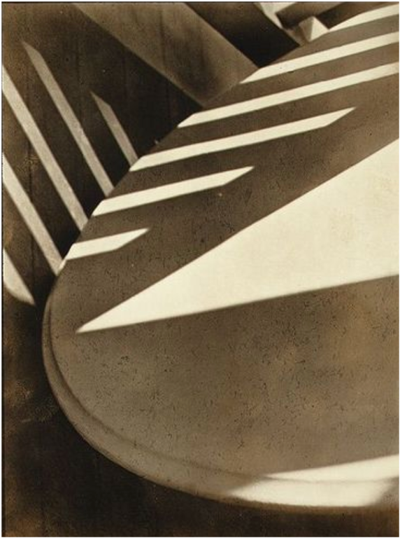
In this picture by Paul Strand, I think Strand may have been interested in the lines and shapes created by the shadow, which contrasts with the white surface of the knocked-over table and adds interest by creating variation with the repetition of the shadowy form. I think that he could have also been interested in the chair’s texture since when not lightened it seems to depict a rougher or coarse surface which adds interest and further contrasts between the light and dark. Lastly, I believe Strand could have been interested in capturing the tone of the table with the enlightened white surface portions and the portions covered by shadow, perhaps with the intention of contrast.

If I were the photographer, I might give this photo the title of “Fallen Lines” since the picture seemingly depicts a fallen table on its side and the various lines created by the shadows and the chair itself are prominently seen throughout the image.

I think something unusual about this picture is the lack of context that this image has since the object is portrayed in the picture. However, what seems to be a table, could very well be another item of furniture, such as a chair or otherwise, making it unclear what the purpose of this image is. This is complemented by the fact the title of the image does not provide any additional context beyond the location and the fact that this is an abstract photo, which does not add much context to the object within the image. I think that the lack of context actually contributes to the meaning of the picture since it makes it so that a viewer may develop unique interpretations or thoughts of the photograph, which could be the intent of this image as a piece of abstraction.

In this image, lines are used throughout the image that are created with the combination of the object in the picture and angled lighting so that shadows will create lines at an angle different from the edges of the chair and the shadows on the floor. Having so many lines at different angles adds complexity to the image, which could inspire interest or fascination by seemingly perceiving the dynamical movement of the shadow.

Shapes, in relation to lines, are used varyingly. The lines at unique angles create polygons that seem to be geometrically irregular with sharp angles yet have an essence of parallelism with surrounding shapes and lines. Thus, this seems to seemingly create a form of disorganization, perhaps even chaos, within uniformity and order. The combination of these two seemingly contrasting elements adds emphasis to the differences made within this image.

Quite obviously, pattern is used in this image through the repeating patterns of lines and shapes to create a sense of conformity within the unorganized image. I think this could be related to the contrast between the abstraction within the image with the formalism of photography at the time, seemingly implicating how abstraction, which is entirely inclusive of disorder, can be inclusive of organization, even if it may conflict.

The use of textures is seen in the difference of the shadows on the chair, in which finer details of roughness is brought out, comparing to the lightened portions of the chair and the (I’m assuming) wood floor. I think these textures help distinguish between three elements in the picture, namely the floor, the shadow and the light, contrasting these three parts apart.

This image’s tone is monochromatic, with various shades of darker and lighter colors used. Although the most prominent colors are probably gray/black and white, there are clearly different shades in different parts of the picture. In line with the patterns of the lines and shapes, I think this helps to add contrast between the elements mentioned in the above paragraph.

The picture is taken in a seemingly shallow depth of field. The object (chair/table/?) taking up most of the image is portrayed quite sharply, whereas the floor seems out of focus. This could perhaps be an effort to emphasize the chair and the shadows shown there?

I think what is best about this picture is the fascinating depiction of abstraction using a seemingly simple household object positioned in such a manner that it isn’t apparent what the object even is. The use of light in this picture seems to add many interesting elements that are subject to interpretation and analysis, which could create such interesting effects when combined with something so simple that this could perhaps be recreated similarly simply by utilizing furniture and sunlight. I think this photograph is a masterful use of various elements of photography in which simple circumstances could result in such expert employment of techniques.