Abstract Photography Final Triptych Reflection

The 3 photographs above are the 3 photographs that I chose for the final abstract photography triptych out of the 101 photos that I took (including the variants made). The first 2 photos are form the first set and the last one is from the second set.

The three photos all fit my vision. My vision is to have a set of photos that contains buildings and condensed line patterns out of the structures of the building itself. In the triptych, the left most photo have parallel lines that connect the windows, the photo in the center have a lot of sideways parallel lines, and the right most photo have parallel lines that outline the bricks.

I chose these photos and they fit each other well as they all have a similar style of having obvious lines that are not horizontal to the horizon, more specifically, all seem to be leaning to the left.

During the process of choosing the photos, I encountered many obstacles as all of my photos vary in some way from each other. In my sets, there were 2 main way of arranging the photos: by the building is about, and by the patterns the possess. There are 2 triptychs that I came up with: the one containing the building on the left all from set 1, which I did not really like, and the one about the wall on the right all from set 2, which I quite liked. However, the triptych about the wall on the right ended up being too similar to each other and lacking features, so I did not end up using it.

Abstract Photography Set 1

Yellow Photographs:

Yellow photographs for me are the photographs that fit the vision but I would likely not use for the final triptych. The photos have some type of flaws such as too much detail, bad angle, or not abstract enough. The difference between yellow and green photos are that those yellow photos are not abstract enough or does not fit with other photos. As an analogy, the yellow photos correspond to RU (rarely used).


Green Photographs:

Green photographs for me are the photos that have good abstraction, are fit for my artistic statement, and overall more eye-grabbing than the yellow photographs. Most of the pictures contain mainly abstract patterns and not a lot of distracting elements, however, the pictures differ from the red ones as they might not fit other photos in the set well or they might lack some uniqueness to it that makes it more usable than other pictures. As an analogy, the green photos corresponds to UU (underused).


Red Photographs:

Red photographs are the photographs that I would likely use in my final triptych and the photos that I think fit the best with my vision in the set. The first red picture on the top left is a photo of a building taken from very far away, thus the pattern is obvious and the photo is zoomed in. The second picture on the top right is a picture of a wall next to the dome in the school. The dripping water’s trace and the lines that form a pattern fit my vision well and provides more variety. The third picture on the bottom left is a zoomed-in picture on the school building from the baseball courts. However, the three pictures do not work together as a triptych, so the goal for the next set is to build on the 3 pictures and build a triptych. As an analogy, the red photos corresponds to OU (overused).

Abstract Photography Set 2

Set 2 Yellow Section:

The yellow pictures for me represent the pictures that fit my vision and are not extremely unusable. The set’s vision is to take pictures that expresses patterns in large scale in buildings and architectures. However, these pictures are not the greatest. In most of these photos, there are too much detail or too much noise that I can not crop. In some yellow pictures, there is too much blank space, some have too low quality, and some are simply not abstract enough. As an analogy, this section corresponds to RU (rarely used).


Set 2 Green Section:

The green pictures for me are the pictures that can be used in the triptych. Due to the fitting problem and variety problem in the set, 4 picture that were green were promoted into the red section. Therefore, I do not have as much green photographs as I did in set 1. The difference between my green pictures and red pictures are that the red pictures either fit together really well in a dedicated triptych or they look generally more interesting. As an analogy, the green pictures correspond to UU (underused).


Set 2 Red section:

The red pictures for me are the pictures I would likely use, are straight up fascinating or help other pictures fit in a triptych. Since the purpose of Set 2 is to provide assists and build the triptych on top of the existing 3 red photos that does not fit in set 1, I have an unusual amount of red photographs, at 7. All of my red photos are neatly edited and polished. The first 5 photos are pictures about a brick wall in Chaoyang Park, I realized that it has a mesmerizing pattern and decided to take pictures of it with a variety of angles and focuses. The 5 red ones are the best photos of the best angles. I have also added a more abstract counterpart to all of my red photos. As an analogy, the red photos corresponds to OU (overused).

Abstract Photography Vision

Artist: Alexander Jaques

Patterns and Confusion

I want to spread the art of repetition and patterns that we as busy people tend to forget about. I want the audience to feel fascinated and appreciate daily life more. I want my audience to think about the buildings and structures that they have seen before when they see my photographs. I will get my inspiration from the tall and modern skyscrapers and Soho in Beijing downtown and find photos about photographs about those buildings. By focusing on the repetitions in the buildings, things we see everyday often get ignored, the art in it would also be ignored.

Mind map:

Paul Strand Respond Task

The photographer, Paul Strand, might have been interested in 3 things that made him take the picture:

  • He might have been interested in the angle of the desk which made the photo look awkward yet mesmerizing.
  • He might have been interested in the repeating shadows that form a parallel pattern on both the desk and the floor.
  • He might have been interested in the texture of the table and its effects while paring with the tone.

If I was the photographer, I would have named this picture “Shaded Desk” as it would help the readers comprehend the picture more.

One thing I discovered that is unusual about this photograph is that it turns a slanted photo that is not parallel to the horizon into a beautiful photograph that contrasts light and shadows. The texture on the table also faded on the areas that are brighter in contrast to the visible coarse texture of the table on darker areas.

The artist used shadow stripes as the lines, creating direction and focus for the photograph. The artist used the desk and the shadow stripes as shapes so that there is both organic and geometric shapes in the picture. The artist used the multiple parallel shadow stripes as repetition to create a pattern in the photograph. The author used the desk’s coarse texture and used the shadow stripes to hide some of it. There is a clear contrast between the shadows and the light parts that form patterns. There is no specific focus in the photograph.

I think the best thing about this photograph is how the objects are not horizontal to the horizon. It creates variation and confusion on the photograph and seemed artistic.

Formal Elements of Photography

Formal Elements of Photography: The phrase “formal elements” mean the most basic and important features that something has, and in photography, they are line, shape, repetition, texture, tone, and focus. Those 6 elements are the basic building blocks of photography that should be considered for every photo.

Line: In photography, there are certain objects that act as a line. They have directions, lengths, and thicknesses, and are either geometric or organic. They often lead directions and show outlines in a photograph

.

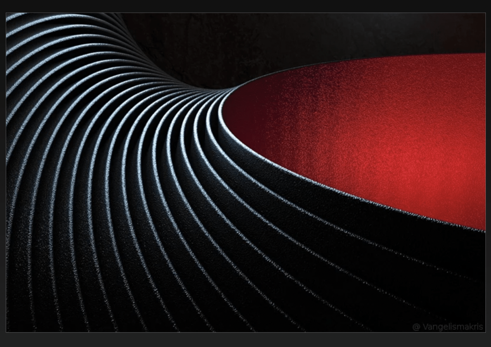
This photo contains many curved lines, and they seem to create a direction from far away to near the camera around the red area. However, only the line on the rightmost of the photo seems to outline the red area. The lines show movement and energy as it extends a long way and has a varied tone in them.


Shape: In photography, shapes can be either geometric or organic. The shape in photography could be varied in size, shade, and amount, and they often have close relationships with other lines and shapes.

This photo contains both geometric and organic shapes, creating a chaotic yet artistic photograph. The geometric shapes include triangles, rectangles, rhombuses, and trapezoids. The organic shapes contain circles, curves, and other soft turns. They relate to each other by being stacked together or next to each other.


Repetition/Pattern: Patterns in photography are illustrated as the same shape or line happening in a specific order repeatedly. Patterns create rhythms, which brings predictability to a photograph and exaggerates the odd ones out.

The monks create a pattern that repeats in the photograph except for 1 monk that is turning his head. I see echoes as the legion of monks does not end within the frames of the photograph.


Texture: Texture is the impression of how it will feel to the touch of the objects in the photograph. The texture could be presented with shadows, notable bumps, or a coarse surface.

If I could touch the surface, it would likely feel crumbly. The objects in the photograph seems to have textures as it has shadows and is clearly 3-dimensional.


Value/Tone: The tone is how colored or lighted a photograph is. For example, a dark photograph will have a different tone than a bright photograph. In photography, the tone can vary depending on specific photographs, and the tone will also vary on the same photograph to direct the viewer’s attention.

There is a range from dark to light. The darkest point is at the bottom of the photograph and the lightest is at the center of it.


Focus: The Focus is a point in a photograph that is clearer than the rest of the photograph, which directs the viewer’s attention.

The photograph is very blurry and out of focus. The flower at the front is relatively the clearest and te orange background is the most blurred.


An image could indeed show more than one formal element at a time. For example, in the photograph below, the formal elements of lines, shapes, tone, and pattern blended well together and created a great photograph. When lines intersect on the same plane, shapes form, and the brightness of every photograph results in differences in tone. The focus and patterns could add on to a good photograph by creating movement and attracting attention from viewers.

Abstract Photography

Definition: Abstract photography is a form of art that does not have a clear object as a focus and is often hard to understand. It is a piece of art made by experimenting with things that no one else had done before and relate to.


The pictorialism movement is a revolutionary stream of thoughts that made photography contain art in addition to the pure science purposes before.

The straight photography movement changes people’s views by producing photographs that are not altered or taken in a planned room. It uses everyday life and common events as a form of art. Straight photography became popular due to the photographer Alfred Stieglitz’s amazing artworks such as The Steerage (1907).

Aaron Siskind was inspired by the straight photography movement as he was one of the first photographers that connected abstract photography to ordinary objects in real life and created art pieces such as Metal Hook (1942).

Andreas Gursky’s artwork is abstract as it doesn’t have a clear object to focus on. His work includes abstract photographs such as “99 cent”, a photo that captures a supermarket from a grand scale, showing all the merchandise as small items. Uta Barth’s artwork directs the viewer’s focus from the object to the environment, which by definition, is abstract. Her artworks, such as the various photos about the “ground”, are blurred. I think both of the artists are straight photographers as they took everyday objects and places and made abstract art work from them. They both redirected the viewer’s attention from the object to the environment.


Sources:

https://www.theartstory.org/movement/pictorialism/

https://scalar.chapman.edu/scalar/ah-331-history-of-photography-spring-2021-compendium/dylan-lavigne-assignment-3

https://www.artnet.com/artists/uta-barth/

https://www.nytimes.com/2018/01/29/arts/andreas-gursky-is-taking-photos-of-things-that-do-not-exist.html

https://www.moma.org/artists/7827#works

https://www.theartstory.org/artist/siskind-aaron/

https://www.artnet.com/artists/andreas-gursky/