Paul Strand Respond Task

The photographer, Paul Strand, might have been interested in 3 things that made him take the picture:

  • He might have been interested in the angle of the desk which made the photo look awkward yet mesmerizing.
  • He might have been interested in the repeating shadows that form a parallel pattern on both the desk and the floor.
  • He might have been interested in the texture of the table and its effects while paring with the tone.

If I was the photographer, I would have named this picture “Shaded Desk” as it would help the readers comprehend the picture more.

One thing I discovered that is unusual about this photograph is that it turns a slanted photo that is not parallel to the horizon into a beautiful photograph that contrasts light and shadows. The texture on the table also faded on the areas that are brighter in contrast to the visible coarse texture of the table on darker areas.

The artist used shadow stripes as the lines, creating direction and focus for the photograph. The artist used the desk and the shadow stripes as shapes so that there is both organic and geometric shapes in the picture. The artist used the multiple parallel shadow stripes as repetition to create a pattern in the photograph. The author used the desk’s coarse texture and used the shadow stripes to hide some of it. There is a clear contrast between the shadows and the light parts that form patterns. There is no specific focus in the photograph.

I think the best thing about this photograph is how the objects are not horizontal to the horizon. It creates variation and confusion on the photograph and seemed artistic.

G9 Engineering Project Energy Transformation Define and Inquire

Define and Inquire


Energy Transformation List:


M: mechanical

C: chemical

E: electrical

T: thermal

S: sound


Horizontal: transformed into

Vertical: Original energy

M C E T S
M x nnd mill friction bell
C Bomb x battery bomb bomb
E motor nnd x Short circuit speaker
T sun nnd steam x nnd
S nnd nnd microphone nnd x


dea 1: fan bell (mechanical to sound)

Rating: 5/10 difficulty

Attach a fan with a bell in a way that when wind passes the fan, the bell rings.


Idea 2: steam bell engine (heat to sound)

Rating: 9/10 difficulty

Have a pot of water that will boil under heat, triggering a bell.


Idea 3: water mill engine (mechanical to electric)

Rating: 6/10 difficulty

Have a water mill that spin magnets to generate electricity, eventually powering up a lightbulb.


Idea 4: balloon car (Elastic potential energy to kinetic energy) (choosing this due to nostalgia)

Rating: 6/10 difficulty

Having a car that acquires its power from a balloon.


Balloon Car Video (I will modify the recipe and procedure in my D&P section):


https://www.youtube.com/watch?v=RStgV8mA-gA&ab_channel=ScienceBuddies


Target Audience:

The balloon car is made for everyone with passion to hand-powered vehicles and are fond of balloons. The car could also be used to learn physics, therefore, is suitable for every student.


Success Criteria:

  1. Finish the product by the last 2 lessons of the unit.
  2. Have the car go at least 3 meters without pushing it.
  3. Have a simplistic design that is visually appealing.


Formal Elements of Photography

Formal Elements of Photography: The phrase “formal elements” mean the most basic and important features that something has, and in photography, they are line, shape, repetition, texture, tone, and focus. Those 6 elements are the basic building blocks of photography that should be considered for every photo.

Line: In photography, there are certain objects that act as a line. They have directions, lengths, and thicknesses, and are either geometric or organic. They often lead directions and show outlines in a photograph

.
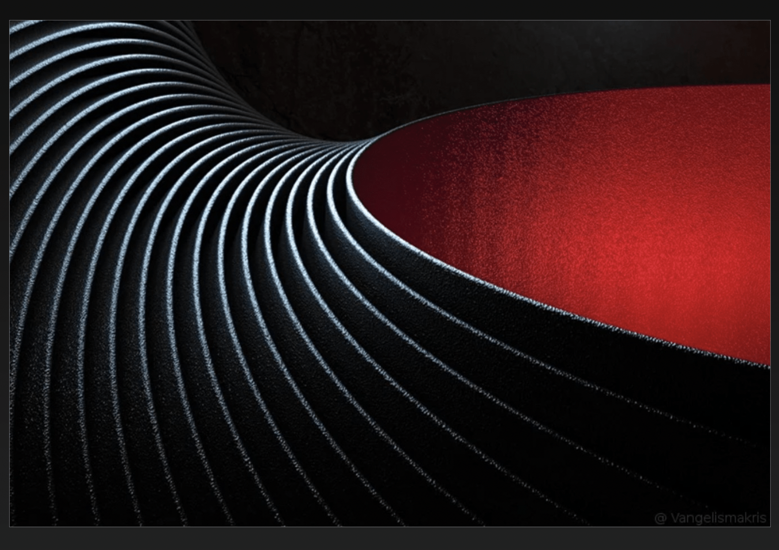
This photo contains many curved lines, and they seem to create a direction from far away to near the camera around the red area. However, only the line on the rightmost of the photo seems to outline the red area. The lines show movement and energy as it extends a long way and has a varied tone in them.


Shape: In photography, shapes can be either geometric or organic. The shape in photography could be varied in size, shade, and amount, and they often have close relationships with other lines and shapes.

This photo contains both geometric and organic shapes, creating a chaotic yet artistic photograph. The geometric shapes include triangles, rectangles, rhombuses, and trapezoids. The organic shapes contain circles, curves, and other soft turns. They relate to each other by being stacked together or next to each other.


Repetition/Pattern: Patterns in photography are illustrated as the same shape or line happening in a specific order repeatedly. Patterns create rhythms, which brings predictability to a photograph and exaggerates the odd ones out.

The monks create a pattern that repeats in the photograph except for 1 monk that is turning his head. I see echoes as the legion of monks does not end within the frames of the photograph.


Texture: Texture is the impression of how it will feel to the touch of the objects in the photograph. The texture could be presented with shadows, notable bumps, or a coarse surface.

If I could touch the surface, it would likely feel crumbly. The objects in the photograph seems to have textures as it has shadows and is clearly 3-dimensional.


Value/Tone: The tone is how colored or lighted a photograph is. For example, a dark photograph will have a different tone than a bright photograph. In photography, the tone can vary depending on specific photographs, and the tone will also vary on the same photograph to direct the viewer’s attention.

There is a range from dark to light. The darkest point is at the bottom of the photograph and the lightest is at the center of it.


Focus: The Focus is a point in a photograph that is clearer than the rest of the photograph, which directs the viewer’s attention.

The photograph is very blurry and out of focus. The flower at the front is relatively the clearest and te orange background is the most blurred.


An image could indeed show more than one formal element at a time. For example, in the photograph below, the formal elements of lines, shapes, tone, and pattern blended well together and created a great photograph. When lines intersect on the same plane, shapes form, and the brightness of every photograph results in differences in tone. The focus and patterns could add on to a good photograph by creating movement and attracting attention from viewers.

Abstract Photography

Definition: Abstract photography is a form of art that does not have a clear object as a focus and is often hard to understand. It is a piece of art made by experimenting with things that no one else had done before and relate to.


The pictorialism movement is a revolutionary stream of thoughts that made photography contain art in addition to the pure science purposes before.

The straight photography movement changes people’s views by producing photographs that are not altered or taken in a planned room. It uses everyday life and common events as a form of art. Straight photography became popular due to the photographer Alfred Stieglitz’s amazing artworks such as The Steerage (1907).

Aaron Siskind was inspired by the straight photography movement as he was one of the first photographers that connected abstract photography to ordinary objects in real life and created art pieces such as Metal Hook (1942).

Andreas Gursky’s artwork is abstract as it doesn’t have a clear object to focus on. His work includes abstract photographs such as “99 cent”, a photo that captures a supermarket from a grand scale, showing all the merchandise as small items. Uta Barth’s artwork directs the viewer’s focus from the object to the environment, which by definition, is abstract. Her artworks, such as the various photos about the “ground”, are blurred. I think both of the artists are straight photographers as they took everyday objects and places and made abstract art work from them. They both redirected the viewer’s attention from the object to the environment.


Sources:

https://www.theartstory.org/movement/pictorialism/

https://scalar.chapman.edu/scalar/ah-331-history-of-photography-spring-2021-compendium/dylan-lavigne-assignment-3

https://www.artnet.com/artists/uta-barth/

https://www.nytimes.com/2018/01/29/arts/andreas-gursky-is-taking-photos-of-things-that-do-not-exist.html

https://www.moma.org/artists/7827#works

https://www.theartstory.org/artist/siskind-aaron/

https://www.artnet.com/artists/andreas-gursky/


Some Rules of Photography

I think the main rule in photography, or any piece of art, is to be creative and avoid plagiarism. It is also very helpful to have an artistic intent on what a photo is expressing. I do not think there are any more rules other than these since art is meant to be creative and should not be restricted by specific rules about specific scenarios like the photo being horizontal to the horizon.

Photography “Breaking Rules”

Breaking Rules

Most of my pictures are taken not horizontally nor vertically to the horizon and the pictures are mostly not balanced. For some pictures  (the darker and the brighter ones), I messed with the lighting values on my phone to make it look unfairly flashing or dark. The darker photos also brought a spooky mood to a common hallway which I intended. In this case, I don’t think rules are needed.

  1. When might it be a good idea to deliberately break the rules?

I think art is all about creativity, so the rules could be broken to make abstract and confusing photographs. For example, the last 3 pictures are very confusing at first glance, but as I look more, I see them as good photos. I think breaking the rules that people set up can result in very different styles and artistic outcomes.

2. Do you think it is possible to break rules if you don’t know they exist? Give reasons for your answer.

I think it is not possible to break rules if you don’t know they exist. If a rule was not known, one would not have any intention to break it, as one can not avoid what one does not know. For example, people who do not realize that the photo should be horizontal to the horizon would not intentionally take pictures that are not horizontal only because they want to break the rule.

3. Can a ‘bad’ picture ever be ‘great’? – How important is the context in photography?

In my opinion, any picture taken with an intention could be “great” if it expresses their artistic intent. For example, the picture “Wrong” by John Baldassari is a great picture as it successfully triggered many people into thinking that it feels “wrong”. In my scenario, the pictures where the hallways are sideways successfully expressed my intent of confusing the audience.

Analysis on photo “Wrong”

Before seeing the word “Wrong”, I see the photo as bland, lacking features. The person in the photo is not centered or emphasized, leaving the photo with no clear subject. The road, car, and roof seemed unplanned and flawed. Overall, the photo was bland and I did not like it much.

The addition of the word “Wrong” transformed this rather bland photograph into a piece of intentionally planned art. The word had expressed the artist’s artistic intent well and gave a reader a word to relate to when viewing this photo. Personally, I think the word changed my opinion of the photo and I now view it as a successful art work.

Overall, the context is important in photography as it provides the viewer what they will look for and what is the artist’s artistic intent. The artistic intent can completely shift the viewer’s view on a photo, for example, the photo “Wrong” by John Baldassari is a bad picture without looking at the word “Wrong” as it is out of focus, have too much background and cutting off cars and buildings. However, with the word “Wrong”, the artist’s intent shifted from appealing the audience by taking good pictures to appealing the audience by annoying the audience with bad pictures, which shifted from unsuccessful to successful.

“Life of an Individual Investor” Capstone Movie by Andrew Luo

“Life of an Individual Investor” is a imovie video made to spread awareness of the issue of the education on individual investors. Individual investors in China often lose money due to their emotions and lack of information on the stock market, which had caused the quality of life of may people to decrease.

Grade 8 Capstone Project: How Does the Stock Market Affect Individual Investors in China?

A massive issue that could be easily ignored is the stock market’s impact on individual investors. Even with decent work, economy is not destined to grow. Individual investors should receive education to thoroughly solve the issue of constantly losing money in the stock market while the educated ones seek them. The purpose of this project is to raise awareness of this global issue and explain what is it, why is it important, and how we could solve it.

French Revolution Journal

Froge, a boy that endured the French Revolution, was the main character in this journal. He was 15 years old during the Storming of the Bastille. He was a radical Jacobin and slowly became a steady man who opposed the revolution. He met a friend named Dave during the Storming of the Bastille and stayed safe together during the entire revolution.


Was the French Revolution worth it? In my opinion, the French Revolution was worth it. First, things had drastically changed in France during these 10 years. From the Tennis Court Oath, new ideas of Liberty, Fraternity, and Equality inspired from the American revolution flooded France. The three key ideas changed our modern world a lot, also providing us the precious Declaration of Rights of Man. In many modern laws and constitutions, the legacy of Declaration of Rights of Man still guide the authors. The most horrifying cost of the revolution was the hundreds of thousands of deaths in the Reign of Terror and Great Fear.