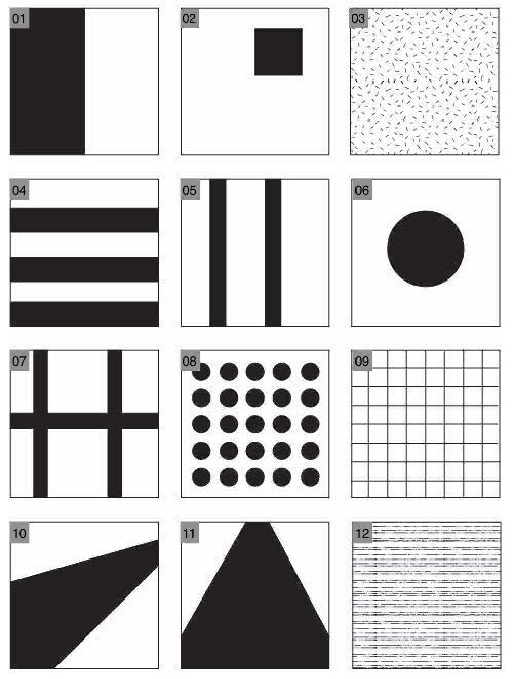


- the black and white split creates a strong and apparent visual contrast to the audience, which can be eye-catching to some.
- personally, I really like the second image because of its simplicity and the way the clock is placed in the top right corner to give it emphasis.
- the third image is a photo of Hanna’s t-shirt. In my opinion, it would be better if the ceiling light wasn’t there so that there would be no shadow casting down on the white cloth.
- the fourth image is taken around the theater, underneath the dragons. This work would be better if the little lines inside the thick line were not there; more attention would be brought to the horizontal lines.
- in the fifth photo, I tried to position the two poles so they follow the drawings’ arrangement, but the composition of the final work turned out to be a little vague. This may be caused by the black fountain before the two poles or the background behind the two poles.
- this image is a photo of a random mask on the floor. I think it could be a good piece of abstraction art if the ceiling light reflection is removed and the shape of the mask is shaped more like a circle.
- this image could look better if the background was not that crowded, especially the pipes that took away the pattern formed by the wall.
- this work captures the wall near the design center. The dot on the wall formed a net pattern that was pleasant to look at.
- this image is taken outside the library. Similar to the previous work, the line built a strong pattern for the audience to observe.
- This image utilizes the reflection of a wall to form the shape in the drawing. I think it is a fun way to play with reflection. Also, how the line is positioned in the image is interesting to look at; it directs a person’s eye from one side to the other.
- This is a photo of the stairs. The straight lines of the handles lead the eye of the audience to the back of the image and end at a high focus point, directing the attention to the painting on top of the stairs.
- This last photo is of the floor in the library. The detailed and sharp image shows the texture of the floor.
Leave a Reply
You must be logged in to post a comment.