Ethan

"I have no special talent. I am only passionately curious" - Albert Einstein

Page 3 of 3

Analysis of an Artist- Alexander Jacques

5 characteristics of the selected photographs:

This set of photographs uses both line and shape

There is a clear subject in every photo I have taken

Each photograph has a clear texture and each texture is different in there own way

The images all have different colors and some use multiple interesting colors

The set uses different geometric shapes such as squares and rhombuses.

In three of the photos, there is a repetition of similar shapes and elements of color. For example the three photos have blue color as well as squares on the architecture.

The artist used characteristics and elements of line and shape to enhance his images and create interesting abstract images which all have an appealing composition and make the viewer interested. The artist tries to highlight the different textures in architecture and uses different colors within his photographs to create an interesting sensation and not have bland photos with the same colors and textures. The artist highlights each distinct image and has a clear subject for each photo the lines and shapes on architecture . I have chosen this photographer because I like how he highlights the different elements on different pieces of architecture. I also like how he uses different colors and textures to enhance his photographs. The photographer relates to my vision because my vision is about architecture and how it relates to different elements of line shape, and texture.

“Sometimes I am surprised how a facade that I see with my eyes can make a picture. First we forget that it is a building, then the lines and perspective transform everything. In the end we only see the pattern.”

-Alexander Jacques

I chose this quote because it informs the viewer his specific ideas about his work and highlights the importance of lines and perspective to transform the image and create an interesting sensation. It helps me understand the photographers work because he says how he uses lines and perspective to show the interesting side of a building. In the quote he talks about the importance of lines and perspective and how they can be used to transform a image which you can see is used in his work on different types of architecture.

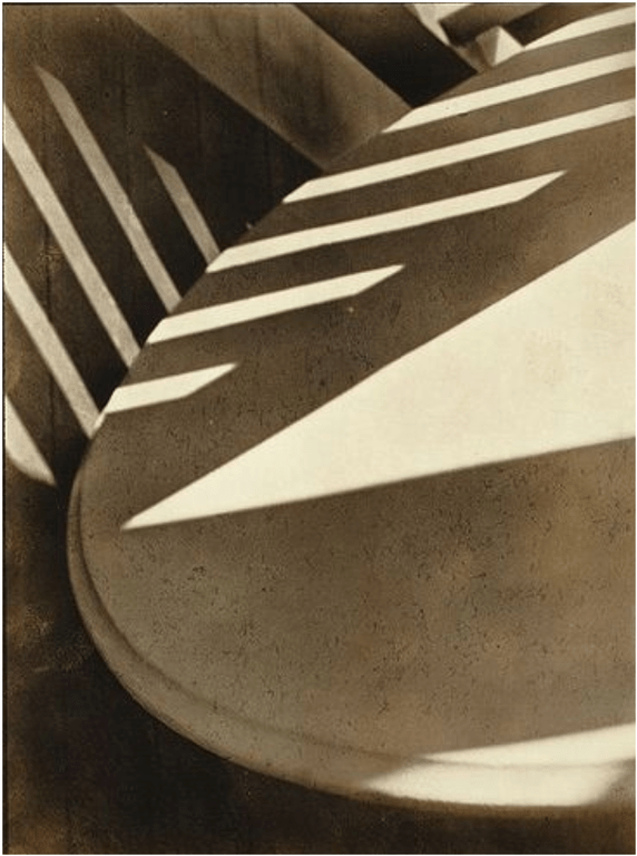
I chose this image because I really like the texture and color scheme in the image and like how Alexander Jacques used different elements such as line and shape to really enhance his photograph and create a distinct image from the others. The texture and blue part of the image looks 3 dimensional when it is really 2  dimensional. This is really interesting and surprising to me and I really like how he used these different elements to create an image which looks 3d. I also like the blue and white colors which the artist highlighted to create a distinct image from others.

The most important formal element in the photograph is repetition because the repetition in this photograph is used to create an interesting pattern which is distinct from other images because other images don’t have that 3 dimensional look to them. I chose repetition because it is used very well and to create an interesting pattern and highlight the important part of the image.  I think repetition is important in this photo because it is used to create a interesting composition and scene of placement and the repetition of this 3 dimensional part of the architecture creates a very interesting pattern which makes the viewer think. I also think the repetition in the image creates interesting patterns of line in shape which are seen in the object in the architecture.

My chosen artist photo is abstract because the artist used a variation of elements such as repetition, line, shape to create an interesting  pattern and make a very cool abstract image. The artist highlighted different elements on this piece of architecture to create a very interesting abstract image. I like how he only focuses on the pattern and color schemes in this photograph and only highlights a small part of the architecture which is very interesting for an architecture photographer. I like how he focuses on a small part of the building and highlights different elements to create an abstract image with different patterns and lines and shape.  I will adapt my style to focus on the small parts of the actual buildings so I can highlight different parts of the buildings and create an abstract image with the many formal elements in the image. This image inspires me to create more architecture photos similar to this one as they show lot’s of different and interesting patterns and highlight many distinct colors which I find interesting.

Revised Vision Statement:

My vision is to highlight the interesting elements on buildings and show very absorbing colors in my image to add emphasis to my main subject. I will take photos in the style of Alexander Jacques. I  am particularly inspired by other architecture photographers with a similar message to Alexander Jacques but I will take more images in the style of Alexander Jacques because he makes buildings very interesting and creates emphasis to distinct objects on buildings to create a pattern.  I will take pictures that use patterns and repetition to bring out the main subject in that image as well as making architecture interesting.

Abstract Photography Vision

Vision

Elements in Buildings

The message of my triptych will be to highlight the structure of buildings and show the different patterns which buildings can have. The interesting architecture in buildings can be seen everywhere and it is very interesting.  I want the audience to feel exited and satisfied when looking at the different elements in buildings. My main message is to get the audience thinking about how different building highlight different cultural aspects in society.  I want the audience to appreciate the interesting architecture and objects which can be seen in buildings.  I will get inspiration and ideas from a photographer who focuses on the architecture of buildings and explores the different patterns on buildings. I want to find photographers who value tones with soft focus on buildings and explore the different patterns which can be found in architecture.  I want to find photographs that explore tones with soft focus. In my opinion, we have to value and respect the interesting architecture and buildings which we pass everyday. Buildings are very interesting and are very exiting and satisfying because of the objects and patterns on the structures. Overall I think Buildings are very interesting and exiting to see and can show very cool patterns and textures on the outside of the building.

Alexander Jacques is a photographer which I will be taking inspiration from as his photos correlate with my main message and vision for what photos I’m going to take. I like how he highlights the architecture and connects it to the elements of abstraction in photography. He uses these elements to show meaning to these building and create an interesting composition.

Mind map

Link

https://padlet.com/ethanelliot1/mind-map-sv74u5pf5vpxay9c


Made with Padlet


Photo Safari

Photo Safari

Contact sheet abstraction

Better image on link

Most of my images worked pretty well and matched the drawings 1 to 12. My 10th image does not correlate very well with the drawing but has similar features to the drawing. The image has the diagonal slant which creates a triangle. This image did not work very well when comparing  it to the original drawing. In the second image the angle and placement of the square does not completely match the drawing. All of my other images for the most part match the drawing and are very similar these images I feel worked very well and were not as hard to capture.


Critique – Paul Strand

The photographer might be interested in using lighting to highlight the shadows as he focuses on the contrast between the lighting and the shadows. The photograph could have also been interested in capturing the shapes in the photo and focus on the formal element of shapes in his image. He might also be interested in the overall texture and patterns in the photograph. The photographer repeated many forms of shapes in a specific way where it shows an interesting pattern and makes the image more appealing for the viewer.

If I was the photographer I would call this “shapes and shadows” as the photographer puts a lot of emphasis on the patterns shown in the frame as well as the shapes represented to make the pattern look interesting. The photographer uses many shapes such as triangles and rectangles to make the image more creative and abstract.

This photograph is very unusual because the angle the photo is taking is facing up and the image looks like it is taken on the streets or under a tree because of the unusual shadow and pattern created in the image. The unusual thing about this is where it is being taken and the overall angle is very unusual as it is facing up and makes the audience wonder where the image is being taken.

In this photograph the photographer used many lines in between the shadow. The lines in the image also created a pattern as these lines are repeated in a specific way. To the right of the lines you can see the photographer used a triangle which is also formed from the shadow. The photographer also incorporated a texture which looks more like a sand stone or a limestone texture because you can see parts of the texture in many parts of the photograph. The image also uses tone as there are different areas which are dark and light as the shadow created darker and lighter areas in the frame. The image is for the most part in focus and does not seem to be too blurry or too sharp.

In my opinion, the best thing about this photograph is the use of shapes and patterns as they make the image more interesting and highlight the power of a single shadow. The shadow made the interesting shapes and lines which ultimately created cool patterns that make the photo extremely interesting.

Formal Elements

In photograph formal elements refer to structural elements of images. Some of these elements are line, shape, pattern, texture, tone, and focus. These elements are used to highlight different compositional features and make the image interesting for the viewer. Formal elements are characteristics that make a photograph unique. They are elements which make a photograph unique.

Line:

In photography lines are common in many objects. Lines are used in objects and can show movement or energy in an image based on the type of line. There are vertical lines horizontal lines and diagonal lines. Each of these types of lines portray something different in the image.  Many of these lines are used to show a sign of movement in a photograph and draw the viewers eye to a specific point of interest in the image.

Shape:

Shapes in photography are used to highlight a specific object or structure in the image. When shapes are repeated in a specific way they can be used to show a pattern. Shapes can also act as a symbol in the image. Objects can be used to symbolize different ideas or moods in the image.

Pattern:

Patterns are created by repeating a specific element such as lines shapes or objects. Many photographs use pattern to make the image appealing and interesting with an interesting pattern of shapes or lines. Patterns in photography are also have an appealing composition and draw the human eye to the picture.

Texture:

Texture of a surface  refers to a specific effect on the human eye which makes you feel like you are touching the surface of a specific object. Texture can highlight a specific mood and convey to the audience the texture of the material on the object. For example, a close up on a tree bark or a rock surface can highlight the texture of the material in the photo.

Tone:

Tone in photography refers to the range of lighting in the photograph. Tone can highlight a specific mood and create an atmosphere of where you are. Tone usually highlights a specific part of the photograph and can create a sense of tension based on the overall lighting of the photograph.

Focus:

Focus is an element which emphasizes one specific part of the photo and can highlight a specific part of the image while blurring out the the background of the image. Focus brings out a specific part of the photo and values that specific part of the image as being important as it is in focus in the frame.

Can an image show just one element at a time? Justify your answer.

An image can show more than one element at a time because multiple elements in photography can make the image seem more interesting and adds more purpose to the image being portrayed. With more than one element the overall composition and structure of the image becomes better as it highlights different ideas and portrays different stuff based on the element chosen.  With more elements the image can create a sense of emotion or mood. Photographers usually try to incorporate more than one element because they want the image to be more interesting and have a purpose of being taken.

Abstract Photography

Definition:

Abstract Photography can be defined as using a unique perspective of an object which makes the viewer think.  Usually abstract photos are pleasing to the human eye and highlight one distinct element in the image. Abstract photos use a variation of elements and colors to portray an interesting view of an image.

Researching the starting point:

Pictorialism is a style of photography that places more emphasis on the aesthetics of the composition, tone, and subject matter than on accurately portraying reality. The Pictorialist viewpoint emerged in the late 1860s and predominated during the first decade of the twentieth century.

Between 1840 and 1860, there was a movement known as straight photography that was centered on perfecting methods and procedures for producing clear images that were as similar to the actual scene as possible and were shot directly from nature. Since straight photography refers to images that are not altered during the image-taking process or by darkroom or digital processes but accurately capture the scene or subject as the camera sees it, it has gained popularity among photographers.

Siskind was one of the first photographers to blend what was known as “straight” photography—recording the actual world as the lens “sees” it—with abstraction. He flipped the medium of photography on its head by capturing photographs of discovered things that were both true to life and abstract. He was inspired by this movement because his photos combined both real things with abstract things which led him to be inspired by the straight photography movement.

Andreas Gursky and Uta Barth photos are abstract because they both use elements and a unique perspective to make the viewer think and be intersted in the painting. Both images use different variations of colors and elements and both show exactly what they are portraying. I would say they are not straight photographers because in their images they do not only portray one thing but rather many different objects in their photos. They also use a big variation of colors and perspectives which are usually not used during straight photography.

Wrong Photo Contact sheet.


Wrong Photos Contact Sheet Ethan Elliot

Wrong Photos

Wrong: Evaluate The Photograph opposite

I think this is a good photo which really highlights a vintage image. The image shows an imperfection of the car and the house as they are not fully shown which ultimately makes the photo worse. This results in the man not being fully emphasized and is in the background.  The man in the photo is also not shown very well and is not centered correctly. He could also be closer to the camera to highlight him and so you are able to see his face. I did like the vintage aspect of the photograph though.

Context:

I think context is very important in photography and can make a huge difference in what the photograph is really highlighting.  For example in this image the word wrong makes a big difference to the photo and changes it’s meaning completely because the word wrong is showing that the image is wrong and should be improved. If there was an art museum with a bunch of photos saying wrong I think that the photos would have more meaning rather than just being plain boring photos which are made wrong. If you provide the word wrong the viewer will understand that the photographer is highlighting this image as wrong and therefore giving further meaning to the photograph. In John Baldassari’s photo you can see that it is a terrible photo because it does not follow the specific rules correctly but if you add the word “wrong” to his image you can tell that he is trying to say the image is wrong.

Rules of photography

The purpose of rules in photography is to have limitation to what photographs you can take and what photographs are considered bad. If you follow a set of rules your photograph will turn out much better and the rules can help you not mess up the photo. The most important rules in photography are not cutting the image out of the frame or cutting off people. For example cutting off someone on the side of the frame or having a car in the side of the image. Another important rule is to have your camera in focus and avoid blurriness. My final rule is to avoid bad lighting because it makes the image hard to see. Overall, the most important rule is to not cut off people in the image and fill in the frame.

Who needs rules anyway?

It might be a good time to break rules when you are trying to make an image bad or make the image look like a piece of art rather than a photograph. For example you can make the image out of focus or blurry when your trying to make the image look more like an art piece but the image will not be good as it does not follow the rules of photography. I think it is possible to break rules if you don’t know they exist because there are many rules which many people follow when taking photography and if you don’t know all of the rules of photography you can possibly break the rules. You can break these rules and still think you have a good photo so it is possible to break rules if you don’t know they exist. A bad picture can be great if you have context behind the image and say why the image is being taking and give a purpose to the image. If you say the image is wrong and give context by saying this photo was purposely breaking rules.


Welcome to Your New Blog!

When you blog you create posts and posts are categorised according to your subject. Some categories have already been set up for you. If you need more categories you can add them as needed. It’s important that your posts have the following:

  • An engaging title – this should not include the name of the subject since this is referenced in the category.
  • Body – this is where you share your learning. This can include text, images, embedded videos from Dragons’ Tube or elsewhere. You should always consider how your post looks to your audience. Is it engaging? Do they want to keep reading?
  • Category – select one that has been set for you or add a new category. Posts can have more than one category e.g. Humanities and Myself as a Learner

Click on the images below to learn more about blogging:


Newer posts »

© 2025 Ethan

Theme by Anders NorenUp ↑

Skip to toolbar