Present

This set answers my intent because the volleyball brings back the happiness Mr. Kumi had back then, bringing nostalgia. The lighting further expresses this: one side of his face is lit up, signifying the “good old days,” with bright warm lights representing the “good.” The dark side of his face presents a contrast to the light, highlighting how much “light” and “brightness” volleyball brought to him. The focus on his gaze clearly presents the satisfaction and the happiness of him holding the volleyball. I named this photo “Back to the Past” because the happiness on his face and with one half-lighted tells the story of memory and nostalgia of the good old days, when he won every single game in that tournament, holding the “MVP” ball from back then. This corroborates with the author, Dawoud Bay, I took inspiration from as he also uses lighting and focus on the eyes to emphasize the facial expressions and emotions that the subject possesses when in a certain scenario: in his cases the students would show emotion in a classroom, in my case Mr. Kumi shows happiness when holding the tournament ball in which he won every single game in. This photo successfully answers my intent because it brought Mr. Kumi happiness and memories, in which I aim to do (triggering nostalgia from different cultures) in my intent. The culture section will be proven in the set with Mr. K, who came from a North American culture (photos below). Since my previous experimentation set, I realize that facial expressions are essential in reaching my intent of establishing nostalgia, and thus I realized that the props that can trigger emotion are very important. Therefore, the volleyball and the shirt Mr. Kumi brought was crucial to bringing him in character with the matching facial expression of my intention in these photos, which was something I learned.

“Back to the Past”

The above photo will have the same name as the set name, and will be the introductory photo.

The above photo is called “Spinning as a Winner.” Mr. Kumi’s remarkable control of the ball signifies his capability and composure when coaching the team that won every game in that tournament.

This one is called “Shining too Bright.” He covers his face in a setting position, as if the light is shining too bright – the light in this case symbolizes the achievements his team earned from that tournament.


Critique:

Composition: All the elements, including the props and lighting, support the subject in this photo as the props match my intent to trigger nostalgia. The negative space and props causes the viewer to focus on the subject with no distractions from the background. However, the background may be too plain – Dawoud Bay’s work consists of corresponding backgrounds, which I could have utilized as well. I indeed went to overboard with amplifying facial emotions and subjects themselves, missing the opportunity to add a more interesting but not distracting background. Despite the missing opportunity, the plain background causes the viewer to initially look straight at Mr. Kumi and Mr. K, which matches my intent of highlighting the identity of the two teachers. The story that both sets tell are pretty clear: Mr. Kumi, enjoying his last year at ISB, flexes and happily explains how important that volleyball means to him and how much glory and pride that specific tournament brought him. I was astonished at how proud and happy he was when he explained the meaning of the ball to me and during the photoshoot, I would like to thank him for his dedication to this photo set.


Below is a new set from Mr. K to contrast Mr. Kumi’s set to match my intent of comparing different cultures. Mr. Kumi has a volleyball-based European identity due to his culture, while Mr. K has a music-based American identity. Similar lighting is utilized, except the point is to amplify Mr. K’s high school life being brought back: he is once again in his high school varsity baseball jacket, holding his beloved guitar, and has the cool “high school kid” face on him, matching my intent. This is supported by photographic technique, such as the amount of negative space around him, pushing him to the left of the frame so the viewers would focus on him and the guitar, the focus is on his gaze so the viewers know that they are supposed to focus on his identity, and the saturation is higher so that the photograph is not as cold, as nostalgia is meant to have a warm feel, as my experimentational set from before proved: warmer colours had a better effect when establishing nostalgia. Moreover, taken by the inspiration from the previous author whom utilizes the same lighting this set also puts the lighting on half of his face. It also utilizes the same close shots as the author I have taken inspiration from, as both utilizes props appropriately to amplify facial emotions of the person within the picture. This corresponds to what I experimented in my first set as again, the facial expression was amplified by negative space and a plain background, as well as props being crucial in triggering the sincere emotion. In Mr. K’s set, he wears his proud baseball jacket from his high school varsity team, in which he was especially proud about. His guitar represents his other hobby, and to contrast Mr. Kumi’s set, his facial expression gives him the feeling of a cool high school student: the cultural contrast is quite clear. The sports culture puts a warm smile on Mr. Kumi’s face, but pushes Mr. K to look cool and proud about it in a much different way. This contrast fullfils my intent as I aim to capture the cultural differences among the sets. When looking at Mr. Kumi’s photos, the viewer should feel warm after hearing the context and should feel happy for Mr. Kumi about all the achievements he has earned for ISB after all these years. When looking at Mr. K’s photos, the viewer should feel like they are staring at an intimidating high school jock whom excels at baseball and music.


“High School Music-Jock” 

This picture is named “Guitar Menace.” He seems to be enjoying his guitar but at the same time looking at the camera in a menacing way, as if saying “DON’T TOUCH MY GUITAR.”


This picture is named “Going Back Home.” He lifts his guitar as if he just finished a concert with a satisfied look after an amazing performance at his high school, with his proudest varsity baseball jacket on.


Posted in Uncategorized | Leave a comment

Critique and Create

I have taken these photos in the style of the author I took inspiration from, whom took photos of high school students decorated with items that symbolize their academic careers in school because I aim to capture this sense of nostalgia from high school with teachers that have graduated a long time ago with the same props and feeling.

The above are the 10 photos I have selected as a result of my green selection. I have selected these photos because they not only present the sense of being a student, but also something that is visually intriguing. For example, many of them include intriguing facial expressions that are distinct to most other photos I took before, their props are very symbolic and important to the photo to convey the sense of nostalgia, or that the utilization of space and lighting was performed exceptionally well, or a mixture of multiple details mentioned. For example, the book and the football are examples of the props that make the photos more intriguing.


These photos convey a student that is enjoying academic related hobbies as a high school students, which can be shown within the sophisticated facial expressions and some details. The details include the props, the braces, and the lighting. They tell the story of a high school student who is captured enjoying school related subjects. The braces prove that he is a student, the book and the football reveal his hobbies, and his facial expression tells us how he feels. When taking these photos, I have learned to use warm lighting when conveying a positive emotion within the photo, and I have also learned to use negative space to highlight the subject figure, and have learned to adjust the camera to focus on the subject’s eyes so focus is on the subject and to follow the rulesof portraiture. Comparing to previous tasks, I have learned to put focus on a subject that I want to capture, in which utilizing negative space, focus on eyes, and lighting saturation could complement. In the next shoots, I would like to decorate the background a bit more, and exclude external distractions from the background, as well as finding more intriguing props and clothing to help establish the nostalgia when filming grown adults.


This is one of the best photos in the set. When first looking at the photo, the eyes of the audience will be drawn towards his eyes as well: it shines brightly and it is as if he is looking at hope and the past coming from his facial expression. Moreover, the lighting presents a story: he is staring at brightness. The ball in his hands show his childhood passion, and this could be applied to the actual set where it tells the story of a grown up looking back on their past, and in the photo they would be looking at brightness. There are no distractions, and exposure and focus are all correct. Thus, this photo will be taken into account in the final set due to its beautiful light composition and the gaze of the subject.


This photo can serve as a counterexample. In some cases, I seek movement to corroborate the prop in the photo. However, in this example, the movement caused the camera to go out of focus and caused many distractions in the photo, such as the shadow, the weird facial expression, and the prop turning from a supplement to a conflicting item. Moreover, it does not really tell a story. To inflict nostalgia, the photos should tell stories through composition, lighting, props, etc. Therefore, this one is too distracting due to movement and in the actual photoshoot I seek to minimize movement and will try to capture moments where movement does not serve as a distraction within the photo.

Posted in Uncategorized | Leave a comment

Statement of Intent

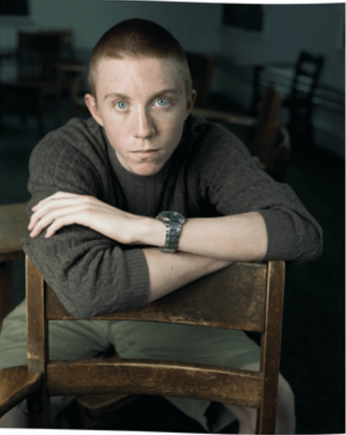
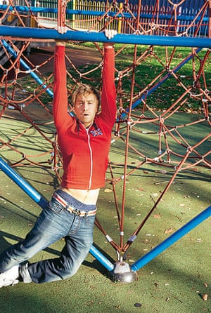
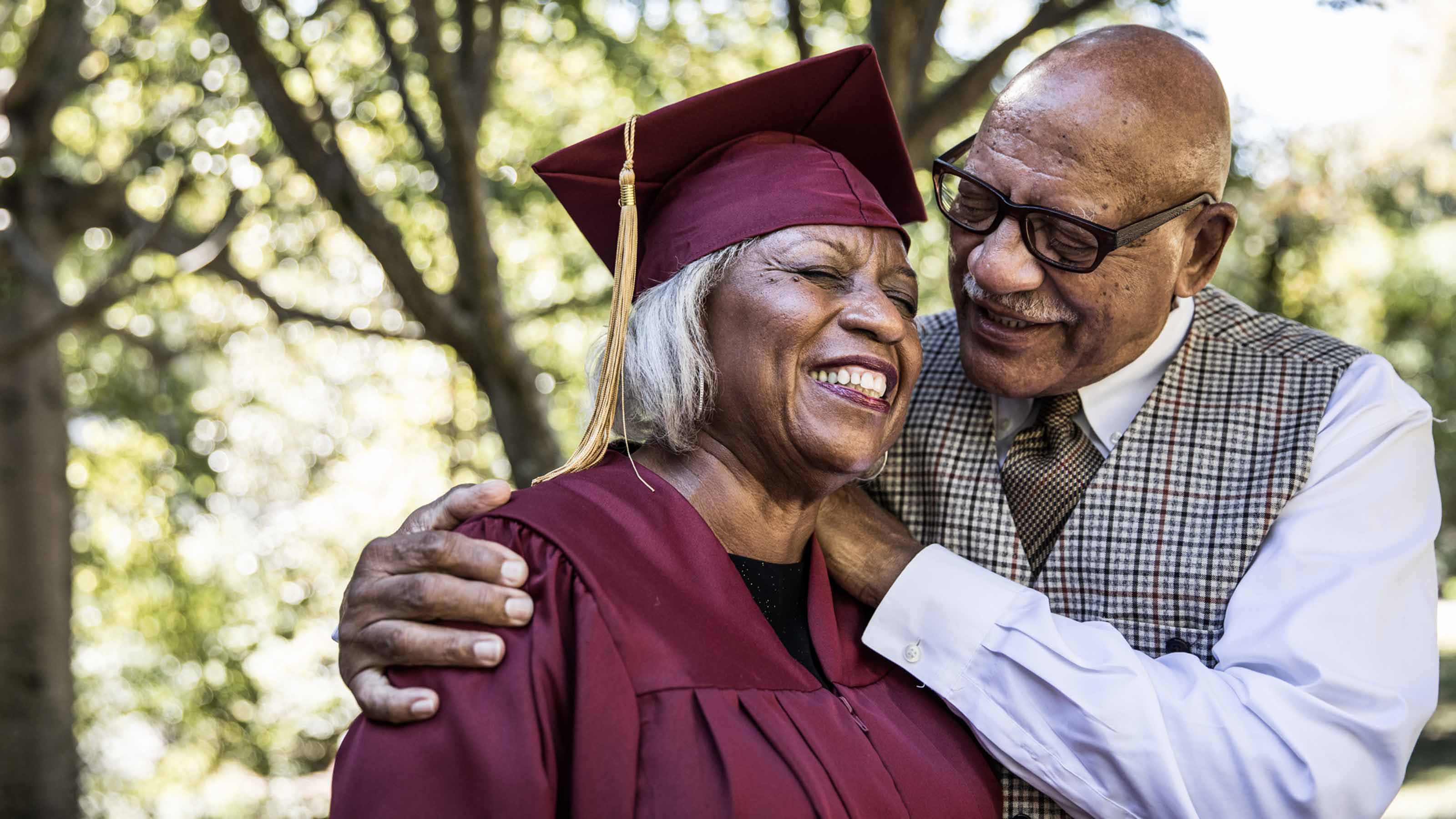
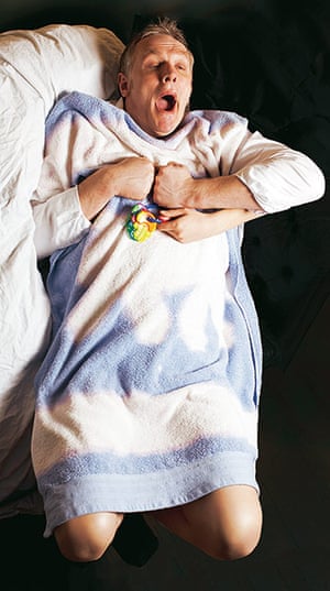
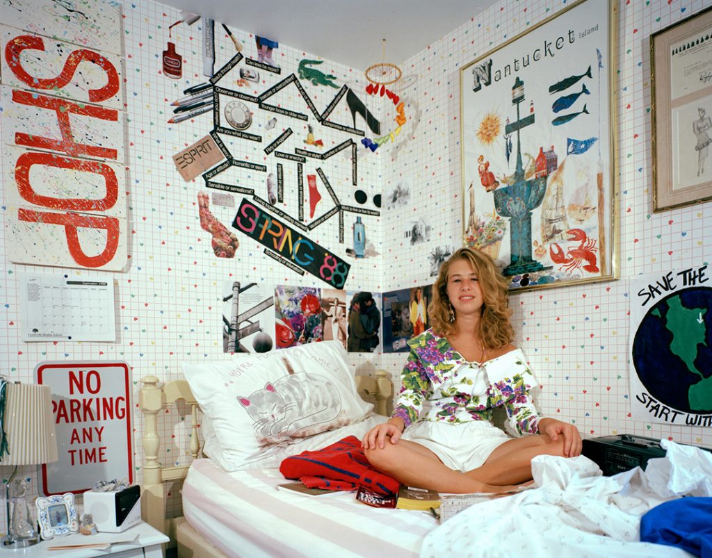
During the identity unit, I will be making a set of photos called “Nostalgia: What were you like when you were in high school? Exploring multiple cultures” The societal issue I aim to explore is the youth and past of the teachers in different cultures, especially helping them relive and revive their memories in high school by dressing them and telling them to act like they did in high school. I want my audience to feel warm when looking at those photos, as if they were watching someone revisit their favourite childhood park and feel happy for the people in the photos too. I also want them to be intrigued when looking at the high school culture of different people. I hope to obtain inspiration from photos that seem to recreate the childhood for certain adults, such as those published by the Guardian, and inspiration from objects that were trending in the 1990s, to better create the correct atmosphere to trigger the nostalgia. I aim to use a black background, intended “bad” light as most photos from the 1990s of shining and bright light that blurs the photo out a bit.


The author I hope to take inspiration from is called Dawoud Bey. Dawoud Bey uses his photos to capture the individuality and identity of the people he takes photos of, particularly within marginalized communities. His photographs challenge stereotypes, which relates to my intent as I wish to capture multi-cultural teenagehood. For example, in his series, “Class Pictures,” he takes photos of teenagers from multiple cultures, wearing or holding something that represents their academic or personal interests. The focus on the eyes really emphasize the distinct traits of each person, and encourages the audience to note special features of each person. All of the photographs use techniques such as highlighting the person while blurring the background. This is because the author intends to focus on the character and traits of the character, but still wants to include a background that presents their academic status. However, the background is blurred so the audience can better focus on the subject. I chose him as inspiration because his photos distinctively represents the culture, the traits, and the teenagehood of his subjects. I hope to capture a similar effect. I will also try out different backgrounds that are blurred in my shoot, as it not only presents the academic side I aim to present in terms of nostalgia, but also helps supplement the clothing or props that put teachers back to their teenagehood.


Subject staring straight into the camera. Features clear and focused.

Staring straight into the camera, similar to the previous ones but presenting another culture. The earings, the background, the makeup, the jewelry, etc.

Similar to the previous 2. Wearing cheerleader uniform – academic/personal interests are presented.

In this specific photo, it is a very detailed example I want to reference. It shows the student in his seat, with a detailed but blurred background proving that he is in a school (the map behind him), the camera is clearly focused on his gaze, and his clothes are representative of his own identity. The focus on his gaze draws a tense but intriguing mood, as it makes him look very serious but still allows readers to examine him and notice things about his identity, both cultural and personal.

Posted in Uncategorized | Leave a comment

Connecting in Identity

In the identity unit in photography, I would like to capture the student identity of teachers in my photos. Teachers were all once students, therefore I would like to revive their identities of being students in the form of multiple photos with them performing, holding, or doing something that they did when they were in high school. I aim to bring back a nostalgic feel as long with levels of contrast which is presented when the teachers (the most mature ones in a school) revert back to students (the most immature ones in a school).


Old me, now me: now russell howard

This photo is what I have taken for inspiration. The adult is grown but recreating a scene that occurred in his childhood, bringing him nostalgia and giving the photo a contrasting feel.


Back in School Decades Later | Kiplinger

This photo is another inspiration as it features an old lady putting on her graduation gown once again. Her facial emotions tells the audience that she enjoys the nostalgia of going back to dressing in a previous phase of her life. I wish to capture similar emotion.


Old me, now me: old greg davies

Greg Davies

This is a humorous photo that attempts to bring nostalgia. The person dresses up as a baby and wishes to return to childhood. The nostalgic purpose is relevant and ideal, but the sets I will be taking will not be as humourous.

Adrienne Salinger uses a 4x5 view camera for her work.

Adrienne Salinger brings

Her photos have the 1990s nostalgic feel as its aesthetic and include very interesting composition. The composition could be used for my set as it brings adults back to teenagehood. This inspires my set as I also hope to recreate teenage hood to bring nostalgia with interesting composition.

Posted in Uncategorized | Leave a comment

Posted in Uncategorized | Leave a comment

Portrait

A portrait is something that highlights and captures the identity of a person in a visually appealing way.

Old man portrait by Ali Dinmohammadlo, Photography, Digital | Art Limited


This picture is the epitome of my definition. This portrait highlights the person’s identity and is visually appealing because of the possible emotions the clothing, the mask, and the surroundings evoke. This evokes a war-like emotion


Posted in Uncategorized | Leave a comment


These photos are all captured in 798, and most of them I plan for them to capture architecture, and to highlight elements other than colour so they become visually appealing once converted to black and white. Black and white can allow viewers to focus on the details of the structures and surfaces of the architecture. This approach can create a visually appealing experience, highlighting the light, composition and shadow. I hope to implement a nostalgic feel to my photos, as the architecture there were factories from the 1970s. Other than that, I also wish to capture places with a modern feel, as 798 has been transformed into a Gen-Z entertainment area, with much more modern fashion and aesthetics implemented into its architecture.

These are the photos filtered into the next section. All of these photos are black and white and of architecture, with many giving a nostalgic 1970s feeling. 2 of them have colour, and even though they do not give nostalgic emotions or black and white, I included them anyways because of how visually appealing they are, since the coloured light and the contrasted bear have amazing composition. The ones under my vision were included in this filter because they are all symbolic of 798, a modern-converted factory place. Overall, I think most of the photos have one thing in common: their composition is what makes them prominent in terms of being visually appealing. Therefore, for the next three, I will select the three based on how well their composition is.

This photo gives out a very nostalgic feel. Its composition follows the rule of thirds, with the chimneys in the center and supporting backgrounds on the left and right. The texture and the chimneys itself seem very old, like an old styled factory. It gives off the feeling of being in the Industrial Revolution era, and removing the colour brings even more nostalgic feel. The beauty of the contrast from the chimneys to the modern buildings on the right symbolizes the speed of modern urbanization, as now countless buildings from the past are now removed and constructed into ones that are more visually appealing for modern people. As fashion development continues, the old aesthetics are viewed as nostalgic, and are presented and appreciated in much different ways.

This photo again is the most visually appealing compared to others due to its composition. With the letters of graffiti in the middle, it emphasizes the 4 letters. Moreover, the photo is full of texture. The lines in the middle, the bricks on the wall near the left, the pattern on the right are all examples. Without colour, the audience could better focus on the building itself. The photo invokes a felling of curiousity and mysteriousness, as the space inside the doors are dark. Moreover, the graffiti and the fact that there is no colour in the photo warns the viewer that going in the doors does not seem like a good idea, as if the end of the alleyway is a pathway to darkness and unfortunate.

This image gives a scared but curious emotion. The texture and swirls behind the sofasgive a sense of unknown. The center hole seems endless in this case. Coincidently, in terms of composition, the curtain perfectly hides the hole, which adds a layer of mysteriousness. Moreover, it evokes curiousity, as it motivates viewers to imagine what is behind the curtain, and invoke the urge of looking what is behind the curtain. This photo also perfectly follows the rule of thirds, with a clear center. It also provokes a sense of nervousness, as the hole behind the sofa acts like it is about to suck away the world like a black hole due to its unique texture and swirl. This would be the most visually appealing out of the three as it casts multiple emotions upon the viewer.

Posted in Uncategorized | Leave a comment

Artist Inspiration 2

Keith Dotson

-Black and white architecture

-Symmetrical or lines that lead the architecture further away

-Uses sky as background to highlight the buildings

-Patterns, repetition, and lines on the building

-Buildings all look old fashioned and gives a retrospective feeling, including factories

Black and white photograph of abandoned storefronts now in ruins in the small Mississippi Delta community of Hushpuckena.

Abandoned, old building, with patterns and environment supporting the subject of the image. The black and white puts more emphasis on line, texture. The composition is quite interesting as well: even though the subject is tilted, it is still in the middle third in the photo, still following the rule of thirds. In the other sections of the thirds, there are plants, roads, and the sky, all highlighting the middle third.


Black and white photograph of the front facade of an abandoned house with four posts on the front porch.

Very symmetrical image of a house. The black and white puts emphasis on composition, as the symmetry becomes visually appealing in this photo, along with the ancient feel of the house. The branches are also pact together, giving a claustrophobic feel, supporting more of the mysteriousness of the ancient house. This gives out the atmosphere of a horror movie, as if murder happened in this house, especially when it is in black and white.

Black and white photograph of the window of a beautiful historic abandoned house that has been consumed by vines on Chapline Street in Wheeling, West Virginia.

The top of the house is similar to a descending line, making the composition interesting: the rule of the thirds separates the building into the wall, the window in the middle, and the plants growing on the old building.Without color, the author leaves the viewer to better inspect the composition and the reflection in the window. The author is trying to prove the beauty of other elements within a building other than color.


Black and white photograph of three buildings along the abandoned old Main Street in Pamplin City, Virginia.

Black and white photograph of abandoned gas station buildings in the wide open Texas Panhandle.

Black and white photograph of architectural details on the exterior of the historic Schmulbach Brewing Company. Founded as the Nail City Brewery in 1855, it was acquired by investors in 1873. Majority partner Henry Schmulbach changed the name in 1882. This structure was built in 1891, and Schmulbach was closed in 1914 when West Virginia passed prohibition laws.

Black and white photograph of a vacant small town storefront with a rusty metal awning and plants growing from its roof.

I have chosen this photographer because his works eliminate color and focuses on other elements within the image. His photos of architecture give people the feeling on being abandoned. Many images include rust and broken wood, implying that the architecture is abandoned. I would like a similar approach when approaching 798, but looking for a much more industrial feeling instead of an abandoned feeling. Even though the abandoned feeling of his images do not align with my theme, his images still correlate a lot in terms of my view for architecture photography that is black and white; therefore, I have referenced his work as inspiration as I would like black and white architecture emphasizing lines, patterns, and texture as many of his do emphasize the texture of wood, the lines of the buildings, etc.

Black and white photograph of the old Maintenance Building located on the grounds of the abandoned high school in Clarksdale, Mississippi.

This image is one I will reference the most. I pick this photo because the building has similar aesthetics with 798 factories. The beauty of the chimney with negative space among the sky can create a very visual appealing, industry-feel picture. When seperating this photo with the rule of thirds, two of the thirds are the sky, which is quite interesting, as the author uses the sky to corroborate the chimney. This would be something I like to do. In this photo, the most important element would be the texture. The texture of the bricks and plants on the chimney is what gives this photo an abandoned and ancient feel. The author’s purpose is to create visually appealing photos of abandoned buildings, and this photo succeeded by using texture as there is no distraction in colour, and people are left to look at the patterns of the chimney while the sky provides an interesting and pure background. This photo is abstract as it focuses on texture instead of colour and the traditional purpose of recording photography, and attempts to create a visually appealing photo through the texture element. As previously mentioned, I favor his art style in this photo as it gives an industrial feel from the chimney, and is a black and white photo. This could be very ideal when taking pictures in 798. I will adapt his style as I will look for chimneys and buildings that give an industrial feel and photograph it in black and white.


Posted in Uncategorized | Leave a comment


Yellow

I have chosen these 38 photos as the first filter of selection. This is because all these photos focus on the texture, pattern, lines, or angle instead of the color itself, proving feasible when switching to black and white. Referencing my statement of intent, I intend to discover photos that amplify the other elements by eliminating color. These are great examples I would like to work with. Many have fascinating textures that are independent from color, therefore should work great under black and white. The next filter will filter out photos that seem too arbitrary or ones are too dependent on color.

Green

These photos made the last 10. They all look unique even without colour and amplifies a specific element.

  1. The first photo amplifies texture. The bumpy, arbitrary patterns make the subject abstract and allows the viewer to appreciate the different strips on the item even without color. Therefore, it made the top 10, possibly even top 3 as its patterns are the most interesting.
  2. The second photo highlights the edges, lines, and details of the puzzle pieces, making it quite interesting. Being scattered across the board makes it abstract, and without color, viewers sculpt the lines of the puzzles in their head as the background is pure white
  3. The third one is one that amplifies the patterns. The repitition of the soft yarn makes the photo interesting even without colour.
  4. The fourth one is another one about lines and focus. Focusing on the lines makes the background abstract and blurred, and looking deep the composition, it is as if multiple rectangles are repeating when you look down the hallway.
  5. This one is quite plain, and it amplifies the lines.
  6. This one is a similar one with the third one. It has plenty of patterns and is enjoyable without color.
  7. This one is another one that focuses on the subject inside the cage, with lines and rims of the cage adding elements to the photo, making it interesting even without color.
  8. This one is a repetition of lines with slight pumps, making it interesting.
  9. This one is another one about focus. It focuses on the string net, and blurs the background.
  10. This one amplifies lines and pattern, but still relatively quite plain.

Red selection

This one made the final 3, as its unique texture and pattern with quite arbitrary changes allow it to be extremely interesting even without color. However, this is one of a particular item. For the next set, I would wish to take wider shots rather than focal ones on just a single item to efficiently utilize the setting of the art area. This one gives a dark and rough atmosphere from the low lighting and unique texture, making it quite interesting.

This one made the final 3 because of its unique focus. The background adds elements to the net, the focus point of the photo, making it interesting without color, fitting my vision. In the next shoot, I wish to do something similar, but with a more interesting background. This one gives a misty and mysterious feel, as the background is black and white and blurred, and intriguing because of the patterns of square lines. In overall, it gives people a “trapped” type of feeling, as the net is very similar to the bars of a jail cell.

This one made the final 3 because of its clean background, allowing the puzzle pieces to be clearly seen without distraction, and a lot of them have interesting content on them. For the next shoot, perhaps adding a bit of interesting color to photos with clean backgrounds would be ideal, slightly breaking the vision but not by much, as I will use photoshop to implement only a small bit of color. This one gives a calming feel as puzzle pieces are scattered throughout a blank background, with the lines of the pieces being the center of attention.

Posted in Uncategorized | Leave a comment

Selecting an Artist

Albert Renger-Patzsch

Albert Renger-Patzsch: The Perspective of Things - Announcements - e-flux

Photographic exhibition of Albert Renger-Patzsch - Fundación MAPFRE

Monday's Photography Inspiration – Albert Renger-Patzsch – Photography & Vision

In Paris: Things, a celebration of Albert Renger-Patzsch at the Jeu de Paume - 1854 Photography

New Objectivity by Albert Renger-Patzsch (686PH) — Atlas of Places

Biography: German photographer Albert Renger-Patzsch | MONOVISIONS - Black & White Photography Magazine

Albert Renger-Patzsch | Digitalis Purpurea | The Metropolitan Museum of Art

The World is Beautiful

Characteristics:

-Interesting without color

His work presents objects without color, emphasizing the beauty and details of the object, proving to the audience that photography could still be great traditionally without color. He also avoids the distraction of color.

-Emphasizes texture

All the objects in his photos present a certain repitition, such as patterns, with presentations of texture. It could be seen whether the object is smooth or rough based on the pattern such as stripes.

-Follows rule of thirds mostly

Multiple images put the main object in the middle third of the image, as if presenting it to the audience, while the other thirds are supporting details to amplify the beauty/effect of the object.

-Clear and bold lines surrounding the object of the image

The objects all have clear and deep lines in the framing, putting more emphasis of the object. His use of lines make the photos crystal clear, creating a different type of abstractness.

-Precise and traditional focus on the subject

The focus of his objects are quite direct, blurring out the background and only emphasizing the object, incorporating a more traditional way in abstract photography.

I have chosen this artist because he does not use color in his photos, avoiding the distraction of colors and amplifying the beauty of objects itself without the color. His emphasis on other tools except colors such as texture and composition are more interesting and compatible with my statement of intent. My statement intent also wants to eliminate the distraction of color and emphasize the beauty of an object itself.

Chosen picture:

Albert Renger-Patzsch: The Perspective of Things - Announcements - e-flux

I chose this image in particular because it emphasizes multiple elements in this photo: Lines, Form (Pattern), Texture, and Composition. The most important would be the lines in this photo, as the picture shows an industrial themed building with mutiple pathways, taking the form of lines, spreading to other sections of the photo. This makes the photo quite interesting, making the object feel quite complex, as lines spread everywhere. It is quite abstract as the building itself is not appealing, but once the author utilizes composition to present the lines spreading in sections of the photos, it turns more appealing, feeling the industrial aesthetic. I like this style as the author has the chance to emphasize other elements except color, which allows images to be more interesting because people see color in their everyday worlds, and mainly takes color as an element that is very important. Once color is taken away, the audience can appreciate the other elements, making the image feel special and distinct. I will also adapt the style, as without color I would have to amplify other elements, such as the texture, patterns, and composition shown in this photo.


Citations:

https://www.e-flux.com/announcements/92598/albert-renger-patzschthe-perspective-of-things/

https://www.fundacionmapfre.org/en/art-and-culture/exhibitions/historical/year-2017/renger-patzcsch/

Monday’s Photography Inspiration – Albert Renger-Patzsch


Posted in Uncategorized | Leave a comment