
Keith Dotson
-Black and white architecture
-Symmetrical or lines that lead the architecture further away
-Uses sky as background to highlight the buildings
-Patterns, repetition, and lines on the building
-Buildings all look old fashioned and gives a retrospective feeling, including factories
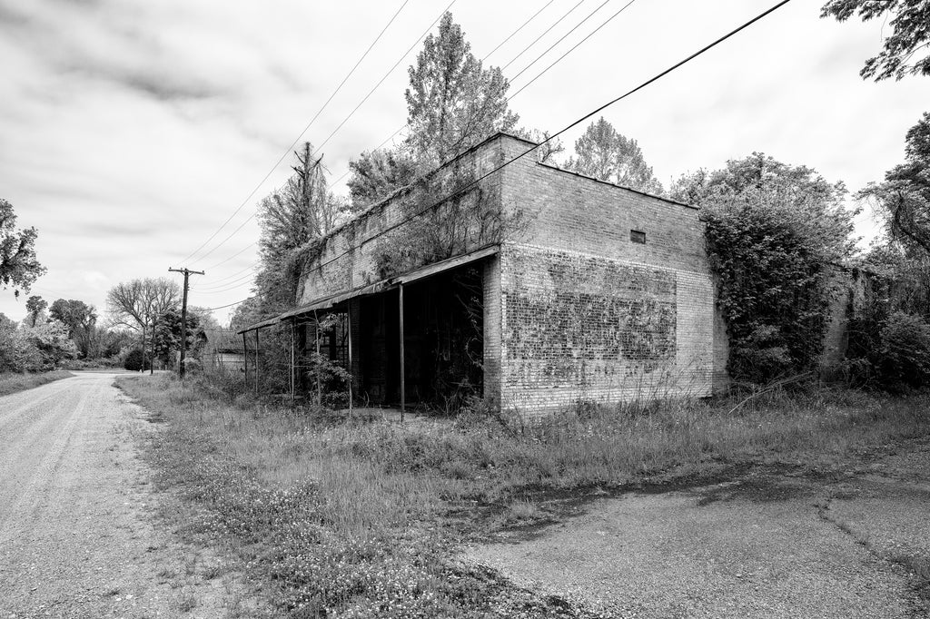
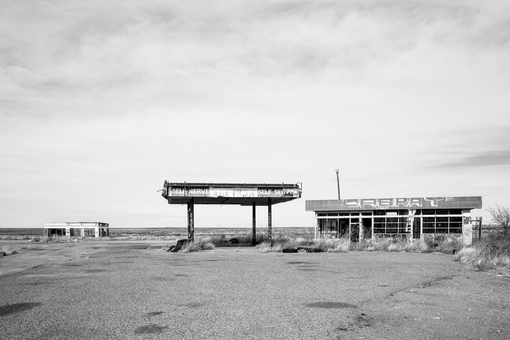
Abandoned, old building, with patterns and environment supporting the subject of the image. The black and white puts more emphasis on line, texture. The composition is quite interesting as well: even though the subject is tilted, it is still in the middle third in the photo, still following the rule of thirds. In the other sections of the thirds, there are plants, roads, and the sky, all highlighting the middle third.
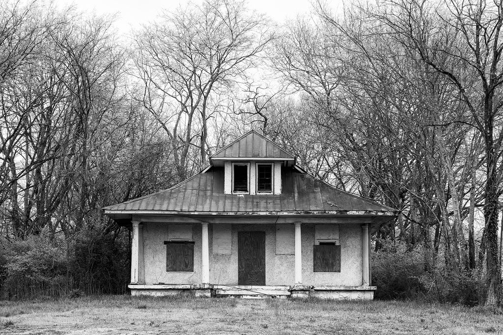
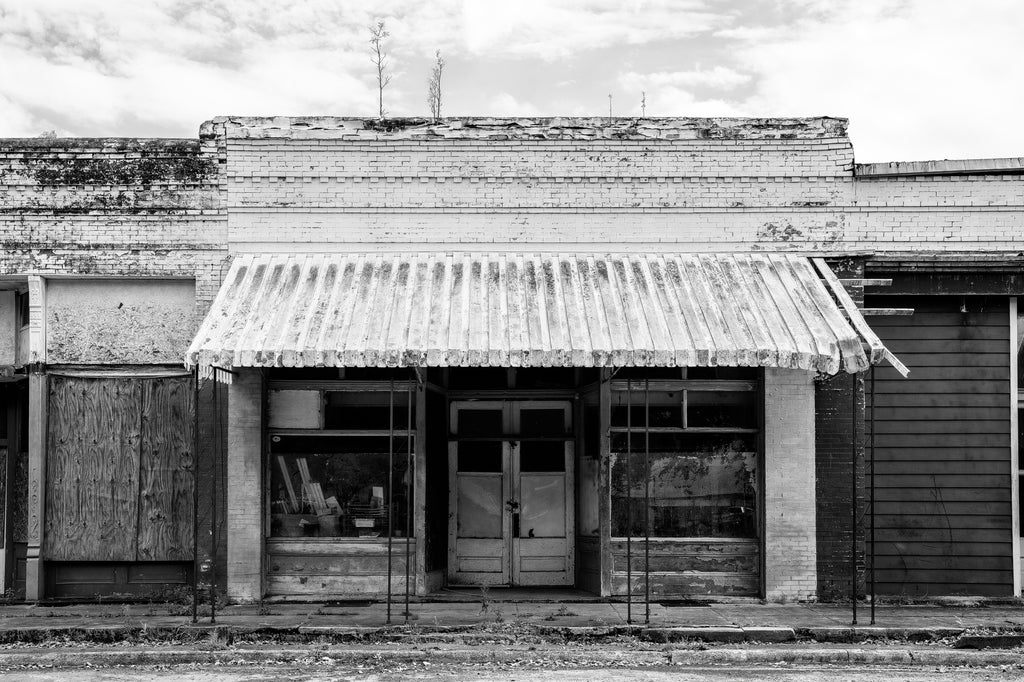
Very symmetrical image of a house. The black and white puts emphasis on composition, as the symmetry becomes visually appealing in this photo, along with the ancient feel of the house. The branches are also pact together, giving a claustrophobic feel, supporting more of the mysteriousness of the ancient house. This gives out the atmosphere of a horror movie, as if murder happened in this house, especially when it is in black and white.
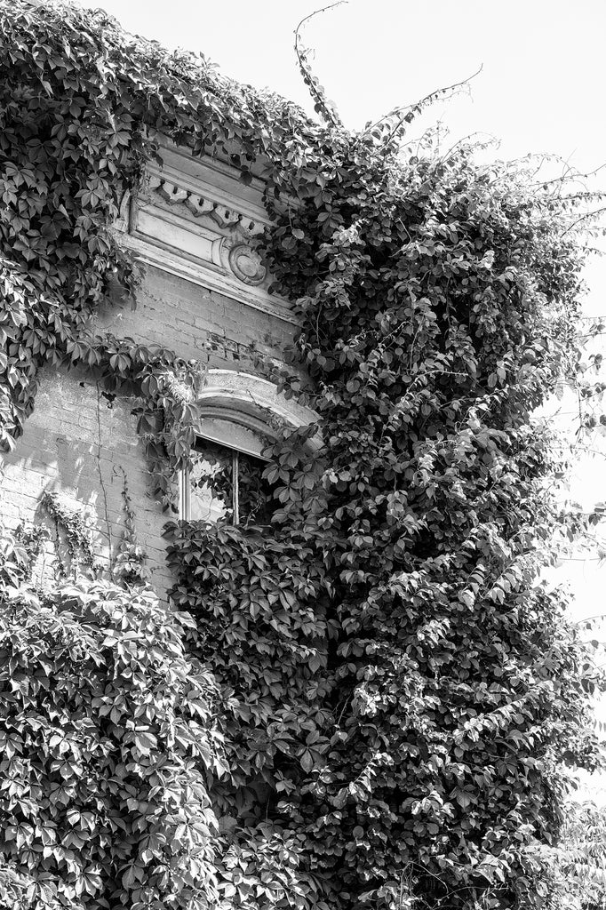
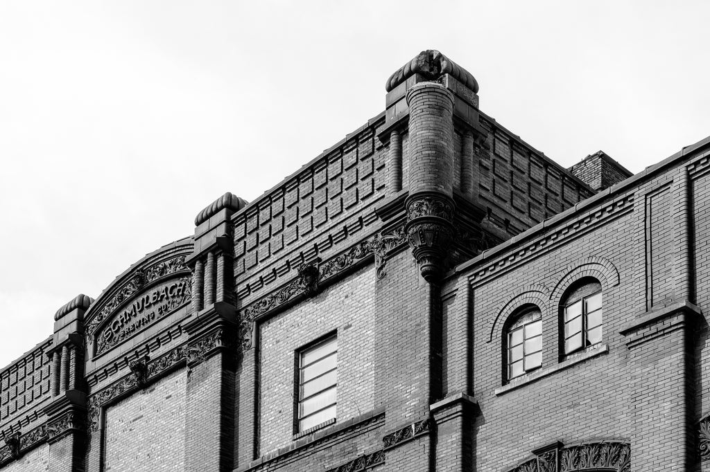
The top of the house is similar to a descending line, making the composition interesting: the rule of the thirds separates the building into the wall, the window in the middle, and the plants growing on the old building.Without color, the author leaves the viewer to better inspect the composition and the reflection in the window. The author is trying to prove the beauty of other elements within a building other than color.
I have chosen this photographer because his works eliminate color and focuses on other elements within the image. His photos of architecture give people the feeling on being abandoned. Many images include rust and broken wood, implying that the architecture is abandoned. I would like a similar approach when approaching 798, but looking for a much more industrial feeling instead of an abandoned feeling. Even though the abandoned feeling of his images do not align with my theme, his images still correlate a lot in terms of my view for architecture photography that is black and white; therefore, I have referenced his work as inspiration as I would like black and white architecture emphasizing lines, patterns, and texture as many of his do emphasize the texture of wood, the lines of the buildings, etc.
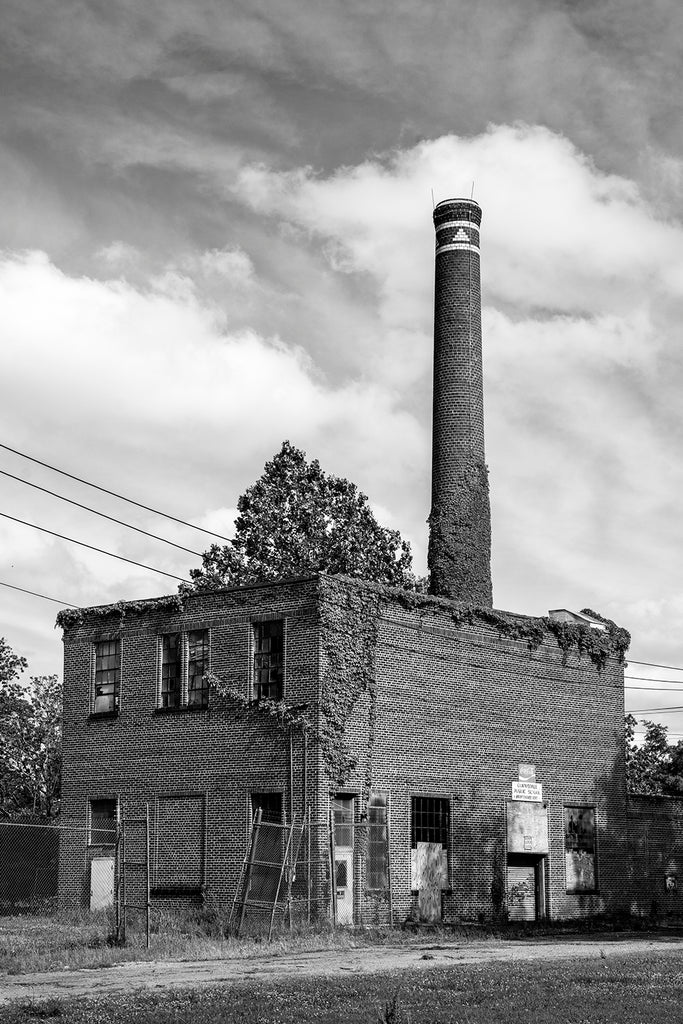
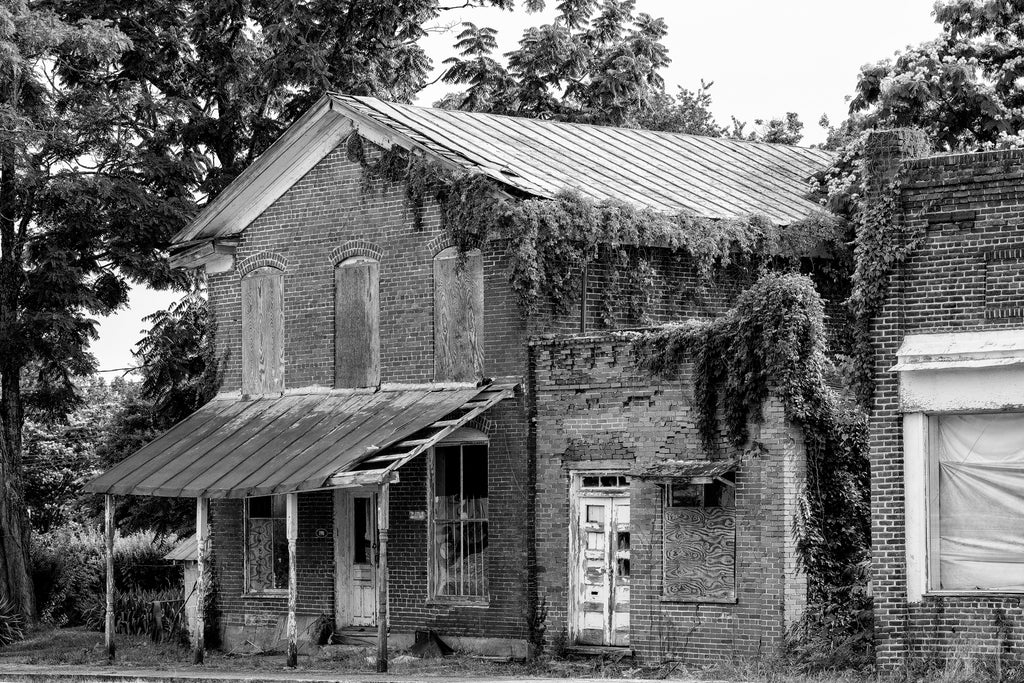
This image is one I will reference the most. I pick this photo because the building has similar aesthetics with 798 factories. The beauty of the chimney with negative space among the sky can create a very visual appealing, industry-feel picture. When seperating this photo with the rule of thirds, two of the thirds are the sky, which is quite interesting, as the author uses the sky to corroborate the chimney. This would be something I like to do. In this photo, the most important element would be the texture. The texture of the bricks and plants on the chimney is what gives this photo an abandoned and ancient feel. The author’s purpose is to create visually appealing photos of abandoned buildings, and this photo succeeded by using texture as there is no distraction in colour, and people are left to look at the patterns of the chimney while the sky provides an interesting and pure background. This photo is abstract as it focuses on texture instead of colour and the traditional purpose of recording photography, and attempts to create a visually appealing photo through the texture element. As previously mentioned, I favor his art style in this photo as it gives an industrial feel from the chimney, and is a black and white photo. This could be very ideal when taking pictures in 798. I will adapt his style as I will look for chimneys and buildings that give an industrial feel and photograph it in black and white.