Identity Project: Mind Map, Mood Board, Artistic Intent

Mind Map

Mood Board

The title of this project is Noir vs. Modern

The cultural issue I want to explore with my photographs is the comparison between the drabness of modern fashion with the glamourous, timeless style of the film noir era. Throughout my life, I’ve been drawn to 60s crime films. The mystery, the suspense, the story, and the characters all made me fall in love with this charismatic genre, but perhaps the most significant and the most representative aspect of the film noir genre is the classic fashion style and shadowed look. I want to replicate this charming style in my identity project, communicating to the audience the glamor, mystery, and charm I felt and loved about this timeless genre.

I want my audience to feel nostalgic, mysterious, alluring, and glamorous.

I will get inspiration and develop my ideas by looking for photographs that might be taken from film noir movies, taking screenshots, and studying the lighting technique, the costume style, and the composition. I will also go on the internet and search “studio film noir photography”

Final Outcome:

Street Photography: Hutong Photography

This is the contact sheet of the street photos I took in the Hutongs.

These are the yellow selections from my contact sheet. I chose these photographs because these photographs matched with the intended look, and had decent focus and composition, and these were all photos that captured rather interesting subjects.

These are the green selections from my yellow selections. I chose these photos because they all capture people either with interesting appearances or had interesting gestures or expressions.

Street Photography: Selecting an Artist

Marie Laigneau

a strangeness in my mind

american fairytales

american fairytales

american fairytales

L1006936-Edit-Edit-2-Edit.jpg

L1005351-Edit-Edit-Edit-Edit.jpg

img_4306-Edit.jpg

a strangeness in my mind

a strangeness in my mind

a strangeness in my mind

american fairytales

Laigneau’s techniques:

  1. Focus on the subject:
  2. Use of shadows:
  3. Capturing faces:
  4. Capturing gestures:
  5. Including environment:

what do you like about their work?

I like Laigneau’s balanced composition. She balances the relationship between her subject with the other elements of the photo. Her subjects are all clearly defined, though not taking over the entire image. I especialltylike her photographs of people walking on the sidewalks of te bridge during a snowy day.

SET 2 PART 2: Experiments

Here is the contact sheet of the photos I took in Pinnacle Plaza trying to recreate the style of Ernst Haas.

Above are the yellow selections of all of my set 2 photographs. These photos all to some extent connect with my vision and share some similarities with Ernst Haas. For example, these photos all feature bold colors.

Above are the green selections from my yellow selection. When I picked these photos, I started to identify certain groups of photographs that go together due to their colors or themes. These photographs share a stronger link to Ernst Haas’ style and my vision.

Above are the red selections of my set 2 photographs. I chose these photographs because they I saw them as two potential combinations for my triptych. All these photographs share the elements of Haas’ photography style and vision, such as strong colors, balanced composition, value, and blur.

The first three photographs share a very orange and warm tonality. The three photographs all convey a different emotion. The first photo due to the cute avocados, makes the photo feel more light-hearted. The green color also helps give the photo a youthful feeling. The second photo is more formal due the the upright composition and the more aesthetic decor such as the flower pot and the wine bottles. The third photo gives off a feeling of solitude.

The second three photographs feature a cooler tonality, consisting of black, grey, silver, and blue. The first photograph uses the bright blue sky color to contrast the dark colors around it. It is also taken from window reflection which creates a double exposure. Similar to Haas’ photos of the reflections through the windows of stores in New York. The second photo features the motion blur that Haas is famous for, it depicts a moving car, inspired by Haas’ photographs of moving cars on the streets of New York. The third photograph is similar to the first photograph. It uses the big greenish-yellow avocado poster to contrast the dark space on the right side of the photo. Looking into the dark space you discover that it is an indoor expanse and that this photo is a reflection taken through a window.

In my next shoot, I will try to go to a better location that resembles more of a city, so it is similar to Haas’ street photography style. I also shall take more pictures of people because photographs of people usually have more storytelling qualities to them.

Set 2: New Vision:

Ernst Haas

California, USA, 1976 © Ernst Haas, courtesy Steidl Books

These 5 characteristics Define Haas’ Photography:

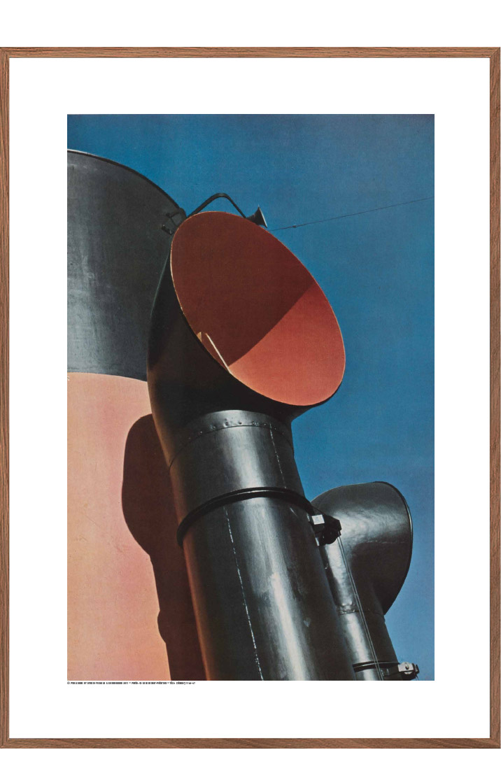
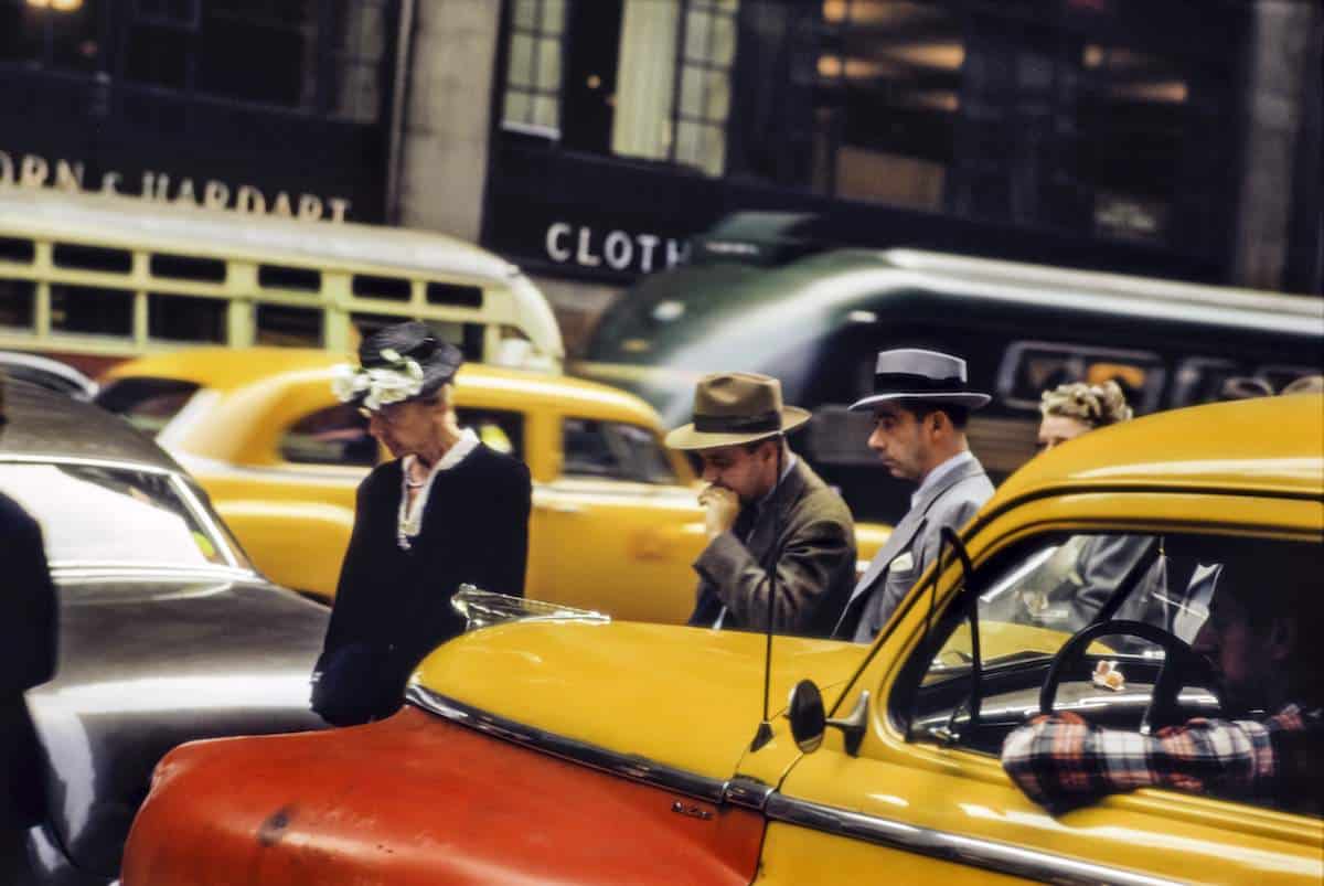
  • Colors: In Haas’ photography, the main subjects of his photos possess distinct colors. Some with a big coverage of a single color, some bombarded with a wide range of colors. The colors create focal points so the audience’s eyes don’t wander around the image. The dynamic colors can communicate certain emotions to the audience. For instance, the third picture consists of many warm colors like yellow and orange, these colors settle the audience to sense a cozy, comfortable feeling.
  • Balanced Composition: Haa’s compositions in each photo are equal and comfortable to look at, with no subject, color, or element taking over the image. Haas in many of his photos abides by standard photography composition rules such as the rule of thirds or centered subjects. You can see this in photos number three and five which Haas uses the rule of thirds. This makes his photos look familiar because they are similar to many standard photos that follow the standard photography rules. But many other of his photographs, he breaks the rules but still maintains the balance in his composition.
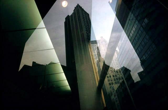
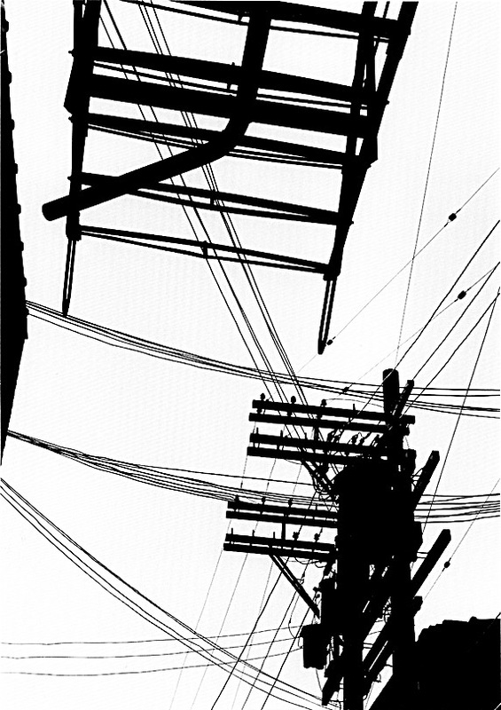
  • Depth: In almost all of his photos, Haas includes subjects of far and close. This makes the photos look realistic because it resembles the experiences of the human eye which in everyday life, you will see things that are close and far at the same time. The depth of his photographs causes the audience to look at the subject that is closer, then look at the subject that is far away (sometimes starting with the farther subjects and landing on the closer subjects). This sequence adds a level of storytelling to the photographs. For example, in photo number two, your eyes will first land on the metal pole thing, then move to the white buildings in the background.
  • Motion Blur: In many of Haas’ photographs, he utilizes a slow shutter speed to achieve a blur or mush on his subjects to create a sense of motion and dynamics. It also provides a unique experience to the audience because the blurriness is a different experience than the stillness that the human eye will see in everyday life. The seemingly moving subjects also create the illusion that the scene captured by the camera is happening right now.
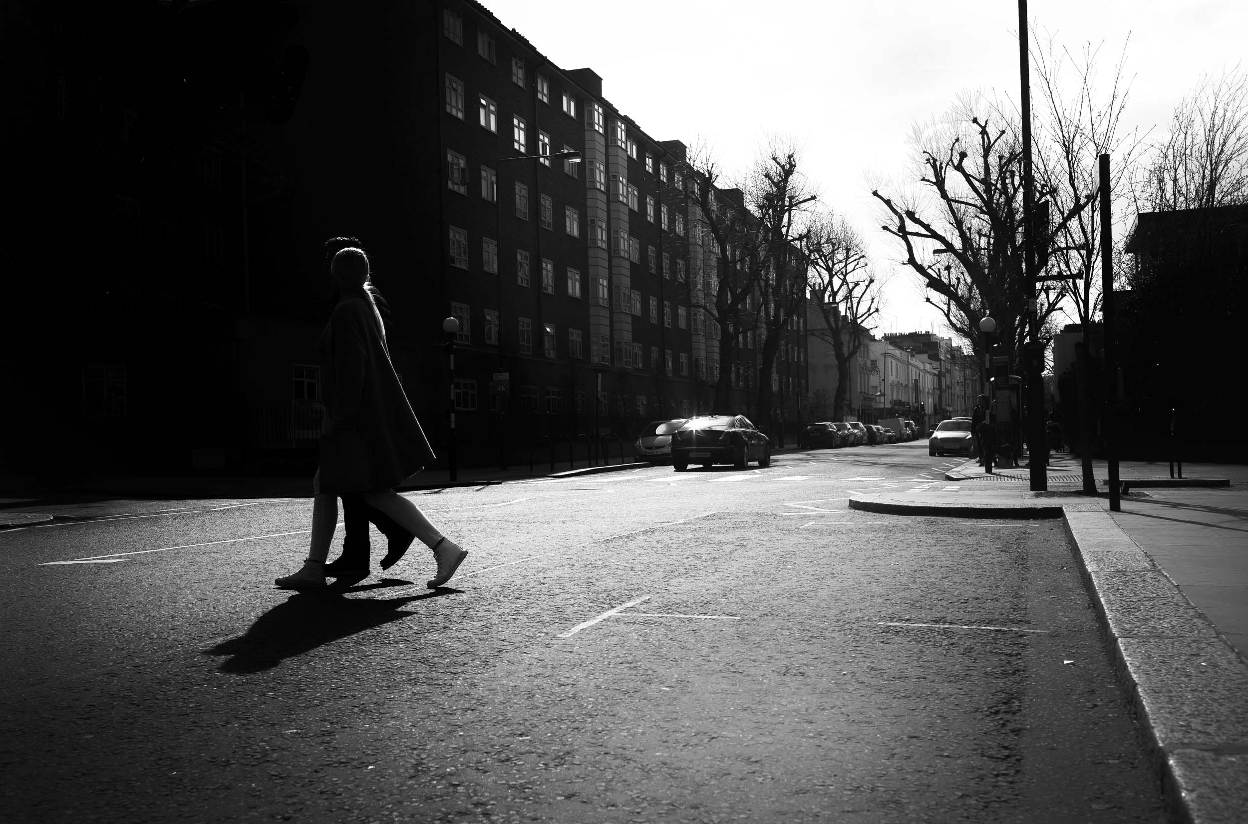
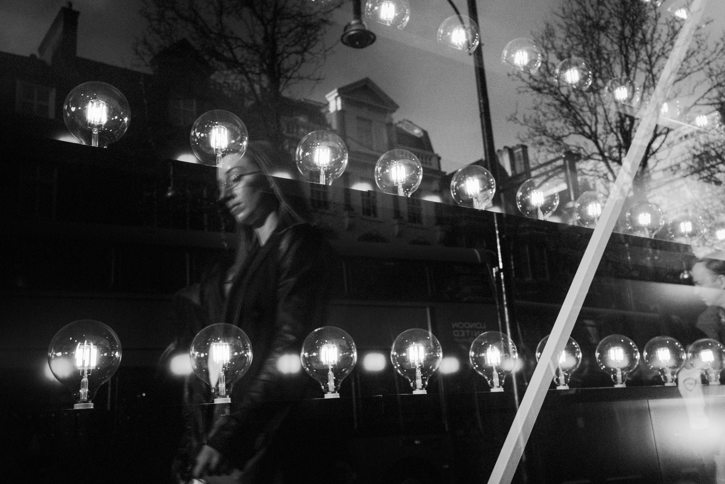
  • Spontaneity: Haas’ photographs are never staged because he is a street photographer. Because it isn’t staged, it makes his subjects feel “every day”, like something you would see on a casual Tuesday morning. And because Haas is able to capture everyday subjects in a way that is totally unique, it gives the audience a level of astonishment in seeing that normal subjects in their lives can be captured in ways they haven’t considered before.

Why Haas?

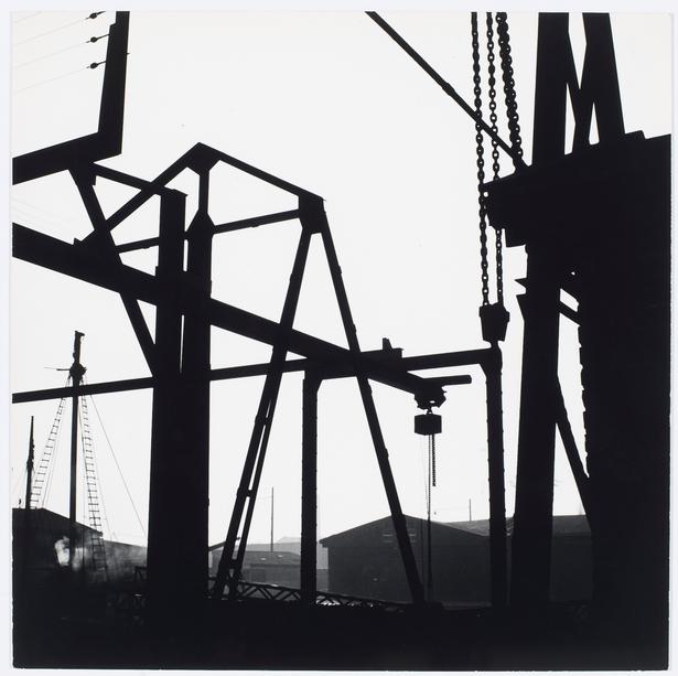
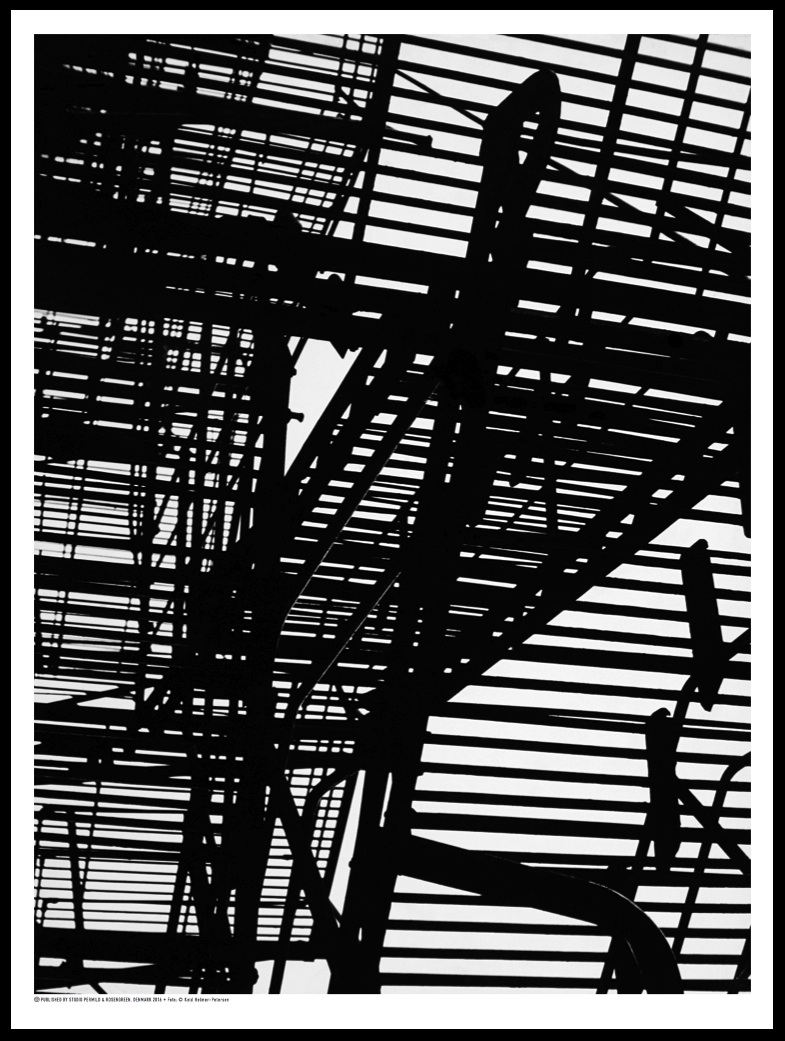
I chose Ernst Haas as my photographer because I have always been drawn to his street photography style, and how spontaneous it is. But despite its spontaneity, Haas has always managed to include story-telling and convey emotions through his photographs, and that is something I would like to recreate. Another reason is that my previous photographer was Keld Helmer-Petersen, whose works are very B&W and high contrast, which is very different from Ernst Haas. I want to add variety to my learning of photography and portfolio, so that’s why Ernst Haas appealed to me. Ernst Haas relates to my vision because his photographs communicate a variety of emotions, and manages to imply sequences in his subjects, which matches my vision of trying to convey emotions and story-telling.

“I am not interested in shooting new things – I am interested to see things new.”

I chose this quote by Ernst Haas because it shows his approach and attitude towards photography. He says that he is not interested in shooting new things, which means that he believes that ordinary, everyday subjects can be made more interesting compared to some unorthodox, exotic object that is only interesting for a moment until your eyes get used to it. Haas expresses that he wants to see things new, which means that his approach to his subjects is to capture them in a way that normal people haven’t seen before in their day-to-day lives. This quote is very helpful for me because it gives me perspective as to how a master like Ernst Haas approaches his work, it helps me critique my own photography process when I’m trying to emulate him.

Analysing Haas

•Why did you choose this image in particular?

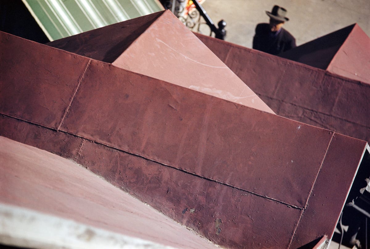
I chose this photograph because this is the most “obviously abstract” photograph of Haas that I’ve seen so far. It features a roof-like structure which is difficult to identify due to the way Haas took this photo. I like this photo because of the varied tonality of the color red. The varied red color makes the photo interesting and dynamic, while also accentuating shapes and lines that also make the photo interesting. The combination of colors also looks very good, with the combination of red, green, white, black, and grey, a very comfortable color palette to look at.

What I find most surprising about this photo is the feeling of sequence you get from looking at this photo. Your eyes are first caught by the texture of the top layer of the red roof, then your eyes are guided to go down level by level like you are walking down some stairs. Then finally, your eyes land on the man, but your eyes are then guided back to the top of the roof by the direction the man is looking at. This sequence creates a cycle that makes your eyes navigate through the photo with clear directions instead of just wandering around. The photo gives you distinct focal points to rest your eyes on, while also suggesting your eyes to go somewhere else that’s also interesting. This really amazed me.

One of the important variables of this photo is value/tone. Notice how the sunlight sprinkles over the roof structure. due to the roof structure’s dynamic shape, it creates many bright and shadowed areas. This brings out many shades of red, some light and some dark. This contrasting tonality is what gives birth to the other elements of this photo. For example, the contrasting tonality really helps accentuate many rigid shapes such as rectangles and triangles that make the photo look interesting. The contrasting tonality also brings out guiding lines, which its effect is discussed in the previous paragraph.

I think Haas is abstract because of his clever and masterful use of abstract photography elements despite being a street photographer. Unlike conventional abstract photographers like Aaron Siskind or Uta Barth who manipulate their elements to diminish the connection between their subjects to the real world. Haas uses the same abstract elements as them but still captures the real world in a sense that is apparent to the audience. But at the same time, he presents the real world from unique perspectives, in ways you haven’t considered before. An example, when he is photographing cars, you can tell that he is photographing cars, but he uses abstract elements such as blurring to make the cars have motion blur, which makes the photograph look interesting.

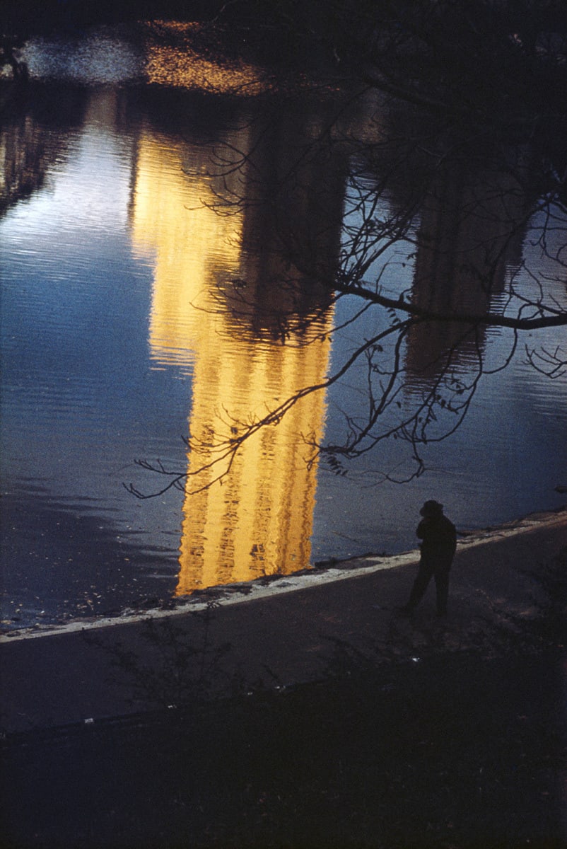
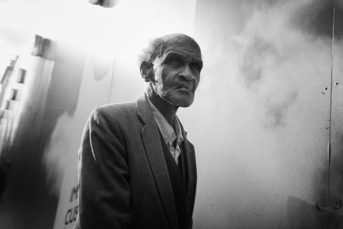
What I like about the style of Haas is the story-telling aspect. In his photographs, there is always a perceivable sequence or a strong emotion that suggests a story. Like in the first photo, the man seems to be a bit melancholy, it feels like he’s just been through something and decided to wander around in Central Park to straighten his thoughts. Another thing I like about Haas’ style is his bold use of color, colors are a really powerful emotion-conveying tool. The use of different combinations of colors, the use of vibrant colors, the use of warm colors, the use of cool colors, the use of only a single color, the use of a bombardment of colors. Using the first photo as an example again, the photograph features dark and cool colors like black, grey, and blue. Creating a calm, melancholy feel.

I will try to use bold colors to try to communicate certain emotions or create a certain mood or atmosphere. Like Haas, who uses colors to capture the different scenes of New York City. I also will emulate his storytelling, trying to capture things that will make the audience imagine what’s not in the photo or what is going to happen. Lastly, I will use slow shutter speed to create motion blur, a thing that Haas does commonly and is what he is famous for. I will use motion blur to capture moving subjects like cars to create a sense of movement, which really captures the quintessential street photography experience.

Vision:

To use colors and composition, to capture the beauty of everyday subjects and use them to convey emotions that will connect with the audience. I will try to emulate the style of Ernst Haas, more specifically his colored photographs of New York. In the photographs that I will take in Pinnacle Plaza, I will try to embody the spontaneity of street photography and the experimental and conceptual aspects of abstract photography. By utilizing mainly colors and balanced phraming.

Set 1 – 798 Photographs

CONTACT SHEET

YELLOW

This contact sheet features the  Yellow selection of photos I took at 798. I chose these photos because they best align with my intent of replicating the B&W, high-contrast style of Keld Helmer-Petersen. Petersen’s style is highlighted by its capturing of tones, lines, and shapes. Though some of my photos wouldn’t visually resemble Petersen’s photos, I believe the utilization of formal elements is consistent. In other words, I believe my photos might not look like Petersen’s photos, but they both depict the same formal elements (shapes, lines, tone). For example, my photo depicts a reflective compartment of a motorbike, which visually, doesn’t look like the typical-Petersen-high-contrast photography. But notice like Petersen, my photo depicts shapes, lines, and tones.

GREEN

These are my Green selections. I chose these photos because I find these photos to be the most aligned with my vision and the style of Kld Helmer-Petersen. Some of the pictures in my yellow selections might share the same formal elements, but they do not visually resemble the work of Petersen. Whereas, all the photos in this Green selection are visually similar to Petersen’s high-contrast, B&W photographs. The attempt to emulate my Petersen can be quite apparently seen in these Green photos.

RED

I chose these photographs as my Red selection because these photographs I believe these photographs possess the most distinct similarities with Petersen’s photographs. The first photo distinctly captures the shape of a sphere and the circle shape is highlighted by the high contrast tonality and technique. The shape and the fluid patterns of the wires are also depicted. The second photo like the first photo, captures the same subjects and utilizes the same techniques and elements. The third photo is distinct in its unorthodox shapes and the organic lines of the branch. The sky behind it also serves as a contrasting tonality that highlights the branch. The fifth photo is similar to the third photo. The fourth photo depicts the shapes formed by the structures of buildings. The big shadows of the structures in ratio to the negative white space are equal to each other which is also a usually unidentified element of Petersen’s photographs, it creates balance within the photo and no tonality is overpowering the other. All of these photos collectively focus on the shapes, lines, and patterns created and depicted by objects and structures that match the qualities of Petersen’s work.

SETS PART 1: Select an artist

Photographer: Keld Helmer-Petersen

KELD HELMER-PETERSENBlack Light - Tallis A-Level PhotographyçHelmer-Petersen, Pylon, Kastrup 1956 - Posters - Permild & RosengreenPrabookKeld Helmer-Petersen: 100 Years! | LFI BlogPrabookHelmer-Petersen, Chimney 1946-47 - Plakater - Permild & RosengreenKeld Helmer-Petersen: Photographs 1941–2013' is a revelation

In Petersen’s photographs, 5 characteristics that stand out are:

  1. High contrast colors. No matter if the photograph is colored or black-and-white, Petersen always utilizes colors to add dynamics to his photographs. Petersen generally only uses around 1-4 colors in his photographs maximum. The colors highlight and distinguish each subject from another, accentuating shape, line, and tone, and blurring the texture of the subjects.
  2. Extreme tonality. In the black-and-white photos of this collection. Peterson exploits the results of shadows and high aperture to create an extremely mono-tone look for his photographs. The tonality completely takes away the aspect of texture and brings all the focus of the audience to the shape and lines of the photograph. With colored photographs, the lack of texture makes them look like paintings which resembles pictorialism. For black-and-white photos, it makes it appear like a 2D print. The tonality also makes the photo appear 2D.
  3. Sharp focus. In Petersen’s photographs, practically everything is in extreme focus. Having sharp focus really defines the silhouettes of objects and defines whereas soft focus will blur them.
  4. Defined Lines. In Petersen’s photographs, the utilization of lines, which is present in most of Petersen’s work, draws and leads the eyes of the audience toward different places and subjects of the photographs, creating engagement and dynamics. Lines are also commonly used as patterns by Peterson, some of his photographs are bombarded with lines like the 6th photo in his collection.
  5. Defined shapes. A variety of defined shapes are featured in Petersen’s photos. The shapes can be rigid and sharp, or they can be curvy and round. Shapes are often the main theme Petersen tries to capture. The extraction of shapes offers the audience a unique perspective on everyday subjects.

Reason for Selection:

Keld Helmer-Petersen’s photographs are very similar to my vision because Petersen has a large collection of photographs of shadows. These photos of shadows commonly accentuate the shapes, lines, and patterns created by the shadows. It is in alignment with my own vision because my vision is to demonstrate the beauty that can be created through the shapes, lines, and patterns of shadows, and Petersen’s photographs are nothing less than wonderful to look at.

“I don’t want my pictures to ‘look like something.’ They should just look like pictures.” – Keld Helmer-Petersen.

I chose this quote from Petersen because to me it just captures the quintessential spirit of abstract photography, as it is not about depicting meaning or aesthetic through its content, but about capturing some thing, some moment, or some aura for what they are. What Petersen expresses through these words aligns with the essence of his own work. His photographs capture a shadow of a building, a smoke funnel, a set of colors, a pattern of lines simple for what they are. No added meanings, no implications, no intentional alterings, minimum complexity. Just plain and simple everyday things.

Evaluation of Petersen’s Photography:

Helmer-Petersen, Chimney 1946-47 - Plakater - Permild & Rosengreen

I chose this photograph of Petersen in particular because this photo embodies the essential elements that appear in most of Petersen’s different works. The use of shapes and lines just astonishes me, how Petersen was able to capture the contours of the smoke funnel in a way that presents and distinguishes itself so interestingly. What also amazes me is how Petersen was able to capture the clash of colors in this photo. The colors are not complicated, just simply 3 colors, red, black, and blue. It is composed so that the blue sky takes up 1/2 of the photo and the red and black funnels take up the other half. Lastly, the most important reason why I chose this photo is because Petersen didn’t take this image for what it depicted, but for what it is, and it’s something I strive to replicate in my own photography.

What I find the most surprising about this photo is how “unsurprising” this photo is. In other words, how simple this photo is. The marvel of Petersen in this photo to me was how he was able to capture both the ordinariness and the un-ordinariness of a simple smoke funnel combined with a dash of blue sky. Petersen takes something that is every day and makes it interesting like you have never seen it before. A feat that is incredibly difficult to perform.

The most important formal element in this picture I believe is Shape. In this photo, the shape of the funnels is accentuated and serves as a guide for the audience’s eyes to explore the photo. When the audience looks at this photo, they will start with the funnel itself, then follow the cylinder shape of the tube all the way up to the oval-shaped opening of the funnel. The shape of the opening of the smoke funnel is distinct and serves as the focal point of the photo where the audience’s eyes will linger. The outline of the entire funnel structure creates a unique shape. It offers the audience a different perspective of observation that they normally wouldn’t have been able to discover in their own lives. At the same time, the funnel structure also outlines and creates the unorthodox shape of the blue sky, which also makes this photo very interesting. It is fascinating to see how the weave of two uniquely different shapes accompany each other.

I believe Petersen’s works are abstract because his photographs offer his audience a new unique perspective on ordinary things. By emphasizing and obscuring certain elements and details, Petersen manages to sprout new concepts and meanings out of predetermined subjects. Yet, another thing Petersen was able to do was that his photographs were also not focused on what message or emotion it is trying to get across, rather he focused on what they are. These two concepts seem to contradict each other, but Petersen managed to balance the two approaches perfectly.

I like how Petersen was able to challenge the audience to identify the subject of his photo by using high contrast. The high contrast can complement and bring out many unusual shapes and patterns that are very interesting to see. I also thoroughly enjoy Petersen’s masterful yet subtle compositions for his photographs.

I am really inspired by Petersen’s approach to creating new meaning out of existing subjects. I will try my best to incorporate this into my own photography in 798 by trying to take different elements and see what meaning they would produce when put together. Also, I really admire how Petersen was able to make choices to capture something not based on what it conveyed, but for what it truly is.

ABSTRACTION: Blog 8

The Shape of Darkness:

The message of my photographs will be to extract beauty from the dynamics created by shadows and light and also offer a new perspective into the world of shadow and darkness. I want my audiences to find astonishment through the simple yet unique shapes, lines, patterns, and tones created by shadows. For inspiration, I will aim to find photographs with high contrast and shot in black-and-white. I would also try to find photos that experiment with tones and shapes. Nowadays, most photographs we see are multi-colored, complex, and filled. It stems from the idea that “complexity is better.” I want to challenge that idea by shooting with a minimalist approach. Utilizing one of the most common things around us as the main subject, shadows. Proving that something as insignificant as some pieces of shade can possess astonishing visual content.

ABSTRACTION: Blog 5

Aaron Siskind as City Documentarian - The New York Times

Watermelon Man – Aaron Siskind

In this photograph, Photographer Aaron Siskind intended to capture the man standing on the back of the truck full of watermelons. Siskind also wanted to capture the man’s gaze and the buildings to the left and right of the man.

If I were the photographer, I would name this picture “Which Path Does the Melon Lead?” The reason being, that I noticed how the buildings on the right side were dark in tone and the buildings on the right were brighter. I can see that the man’s gaze and the watermelon slice that he is holding both are pointing toward the direction of the brighter buildings. It gave me the idea that it symbolizes that man is choosing light instead of darkness.

The photograph features the top of the buildings forming a line that leads the audience’s eyes to the man. The man’s gaze and the direction of his watermelon slice both diverge the audience’s gaze to the top left of the picture. The shapes featured in this picture are usually sharp, aside from the watermelons and the man with his hat. The most distinct shape of the photo is the triangle which is the melon slice that the man is holding. There is no noticeable pattern in this picture. The picture is taken from far away so it lacks texture, the most distinct textures are the man’s clothing which is soft and wrinkly, and the brick wall of the buildings. The picture’s darkest tone is the shadow of the truck and the brightest tone is the building on the left. The interesting thing is that the two opposite buildings have a contrast in tone, one is bright while the other is dark. The focus of the picture is on the man, and the background is a little blurred. Overall the picture’s focus is pretty clear.

Skip to toolbar