CONTACT SHEET


YELLOW

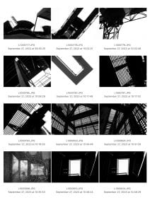

This contact sheet features the Yellow selection of photos I took at 798. I chose these photos because they best align with my intent of replicating the B&W, high-contrast style of Keld Helmer-Petersen. Petersen’s style is highlighted by its capturing of tones, lines, and shapes. Though some of my photos wouldn’t visually resemble Petersen’s photos, I believe the utilization of formal elements is consistent. In other words, I believe my photos might not look like Petersen’s photos, but they both depict the same formal elements (shapes, lines, tone). For example, my photo depicts a reflective compartment of a motorbike, which visually, doesn’t look like the typical-Petersen-high-contrast photography. But notice like Petersen, my photo depicts shapes, lines, and tones.
GREEN

These are my Green selections. I chose these photos because I find these photos to be the most aligned with my vision and the style of Kld Helmer-Petersen. Some of the pictures in my yellow selections might share the same formal elements, but they do not visually resemble the work of Petersen. Whereas, all the photos in this Green selection are visually similar to Petersen’s high-contrast, B&W photographs. The attempt to emulate my Petersen can be quite apparently seen in these Green photos.
RED

I chose these photographs as my Red selection because these photographs I believe these photographs possess the most distinct similarities with Petersen’s photographs. The first photo distinctly captures the shape of a sphere and the circle shape is highlighted by the high contrast tonality and technique. The shape and the fluid patterns of the wires are also depicted. The second photo like the first photo, captures the same subjects and utilizes the same techniques and elements. The third photo is distinct in its unorthodox shapes and the organic lines of the branch. The sky behind it also serves as a contrasting tonality that highlights the branch. The fifth photo is similar to the third photo. The fourth photo depicts the shapes formed by the structures of buildings. The big shadows of the structures in ratio to the negative white space are equal to each other which is also a usually unidentified element of Petersen’s photographs, it creates balance within the photo and no tonality is overpowering the other. All of these photos collectively focus on the shapes, lines, and patterns created and depicted by objects and structures that match the qualities of Petersen’s work.