Identity Project: Mind Map, Mood Board, Artistic Intent

Mind Map

Mood Board

The title of this project is Noir vs. Modern

The cultural issue I want to explore with my photographs is the comparison between the drabness of modern fashion with the glamourous, timeless style of the film noir era. Throughout my life, I’ve been drawn to 60s crime films. The mystery, the suspense, the story, and the characters all made me fall in love with this charismatic genre, but perhaps the most significant and the most representative aspect of the film noir genre is the classic fashion style and shadowed look. I want to replicate this charming style in my identity project, communicating to the audience the glamor, mystery, and charm I felt and loved about this timeless genre.

I want my audience to feel nostalgic, mysterious, alluring, and glamorous.

I will get inspiration and develop my ideas by looking for photographs that might be taken from film noir movies, taking screenshots, and studying the lighting technique, the costume style, and the composition. I will also go on the internet and search “studio film noir photography”

Final Outcome:

SETS PART 1: Select an artist

Photographer: Keld Helmer-Petersen

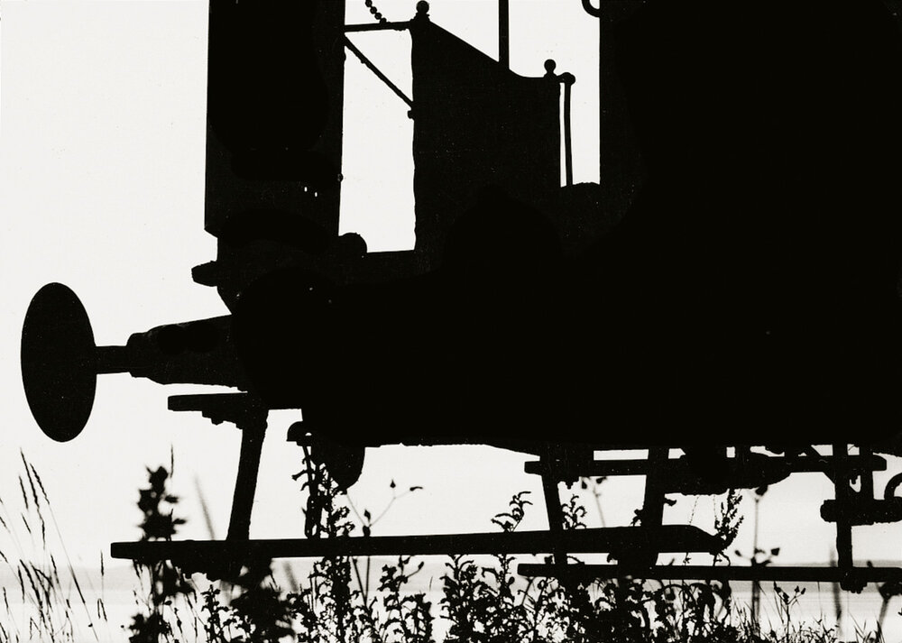
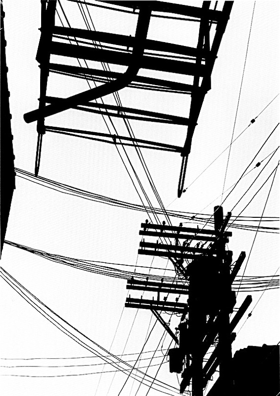
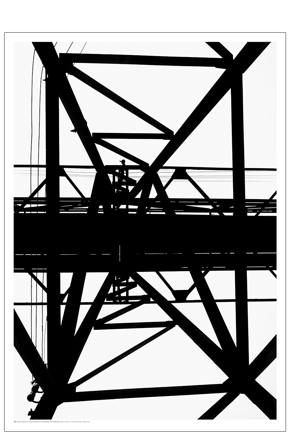
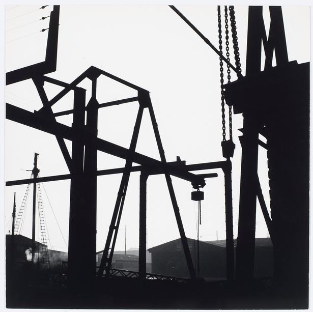
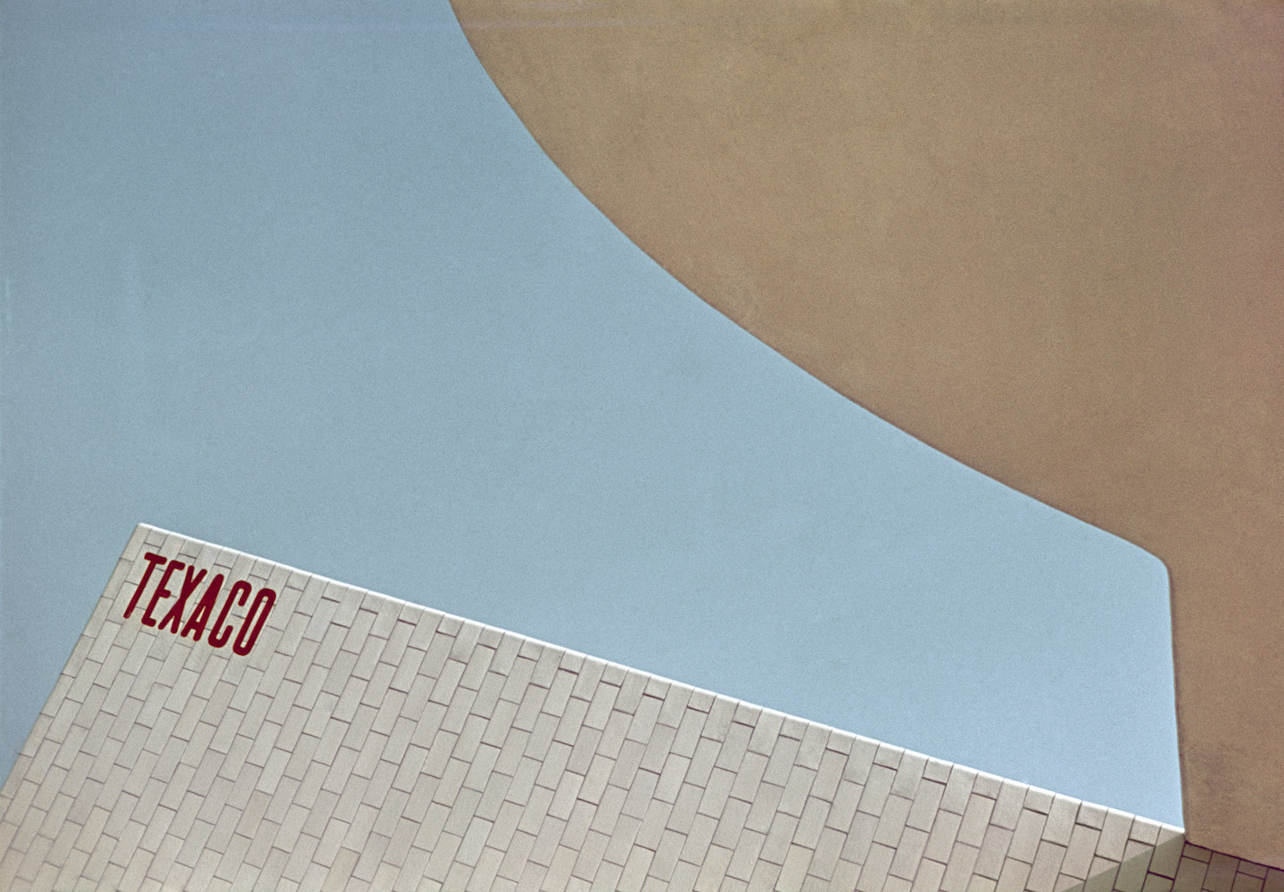
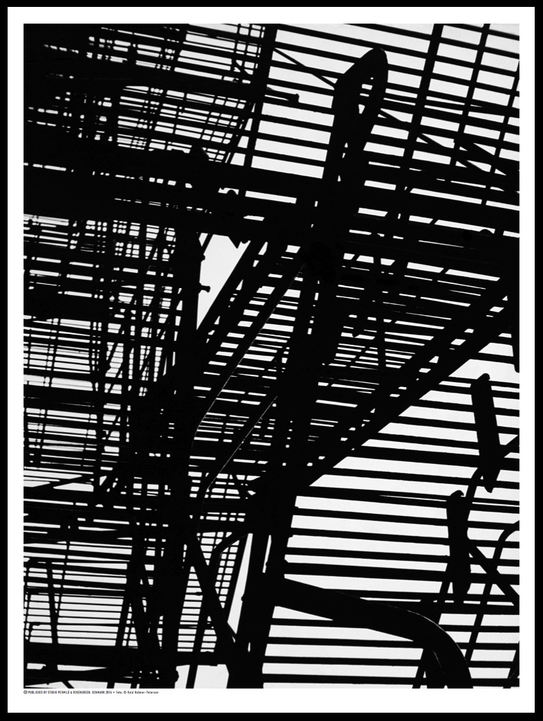
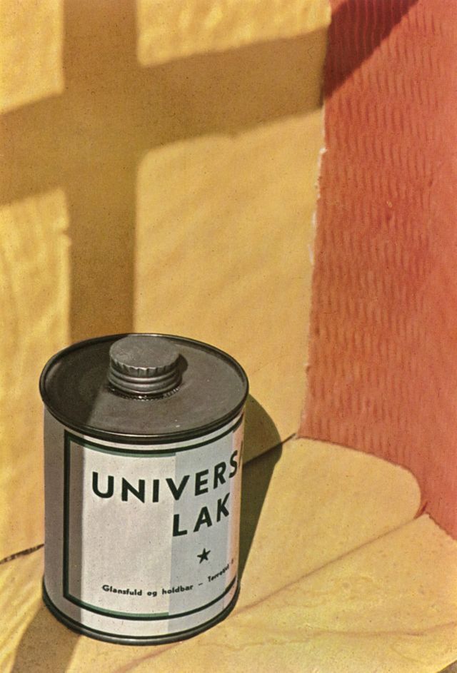
KELD HELMER-PETERSENBlack Light - Tallis A-Level PhotographyçHelmer-Petersen, Pylon, Kastrup 1956 - Posters - Permild & RosengreenPrabookKeld Helmer-Petersen: 100 Years! | LFI BlogPrabookHelmer-Petersen, Chimney 1946-47 - Plakater - Permild & RosengreenKeld Helmer-Petersen: Photographs 1941–2013' is a revelation

In Petersen’s photographs, 5 characteristics that stand out are:

  1. High contrast colors. No matter if the photograph is colored or black-and-white, Petersen always utilizes colors to add dynamics to his photographs. Petersen generally only uses around 1-4 colors in his photographs maximum. The colors highlight and distinguish each subject from another, accentuating shape, line, and tone, and blurring the texture of the subjects.
  2. Extreme tonality. In the black-and-white photos of this collection. Peterson exploits the results of shadows and high aperture to create an extremely mono-tone look for his photographs. The tonality completely takes away the aspect of texture and brings all the focus of the audience to the shape and lines of the photograph. With colored photographs, the lack of texture makes them look like paintings which resembles pictorialism. For black-and-white photos, it makes it appear like a 2D print. The tonality also makes the photo appear 2D.
  3. Sharp focus. In Petersen’s photographs, practically everything is in extreme focus. Having sharp focus really defines the silhouettes of objects and defines whereas soft focus will blur them.
  4. Defined Lines. In Petersen’s photographs, the utilization of lines, which is present in most of Petersen’s work, draws and leads the eyes of the audience toward different places and subjects of the photographs, creating engagement and dynamics. Lines are also commonly used as patterns by Peterson, some of his photographs are bombarded with lines like the 6th photo in his collection.
  5. Defined shapes. A variety of defined shapes are featured in Petersen’s photos. The shapes can be rigid and sharp, or they can be curvy and round. Shapes are often the main theme Petersen tries to capture. The extraction of shapes offers the audience a unique perspective on everyday subjects.

Reason for Selection:

Keld Helmer-Petersen’s photographs are very similar to my vision because Petersen has a large collection of photographs of shadows. These photos of shadows commonly accentuate the shapes, lines, and patterns created by the shadows. It is in alignment with my own vision because my vision is to demonstrate the beauty that can be created through the shapes, lines, and patterns of shadows, and Petersen’s photographs are nothing less than wonderful to look at.

“I don’t want my pictures to ‘look like something.’ They should just look like pictures.” – Keld Helmer-Petersen.

I chose this quote from Petersen because to me it just captures the quintessential spirit of abstract photography, as it is not about depicting meaning or aesthetic through its content, but about capturing some thing, some moment, or some aura for what they are. What Petersen expresses through these words aligns with the essence of his own work. His photographs capture a shadow of a building, a smoke funnel, a set of colors, a pattern of lines simple for what they are. No added meanings, no implications, no intentional alterings, minimum complexity. Just plain and simple everyday things.

Evaluation of Petersen’s Photography:

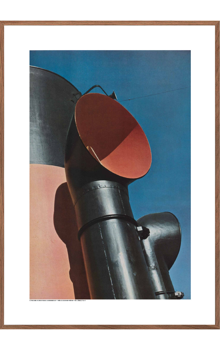
Helmer-Petersen, Chimney 1946-47 - Plakater - Permild & Rosengreen

I chose this photograph of Petersen in particular because this photo embodies the essential elements that appear in most of Petersen’s different works. The use of shapes and lines just astonishes me, how Petersen was able to capture the contours of the smoke funnel in a way that presents and distinguishes itself so interestingly. What also amazes me is how Petersen was able to capture the clash of colors in this photo. The colors are not complicated, just simply 3 colors, red, black, and blue. It is composed so that the blue sky takes up 1/2 of the photo and the red and black funnels take up the other half. Lastly, the most important reason why I chose this photo is because Petersen didn’t take this image for what it depicted, but for what it is, and it’s something I strive to replicate in my own photography.

What I find the most surprising about this photo is how “unsurprising” this photo is. In other words, how simple this photo is. The marvel of Petersen in this photo to me was how he was able to capture both the ordinariness and the un-ordinariness of a simple smoke funnel combined with a dash of blue sky. Petersen takes something that is every day and makes it interesting like you have never seen it before. A feat that is incredibly difficult to perform.

The most important formal element in this picture I believe is Shape. In this photo, the shape of the funnels is accentuated and serves as a guide for the audience’s eyes to explore the photo. When the audience looks at this photo, they will start with the funnel itself, then follow the cylinder shape of the tube all the way up to the oval-shaped opening of the funnel. The shape of the opening of the smoke funnel is distinct and serves as the focal point of the photo where the audience’s eyes will linger. The outline of the entire funnel structure creates a unique shape. It offers the audience a different perspective of observation that they normally wouldn’t have been able to discover in their own lives. At the same time, the funnel structure also outlines and creates the unorthodox shape of the blue sky, which also makes this photo very interesting. It is fascinating to see how the weave of two uniquely different shapes accompany each other.

I believe Petersen’s works are abstract because his photographs offer his audience a new unique perspective on ordinary things. By emphasizing and obscuring certain elements and details, Petersen manages to sprout new concepts and meanings out of predetermined subjects. Yet, another thing Petersen was able to do was that his photographs were also not focused on what message or emotion it is trying to get across, rather he focused on what they are. These two concepts seem to contradict each other, but Petersen managed to balance the two approaches perfectly.

I like how Petersen was able to challenge the audience to identify the subject of his photo by using high contrast. The high contrast can complement and bring out many unusual shapes and patterns that are very interesting to see. I also thoroughly enjoy Petersen’s masterful yet subtle compositions for his photographs.

I am really inspired by Petersen’s approach to creating new meaning out of existing subjects. I will try my best to incorporate this into my own photography in 798 by trying to take different elements and see what meaning they would produce when put together. Also, I really admire how Petersen was able to make choices to capture something not based on what it conveyed, but for what it truly is.

ABSTRACTION: Blog #4

What are Formal Elements in photography?

  • Formal elements can be defined as the visual devices and components a photographer can manipulate to convey meaning and make their pictures more interesting. Formal elements of photography include lines, shapes, patterns, texture, tone, and focus.

Lines:

Using Lines to Improve Photographic Composition - The Photo Argus

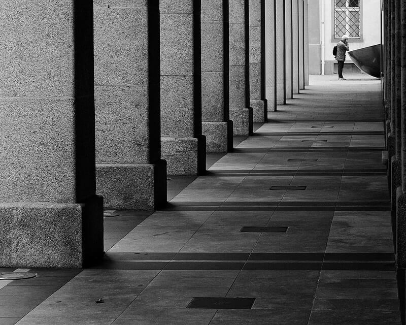
Manuel Buetti – Arcade Chur

In this picture, the photographer utilizes lines formed from shadows from the pillars, the outline of the hallway, and the tiles of the floor, to lead the audience’s eyes to the subject which is the person at the end of the hallway. The lines also create energy of movement, that reaches from the start to the end of the hallway.

Shape:

Shape & Form

http://photodomain.com.au/photography/shape-and-form/

In this picture, the photographer captures the shapes created by the shadows and the shape of the building. Most of the shapes that compose this picture are sharp and defined, like rectangles triangles, and squares. With the lack of curves and round shapes, it creates a sense of order and preciseness.

Patterns:

Weekly Photography Challenge – Patterns

Kate Ausburn

In this picture, the photographer captures the pattern created by the windows on the side of a building. The picture repeats the shape rectangular shape and lines of the windows, the placement of the windows, and the reflection in the windows also repeats. The picture is taken at a diagonal angle which makes the patterns pop out to the audience more and creates more dynamic and a sense of flow and rhythm.

Texture:

Rome 55, Aaron Siskind | Mia

Rome 55, 1963 – Aaron Siskind

In this picture, the photographer captures the texture of a gelatin silver print. The photographer captures the subject with sharp focus and with lots of details.

Value/Tone:

Seascapes' timelessness by Hiroshi Sugimoto — Cercle

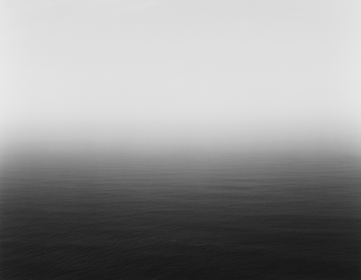
Hiroshi Sugimoto: Seascapes

In this picture, the photographer photographs the horizon of the seascape. With only black and white colors, the brightest tone is the sky that gradients its way to the sea which is the darkest tone of the picture.

Focus

Field #20', Uta Barth, 1997 | Tate

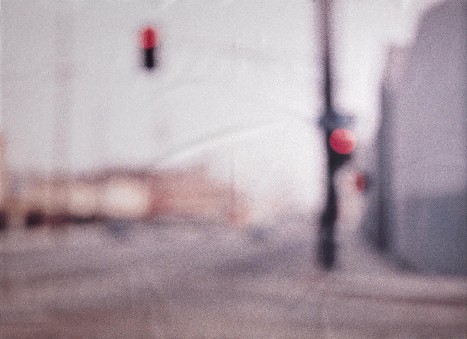
Field #20′, Uta Barth, 1997 | Tate

In this picture, the photographer blurs the image to capture unique colors, undefined shapes, and interesting silhouettes. Nothing is in focus. The blurred street brings out a sense of “ineptitude”.

Can an image show just one element at a time?

Yes, but then you would have to be very intent when it comes to trying to create that photo, and when you are at that point I would argue if your photos actually represent abstract photography or not.

It is definitely possible, but in most photos, it’s usually going to include more than 1 element. Because all these elements are intertwined in similarities. You can’t have shapes without lines. You can’t have texture without focus, and the same goes for patterns. Every element is connected to one another.

Science unit: Engineering Design Project blog post #4 – REFLECT & SHARE

Kai Geng and I, we first were leaning towards the idea of energy transformation including potential energy to kinetic energy, we first grappled with the idea of a rubber band car, then we played around with the idea of a hopper popper, but the material need to make the hopper popper was unavailable. We then came across a video called “How to Make a Rubber Band Plane Out of Paper – Very EASY” uploaded by JoshBuilds on youtube. We were fascinated by that idea and we decided to take Josh’s single-propeller design and make our own, double-propeller rubber band plane. We looked at materials that are recyclable, and accessible, and we made sure the design was easy to build. unfortunately, I got sick during the final stages of construction. We ended up not being able to finish the prototype. After receiving peer feedback, some strengths we came up with our design were that it was very easy to make, the materials were recyclable and accessible and our design aligned with the needs of our targetted audience, which is children. These children can gather these materials themselves, they can construct their own plane, and get educated on energy transformation. lastly, our design is very safe to use. Some weaknesses of our design were that it was fragile, the quality of the materials wasn’t very good, and we didn’t get to finish it.
Our design fits into the design specifications because it acts as a toy that aligns with our targetted audience which is children, second, it is environmentally friendly, and all the materials that are needed to construct this plane are recyclable. Our design arguably doesn’t possess the best durability, but considering that the materials can be bought so cheaply and so easily, to some extent it cancels out the durability issues we have with our plane. It is for sure very safe to use our plane, its materials are harmless and construction doesn’t require any dangerous jobs like carpentry, laser cutting and such. Our design is original because we admit we took heavy inspiration from JoshBuilds’ video, but instead of completely copying his design. We innovated his design by adding one more propeller and we modified the rubberband twisting mechanism.
I am most proud of the cooperation Kai Geng and I had. We both inputted an equal amount of work, and no one was slacking off. We helped each other out when one is struggling. We were patient with each other. Most importantly, we built on top of each other’s ideas very well. The most challenging thing during this unit was probably when I get sick, and Kai had to work on the project alone, it was very challenging for the group, thank you Kai very much for putting in extra effort.

Science unit: Engineering Design Project blog post #3 – CREATE & IMPROVE

Reflecting on our prototype, one of our strengths was that we used very recyclable materials to construct this plane, and it wasn’t very complicated to do so. Some refining that would be needed for our prototype is first to finish it, second is to find better ways to glue pieces together because at the moment the wings are fragile. The feedback received from peers is generally these: finish the prototype, fragile, cool concept. with this feedback, one of the things we are going to change is the durability of the plane for it is very fragile right now. And most importantly we will try to finish our prototype.

Science unit: Engineering Design Project blog post #2 – DEVELOP & PLAN

Because my partner and I decided early on that we were going to design a product that serves as a toy for children, we chose to make a plane because our toy will entertain the children and at the same time, teach them about energy transformation. and we tried to make it look as “cool” as possible, so we designed the wings purposefully into that shape, to mimic a battle plane. Our plane is made out of paper straws, paper pins, rubber bands, and foam, all recyclable materials, although foam isn’t considered to be the most recyclable material. Our plane wouldn’t be the most durable toy to play around with, but we believe the accessibility of the material and how easy it takes to construct the plane would out weight the problems of durability. Our plane is very safe to play with, it takes some extra attention when building the plane when you are dealing with hot glue and super glue, but overall it is very safe. Our plane was inspired by a video published by the youtube channel JoshBuilds titled “How to Make a Rubber Band Plane Out of Paper – Very EASY”. We were heavily inspired by that video, we took their design of twisting the propellers that were linked to rubber bands so that releasing the propellers would create the rotation that would help the plane fly. Our innovation was that we took that mechanism and decided to add two propellers to our plane instead of one which was the same as JoshBuilds’ design.

Here is the plan to construct this design.

1, gather materials needed: foam boards, 2 straws, 3 paper clips, 1 plastic cup, 2 toothpicks, 4 rubberbands, super glue, and hot glue.

2, cut the foam board into the wings, and the tails of the plane according to the measurements given.

3, hot glue the wings and tails to a straw according to the plan

4, grab the other straw and cut out three 1cm straws

5, cut the plastic cut vertically, making it into a fan shape, you then lay it flat and cut out 4 propellers.

6, you superglue the propellers to the toothpicks, two propellers per toothpick, the tips of the toothpicks should be glued to the bottom of the propellers.

7, bend the paper clips into small hooks.

8, hot glue the paper clip hooks to the middle toothpick part of the propellers, when the propellers and horizontal, the paper clip hooks should be verticle, glued to the middle of the propeller right on the middle toothpick part.

9, connect 2 rubber bands together, do that 2 times to create two rubberband ropes.

10, hook the ropes to the hooks of the propeller, take the three 1cm straws we cut out earlier and stick two of them under the right & left wings, and stick the last one at the bottom of the tail of the plane.

11. have the rubberband rope connected to the propellers go through the straw holes under the wings first, then let it both go through the straw hole under the tail of the plane, when it goes through, hook both the rubberband ropes to a paper clip, it will stop the rubberband ropes from trying to retract back towards the propellers. seal the paper clip and hot glue it so it doesn’t move.

12, completed.


Engineering Design Project Planning

What is the purpose of your device/toy, how does it function, and who is your user?

My elastic band plane’s purpose is to transfer stored energy into kinetic energy. The plane stretches a rubber band which when released will push the plane into the air. My intended audience is primarily children who will learn the concept of energy transformation through the usage of this toy

What is the environmental impact of your product and is it durable and safe?

My product uses very accessible materials such as rubber bands, straws, paper clips, and paper. All these materials can be easily recycled, and they are very safe to manipulate. It’s reasonably durable considering its materials and performance which is promising.

What precedents inspired you? What did you take away from them & how did it inform your choices?

Kai and I took inspiration from the video “How to Make a Rubber Band Plane Out of Paper – Very EASY”. Uploaded by the youtube JoshBuilds. We were inspired by his design of twisting the rubber band and releasing it to provide rotation to the propellers. We plan to use his single propeller to make our own double-propeller design.

How are you making your product original and/ or using creativity?

We are going to make our own double-propeller rubber band plane inspired by JoshBuild’s design. We are going to use different materials.

Improvisation

I use to think that being good at improvisation just takes a lot of natural talent, but now after a few classes I think to be good at improvisation and just acting as a whole, all it takes is supreme confidence and experience.

The big idea about improvisation I think will stick with me is to always say yes, because it is really how you keep an improvised performance flowing, and building on top of others’ ideas may also spark some great ideas for yourself.

During improvisation, I think I did well at accepting my fellow performers’ ideas, always saying yes, and keeping the performance flowing. I struggled with staying in character, and always facing the audience, I am also sometimes timid when it comes to my acting choices and I need to work on being bold. I think what will help me be a better actor is to be comfortable with mistakes and be more courageous when it comes to different acting choices.

One of the activities we did during improvisation, was Endowments. this activity consists of performers forming a circle, one person stands in the middle and the people surrounding the person in the middle will strike up a performance with the person in the middle, and after some time the person in the middle changes. so on so forth.


Cuban-Revolution Journal

In this Humanities unit, I studied the Cuban revolution, by looking through primary and secondary sources. Then, using the knowledge I have, I wrote a journal that is written by a person that was experiencing through the revolution. So please enjoy.

<iframe width=”760px” height=”500px” src=”https://sway.office.com/s/OSzqmPiwZtYwnUyw/embed” frameborder=”0″ marginheight=”0″ marginwidth=”0″ max-width=”100%” sandbox=”allow-forms allow-modals allow-orientation-lock allow-popups allow-same-origin allow-scripts” scrolling=”no” style=”border: none; max-width: 100%; max-height: 100vh” allowfullscreen mozallowfullscreen msallowfullscreen webkitallowfullscreen></iframe>

Skip to toolbar