


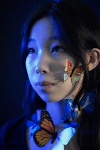
For my practice photos, I tried using different colors of lighting, angles, and close-ups with the fake butterflies. The colors for half of my photos are edited with low saturation of the face and a tint of high emphasis on the complementary colors, blue and orange. For my final sets, something I could improve on is sharpening the facial expressions and expressing more poses to appeal to the emotion.
Leave a Reply
You must be logged in to post a comment.