
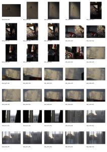
Here are the photos I took for my second set:


The contact sheet below contains my “yellow” photos selected from the total images above. I chose these pictures because I found them interesting and worth looking at again. They loosely connect to my inspiration, Uta Barth, and her composition in the artist gallery I collected in my previous post. For example, I took photos of sheer curtains and projections of light in rooms I find comfort in – bathrooms and bedrooms.


Below are my “green” images, selected from the “yellow” pictures above. These photographs hone into their connection with my vision of capturing light projections to create intimacy and contact with the audience. With this vision in mind, I took photos of light points on the wall, reflections on tile, and light in sheer curtains and blinds, similar to Barth’s work in my artist gallery.

Below are some of my “red” pictures, selected from the “green” set above. These images directly connect to my message and show Uta Barth as inspiration for my entire set. I added the central photo because I found it related to the lines, patterns, and textures in the other two pictures, and I cropped them all to square so they all had the same formatting (the central one used to be portrait). My favourite image from the final triptych is the first one, IMG_4470. This photo reminds me of the picture I analysed in my previous post, Sets 2: New Vision with Uta Barth, because of its similar subject and framing. Barth’s photo depicts a light projection on her cupboard, with the shadows of her window, cup, and bottle projected onto the wall. The photograph simply captures the light on the closet with the corner of a bedside table, simple and minimalistic framing and colour schemes of white tones. In my photo, there is a golden-hour coloured light projection on my wall.
I like the inclusion of the name board along the bottom border, which reminds me of the inclusion of Barth’s water glass and the texture of the sheer curtain that the light passed through. I think this image connects to the simplicity and beauty of lighting. I think it also allows the audience to communicate with me, seeing the choices within my house and decor. The photos also create a narrative, starting with warm tones and slowly transitioning into darker, cooler tones. I think this also connects to my vision as it emphasises the lack of light in the later photos and the inclusion of shadows. By changing this perspective, the audience can see the light, warm aspects of the first image as a positive, necessary element.
In contrast, the last photo becomes slowly heavier and sadder. This creates intimacy between the audience and the photographs, leaving room for the audience to create a storyline that may connect to their personal experiences. I think one of the critical aspects of the triptych is the texture and pattern on the wall. The triptych has a surface pattern of repetitive diagonal lines on the wall, laundry rack, or bathroom tile. I think this aspect connects the photographs together to create a cohesive triptych. Another similarity is the slight blur in the light throughout the three photos.

If I were to take more photos to add to this triptych, I would like to take photos at various times. These photos were taken as the golden hour hit and as the sun began to set, which aids the mood and story of the triptych. However, I think taking photos at an early time of day would also create a more intimate photo and storyline, and would emphasize lighting throughout the day rather than the tone of light, which I think would better connect with my vision. Whilst these photos connect quite well to my overall theme and idea, I think that taking photos at dawn would create a better connection with both the audience and photos.