IDENTITY

Portrait Photography

Portrait photography is a type of photography that focuses on capturing an individual’s or group of people’s likeness, personality, and essence. Portrait photography’s main goal is to showcase the subject’s personality, emotions, and physical features in a visually appealing and engaging way. To create compelling portraits, portrait photographers employ a variety of techniques. They collaborate closely with their subjects to create a comfortable and relaxed environment in which to capture genuine expressions and emotions. The photographer’s skill is in connecting with the subject, putting them at ease, and encouraging them to reveal their true selves.

I want to show people’s personalities by photographing them doing sports. I worked with Weiwei and Carol (from the other photography class) in the dome to capture different phases during a volleyball spike. It was extremely difficult to capture the phases because the entire process only lasted seconds or milliseconds. Fortunately, we appear to have met our expectations, as the three photos I chose display the different phases during a spike in time order, from top to bottom: when the ball was set high in the air (out of the frame), when the person was ready to hit the ball, and when the person hit the ball to the ground.

STREET PHOTOGRAPHY

Brainstorming

Street photography is a photographic genre that focuses on capturing unscripted and unposed moments of daily life in public locations, usually in urban settings. It frequently entails capturing events and people in their natural situations, without the use of artificial or fabricated settings. The core of street photography is capturing fleeting moments and communicating stories visually. Photographers in this genre aim to capture the human condition, cultural characteristics, and the unique interactions that take place in public places. Street photography themes can range from individuals going about their daily lives to huge scenes that capture the spirit and atmosphere of a certain locale.

Photo Gallery: Joel Meyerowitz

Joel Meyerowitz began his career as a street photographer in the 1960s, when black-and-white photography was more popular in the art world, using 35mm cameras to capture the bright energy of New York City. His use of color gave his photos a fresh and energetic feel, and he became noted for his superb compositions and sharp eye for capturing key moments. Joel Meyerowitz was chosen as my photographer because of his ability to uncover beauty and excitement in mundane surroundings. These photographs appear to be quite natural, depicting both the main character(s) and the urban landscape, much like what we see with our own eyes. His images, in my opinion, frequently communicate a feeling of serendipity and a genuine appreciation for the transitory moments of everyday life.

All Photo Contact Sheet

Here are 75 photos that I took in total during the trip to Gu Lou; some were taken in the Hutongs, and some were taken on the roads.

Yellow Photos

I chose 57 photos and excluded 18 others. There are three reasons, all of which are related to the definition of street photography. The first is that the image lacks a central character. For example, one depicts a narrow Hutong but nothing else but a three-wheeler. The second is that the photograph does not depict certain aspects of daily life in the Hutongs, which is too boring. For example, there is a photograph of a road near the Gu Lou, but no one would know where it was taken unless you told them. The third reason is that some photos are similar, so I chose the best one.

Green Photos

While selecting the green photos, I started to consider the style of the photographer. Since Joel Meyerowitz was one of the pioneers of taking colored photos, I chose photos that contained colors, lights, and shadows, conveying a fresh and energetic feeling. Thinking about colors, my favorite ones are the candied haws (red) and the photo with two elders with red and blue hats. An interesting fact that I discovered is that many people wear blue and red (orange) hats.

Red Photos

Finally, I decided on these three photos as my red photos. The first photo on the left depicts the daily lives of people in the Hutongs. There are rickshaw drivers, visitors, shoppers, and so on. Everything appears to be very natural. Despite the cold weather, the sunlight and warm red colors from the rickshaw provide energy and warmth. My favorite is the second photo in the middle. The photograph focuses on our main character, a middle-aged man. Despite being alone, he fits in and enjoys the candied haws in the early winter. This demonstrates how this place brings people together and fosters a sense of belonging. The third photo on the right is straightforward, displaying the special food of northeast China during the winter. In the cold winter, the redness of candied haw warms people’s hearts, and the sweetness brings them happiness.

ABSTRACTION IN PHOTOGRAPHY: PHOTO SET 1

Brainstorming

Developing My Vision

I plan to emphasize the solemn solitude peculiarity of industrial style by using a sharp focus and focusing on the shapes, patterns, and tones of the photographs (similar to straight photography, but in black and white). My target will mainly be industrial architecture taken during the trip to 798.

Statement of Intent

The message of my triptych will be to respect and preserve obsolete industrial architecture. I want the audience to appreciate the solemn solitude peculiarity, and greatness of these structures and buildings when looking at my presentation. For inspiration, I will try to find a photographer who explores industrial buildings and finds photographs that explore shapes, patterns, and tones with sharp focus. I’m obsessed with realistic and straight photography, so I try to adhere my style to these types of photography.

Photography Artist & Photo Gallery: Albert Renger-Petzsch

Albert Renger-Patzsch was a prominent and intriguing German photographer whose career spanned decades and continents. But when I looked through a series of his images, displaying anything from still life to flowers, each focusing on the industrial era differently, it stayed with me and my thoughts. They convey a story of a specific time and place, reflecting Renger Patzsch’s leanings toward documentary photography and the time period in which they were taken.

For example, in the first photo, the railway symbolizes industry. However, it is shown uniquely in this artwork. Instead of a train in motion or even the train tracks, the focus here is on the railway embankment, photographed from below and looking up. This perspective is highly effective since it conveys the magnitude of the embankment, which may have been a mirror of industry in general during the 1920s. This is emphasized further by the presence of a small figure near the center of the image. This figure, whose details are obscured by distance and shadows, highlights how little man is compared to some of the time’s industrial endeavors. In this image, Renger-Patzsch uses dark, light, and shades to significant effect. The arches of the railway create striking shapes, and the fact that they get smaller from left to right helps to give the photo a sense of depth and distance.

With inspiration from Albert Renger-Petzsch, I noticed that one option is to use the effect of tones, lines, and patterns, if possible, to create a contrast or a sense of depth to display the solemn solitude peculiarity.

Yellow Photos

I selected these 59 photos as “Yellow Photos” because these are all the ones I shot toward industrial architecture from a unique angle that used lines and shapes to create a sense of depth. I turned these photos into black and white to match Albert Renger-Petzsch’s style and emphasize the solemnness and greatness of the industrial structures, matching my statement of intent.

Green Photos

I chose these 10 photos as my green ones because they have a wide dynamic range, which made it possible to create contrast, as mentioned in my inspiration from Albert Renger-Patzsch. It also matches the purpose of my final presentation, which is to emphasize the solemn solitude style.

Red Photos

I chose these three as my red photos, matching my intent and vision. They have wide dynamic ranges in black and white, displaying the solemn industrial style. The first and third photographs were shot at the same target but from different angles, as implied by the time taken. Moreover, all the photos have a hard, solid, and cold (if you touch them) texture, which enhances the solemn solitude peculiarity. This can be an option for my final triptych as I cropped them into the same size, and they convey similar messages and emotions.

ABSTRACTION IN PHOTOGRAPHY: DEVELOP IDEAS THROUGH INVESTIGATION

1. Starting Point

Abstract photography can be defined as capturing images in which the subject isn’t the most interesting element. Albert Renger-Patzsch and Aaron Siskind photographed the ordinary to reveal their beauty. Uta Barth reversed the typical use of the camera, shooting out of focus and Andreas Gursky photographs the repetition of elements. During this unit, you will investigate appropriate examples of abstract photography and respond in your own way.”

Initial Thoughts

In abstract photographs, the subject doesn’t have to stand out. This means that the subject does not necessarily build a connection with the real world automatically. It can be anything around your daily events.

2. Definition of Abstraction

Abstract photography comprises images created with photography materials and equipment that have no direct connection to the physical world. Abstract photographers use perspective, movement, and light to create unexpected, often unrecognizable images from the world around them.

3. Researching the Starting Point

Pictorial Photography

Summary

In the early 1900s, photography began to be understood and valued as an art form with advancements in technology and production techniques utilized by photographers. Because of its intended parallels to popular painting techniques of the period, pictorialist photography was the first photographic approach that was regarded as an art form by the public and critics. This approach was later called the pictorialism movement.

Style

Pictorialists believed photography should be regarded as a form of personal expression on par with other fine arts. A pictorial photograph typically lacks sharp focus (some more than others), is printed in one or more colors other than black-and-white (ranging from warm brown to deep blue), and may have visible brush strokes or other surface manipulation.

Masterpieces

“The Pond—Moonlight” by Edward Steichen

“Photography records the gamut of feelings written on the human face, the beauty of the earth and skies that man has inherited, and the wealth and confusion man has created. It is a major force in explaining man to man.”

This photograph’s subject matter, color palette, and poetic atmosphere are reminiscent of Tonalist paintings. The hazy effect, muted foreground, and lack of distinction between reality and reflection create a dream-like appearance to the image.

Influence

The movement resulted in significant innovation in the photography field, with many photographers associated with it developing new techniques to further their artistic vision. This paved the way for subsequent advances in color photography and other technical processes. Pictorialism declined around 1915 as key advocates, such as Stieglitz and Steichen, turned to other visual modes, notably Straight Photography. Steichen’s work influenced the next generation of Pictorialists, including Edward Weston and Imogen Cunningham, though they also followed in his footsteps by experimenting with other photography styles.

Straight Photography

Summary

Straight photography emphasizes and engages with the camera’s technical capability to produce sharp and detailed images. The term generally refers to photographs that are not manipulated, either during the taking of the image or through darkroom or digital processes, but instead sharply depict the scene or subject as seen by the camera. Straight photography is more “straightforward” and realistic than pictorial photography.

Style

For the first time since photography’s inception, straight photography respects the medium’s own technical visual language. Form, sharp focus, rich detail, high contrast, and rich tonalities are among the camera’s distinctive vocabulary. Because both terms describe the camera’s ability to faithfully reproduce an image of reality, straight and pure photography are synonymous.

Masterpieces

“Monolith, the Face of Half Dome” by Ansel Adams

“The photographer visualizes his conception of the subject as presented in the final print. He expresses his visualization through his technique – aesthetic, intellectual, and mechanical.”

Adam’s career was launched by his photograph of Half Dome, a landmark in Yosemite National Park in California. At its lower left and lower right, this shaped granite rock formation is captured as a dark, imposing monolith rising to a distant peak against a dark sky and snowy landscape.

Influence

Straight photography, defined by a pure approach to the medium, was used in all fields and styles of photography, ranging from avant-garde photography to documentary and street photography to abstract photography. The approach was adapted by each photographic style to emphasize its own treatment of form, sensory experience, or changes in the social and cultural environment. For example, during the Great Depression, Walker Evan’s famous image, Allie Mae Burroughs, wife of a cotton sharecropper, Hale County, Alabama (1936), highlighted the plight of poor sharecroppers and the need for social reform.

4. Elements Described

Formal Elements

Formal elements are visual elements that, when used correctly, have the potential to transform ordinary subjects into great shots. These formal elements are commonly known as:

  • Line
  • Shape
  • Repetition/Pattern
  • Texture
  • Value/Tone
  • Focus

Paying attention to the formal elements will help you organize your compositions and emphasize the most important aspects of the shot.

Line

Lines in photography, like points in geometry, do not have the same strict definition. A line is defined in photography as a path that either cuts across the frame or connects two points within it. Two examples of such features are a winding road or a ridge of jagged mountains. In the photo I took in the garden of the Huntington Library, there are straight lines created by the frame, the pillars, the pathway, and the shadow of the frame, all converging to one point – the end of the path. These lines are called leading lines, a compositional technique in which man-made or natural lines guide the viewer’s gaze through a photograph to the subject or heart of the image. The point the lines are gathering to is called the focal point. An image can also have more than one focal point, as shown in the photo taken at Apple Headquarters: the lines of the floor and walls converge to the right, whereas the lines of the table and shadows point to the left.

Shape

A shape is a graphical representation of an object’s external boundary, outline, or surface. This photo taken at an art museum shows the ceiling of a circular building, including circles, quadrilaterals, and hexagons. These shapes are surrounded by one another, which also creates a pattern, which is discussed below.

Repetition/Pattern

Patterns are shapes and textures that are repeated in a rhythmic arrangement. A geometric pattern is made up of geometric shapes that are typically repeated, much like a wallpaper design. The photo taken at the Olympic Park shows the curvy and repeating oval shape of the petals and the straight-edged diamond shape of the seeds. The oval petals overlap, creating different layers for the photo. The diamond-shaped seeds are arranged so excitingly that the space between each other forms curvy lines that intersect, making a sense of illusion.

Texture

The perceived surface quality of an artwork is referred to as texture in the visual arts. It is a component that can be found in two- and three-dimensional designs, characterized by its physical and aesthetic qualities. This photo’s curviness and furry elements create a soft and warm texture.

Value/Tone

The lightness or darkness of an object determines its tone. Value, also called tone, is one of the most potent design components. In any painting, photograph, or design, the area with the greatest contrast between light and dark will always demand the most attention. In this photo I took in the church of Stanford University, most of the parts are dark, except for the space close to the platform. This emphasizes the platform and grabs viewers’ attention.

Focus

In photography, focus refers to the process of adjusting the lens to find the subject’s best possible resolution, sharpness, and contrast. You can do this using manual focus or your camera’s autofocus system. In this photo, the camera focuses on the cat as the main subject, and the background, such as the Ravenclaw pillow, is blurred. This also makes the main subject stand out by making it sharp and contrasting the background.

Can an Image Show Just One Element at a Time?

The answer is no. For instance, the photo of the sunflower shows both the shape and pattern, as the definitions of these two elements overlap. The pattern is the repetition of shapes, so in order to have a pattern, the image must contain elements of shapes. Another example is the photo of the cat rolled up in a circle. The warm and soft texture can’t be created without the curvy lines. Therefore, some elements of photography are inseparably interconnected, making it impossible to show just one element at a time.

It is discussed that the photo of the church taken at Stanford University shows the element of tone. However, there are also lines hidden in the image, such as the line formed by the pathway, windows, seats, and ceiling, which gathers at the focal point, the platform. Elements such as lines are too common in photos, which makes it challenging to take a picture without these features. This is also why an image can not show just one element at a time.

5. Elements – Photo Example

“Beaker” by Albert Renger-Patzch

This photograph was created as part of a commission for Jenaer Glaswerke Schott, for whom he photographed several sets of laboratory objects in glass (recipients, flasks, tubes, jars). In this image, Renger-Patzsch arranges eight glass beakers on a reflecting surface, each with the same cylindrical shape but varying dimensions, and photographs them from a slightly elevated angle. The larger items are positioned in the back. The objects overlap. The base’s mirroring effect gives the impression that the glassware is floating, especially in the center of the image, where the smaller cylinder (on which the manufacturer’s logo can be read) is the focal point. The photograph has a smooth, firm, and cool texture, just like the texture of regular glass. The objects create a choreography of light, shadows, and reflections due to their simple, standardized shape and transparency, an experiment with the possibilities of looking at objects and reconfiguring their shapes.

The photographer Albert Renger-Patzch might be interested in capturing the overlapping cylindrical shape and their shadows, creating a sense of space. He might also be interested in the reflection of the light on the beaker. This adds brightness to the image, contrasting the mostly dark and grey background and making the shape more tri-dimensional. Another factor that may intrigue Albert Renger-Patzch is the balance of the scene by carefully arranging the eight beakers. The height of the beakers is lower on the sides and taller in the middle. If I had to give this photograph another title, I would name it “Glassware” because it is just as concise and evident as the photo itself, showing nothing other than beakers (glassware).

6. Photo Safari

This photo corresponds to the first image in the picture set. It was shot at the wall outside of the photography classroom but rotated 90 degrees counter-clockwise. The tone is the element best represented in this photo. The left half is dark and the right half is bright, creating a contrast. I did well capturing the tone and the arrangement of the dark and bright sides. One thing I didn’t do so well is I edited the photo on my phone so the whole image looked a little blurry.


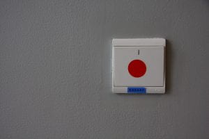
This photo corresponds to the second image in the picture set. It was shot at a light switch outside the elementary theater. The shape is the element best represented in this photo. A square is positioned at the top right, and the rest of the photo are negative spaces. I did well capturing the position of the square. One thing I didn’t do so well is there are other rectangles and a circle inside the light switch, which act as a distraction from the larger square.


This photo corresponds to the third image in the example. It was shot at the field outside gym 3. The texture is the element best represented in this photo. I did pretty well capturing the rough and “furry” texture demonstrated in the picture provided.


This photo corresponds to the fourth image in the picture set. It was shot at the air conditioner outside of gym 3. The pattern is the element best represented in this photo. I did pretty well capturing the repetition of rectangles. One thing I didn’t do so well is that the border of the rectangles is unclear because the borders are created by the shadows, but this was the best I could find apart from the stairs.


This photo corresponds to the fifth image in the picture set. It was shot opposite the air conditioner. The line is the element best represented in this photo. Two straight and vertical lines divide the image into three segments. I did pretty well capturing the divisions, except for the background is a little messy and distracting.


This photo corresponds to the sixth image in the picture set. It was shot at the stadium. The shape is the element best represented in this photo. I did pretty well capturing the circle at the center of the composition. Some may say there is too much negative space in this image, but this was caused by the difference in the width between the two pictures.


This photo corresponds to the seventh image in the picture set. It was shot at the high school library. The line is the element best represented in this photo, with three lines dividing the picture into six parts. I did pretty well capturing the position of the lines. However, the photo is underexposed and the background is very distractive.


This photo corresponds to the eighth image in the picture set. It was shot in the elementary playground. The pattern is the element best represented in this photo. I believe that I did well in capturing the repetition of the circular shapes. These circles are not that obvious, but when you search for a pattern in this photo, it quickly stands out, making this my favorite photo in this safari.


This photo corresponds to the ninth image in the picture set. It was shot at the discus net in the stadium. The pattern is the element best represented in this photo. I captured the repetition of the squares correctly. However, the background is distracting.


This photo corresponds to the tenth image in the picture set. It was shot in the same place as the first picture. The line is the element best represented in this photo. I took this photo by slightly adjusting the angle of the camera, with the left closer to the wall, stretching the line further to the right so it becomes thinner.


This photo corresponds to the eleventh image in the picture set. It was shot at the track in the stadium. The line is the element best represented in this photo. I did well capturing the convergence of the line at the focal point. One thing I didn’t do so well is the color of the background because it makes this photo look not horizontal to the ground.


This photo corresponds to the twelfth image in the picture set. It was shot outside gym 3 against the floor. The texture is the element best represented in this photo. I did well capturing the rough and hard surface. One thing I didn’t do so well is I left a shadow on the ground when I was taking the photo so there is a dark region.


Works Cited

“Focus: Understanding the 7 Formal Elements of Photography.” Picfair.com, 2023, focus.picfair.com/articles/7-formal-elements-photography. Accessed 17 Sept. 2023.

https://www.facebook.com/vogueballroom. “Vogue Ballroom – Wedding Reception & Function Venue Melbourne.” Vogue Ballroom – Wedding Reception & Function Venue Melbourne, 2023, vogueballroom.com.au/what-are-the-seven-elements-of-photography/. Accessed 18 Sept. 2023.

“Pictorialism Movement Overview.” The Art Story, The Art Story, 2014, www.theartstory.org/movement/pictorialism/. Accessed 18 Sept. 2023.

“Straight Photography Movement Overview.” The Art Story, The Art Story, 2015, www.theartstory.org/movement/straight-photography/. Accessed 18 Sept. 2023.


“WRONG!” BUT RIGHT

Unit Synopsis

The first unit of my first photography course was unique and special. We started by learning about a famous photographer, John Baldassari, and his “masterpiece” named “WRONG.” Then, we mimicked John Baldassari’s art piece and took several “wrong” photos to demonstrate our understanding of what it means to take a good picture, allowing us to describe the “rules” for taking photos.

“WRONG” by John Baldassari

It is not wrong to take a “wrong” photo. The “Wrong” series by John Baldessari was on display in 1967. He employs a number of text-anchor-supported photographic pictures. The most well-known of these, labeled “wrong,” features an image poorly composed with the word “wrong” underneath it. In a book on photographic skills, the composition chapter is referenced in this picture. What makes the image so alluring is the irony of the term. Baldessari attempted to convey in the photo, “Why must our work be judged? Why should we adhere to traditional photographic or artistic standards?” A thought can never be correct or wrong when carried out as a human response, which is an intriguing reality.

Context in Photography

Context is essential in photography because some of the missing information can be retrieved by looking into the context of an image. Context shapes our understanding and interpretation of every visual information we come upon. The context for images can take many forms, such as supplemental text, related images, and even audience cultural familiarity. “WRONG,” by John Baldassari, is a fantastic illustration of a picture with context. It enables the viewer to comprehend the meaning John Baldassari attempted to express, as mentioned above. Some viewers may interpret this image as a poor photo made by a less skilled photographer if they are unaware of the context or the word “wrong.” They’ll fail to see the irony in the image and its real meaning, which would make a big difference.

Contact Sheet

Here are the eight “wrong” photos I’ve taken. These photos all broke the “rules” of photography, and some even broke more than one. Each title refers to the rule they violated and briefly explains how it was broken and why I chose this photo.


I learned from this unit at least eight rules and how to take “wrong” photos by disobeying them. I also observed that most rules are recommendations, not requirements; it all depends on the photographer’s personal preferences.

SCIENCE AND ENGINEERING ENERGY TRANSFORMATION PROJECT REFLECT AND SHARE

Introduction

This is the end of our science and engineering two-week project. After looking at others introducing their projects, I feel really impressed by how clever those designs are. The most impressive design was Jayden’s terrarium and Andrew’s roller. I have also learned a lot from my straw experiment.

Reflection

Even while everyone is aware that blowing through a straw can produce sound, real fascination arises when you realize that the mechanism of the straw’s mechanism can be used to build a thermoacoustic engine. Simple initiatives could also have a significant mechanism. I realized that instead of creating an overly complicated project, we should think about the time and resources that are still available.

Andrew’s roller is a good illustration. Elastic energy is converted into kinetic energy through his project. The rubber within the roller will tighten as you move it ahead. The roller is pushed in the opposite direction by the kinetic energy that results from the transformation of elastic energy into kinetic energy, returning the roller to your hands. In comparison to my design, this one only requires a plastic cup and a rubber band. I observed him finalize the design fairly early, giving himself plenty of time to solicit input. Each student in the science and engineering class was given an interview before being given the opportunity to sign the roller.

The project that stands out to me the most is Jayden’s terrarium. His design is the only one among the others that doesn’t need kinetic energy and is sustainable. His terrarium has been alive for 30 days since the project was finished, which is incredible. Throughout the course of the two weeks, I assisted him in building the terrarium, and I saw that he bought all the ingredients at the beginning of the second week, packaged them in a box, and even had leftovers. Because it was obvious how much work or resources he had left, he can stay on schedule thanks to this. He was acting very independently and effectively. A tweezer and a water bottle were among the materials he took into consideration. He created the light.

Conclusion

AlthoughI was unable to carry out my original intention to build a thermoacoustic engine, I was still able to understand its workings. My classmates have also taught me about their goals and crucial principles that are required for a lone project. As a result, I think this two-week project is quite worthwhile.

SCIENCE AND ENGINEERING ENERGY TRANSFORMATION PROJECT CREATE AND IMPROVE

Introduction

In this stage, students should be working on creating and improving their designs. However, I wasn’t able to fully concentrate on my thermoacoustic engine as I was sick and missed some classes. As a result, I created a very simple product, a straw, to simulate my thermoacoustic engine.

Design Ideas

Before finding a possible design, I first looked closely at the mechanism of my thermoacoustic engine. By deeply understanding the mechanism, I’m able to create an alternative that is as simple as possible. Since the thermoacoustic engine involves the use of sound waves and temperature, I want to create a product that is really basic but uses energy transformation.

I recognized that we can create a “whistle” sound when we blow the straws, so I speculate it might be related to the sound wave.

Experiment Analysis

Straw Experiment 0

Straw Experiment 1

Above are two recordings that I did at home about the very simple straw experiment. It shows how I created, and tested my design. The result turned out successful. When I blow into the straw, it is kinetic energy because air particles go into the straw. The kinetic energy is transformed into sound energy, as you can hear the “whistle” sound in the video.

The mechanism of the straw experiment is the same as the thermoacoustic engine, and you can refer to the poster “How Does a Thermoacoustic Engine Work” above.


SCIENCE AND ENGINEERING ENERGY TRANSFORMATION PROJECT DEVELOP AND PLAN

Introduction

After closely evaluating my potential three design ideas for the two-week project, I have decided to make a thermoacoustic engine. Its visual appearance and cool mechanics make it eye-catching and interesting to make. In this blog post, I will take about my plan and the materials required to create a thermoacoustic engine. The attached video below is the kind of thermoacoustic engine that I intend to make.

Plan

I have created a schedule from Feb.13th to Mar.5th for my two-week project, divided into four sections: Define and Inquire (D&I), Develop and Plan (D&P), Create and Improve (C&I), and Reflect and Share (R&S). Detailed information is included in the schedule. The schedule included deciding on the project, designing the project, ordering the materials, testing the materials, asking and receiving feedback, and reflecting on the feedback.

Design

Above is the design of my thermoacoustic engine. It is composed of three main sections: rod, piston, and wheel. I included a screenshot and a zoom-in for each section so that the design is clear and easy to follow.

Materials

According to the design, here are the materials required:

  • One 25*200mm Test Tube
  • One Wooden Cylinder with a diameter of 10mm and height of 30mm
  • One 10*100mm Wooden Stick (connected to the wooden wheel)
  • Two 10*10mm Wooden Pieces (glued onto the carbon rod)
  • One 150*150mm Wooden Wheel 
  • Two 30*50mm Wooden Pieces (hold the test tube and the wooden wheel)
  • One 60*400mm Wooden Piece (the base of the engine)
  • One Toothpick/Wooden Piece (connect the stick and the rod)
  • One 2*3.15*10=63mm Heat Resistance Tape
  • One 0.5*0*5*20 Carbon Rod
  • One Steel Wire Ball
  • One 50mm Screw 
  • One Nut

Apparatus

  • Hot Glue Gun
  • Wood Driller
  • One Candle

SCIENCE AND ENGINEERING ENERGY TRANSFORMATION PROJECT DEFINE AND INQUIRE

Introduction

In this unit of the Science and Engineering course, we are making a device that uses energy transformation to make a difference in society. This can be as simple as building an electric fan and converting chemical potential energy into kinetic energy. However, I do not believe it is cool enough. My goal is to create something more complex, amazing, and worthwhile. I currently have three designs: a sterling engine, an electric motor, and a thermoacoustic engine. I’ll describe my potential designs and evaluate them based on their visual appeal, challenge, and usefulness level.

Potential Designs

Sterling Engine ⭐⭐⭐⭐

Visual Appeal Level: ⭐⭐⭐⭐⭐

Challenge Level: ⭐⭐⭐⭐⭐

Usefulness: ⭐⭐⭐⭐⭐

The Stirling engine converts thermal energy into mechanical/kinetic energy by establishing a cycle of a fixed mass of gas that is heated and expanded, then cooled and compressed, using the temperature difference between its hot and cold ends. In a Stirling engine, the coil of steel wool placed inside the soda can is referred to as a displacer, and the higher soda can is referred to as a piston that connects to the crank shift. The engine begins with a displacer at the top of the can and a piston halfway down the can. When the can is heated, the air pressure inside the can rises in comparison to the outside air pressure, penetrating the displacer and pushing the piston up. The piston propels the crankshaft and fan, causing them to spin. The flywheel momentum builds up as the fan spins, accelerating the rotation. The displacer is also connected to the crankshaft, but at a 90° angle with the piston connection. As a result, as the piston rises, the flywheel momentum lowers the displacer and vice versa. When the displacer is pushed downward, the gas inside the can rises to the top and cools, and the air pressure falls in comparison to the outside air pressure, causing the piston to fall to the bottom. The flywheel momentum then propels the piston to the halfway point and the displacer to the top of the cycle, and the cycle begins again. As long as the burner keeps heating the gas inside the soda can, the Stirling engine will run for a long time.

The Stirling engine is what I believed is the most challenging one out of my three potential designs. It requires a wide range of materials/apparatus such as steel wool, a plastic pipe, a crankshaft, an alcohol burner, a wooden setup, a hot glue gun, and a drilling machine. It requires high craftsmanship and investment (time & effort), which I believe is difficult to finish in two weeks. However, I really like the way the Stirling engine functions, and the process of energy transformation in terms of this design.

Electric Motor ⭐⭐⭐

Visual Appeal Level: ⭐⭐⭐

Challenge Level: ⭐⭐⭐

Usefulness: ⭐⭐⭐⭐

An electric motor is a piece of machinery that converts electrical energy into mechanical energy. Magnetism is important in this energy transformation process. When an electrical current flows through the coil on the bottom, it can act like a magnet, which is known as an electromagnet. Torque is a rotational force torque that can be generated by using the forces of electricity and magnetism—the attraction and repulsion exhibited by magnets, as seen in the video. With the help of a battery, the wire coil was transformed into an electromagnet, which repelled the magnets attached to the bottle, resulting in a torque that spun the bottle and the fan. The rotation will last until the battery runs out.

The electric motor is what I believed is the smartest and easiest one out of my three potential designs. It requires fewer materials and is less dangerous since it doesn’t include the use of fire. The main focus is on the circuits and the magnets, which I’m quite interested in. However, I think the design is too simple and tiny and is not that attractive to audiences.

Thermoacoustic Engine ⭐⭐⭐⭐⭐

Visual Appeal Level:  ⭐⭐⭐⭐⭐

Challenge Level: ⭐⭐⭐⭐

Usefulness: ⭐⭐⭐⭐⭐

This thermo-acoustic Stirling engine has a single piston instead of the two found in more traditional Stirling engines. Stirling engines use a power piston and a second piston to move air between the hot and cold parts of the engine (known as a displacer piston). Instead of a displacer piston, this thermo-acoustic engine uses a traveling sound wave to do the work of a displacement piston. A small alcohol burner included with the engine provides heat.

The thermoacoustic engine is what I believed is the best one out of the three potential designs. It uses the mechanism of the Stirling engine and is easier because it contains only one piston instead of two. Therefore, I decided to create a thermoacoustic engine for my two-week project.


Skip to toolbar