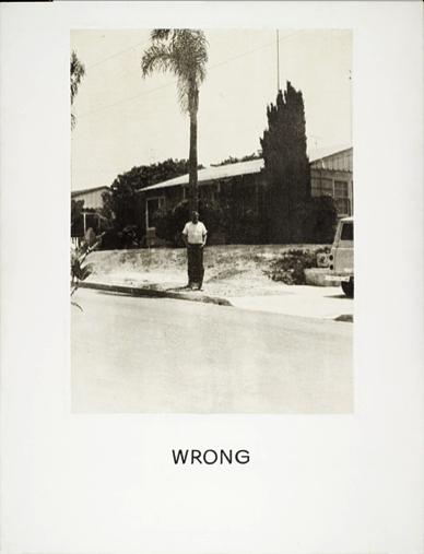
CONTEXT OF THE PHOTOGRAPH “WRONG”:
In 1967 John Baldessari exhibited his ‘wrong’ series. He uses a selection of photographic images anchored by text. The most famous of which titled ‘wrong’ shows an image with poor composition juxtaposed by the text ‘wrong’ bellow the photograph.
The irony of the word is what makes the image so appealing, just blatant judgement of the photograph. The message that Baldessari was trying to say in the image is why should we conform to conventional aspects of art or photograph, why does our work have to be judged? The interesting fact is that an idea cannot be wrong or right as it is executed as a personal response. John Baldessari once stated: “You don’t want anyone to say, ‘You can’t do that!’
A question has emerged lately: Can a publicly defined “not so appealing” photograph be great? My answer came to me in less than a minute—of course, it can! Why? Because who is there to define the art you create? Art never has only one interpretation; due to everyone’s unique experiences, each person can have a very different interpretation. Some may see it from their perspective, while others may view it similarly to others. However, each point of view is unique and never exactly the same. When you’re standing on a table or lying on the ground, how could your point of view ever be the same as someone who’s sitting in a chair? Therefore, a photograph that is labeled as “bad” can still be great because it represents you, expresses yourself, and reflects your inner state, your world, and your point of view.
Additionally, providing context in photography can indeed help others have a better, more precise interpretation of your artwork. Using the photograph “wrong” as an example, some view it as fantastic art since it captures the haphazardness of the world: ‘The man covering the cropped tree where placed in the middle of the photo while the surroundings were empty, evoking a sense of loneliness. The choice of black-white color adds to the sense of loneliness and creates an atmosphere of emptiness. The once-life-green-symboled plants were presented as pale black, further emphasizing the desperateness of the overall mood. The moving tree leaves contrast with the still man, providing a sense of feeling that the man was stepping on the same stone despite the surroundings; everything else is moving forward, again emphasizing the overall hollowness and emptiness.’ others, however, from a different angle, might view it as a bad photograph that does not adhere to some of the golden rules of photography: the man and the tree’s positions do not follow the rule of thirds; the photograph is blurry and does not focus on either the subject or the foreground; and the tree and surroundings, such as the car and the plants, are cropped out.
Nevertheless, Both interpretations may not align with the author’s initial purpose in creating the photograph since they are merely the audience’s own conjectures. If there were the context provided by the author—such as the author’s explanations, the circumstances under which the photo was taken, or the intended purpose—the photograph would be easier to understand. In fact, stated by the author of the photograph (Baldessari), the breaking of photography rules in the photograph was intentionally done to raise the question: “Why should our work be judged?”, criticizing how the public defines other artists’ work.
In conclusion, a photograph cannot be strictly defined as “good” or “bad,” and it can have many interpretations—and that is fine. However, providing context for the photograph can help the audience better relate, appreciate, and understand its purpose.
(The 10 “Wrong” Photographs):


Citations:
Baldessari, John “Wrong” Photograph. Dragon’s Exchange, ISB, 22nd August 2024. https://dx.isb.cn/dash/#/classroom/648607/sections/lesson/344114/page/344116/edit, Accessed 24nd August 2024.
WRONG! | International School of Beijing. dx.isb.cn/dash/#/classroom/648607/sections/lesson/344114/page/344118.
Recent Comments