This is my mind map:
https://isbeijing.padlet.org/anthony_huang1/my-remarkable-padlet-9r1pw2fjilmsyzqx
This is my mind map:
https://isbeijing.padlet.org/anthony_huang1/my-remarkable-padlet-9r1pw2fjilmsyzqx

 This photo demonstrates a contrast of the colors brown and red. It is taken when I push the chair so that it touches the table. I believe this photo demonstrates some aspect of the drawing as it is indeed a contrast that stands left to right; however, because the chair isn’t straight, it resulted in a way so that the mid-line is a bit off. Thus, I believe this photo in the middle between “worked” and “doesn’t work”. The photo illustrates the element of Alignment & Contrast & Lines.

 This photo portrays a pink magnet on the whiteboard. Comparing the photo and the image, I believe this photo was pretty successful in mimicking the aspect of having the subject at the upper right corner of the entire photo and having everything else just with negative space. Thus, I believe the photo has “worked” for the image. The photo illustrates the element of shapes initially – but I then thought that a lack of focus in this context would make it more interesting; the element of focus is then added.

 This photo portrays a series of puzzles scattered and on top of each other. Comparing the photo and the image, I believe this photo is successful in mimicking the aspect of scattering repetition in this image. I’ve intentionally made the puzzles haphazard and chaotic so that it demonstrates the orderless that was in the image. Thus, I believe the photo has “worked” for the image. The photo illustrates the element of patterns as the surroundings and subjects were designed to match that concept.

 This photo portrays two pipes on the ceiling of an art room. Comparing the photo and the image, I believe this photo isn’t so successful in mimicking the aspect of the structured, ordered, and organized lines in the image because firstly, the lines in the photo only consist of two while the image possesses three; secondly, lines looked a bit curved due to the position and angle I took the picture in; lastly, the overall tone of the photo failed to demonstrate the contrast that I wish it had – looking from left to right, it is Little bit of shadow -> Large area of light – > Medium area of shadow. Thus, I believe the photo didn’t “work” for the image. The photo tries to illustrate the element of tone and demonstrates patterns as well as the lines.

 Similar to photo #4, this photo portrays a file container in the front view. Comparing the photo and the image, I believe this photo is some-what successful in mimicking the aspect of structured lines in the image. The two sides of the file container correspond with the two lines in the image, but I have to blur the photo because of the crowded surroundings around the file container – therefore, I believe the photo, to a certain degree, has “worked” for the image. The photo illustrates the elements of patterns, lines, and focus.

 This photo portrays a light source front view. Comparing the photo and the image, I believe this photo is successful in mimicking the aspect of the attention-grabbing shape in the image. The light by itself seemed dull and uninterested. Therefore, I blurred it so that the colors of the light and its contour blended together into one thing, creating a hierarchy in the center. Thus, I believe this photo has “worked” for the image. The photo illustrates the elements of shapes and focus.

 This photo portrays a sticker. Comparing the photo and the image, I believe this photo is somewhat successful in mimicking the aspect of the image because it does indeed have the shape and look of the image, but due to the angle problem, it made the photo look a bit weird. Thus, I believe this photo, to a certain degree, has somewhat “worked” for the image. The photo illustrates the elements of lines and patterns.

 This photo portrays a blanket. Comparing the photo and the image, I believe this photo is successful in mimicking the aspect of repeated circles. The repetition of the holes corresponds with the circles in the image. Thus, I believe this photo has “worked” for the image. The photo illustrates the elements of shapes and patterns.

 Similar to photo #9, this photo portrays another blanket. Comparing the photo and the image, I believe this photo is successful in mimicking the aspect of the grid-look image. Because I believe the blanket by itself is boring to look at, I found that I could actually photo the two layers of the blanket and create a double layer of grid shape. Thus, I believe this photo has “worked” for the image. The photo illustrates the elements of patterns and shapes.

 This photo portrays a light bulb. Comparing the photo and the image, I believe this photo is successful in mimicking the aspect of the line crossing over the left-down corner to the upper right corner. During the process of capturing this photo, I discovered that focusing on the light could make the surroundings black, demonstrating a contrast of black and white, aka, tone. I used the same angle approximately and created a similar look. Thus, I believe this photo has “worked” for the image. The photo illustrates the elements of line, focus, and tone.

 This photo portrays a table knife. Comparing the photo and the image, I believe this photo is not successful in mimicking the aspect of the attention-grabbing shape in the image. I blurred the subject so that it doesn’t look dull. However, because of the wrong angle, I took the photo in, it does not mimic the image, and it looks terrible. Thus, I believe this photo has not a single bit “worked” for the image. The photo illustrates the elements of line and focus.

 This photo portrays the wooden wall. Comparing the photo and the image, I believe this photo is successful in mimicking the aspect of the haphazardness in the image. The wooden wall, like the image, creates a texture of rough, fabric like look. Thus, I believe this photo has “worked” for the image. The photo illustrates the elements of texture.
“Abstract photography can be defined as capturing images in which the subject isn’t the most interesting element. Albert Renger-Patzsch, Edward Weston and Aaron Siskind photographed the ordinary to reveal their beauty. Uta Barth reversed the typical use of the camera, shooting out of focus and Andreas Gursky photographs the repetition of elements. During this unit you will investigate appropriate examples of abstract photography and respond in your own way..”
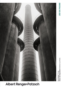
The photo above is taken by Albert Renger-Patzsch. The photo here consists of a variety of elements of abstract photography:
Lines and shapes were used to model out the basic structure and the decorations/patterns on the buildings; patterns/repetitions were used to repeatedly model out not only the looks of the building but also the objects surrounding the central subject; the tone was used to create lightings and shadings on the buildings, creating hierarchy and also emphasizing the subject in the middle same time; some textures were created by the tone, giving a somewhat smooth but also rough surface. If I were the author, three main reasons why would I take the photo would be one, the buildings were very structured, and organized and gave out a feeling of solemn; two, the surrounding buildings/objects centralize the tallest subject and make it look as if the objects were “worshiping” the subject; third, the lightings add a bit of “holiness” in the picture. Because the subject is the tallest, and lights were shadowing down, I would describe the picture as “the emperor”.
A. Develop Ideas Through Investigation | International School of Beijing. dx.isb.cn/dash/#/classroom/648607/sections/lesson/344121/page/344128.
Albert Renger-Patzsch : Les Choses – Les Presses Du Réel (Book). www.lespressesdureel.com/EN/ouvrage.php?id=7273&menu=0.
What are the formal elements of Photography? It is the six traits – line, shape, pattern, texture, tone, focus – that, maybe not all, but would definitely be consisted in a photograph. A photo can include as many elements in it and could just have one element in it. For example, you could just capture a focused or not photograph of pure white and nothing else – it still has the element focus in it but without any other elements.
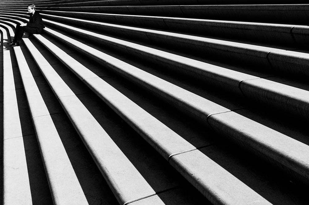
Line is literally what it is, a line or lines that either intertwine or exist on their own – it is often used to emphasize a certain object. Furthermore, by using lines, you could use them to emphasize or to create direction towards an object. For example, the image below uses stairs as a way to emphasize and create direction towards the person sitting. Additionally, it could also be used to create a focus point – all the lines below point toward one single direction, and because of the proportion, it grabs the viewer’s attention.
Shape is when a group of lines works together to create a geometrical shape; it often occurs with repetitions/patterns as it then becomes a group of shapes. In the image below, it uses shapes in different positions and postures as the subject of the photo. In fact, shapes are often used as the subject of the photo because they exist almost everywhere, and their size/physical traits often allow them to become the center of attention.

Pattern, aka repetition, is when a group of shapes is put together to generate a pattern. Patterns can make the photo feel structured and organized, thus generating an overall peaceful, stable mood. In the image below, the pattern creates a strong construction of systems of layers and evokes a stable, structured feeling in the viewers.

Texture is adding visual elements of color, depth, and shape. It can convince the viewer of the material on the surface of the photograph and make the viewer feel as if they are in the situation. In the photo below, because of the focus and the clarity of the photo, you can imagine what the sand touches, feels like, and is probably shaped like.

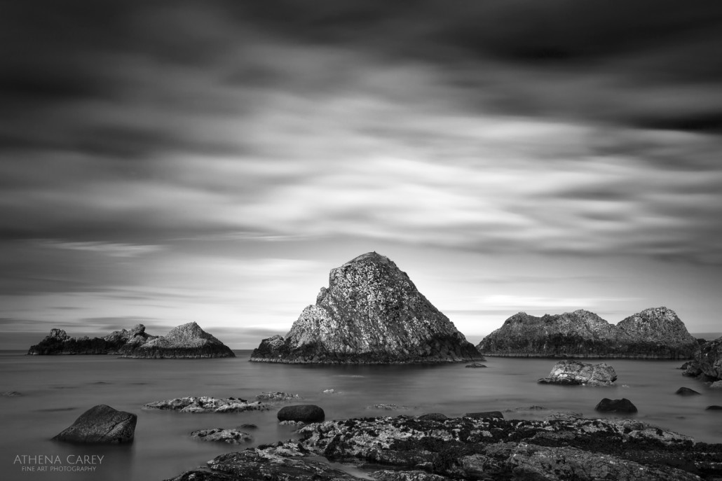
Tone is to create light-dark differences in a picture. It either emphasizes strong darkness vs. weak lighting or strong lighting vs. weak darkness, but it could also be just dark vs. light. In the picture below, the tone was used to emphasize the mountain in the middle – the surroundings and corners are all dark, and in the center, where the mountain is at, is the brightest. The hierarchy created by tone creates a strong contrast between its subject and its object.
Focus is to blur everything, or focus on everything, or to focus on mainly one thing and blur the rest. It’s often used to create focus points and hierarchy – or to blend the colors and subject together. In the picture below, focus is used to create a hierarchy on the toy bus and blur the background. Focus is also used here to blend the colors of the light and the colors of the objects – such as the cars and trees… – together, creating a glorious background view to set off its subject, the toy bus.

Citations:
Stripes And Lines: Street Photography Series By Alexander Schoenberg
“Thumbnails Exploring the Use of: LINE, POINT, SHAPE, FORM, SCALE, PATTERN, COMPOSITION, CONTRAST, TEXTURE Etc.” Connor Rankine, 29 Aug. 2014, connorrankine.wordpress.com/2014/08/29/thumbnails-exploring-the-use-of-line-point-shape-form-scale-pattern-composition-contrast-texture-etc.
dezeen.com/2014/03/22/alexander-jacques-photographs-abstract-architectural-patterns/
adobe.com/creativecloud/photography/discover/abstract-photography.html
visualwilderness.com/post-processing/using-tonal-contrast-better-bw-photography
greatbigphotographyworld.com/focus-modes/
Images that do not have a clear or direct connection with the world – it doesn’t specifically state the subject and use shapes, lines, or colors to modify the visual effect it has on the views. You could not directly tell what had been captured by the photographer.
“Abstract photography can be defined as capturing images in which the subject isn’t the most interesting element. Albert Renger-Patzsch and Aaron Siskind photographed the ordinary to reveal their beauty. Uta Barth reversed the typical use of the camera, shooting out of focus and Andreas Gursky photographs the repetition of elements. During this unit, you will investigate appropriate examples of abstract photography and respond in your own way.”
There are objects in the world where it doesn’t grab your attention – it could be the lack of hierarchy in creation, it could be the special color choice, and it could be the damage of time on it -, in fact, you might ignore it in the daily life because its too common. However, nothing is common; under the right circumstance, the right lighting, the right angle, the right background, and the right focus, the object, the subject of the photo, could vividly present itself in a way that you would have never imagined, in a way were it becomes gorgeous. For example, a normal pencil, the type of the typical pencil, sitting on a typical table with normal light ball lighting on top facing a wall would not be as interesting as the same pencil, but this time facing the window where you see the burred, uncleared red light (the dawn) drags the yellowness circular object (the sun) down into the ocean.
Citation:
A. Develop Ideas through Investigation | International School of Beijing. (n.d.). https://dx.isb.cn/dash/#/classroom/648607/sections/lesson/344121/page/344123
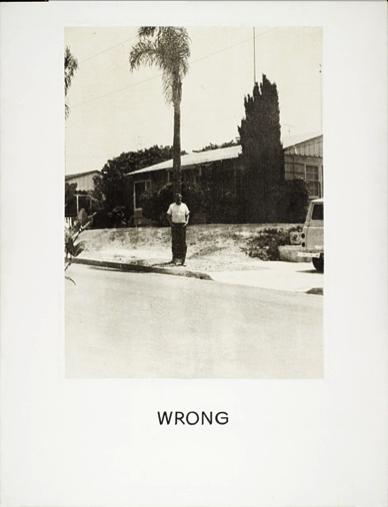
CONTEXT OF THE PHOTOGRAPH “WRONG”:
In 1967 John Baldessari exhibited his ‘wrong’ series. He uses a selection of photographic images anchored by text. The most famous of which titled ‘wrong’ shows an image with poor composition juxtaposed by the text ‘wrong’ bellow the photograph.
The irony of the word is what makes the image so appealing, just blatant judgement of the photograph. The message that Baldessari was trying to say in the image is why should we conform to conventional aspects of art or photograph, why does our work have to be judged? The interesting fact is that an idea cannot be wrong or right as it is executed as a personal response. John Baldessari once stated: “You don’t want anyone to say, ‘You can’t do that!’
A question has emerged lately: Can a publicly defined “not so appealing” photograph be great? My answer came to me in less than a minute—of course, it can! Why? Because who is there to define the art you create? Art never has only one interpretation; due to everyone’s unique experiences, each person can have a very different interpretation. Some may see it from their perspective, while others may view it similarly to others. However, each point of view is unique and never exactly the same. When you’re standing on a table or lying on the ground, how could your point of view ever be the same as someone who’s sitting in a chair? Therefore, a photograph that is labeled as “bad” can still be great because it represents you, expresses yourself, and reflects your inner state, your world, and your point of view.
Additionally, providing context in photography can indeed help others have a better, more precise interpretation of your artwork. Using the photograph “wrong” as an example, some view it as fantastic art since it captures the haphazardness of the world: ‘The man covering the cropped tree where placed in the middle of the photo while the surroundings were empty, evoking a sense of loneliness. The choice of black-white color adds to the sense of loneliness and creates an atmosphere of emptiness. The once-life-green-symboled plants were presented as pale black, further emphasizing the desperateness of the overall mood. The moving tree leaves contrast with the still man, providing a sense of feeling that the man was stepping on the same stone despite the surroundings; everything else is moving forward, again emphasizing the overall hollowness and emptiness.’ others, however, from a different angle, might view it as a bad photograph that does not adhere to some of the golden rules of photography: the man and the tree’s positions do not follow the rule of thirds; the photograph is blurry and does not focus on either the subject or the foreground; and the tree and surroundings, such as the car and the plants, are cropped out.
Nevertheless, Both interpretations may not align with the author’s initial purpose in creating the photograph since they are merely the audience’s own conjectures. If there were the context provided by the author—such as the author’s explanations, the circumstances under which the photo was taken, or the intended purpose—the photograph would be easier to understand. In fact, stated by the author of the photograph (Baldessari), the breaking of photography rules in the photograph was intentionally done to raise the question: “Why should our work be judged?”, criticizing how the public defines other artists’ work.
In conclusion, a photograph cannot be strictly defined as “good” or “bad,” and it can have many interpretations—and that is fine. However, providing context for the photograph can help the audience better relate, appreciate, and understand its purpose.
(The 10 “Wrong” Photographs):


Citations:
Baldessari, John “Wrong” Photograph. Dragon’s Exchange, ISB, 22nd August 2024. https://dx.isb.cn/dash/#/classroom/648607/sections/lesson/344114/page/344116/edit, Accessed 24nd August 2024.
WRONG! | International School of Beijing. dx.isb.cn/dash/#/classroom/648607/sections/lesson/344114/page/344118.
Over half of the four million foods provided each year have been wasted, while many are suffering from starvation and hypohydration, particularly refugees.
Around 7 billion people in the entire world(Data Commons Place Explorer), and the average adult could fit, approximal, 525 pounds of food per year(papertrell.com), 0.2625 tons.
0.2625 tons and 7.888 billion multiplied is nearly 2 million tons.
This means human latterly only needs half of the food that’s produced to survive(bloomberg.com), and yet with the extras, 828 million are still in starvation(actionagainsthunger.org).
As a lazy and messy person, a place to hold all my belongings and tools such as blank paper and pencil & pen is a great desire, since I am too lazy to get up and get a blank A4 paper or a pencil or my school articles, I’d rather think “I could do that later!”.
But this thinking causes me to have many problems like a messy table since I just put all my articles and paper and pens on the table and mess up everything-. But then, I had an idea of a box, that takes up some space but can organize every supply I needed, pens, pencils, papers, school stuff…etc, and that’s the moment when I decided to make this project.
At first, I had a picture of a box that had 2 dividers and that’s all, but then, I thought of a place to hold my pens and erasers. So I think of a box that’s connected to the wall which then I had space for my stationery. After that, I felt like two dividers that created space wasn’t enough, so I thought of adding one at the bottom, and that’s basically my thinking process.


But in the end, I wasn’t careful enough, I measured a bunch of my pieces wrong, which then forced me to change the entire look of the box, such as abandoning the small box to hold erasers, changing the position of my dividers, changing the position of my long box to hold pens. Luckily, I was able to save my project and make it kind of look like I wasn’t making any mistakes…

As for the skills I’ve grown, I’ve grown a bunch, why? Anyone would after recreating every slide after finishing it, drawing fit points line, finding tools that haven’t been introduced such as polygon, again recreating slides because of forgetting bridges on every circle, and shape; or just trying to “copy” a shape from the internet, it was a process of true torturing & pain & miserable.
Something cool is that I survive, after brain pain and headaches, and one skill of making and giving better looks of your design, any design, I’d recommend is to use the extend&break. Those are the tools that would be the oasis in this pure miserable process.
Answering the question since I’m lazy about writing paragraphs:
What tips, tricks, and advice would you give to the incoming students?
Tips, tricks, and advice I would give to those incoming are, please ask the teacher, ask the teacher about everything, and do annoy the teacher else you would be annoyed. The process of changing and correcting mistakes is painful and aren’t like correcting an essay, it is just suffering and tear of regret.
And if I know that I should ask the teacher often, maybe I wouldn’t need to change my entire project’s look into an entirely different thing because of the wrong measurements.
What would you, individually, do differently if could go back and do the class over?
I would surely spend more time planning instead of rushing over and screwing up everything in the end.

Because my design ideas, sure, weren’t the best, but even though my work effort would probably be 4.5 out of 5, the mistakes of bad plan lift, no, triple the challenge, making the level of difficulty from probably 5 out of ten to 8, “challenged” my self to the edge of collapse.
What would you (the student) want to be changed about the course so I (the teacher) can make improvements to the course?
Really, the cause of my problems was basically all my fault, Ms. Kim did a wonderful job of trying to make everything easy and less complicated and decrease the level of headaches, but what’s the problem is that I didn’t listen to the advice Ms. Kim given to us at the beginning of the course, “Ask the teacher”, so there’s really wasn’t any advice I would give to Ms. Kim because of the hard-working she is and always trying to help everyone with their problems and did fantastic on explaining the tools and courses.
But one non-important piece of advice I would give is probably TEACH THE EXTEND & BREAK AT THE BEGINNING OF THE PROJECT SO LESS OF MY HEADACHES WOULD APPEAR IN THE FIRST PLACE!!!
© 2025 Anthony
Theme by Anders Noren — Up ↑
Recent Comments