Evaluation – Identity Photograph

I ultimately chose two photos as my identity photo, and the most prominent theme displayed in these two photos is a white flower and myself covered by white flowers. The theme that these two photos want to express is that there is a white flower in my heart, and this white flower can help me forget my troubles and also allow me to calm down and do what I want to do. Therefore, this white flower occupies most of my face, not a tiny part. I like attention to understand and use the contrast between white flowers and dark background colors to make them more noticeable so that people can focus on white and pure food instead of black and dark things.

Connecting – Identity Project

Finding Focus

This photography project explores how people shape their identities in response to societal and cultural influences. By placing objects on the subjects’ faces, the photographs symbolize the masks we wear and the hidden parts of ourselves. Through these images, we aim to spark conversations about the impact of society on personal identity, encouraging viewers to reflect on the authenticity of self-expression in our world today.

Image Inspiration

OFFICIAL FINAL PIECE IDEA 2 – ”IDENTITY” – Michael Wills PhotographyKuwaiti Photographer Maha Alasaker and her thoughts on identity and  belonging. – Reconnecting ArtsAttack Mode 2017 | davidevanmackay

I researched three pictures, and they had some similar parts. They’re all in black and white, which didn’t show the lighting. They use different objects and put them on or beneath their face to establish their identity. The object could be changed by the uniqueness of other people, which usually will be things that could represent this person.

Mood Board

Statement of Intent

The title of this project is “Reflections: Unveiling Societal Constraints.”

The societal/cultural issue I want to explore with my photographs is the complex interplay between societal expectations and individual identity. Using visual metaphors and symbolism, I aim to shed light on how society’s norms and standards can influence and limit personal expression and authentic selfhood.

I want my audience to feel a sense of contemplation and introspection when engaging with my photographs. I want them to question the societal constructs that shape their own lives and the lives of others. Through the juxtaposition of beauty and constraint, I hope to evoke emotions of curiosity, empathy, and a desire for greater understanding.

I will get inspiration and develop my ideas by looking for photographs that challenge conventional notions of identity, gender roles, and societal expectations. I will explore images that portray fragments, veils, and hidden elements and showcase the delicate balance between freedom and restriction. By studying the works of artists who have explored similar themes, I will seek inspiration to craft my unique visual narratives that provoke thought and encourage dialogue.

Through this project, I aspire to spark conversations about how societal and cultural norms can impact individuality and self-expression. I aim to inspire viewers to question the constraints they may unknowingly impose on themselves and others and to foster a greater appreciation for human identity’s diverse and multifaceted nature.

Triptych

Triptych 1

These three pictures could be in one set because they have the same theme. The left side of these three pictures is all the roads that pass from the back to the front, and the right side is all that passes from front to back. They all have the middle part, the separate line of the road, and they are all the same. The pictures are also perfectly separated into two pieces instead of 1/3 and 2/3. I like these pictures because they are well organized, and the down half part is about the same.

Triptych 2

These three pictures are in another set with the same theme. They are all taken by standing on the street, which is the end of the buildings in front of me. No matter if it is the left end or the right end, they still are the same. Also, they get the crossroad as their same thing. They look good with each other because of the arrangement that I use, in which the first and second pictures (from left to right) could match each other, and the third one also fills up the gap of the second picture.

Set 2

Thomas Truth

Thomas Struth is a German photographer known for his large-scale, highly detailed images of urban and natural landscapes and portraits. His work explores the relationship between individuals and their environments, often capturing crowds of people in iconic locations. Struth’s meticulous attention to detail and use of large-format cameras create immersive and thought-provoking photographs that have significantly impacted contemporary photography.

Photographer’s photo

Thomas Struth: Photographs | Exhibitions | The Renaissance Society

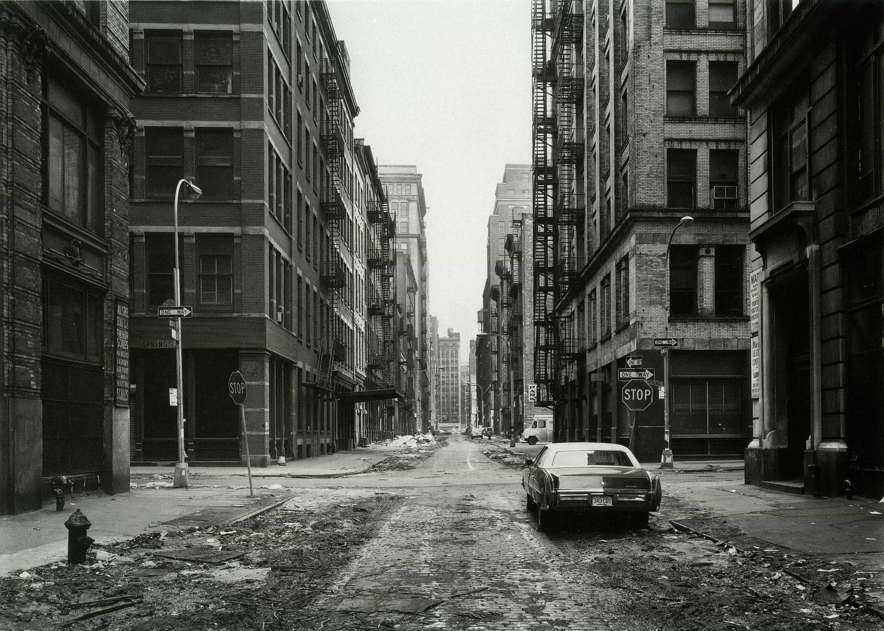
This is a photo by Thomas Truth, which is the classic style of his photographs. In this picture, it is an urban street with no people. He uses the “line” element to organize the image and adds a black-and-white filter. No road will be black and white, so this must have a filter on. But the part of the sky is pretty bright, which strongly contrasts the buildings. These are the reasons why this picture looks nice.

Contact Sheet

Red

I made this picture a “red” image because it is similar to the photographs taken by the artist Thomas Truth. The artist’s characteristics are the view from standing in the middle of the street and taking a picture of the buildings. In Beijing, it is rare to see roads separated from the left and right lanes in the middle. So, I chose to take a photograph that only partially has anything on the road but still has the same theme. This picture looks nice because of the buildings, roads, and especially the building that spans the middle.

I mark this picture a “red” image because of the same style as the photographs taken by the artist Thomas Truth. It also stands in the middle and pays attention to the buildings. We are similar in also leaving a gap in the middle, which allows the audience to think more about what other facilities will be different than the buildings already appear in the image. I let the road be about 1/3 in the picture because the road is also a vital element for allowing the facilities to get smaller and smaller. Even though the photo by Thomas Truth did not contain any component of trees or colors, adding the shade of trees and buildings is still excellent.

Yellow

I mark this picture as a “yellow” image because it will be a set of photos taken around 5:20-5:30, which is the time of sunset on Oct 28. I first check the time on my phone in the evening, and I wait till the day comes dark. This photo is taken by the place around the China World Apartment. This picture looks great because of the rich elements, such as the zebra crossing, passing vehicles, advertisements on buildings behind, and more high-rise buildings on the left rear of the building. All these elements look excellent with each other and do not make the audience feel messy or so. I love the slope on the left of the building, which forms a great angle and leads the attention to the formation on the back. I also love how the lights are partly open in the building on the back, which gives a unique atmosphere.

I mark this picture as a “yellow” picture because of the same theme as the first yellow picture. It was also taken in the same period as the first photo. I was actually standing at the crossroads in the first yellow picture. I decided to stand in the middle of the corner and take a photograph because it would be excellent if two cars were passing, and also, the background of the building spans in the middle light up. The lights have an eco, which forms a unique atmosphere. They can be analyzed as three different types of lights: bright (white), yellow (warm), and red. The elements also surprised me; I’m fortunate, too.

Green

I mark this picture as a “green” photo because of the same elements that the other green image will also have, which this picture is taken at 16:25. In this picture, it can be directly seen that the building looks like pants in the middle, and its name is “Big Pants.” I discovered I could take a picture of the upper part of this building, but also with many gaps filled by the sky. There are also some buildings on the right of “Big Pants,” but they still leave a clean area, with only one “Big Pants” in the middle. I was standing outside a shopping mall, which, as you can see on the left side of the picture, has some buildings that “show up.” This picture looks good because of the gaps highlighted in the “Big Pants.”

I made this picture a “green” picture because, as you can see, it is about the same angle as the first, but in different periods. This picture was taken at 17:38 on Oct 28, about 1 hour after the first picture. I decided to take photos in the different periods because I know there will be light effects at night, so I wanted to see if it would form a strong contrast if I took pictures one hour before sunset. I was satisfied with the result that I got. The difference is noticeable, and if you spend more time staring at this picture and then look up at the first picture, you will think that the first picture might be black and white. The first picture still has color, but because of the strong contrast, it does not look like it has color. I think this picture looks great because of the buildings’ lighting and street lamps. The dark blue of the building and some light up inside of the building got eco with the street lamps. The sky was blue with purple, which is my favorite color. All these elements form such a nice picture.

Hiroshi Sugimoto

5 Characteristics of Pictures by Hiroshi Sugimoto

All of the pictures are black and white, or the color is only on the object which is focused on. They are all indoor designs, not shooting outdoor buildings. Most of them are photography exhibitions, and the photos in the collections are very similar. There are also filming places similar to theaters, all in black and white. There are apparent straight lines instead of curved ones.

Total Analyzing the Pictures by Hiroshi Sugimoto.

Hiroshi Sugimoto’s works have an unmistakable style and focus on capturing indoor scenes. Most results are about paintings at art exhibitions or photography in theaters or large spaces.

Why I chose this photographer

I chose this photographer because his style aligns with the black-and-white minimalist style I aspire to. And it clearly indicates different themes and does not confuse people. And he is not entirely black and white; some of his shots of exquisite paintings are in color. The background is black and white, which also creates a perfect contrast.

A Quote

“I’m inviting the spirits into my photography. It’s an act of God.”
–Hiroshi Sugimoto

I chose this quote because he expressed all his emotions about photography, which explains why his works are so stylish. It helps me understand that he likes to take pictures of spotless things instead of messy ones.


Red Picture

Red

I mark this picture as a “red” picture because I think this picture looks good. It shows lovely shapes. The shape will have different looks from different angles. In my grade, the body will look more extensive on the left and smaller on the right. When I photograph the body in the center front, it will all be in one size. The part of the sky also gives the picture a highlight, and the image is not dull anymore. The decorations of the photograph could be analyzed as the streetlights, cars, and trees. All these elements are from a nice view.

I mark this picture as a “red” picture because I think this picture looks great. It shows the roof of the building and also the sky. The top of the building is not regular lines; it is like a triangle. The building at the back is in red, which also has an acho with the window of the second building in the photo. The weather in the picture is not a good sunny day, but it still has an intense light. Which provides a contrast with the buildings. The color element of green from the trees also gives the picture more features.

Yellow and Green Pictures

Yellow

I mark this picture as a “yellow” picture because I think this picture looks great. From the elements that this picture contains, it has a prominent “line” element from the line of the building, the line from the street, or the line for the street lamp. The intense color contrast, red(the building) and white, as well as the green of the roadside green belt, makes the picture look more attractive. The white of the building also has an echo with the sky. The pedestrian also highlights the image, and the pedestrian is also in the middle. To sum up, the design of the house and the pedestrian make this picture look nice.

I mark this picture as a “yellow” picture because I think this picture looks great. This picture contains a vital line element, which is from the design of the handrail of this stair. It also shows how the gap between the objects turns smaller because of the place where I stand and take this photograph. Also, the right part of the picture is all the interesting buildings and stuff, and the left leg is clean. The contrast and the handrail of stairs make this picture look good.

Green

I mark this picture as a “green” picture because I think this picture looks perfect. The element that this picture contains is the shape. It can be separated into three part, which is horizontally. The ceiling and the ground are black and gray, which will lead the audience’s attention to the middle part, which is the drawings. It has a white background, which means it has a strong contrast. Even though the painting uses black and white color, the lights on the drawing make it more like the focus. The lights and the color contrast make this photo look nice.

I mark this picture as a “green” picture because I think this picture looks fantastic. First, it clearly shows the theme: a painting with many innovative ideas. Second, it got a great light that directly shot on the parting, a strong contrast of the image and the background, and a perfect elliptic shape. At last, the shadow of the drawing reflects on the ground. It makes the overall spatial sense of the image perfect. The graphic’s shadow is the best part, which makes the picture look more excellent.

Skip to toolbar