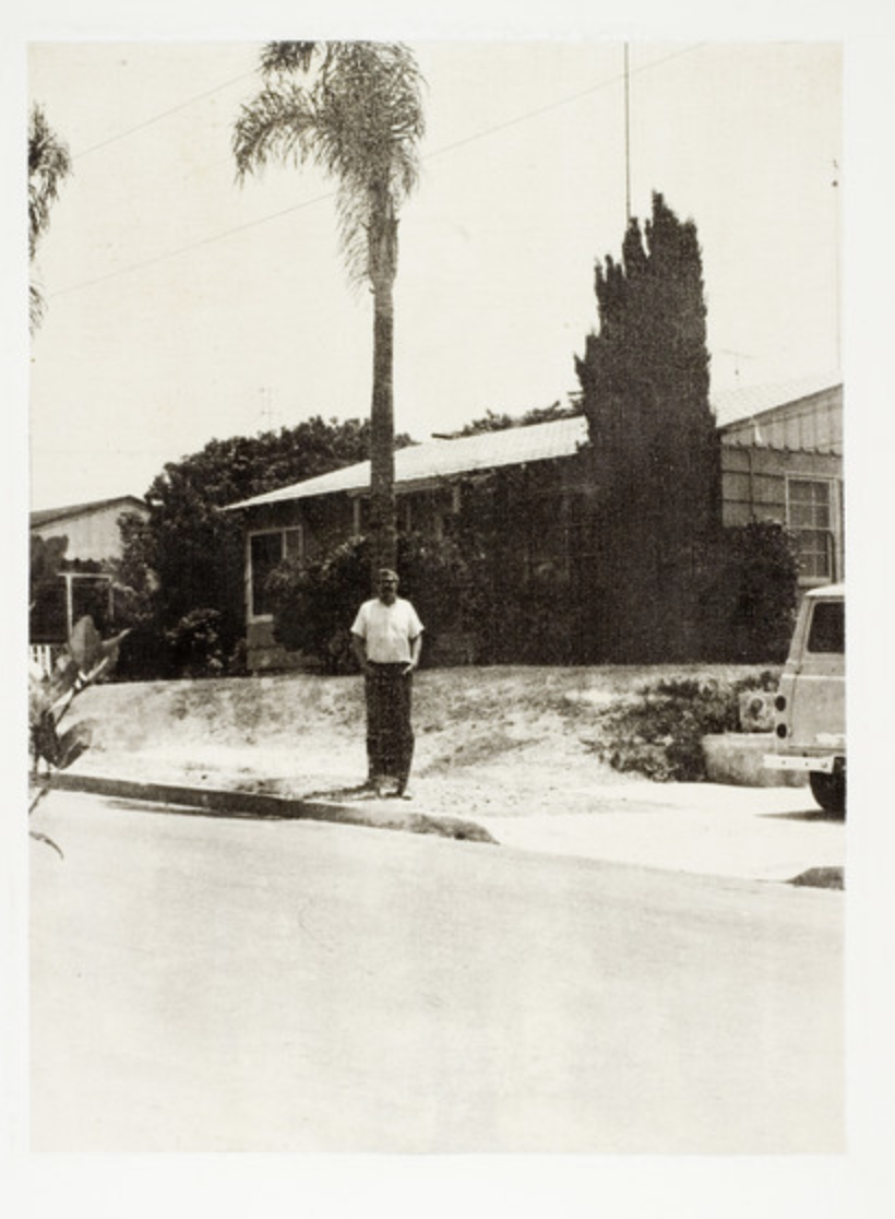
This is all about breaking the photography rules that my partner Adrian and I posted on the Padlet website. We’re doing this to take any photos that don’t follow the rules. Surprisingly, breaking these rules doesn’t make the images look ugly. Instead, it actually makes them look even better. That’s why I chose the title we did—it reflects this unexpected outcome.
Pictures


Each of these pictures is accompanied by a title and a brief explanation highlighting the specific rules it violates. In addition, the explanation also specifies why I believe these ten pictures look fantastic. To provide further clarity, I have listed the rules below.
1. Divide the picture into thirds.
2. Always put your subject in the middle.
3. Place the horizon in the middle of the frame.
4. Fill the frame.
5. Don’t blur the background.
6. The photo needs to be bright in the background.
7. Need to have a theme.
8. The photo must be parallel to the ground.
Photo by John Baldessari

“Wrong” is an intriguing artwork crafted by John Baldessari, an esteemed artist celebrated for his inventive methods in the realm of visual art. This particular piece defies conventional ideas and established norms in photography. Baldessari achieves this by purposefully blending contrasting elements, compelling viewers to challenge their preconceived notions regarding composition, subject matter, and the limitations of visual storytelling. The image serves as an invitation to delve deeper into the intentional subversion of rules and expectations, ultimately resulting in a compelling and visually stimulating outcome that provokes contemplation.