Category Archives: Photography
Photo Safari
The elements that have been represented by these pictures are Line, Shape, Repetition/Pattern, Texture, Value/Tone, and Focus.
Pictures


Worked well or not
Red brick images was incredibly effective in displaying their intricate patterns and textures with exceptional clarity. The organization of these images was flawlessly executed, seamlessly incorporating the number 9 from the picture gallery. This sophisticated decision not only emphasized the visual charm of the red brick composition but also showcased a deep understanding of aesthetic principles and skillful curation.
Unfortunately, the third-to-last choice didn’t work well because the camera couldn’t zoom in or out as needed. Since I couldn’t adjust the zoom level, I couldn’t make the object smaller or get a better angle or view. As a result, I couldn’t improve the way the picture looked because of this significant limitation.
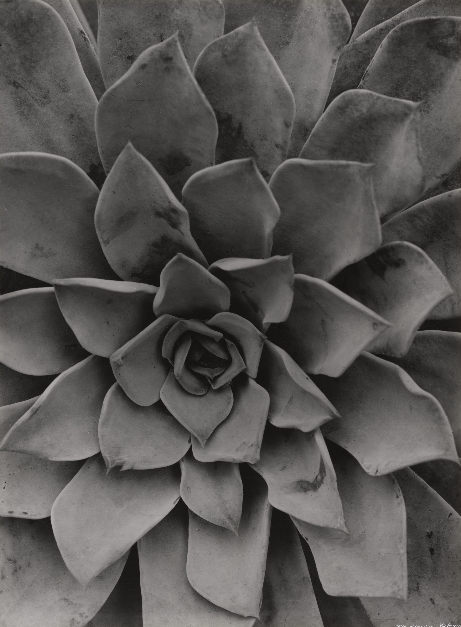
Albert Renger-Patzsch

Detail and Texture: Renger-Patzsch often focused on capturing the intricate details and textures of his subjects. In the case of an Echeveria plant as shown in the picture, he might have been interested in highlighting the unique patterns and textures of the plant’s leaves, showcasing their intricate beauty.
Form and Shape: Renger-Patzsch paid attention to the formal qualities of objects. In photographing an Echeveria, he might have been intrigued by the plant’s geometric and symmetrical shapes, capturing its distinctive form in a visually appealing way.
Objectivity and Realism: Renger-Patzsch aimed to represent the world in an objective and realistic manner. With an Echeveria, he might have sought to capture its natural essence, presenting it in a straightforward and unembellished manner, allowing viewers to appreciate the plant’s inherent beauty.
The title
If I were to suggest a title for a photograph of an Echeveria taken by Albert Renger-Patzsch, I might consider something like “Symphony of Succulence.”
This title aims to evoke a sense of harmony and beauty found within the Echeveria plant. “Symphony” suggests a composition or arrangement of elements working together in harmony, reflecting the intricate patterns, shapes, and textures of the plant. “Succulence” emphasizes the juicy and fleshy nature of the plant’s leaves, alluding to its vitality and richness.
Additionally, Renger-Patzsch’s focus on detail and objectivity in his photography often allowed viewers to appreciate the inherent beauty of his subjects. The title “Symphony of Succulence” captures the essence of Renger-Patzsch’s approach and highlights the captivating qualities of the Echeveria plant.
The Use
Line: In the photograph, lines may be present in the form of the plant’s leaves or stems. These lines can create a sense of direction and guide the viewer’s eye through the image, enhancing the overall composition and adding structure to the photograph.
Shape: The Echeveria plant itself exhibits various shapes, such as the rounded and overlapping forms of its succulent leaves. These shapes contribute to the overall visual appeal and structure of the composition, providing a sense of balance and harmony.
Repetition/Pattern: The repetition or pattern can be found in the arrangement of the Echeveria leaves. The repeated shapes and textures of the leaves create a rhythm and visual harmony within the photograph, enhancing the overall aesthetic appeal and inviting the view’s attention.
Texture: The texture of the Echeveria’s leaves can be visually captivating. The photograph may highlight the intricate details and surface characteristics of the leaves, such as their smoothness or the presence of small bumps or ridges. Texture adds depth and tactile quality to the image, allowing the viewer to almost feel the surface of the plant.
Value/Tone: The photograph showcase a range of values or tones, depending on the lighting and exposure settings. The bright highlights and dark shadows on the surface of the Echeveria leaves can create contrast and depth within the image, contributing to its overall mood and atmosphere.
Focus: he photographer’s focus would likely be on capturing the Echeveria plant in sharp detail. The main point of interest, such as a specific leaf or the center of the plant. would be the primary focus to draw attention and allow viewers to appreciate the indicate details of the subject.
Formal Elements
Line: “Line” refers to a visually prominent and noticeable element that runs through an image. It could be a straight line, a curved line, or even an implied line created by the arrangement of various objects. Lines play a crucial role in composition, as they can guide the viewer’s eye, create a sense of movement or direction, and add structure and balance to the photograph. Lines can be found in various subjects, such as roads, buildings, tree branches, or even the edges of objects. They help to create depth, perspective, and visual interest in a photograph.

Shape: “Shape” refers to the visual outline or form of an object or subject within an image. It is the two-dimensional representation of an object’s external boundaries. Shapes can be geometric, such as squares, circles, or triangles, or they can be organic, like the shape of a person or a tree. Shapes are an essential element of composition in photography, as they contribute to the overall structure, balance, and visual impact of an image. They can create patterns, convey emotions, and draw attention to specific areas within the photograph. By recognizing and utilizing shapes, photographers can enhance the aesthetic appeal and storytelling potential of their images.

Repetition/Pattern: “Repetition” or “pattern” refers to the recurrence of similar elements or motifs within an image. It involves capturing and highlighting the repeated shapes, colors, lines, or objects to create a sense of rhythm and visual harmony. Repetition/pattern can be found in various subjects, such as architecture, nature, or everyday objects. It adds a compelling and organized quality to a photograph, capturing the viewer’s attention and creating a sense of order. By recognizing and emphasizing repetition, photographers can create visually captivating images that evoke a sense of rhythm, balance, and beauty.

Texture: “Texture” refers to the visual and tactile quality of surfaces within an image. It’s the way you can see and almost feel the different details, patterns, and roughness or smoothness of a subject. Texture adds depth, interest, and a sense of touch to a photograph. It can be found in a variety of subjects, such as tree bark, fabrics, rocks, or even human skin. Texture can be enhanced by lighting and composition techniques, such as capturing shadows or using side lighting to accentuate the surface details. By emphasizing texture, photographers can create images that invite the viewer to imagine the feel of the subject, adding a sensory experience to the visual art form.

Value/Tone: “Value” or “tone” refers to the brightness or darkness of different areas within an image. It’s like the lightness or darkness of the colors used in a photograph. Value/tone helps create contrast and depth, and it contributes to the overall mood and atmosphere of the image. When an image has a wide range of values, it means there are both very bright and very dark areas, which can create a dynamic and visually striking composition. On the other hand, when an image has a limited range of values, it can create a more subtle and subdued effect. By understanding and manipulating value/tone, photographers can control the visual impact and emotional response of their photographs.

Focus: “Focus” refers to the clarity and sharpness of the subject or the main point of interest in an image. It’s like getting a clear view of something you’re looking at. When a photograph is in focus, the subject appears crisp and well-defined, while the surrounding areas may be slightly blurred or out of focus. Achieving proper focus is important because it helps draw attention to the intended subject and allows viewers to see the details and textures clearly. On the other hand, when a photograph is out of focus, the subject appears blurry or unclear, which can detract from the overall quality of the image. Photographers use various techniques, such as adjusting the lens settings or manually selecting the focus point, to ensure that their images are sharp and well-focused.

One element
An image can show just one element at a time. In a photograph, you can focus on a single subject or a specific aspect of a scene to capture and highlight that particular element. By isolating and emphasizing one element, you can draw attention to its details, textures, or significance within the composition. This approach allows for a more focused and impactful visual storytelling, as it directs the viewer’s gaze and creates a clear point of interest within the image. So, in summary, an image can indeed showcase one element at a time, enabling photographers to convey their intended message or evoke a specific emotion through careful selection and presentation.
Analysis of Photographers
The Pictorialism Movement
The Pictorialism movement in photography was a style that emerged in the late 19th and early 20th centuries. It aimed to elevate photography to the status of fine art by emphasizing the artistic interpretation and subjective vision of the photographer. Pictorialist photographers used soft focus, manipulated printing techniques, and compositional elements borrowed from painting to create atmospheric and evocative images. They sought to convey emotion and mood rather than simply document reality, often favoring landscapes, portraits, and still lifes. Pictorialism had a significant impact on the development of photography as an art form.
The Straight Photography Movement
The Straight Photography movement, also known as the “New Vision” or “Objective Photography,” emerged in the early 20th century as a reaction against the soft-focus, manipulated aesthetics of Pictorialism. Photographers associated with this movement, such as Edward Weston, Aaron Siskind, Uta Barth, and Andres Gursky sought to capture the world as it truly appeared to their eyes. They valued sharp focus, precise detail, and the ability to freeze a moment in time. By focusing on the essence of the subject matter, they aimed to reveal the beauty and significance of the mundane.
Straight Photography became popular among photographers because it aligned with the modernist movement, which rejected traditional artistic conventions and embraced the realities of the modern world. It emphasized objectivity and the depiction of everyday life. Advancements in camera technology, like smaller and more portable cameras, allowed photographers to capture spontaneous moments. Faster films with better sensitivity also helped capture sharp and detailed images in different lighting. Overall, Straight Photography offered a fresh and honest approach to capturing the world, contributing to the development of photography as a respected art form.
Edward Weston and Aaron Siskind
Edward Weston and Aaron Siskind have both been influenced by the Straight Photography Movement, which emerged in the early 20th century. This movement emphasized capturing subjects with clarity, precision, and objectivity, rejecting the pictorialist approach that used soft focus and manipulation techniques. Straight photographers aimed to present the world as it appeared, focusing on form, texture, and composition.
Edward Weston
Edward Weston, known for his iconic black-and-white photographs, was a prominent figure in the Straight Photography Movement. He embraced the movement’s principles by capturing sharp, detailed images of various subjects, including landscapes, still lifes, and nudes. Weston’s photographs emphasized the inherent beauty of the subjects through careful composition and precise tonal range. He often explored close-ups and abstract compositions, highlighting the textural qualities of his subjects. Weston’s approach to photography was characterized by a strong sense of formalism and a dedication to technical excellence.

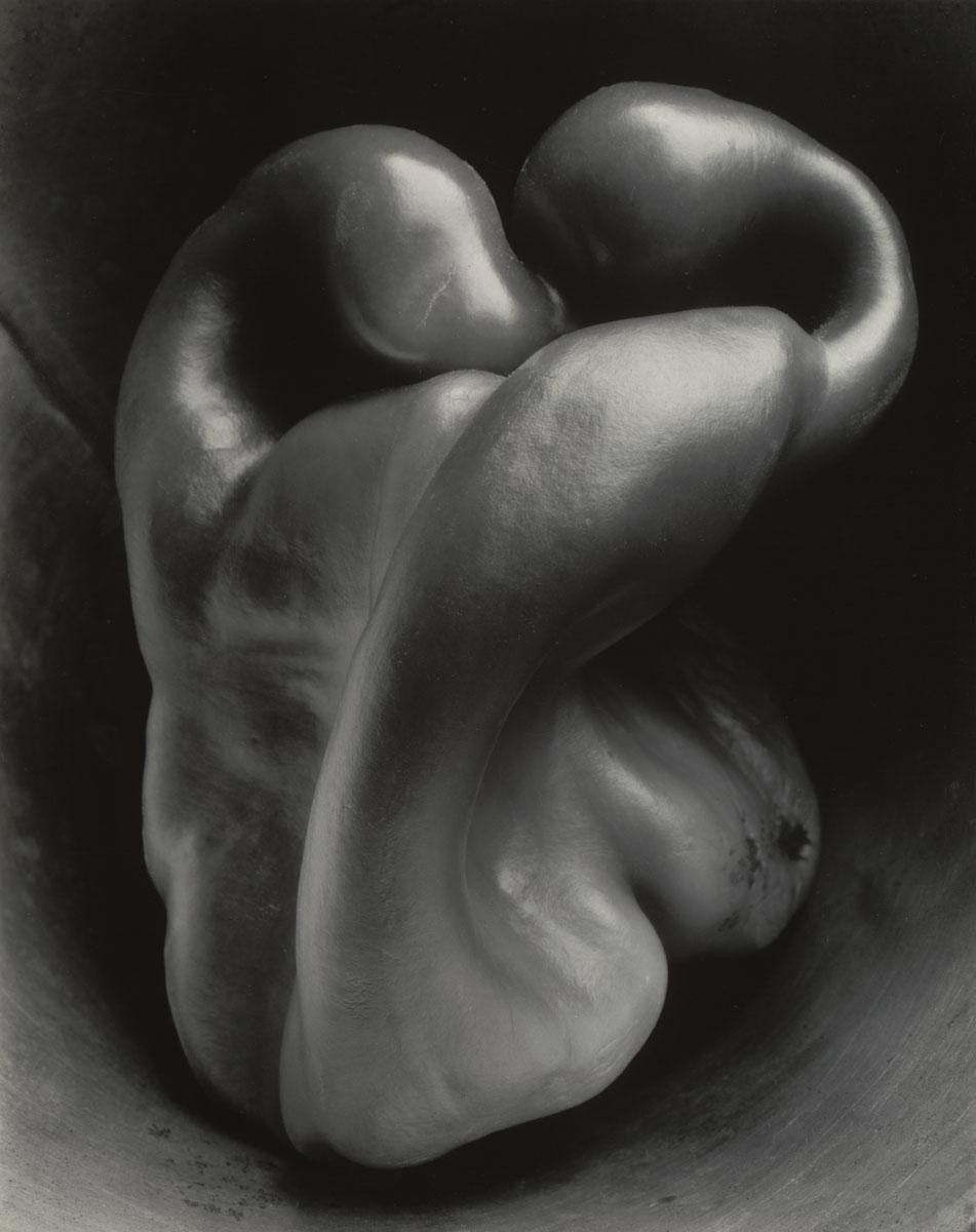
Pepper N0.30.1930
“Pepper No. 30″ is a gelatin silver print taken by Edward Weston in 1930. Measuring 9 7/16 x 7 1/2” (24 x 19 cm), it is one of Weston’s most iconic photographs. The close-up perspective and careful lighting elevate the pepper to the status of a human figure, with its twisted form resembling heads leaning toward each other or a person’s back. This still-life arrangement reflects American artists’ exploration of traditional themes in new modern ways.
Aaron Siskind
Similarly, Aaron Siskind was influenced by the Straight Photography Movement, although his work evolved in a different direction. Initially a documentary photographer, Siskind shifted his focus to abstraction and the exploration of the photograph as a means of artistic expression. He applied the principles of Straight Photography to capture the world around him with clarity and precision. However, he also experimented with cropping, fragmenting, and recontextualizing his subjects to create abstract compositions. Siskind’s photographs often showcased the textures, patterns, and graphic qualities found in everyday objects, highlighting their aesthetic potential.

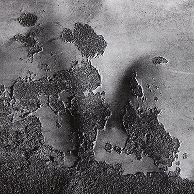
Chicago 48
The website showcases Aaron Siskind’s photograph titled “Chicago 48.” Created in 1948, this gelatin silver print measures approximately 12.50 x 16.75 inches (31.8 x 42.5 cm). “Chicago 48” is renowned for its abstract form of expression and serves as a testament to Siskind’s innovative approach to photography, highlighting his emphasis on aesthetics and pushing the boundaries of the medium.
Conclusion
Both Weston and Siskind shared a commitment to the core tenets of the Straight Photography Movement, such as sharp focus, precise composition, and a direct approach to capturing the world. However, their individual artistic visions allowed them to push the boundaries of the movement and explore new artistic possibilities. Weston’s work focused on the inherent beauty of his subjects, while Siskind used photography as a means of abstraction and visual experimentation. Their contributions to the Straight Photography Movement continue to influence and inspire photographers to this day.
What makes it abstract?
Andreas Gursky
Andreas Gursky’s work can be characterized as abstract due to his approach to capturing and representing subjects. He often focuses on large-scale, expansive scenes that emphasize patterns, repetition, and the interplay of shapes, colors, and textures. His photographs invite viewers to explore and interpret the composition in their own way, as they often lack a clear focal point or narrative. Gursky’s images present the subject matter as it is, without significant alterations or subjective interpretations, aligning his work more with the tradition of straight photography.

Les Mées
Andreas Gursky’s photograph “Les Mées” depicts a French solar farm and creates an abstract composition reminiscent of computer-generated grids. The photo isolates the solar panels, focusing on their orderly arrangement and repetitive pattern. Gursky simplifies the image by reducing details and adopting a minimalistic approach. This highlights the shapes, lines, and patterns, inviting viewers to explore the abstract qualities of the photograph.
Uta Barth
Uta Barth’s contemporary photography is abstract, achieved through deliberate techniques like blurring and shallow depth of field. Her images lack sharpness and instead focus on the interplay of light, color, and form. While depicting everyday scenes, Barth removes specific references, inviting viewers to engage with abstract compositions. Her work defies clear categorization as either pictorialist or straight photography. It diverges from pictorialism by not imitating other art forms or conveying narratives. Similarly, while it shares some traits with straight photography, Barth’s intentional blurring and emphasis on abstraction push it beyond strict adherence to traditional principles. Instead, her practice blends abstraction, conceptualism, and subjective interpretation, resulting in a unique and captivating artistic expression.

Field #20
“Field #20” by Uta Barth is an abstract photography work characterized by deliberate blurring and shallow depth of field. The image features muted browns and greys, with striking red traffic lights that expand dramatically. The large-scale format adds to its abstract nature, appearing as colored dots up close and distorted street scenes from a distance, as if viewed through wet glass. Barth’s intentional blurring challenges traditional photography, encouraging viewers to focus on the visual experience rather than specific subjects.
Conclusion
In conclusion, Uta Barth and Andreas Gursky are influential contemporary photographers who have challenged traditional notions of photography. Barth explores perception through abstraction, while Gursky captures expansive scenes of modern life. Both artists push the boundaries of the medium and offer thought-provoking perspectives. Their contributions continue to shape and inspire contemporary photography.
Definition of Abstraction
The statement means that in abstract photography, the subject of the photograph is not the main thing that grabs your attention or makes the photo interesting. Instead, other aspects such as colors, shapes, patterns, or lighting are more important and captivating. Abstract photography focuses on creating visually appealing or thought-provoking images by emphasizing these elements rather than the subject itself. So, the subject might be recognizable or familiar, but it takes a backseat to other visual qualities that make the photo intriguing.
Wrong!
This is all about breaking the photography rules that my partner Adrian and I posted on the Padlet website. We’re doing this to take any photos that don’t follow the rules. Surprisingly, breaking these rules doesn’t make the images look ugly. Instead, it actually makes them look even better. That’s why I chose the title we did—it reflects this unexpected outcome.
Pictures


Each of these pictures is accompanied by a title and a brief explanation highlighting the specific rules it violates. In addition, the explanation also specifies why I believe these ten pictures look fantastic. To provide further clarity, I have listed the rules below.
1. Divide the picture into thirds.
2. Always put your subject in the middle.
3. Place the horizon in the middle of the frame.
4. Fill the frame.
5. Don’t blur the background.
6. The photo needs to be bright in the background.
7. Need to have a theme.
8. The photo must be parallel to the ground.
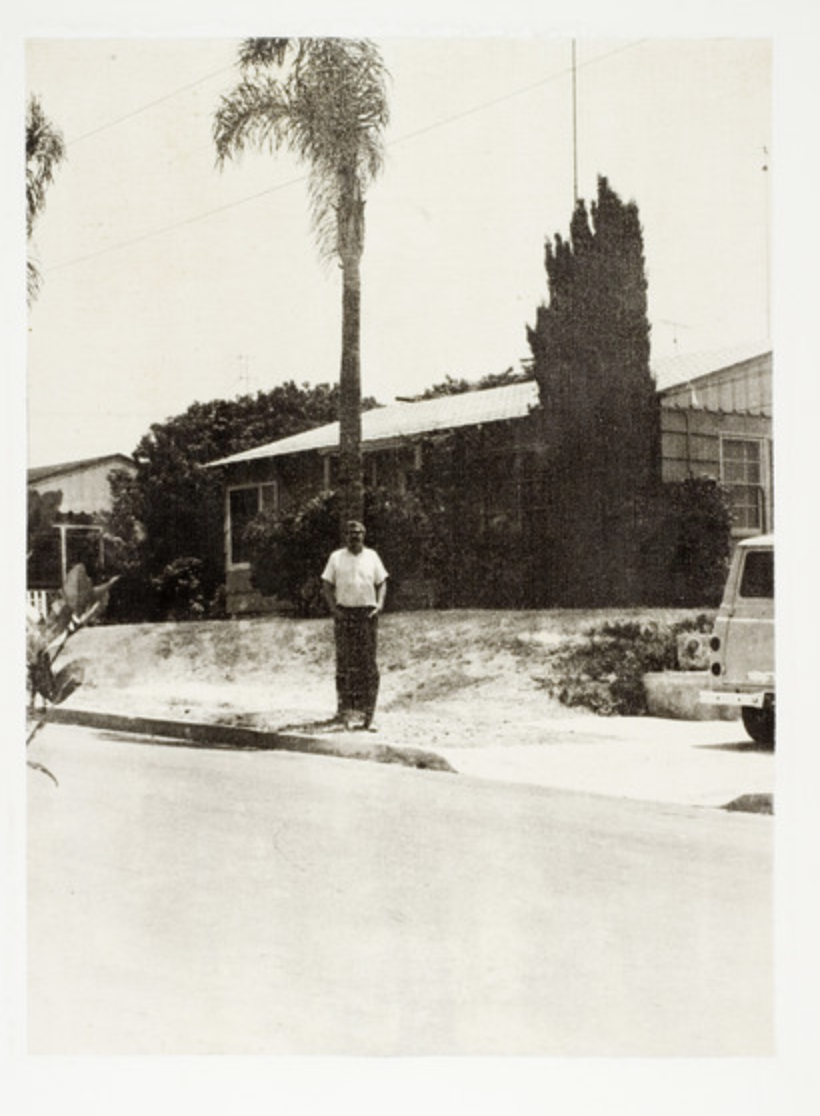
Photo by John Baldessari

“Wrong” is an intriguing artwork crafted by John Baldessari, an esteemed artist celebrated for his inventive methods in the realm of visual art. This particular piece defies conventional ideas and established norms in photography. Baldessari achieves this by purposefully blending contrasting elements, compelling viewers to challenge their preconceived notions regarding composition, subject matter, and the limitations of visual storytelling. The image serves as an invitation to delve deeper into the intentional subversion of rules and expectations, ultimately resulting in a compelling and visually stimulating outcome that provokes contemplation.