SETS: Part 1

“I am never interested in the individual, but in the human species and its environment.”

————–Andreas Gursky

Photographs:

Amazon, 2016: Showcasing the original and personal style of Gursky and a piece of evidence claiming his target. In this work, Gursky portrayed a massive viewpoint of a huge supermarket, with all kinds of different objects and commercials. The main reason that made this abstract is because there are not any specific targets Gursky aimed in this photograph; instead, many elements differentiating color, line, and shape, are shown to create a mixed and total feeling for the audience.


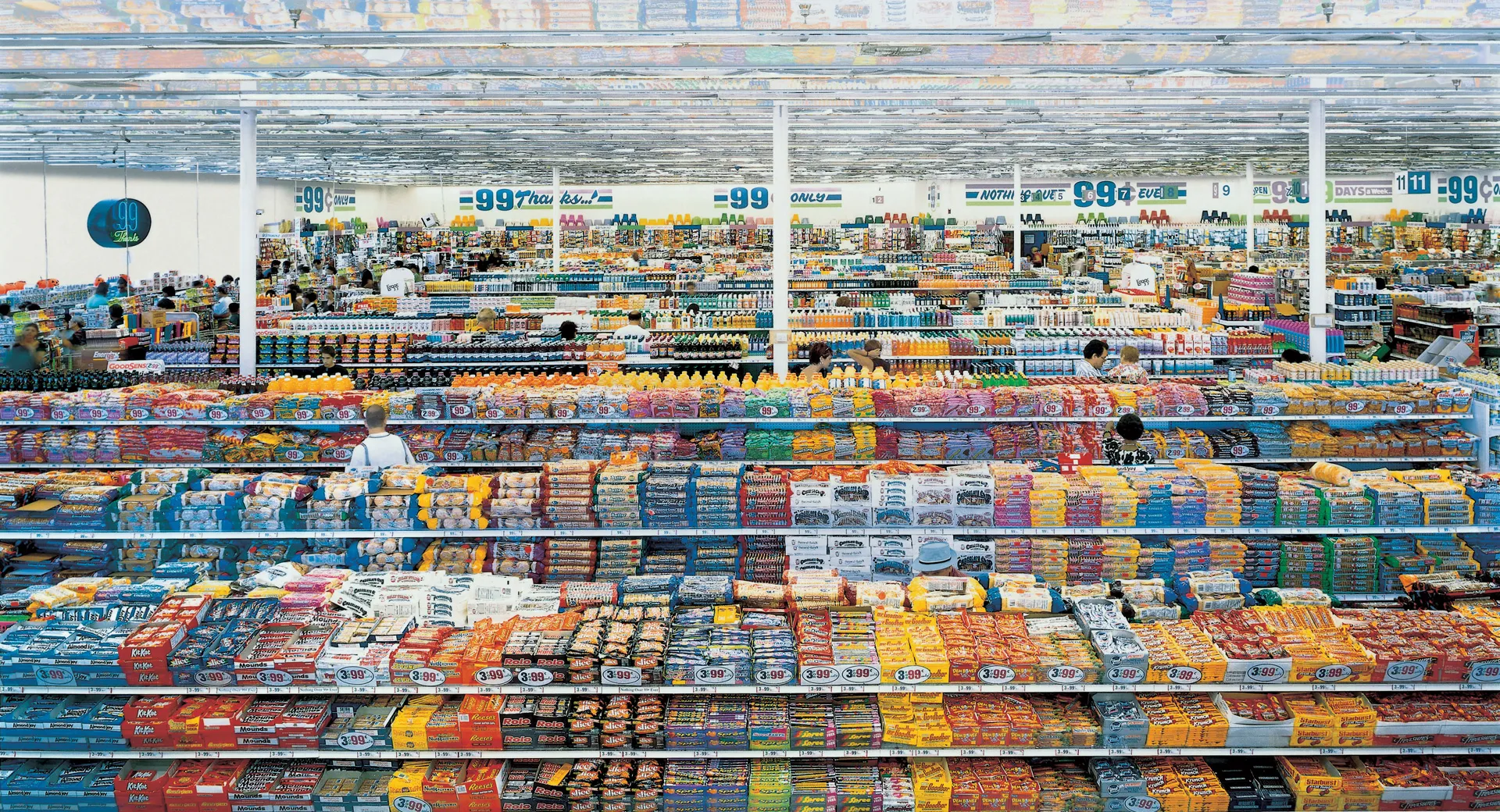
99 Cent, 1999: Similar to the previous photograph, this work has a sense of abstraction as it creates another mixed feeling inside a relatively smaller area. There are also hints all around the photograph of “99 cents” that can be found on the walls, on the commercials, and on the counters, as it was once a popular commercial store that required only 99 cents to buy its products. This includes elements of color, shape, and pattern as Gursky tried to create an abstract with repetitions of repeated mentioning, with the hidden ironic feeling of criticizing modern consumerism.


Rhein II, 1999: This work of Gursky has a strong sense of contrast compared to the previous photos that included an infinite amount of individual elements to create a big influence and atmosphere. Instead, simple elements of color, line, and shape worked together to create a showcase of a river calmly flowing above the flat green fields, under the white sky. It is similar to a previous work of his, Rhein, created in 1996, and serves as a subsequent artwork for that.


Rimini, 2003: Back to Gursky’s previous unique style, there are similarities and also differences in this relatively new capture of an Italian beach on a good day, with tourists and their umbrellas forming the structure for this piece of work. For example, the establish of colors and patterns was always his way of creating photographies, but this time, he chose an angle from the top to the bottom, instead of his previous ones which were on the same level, probably because this perspective can portray the umbrellas in a more significant way, as what the “sun” will probably see from its point of view.


Paris, Montparnasse, 1993: This is a rare artwork compared to the previous styles that influenced Gursky the most; instead, this artwork showcases and combines architecture from the city and abstraction together, creating a unique style of his own. The building consists of many rectangles (related to the shape element) with different colors on each of them, trying to portray the side as if it’s a mosaic board).


Salerno, 1990: This work contains similar elements to the previous style Gursky established. For example, the red and white patterns on the bottom part indicate and show hints from his previous works, with styles that he liked; however, this time the photograph was shot with a bigger “range”, as in, for his previous works, the entire image would probably only show the red and white shapes. This time, extra, nature, and infrastructure elements, such as the port on the top and mountains, are all portrayed and displayed within this massive work.


Chicago Board of Trade, 1999: This goes back to the old style of Gursky, showcasing a collection of different colors, but this time creating a bit messier feeling as the shape wasn’t able to take control of the colors, creating a feeling as if the color was “splashed” onto the artwork as in a painting.


Pyongyang IV, 2007: This artwork stands out as a unique style within the queue of Gursky’s artworks. Firstly, unlike other photographs that include a wide range of different colors, this mainly only has red as the primary color and black for backups. The shape in the bottom is also similar, or even, the same, as in the order and overall looking.


Ocean II, 1997: At first, I could not even tell that this was shot by Gursky, the author who loves to use a mix of color and shapes to create abstraction. In this photo, the dark blue and black ocean is displayed in almost all of the areas, starting from the middle and stretching out. On the sides, there is evidence of islands that come in white, gray, and dark black. The abstraction level, in total, is definitely pushed to the top.


Final List:

Interestingly, most of Gursky’s photographs have a different top (compared to the bottom of the shots, such as the indoor color series, the Rhein, etc.) and have shared “personalities” within that form a connection. They often have a large scale with high detail (shown by the immense amount of colors in each shot), as well as the repetitions and patterns that structure the colors. Lastly, to link to the quote from the beginning, his works focus on the big environment, not by focusing on any individual objects. That, is Gursky’s abstraction.


Works Cited:

“Andreas Gursky.” Gagosian, 11 June 2024, gagosian.com/artists/andreas-gursky/. Accessed 17 Feb. 2025.

“99 Cent – Andreas Gursky | the Broad.” Thebroad.org, 2016, www.thebroad.org/art/andreas-gursky/99-cent. Accessed 17 Feb. 2025.

“Rhein II.” Wikipedia, Wikimedia Foundation, 17 Nov. 2024, en.wikipedia.org/wiki/Rhein_II. Accessed 17 Feb. 2025.‌

“Andreas Gursky | Rimini (2003) | Artsy.” Artsy.net, 2016, www.artsy.net/artwork/andreas-gursky-rimini. Accessed 17 Feb. 2025.

“Andreas Gursky | Selected Works – Paris, Montparnasse.” Andreasgursky.com, 2025, www.andreasgursky.com/en/works/1993/paris-montparnasse. Accessed 18 Feb. 2025.

Tate. “‘Chicago, Board of Trade II‘, Andreas Gursky, 1999 | Tate.” Tate, 2022, www.tate.org.uk/art/artworks/gursky-chicago-board-of-trade-ii-p20191. Accessed 18 Feb. 2025.

Sawa, Dale Berning. “Andreas Gursky on the Photograph That Changed Everything: ‘It Was Pure Intuition.’” The Guardian, The Guardian, 18 Jan. 2018, www.theguardian.com/artanddesign/2018/jan/18/andreas-gursky-each-photograph-is-a-world-of-its-own-best-photograph-salerno-harbour. Accessed 19 Feb. 2025.


Presenting Notes

Presentation Triptych:

My triptych explores the contrast between architecture and art through variations in color and structure, with inspiration from Andreas Gursky. His large-scale, highly detailed images of colorful urban environments influenced my techniques of capturing ideas, particularly in how I framed and organized elements within each composition. I aimed to capture the tension between artistic expression in life and structured design in architecture by showcasing graffiti’s diverse energy alongside the rigid forms of industrial architecture.

A close-up of graffiti in bright orange and blue colors is seen in the first panel, highlighting the raw, textured quality of street art. Layers of spray paint and overlapping labels of words in the central panel shown in an angled shot reinforce this motif, producing a complex visual field that is similar to Gursky’s methodical compositions, in which patterns appear out of seemingly mixed with many layers. The last panel instantly changes to a simple architectural view with deep blue skies, a tall chimney, and clean lines, as well as a tipped angle established similarly to the second panel. This contrast emphasizes how urban settings find a balance between freedom and control, reflecting Gursky’s capacity to discover order in complexity.

Furthermore, I carefully considered how to display my images to reinforce this theme. The triptych format reflects how cities absorb and control artistic expression by allowing a movement from artistic freedom to regulated space. The use of bold and layered colors in the second image contrasts with the cooler, calm tones of the final panel, underscoring the transition from a free artistic space to a controlled, architectural setting.

Personally, this project represents my interest with the relationship of human creativity and structured architectures. If I had more time, I would probably investigate on areas that contain more mixed and diverse colors to be included.  Still, I think my triptych speaks to the related shifts between urban art and architecture, encouraging audiences to think about how public areas oppose and embrace artistic participation at the same time.


Statement of Intent

The message of my triptych will be to highlight man-made equipment that contributes to urbanization, indicating both its pros and cons. I want the audience to learn and understand urbanization, its causes, and what it brought to human life, as well as both positive and not-so-positive comments and sides to try to influence the audience on what should they do in response to the presence of urbanization. For inspiration, I will try to find evidence and traces of urbanization (including architecture, infrastructures, etc.) and mainly focus on their appearances and the outcomes they brought to society. I want to find photographs with elements of shape and shape focus. In my opinion, urbanization has brought a brand-new world and solution to our modern society, but its occurrence and outcome can sometimes be out of our evaluation or expected estimation.

Photo Safari

In the pictures shown above, evidence of different combinations of elements explained in previous blogs is shown, creating mixed and unique feelings among all the different arts. Here below are some analyses made for each of the pictures.


For picture one, a hard contrast of value is shown as the left half of the picture is completely dark, while the other side is purely white, showing a dissimilarity between the two colors. Besides, the shape is also mentioned as two similar, but also different rectangles are described and shown.

This is my first photo used to compare the previous one, containing a dark, black sponge placed on a white table. It has similar elements to the tone applied in the previous one, having a dark object (rectangle for a specific shape) on the left corner and white on the other parts. This can also be connected with the second picture shown above as they share some similarities: for the second picture, the tone/color was applied the same, but just the position was different. The dark square was shown isolated in the middle, without connecting to a particular side.


This is my second photo, compared with the third and twelfth pictures, shot with a short, close position right onto a piece of pillow, showing the details of the patterns and textures of the sham. This photo somehow also shows a combination between the two pictures mentioned, as the texture for the third picture is dotted and not connected, while the twelfth picture is uneven (both in positioning, spacing, and thickness), with horizontal lines. For my photo, both the lines and the dots are shown as the dots “sit” on the lines, while forming the surface of the lines themselves. (some dots are connected and are displayed like lines as they form in a long, straight shape).


My third photo presented an art tool that has many layers, used to separate papers containing paintings to prevent them from touching each other until they dry out. This has similar links to picture four, with different layers of different colors. Something different would be that the spacing is not the same in my photo while the picture’s spacing is the same.


This fourth photo is trying to display the straight, vertical lines in the middle, compared with photo five. Differences are that the spacing in my photo is too much compared to the picture, and that the thickness of the lines here are too thin compared to the picture’s. Lastly, there are variances in quantity (3 vs 2) and color (yellow vs black).


The fifth shot I took was focusing on a VEX Robotics “donut” used as props for its competition, which is connected to the sixth picture shown above. Some connections of this set include the round, circle shape that is placed and portrayed in the middle of the photos, and with a background under with another color to show contrast. The difference, on the other hand, is that the colors are different (this is red while the photo’s black), and that there is a hole in the middle of my shot, while the example photo is a full circle with no hollow inside.


In the sixth shot, I focused on the white spaces in between the dotted squares, creating a really similar shape to picture seven. The only difference would be that the shape shown here is a secondary focus (as the first being the squares, dehighlighing the shape in the middle). Also the angle is shot from the downside and not straight top.


The seventh shot I took can be linked to picture eight from above. For picture eight, a significant pattern of circles is displayed with equal spacing and the same size. For the seventh shot of mine, I focused on the reflections of the lights on the ground, creating a pretty similar shape overall with picture eight. Differences include shape (where my shot contains squares while the picture is circles), color (white vs black), and angle (tilted for my shot, straight up and down for the picture).


The eighth shot I took shows the ceramic tile on the ground, with the black lines in between each tile being similar to picture nine. The difference will be that the space in between (the tiles, in the case of my shot) is too much compared to the picture and that the image is a bit tilted. Lastly, the lines are not exactly the same in tone as some are lighter and some are darker.


This ninth shot I took shows a set of handrails, with a special angle indicating the outline similar to picture ten. Some differences are that, there isn’t anything in the middle for my shot, while the picture is filled in between, and that the color is different.


My tenth shot shows the edge of a wooden table, just displaying a triangle shape overall used to compare to picture eleven. Something different would be that in the picture, the angles on the lines’ meeting point are “cut off”, while mine still remains the same. Also, the color (wood vs black) and the angle (from the side vs straight) are different.

Analysis – Shells and Rocks Arrangement

“Abstract photography can be defined as capturing images in which the subject isn’t the most interesting element. Albert Renger-Patzsch, Edward Weston and Aaron Siskind photographed the ordinary to reveal their beauty. Uta Barth reversed the typical use of the camera, shooting out of focus and Andreas Gursky photographs the repetition of elements. During this unit you will investigate appropriate examples of abstract photography and respond in your own way..”

File:Shell and Rock Arrangement, 1931.jpg - Wikimedia Commons

“Shells and Rocks Arrangement” by Edward Weston


This example of an interesting photo was shot by Weston, known for his black-and-white object-based works that tried to show “still lives”. In this photo, highly influenced by the straight technique of photography, Weston continued to create an atmosphere consisting of a sharp focus on the subject he intended to show: the white shell, in this photograph.

Moreover, this product can also be explained using the different aspects of elements, including the six mentioned in a previous blog. All of these elements served as inspirations that helped Weston achieve this work and finish it.

For line, surprisingly, not much evidence was shown in this photograph as most of the objects inside are rounded. The only evidence that could be related to the lines is probably the split in the middle between the different layers of the black sand/rock in the back, showing vertical divisions with a sense of space.

For shape, as mentioned, there were many lines and objects providing a rounded, curvy feeling. Especially for the shell in the front, the outlined shape that served as a stage does look captivating as there are several edges when the white color minimizes its area into a triangle.

Repetition and pattern, on the other hand, are not shown quite much in this photograph as most of the objects (including the black sand/rock serving as the background) are irregular and unique from each other, meaning each one is different, no matter in size, shape, or texture.

In addition to texture, as I mentioned, we can see that the black part in the middle level (horizontally) seems to show a sense of a rocky and unsmooth feeling (for if we imagine touching or making contact with the surface); in contrast, the parts in the left and right bottom corners seems to have a smoother feeling and seems to be nice and slick to be touched. Finally, the shell in the middle shows a sense of clarity, and perhaps the slickest part can be found here, on the surface of the shell, within the entire photograph.

For value and tone, a brief description can be made of the white-colored shell as the lightest part, compared to ALL other parts in this photograph as they are all dark and black-colored. The value and tone in this work also work and match with the intention of focus the author wanted to show, for the audience to capture the white shell first as the main, targeted object, then notice the background of an interesting landform displayed in another color in contrast.

To concentrate the ideas for what Weston had considered as influences that helped him in achieving and finishing this work, there is the use of sharp focus and precise detail to emphasize the shell’s form and texture and the control of light and shadow to create a sense of depth. Weston also took influence from natural abstraction, turning realistic, everyday objects into sculptures with unrealistic qualities. His method, which rejects alteration and emphasizes the subject’s essential beauty through clarity, tonal contrast, and thoughtful composition, is in line with the Straight Photography Movement (as shown in this work, for the shell to be the primary target and display it uniquely for the audiences).


Works cited:

“File:Shell and Rock Arrangement, 1931.Jpg – Wikimedia Commons.” Wikimedia.org, 2024, commons.m.wikimedia.org/wiki/File:Shell_and_Rock_Arrangement,_1931.jpg. Accessed 23 Jan. 2025.

“Edward Weston.” The Art Story, 2016, www.theartstory.org/artist/weston-edward/#:~:text=Taking%20inspiration%20from%20his%20surroundings,him%20to%20well%2Ddeserved%20fame. Accessed 23 Jan. 2025.

“Edward Weston: His Life and Photographs.” Christies.com, Christie’s, 2024, www.christies.com/en/stories/edward-weston-guide-27f49c3a5bf54cb8a92c4a68f1ddf2ae#:~:text=Influenced%20by%20the%20simplicity%20of,marmoreal%20gleam%20recalled%20Classical%20sculpture. Accessed 23 Jan. 2025.

Formal Elements of Photography

In art, there are several essential elements to consider when producing work to enhance the art and push it to a higher level. In photography, six of the key terms can be applied in the form to produce a shot with a high level of aesthetic, as well as a “high-standard quality” title to describe the photograph overall.

First of all, line. As we start to notice, learn, and accept it, we can find it everywhere in the world, in any form and any type. In a photograph, there can be many types of lines; straight, curvy, clear and grand, vague and serving as hints, even mysterious and containing deeper meanings (this requires a dig into the world to capture and collect). Lines can serve as guides, outlines, and even become the subject of the photograph itself.

12 Amazing Photos That Will Make You Appreciate Leading Lines as a Great Composition Tool

A “lined” photograph of a park bench


Then comes the shape. Not just in photography, shapes happen to be in every moment when we open our eyes as everything and anything contains shape. In the world of photography, some shots were really focused on the actual shape of a single object or how multiple objects collaborate and reflect with each other to create a new shape.

Edward Weston's Shells - Holden Luntz Gallery

Shells, 1927, Silver Gelatin Photograph by Edward Weston, mentioned in previous blogs


The next one is repetition/pattern. The base meaning of this is to find repeating elements in a single photograph and how they create a pattern, or simply, an interesting point that’s worth it to be displayed and seen by other people.


18 Stunning Examples of Patterns in Photography | Photzy

An abstract photo showing the colors of red, blue, black, and white to match together.


Next up comes the texture. For this element, an important question to consider is, “If one can touch the surface of the photograph, how would it feel?” This element is actually relatively hard to focus on and actually create, as the photographers cannot always determine the actual “touch” of their photographs, even though there can be some options they desire to create out.


25 Stunning Texture Photographs

A hard and rocky feeling comes up when this shot is observed and pretends to be touched


After that, comes up the value/tone. The value or tone of a photograph refers to the range of lightness and darkness within the image. It can directly impact the mood, depth, and overall visual appeal of a photograph.

Why and How: Mastering Tonality in Nature Photography

Try to spot the lighter and darker parts in this photograph of this dog.


Finally, focus determines the first point that catches the audience when they get a look at the photograph. Photographers try to make what they want to display in a focus and match them with other techniques or elements.

THE IMPORTANCE OF FOCUS IN PHOTOGRAPHY - Wild Eye

In this photo, the zebra behind is the intended focus point, as the ground and the elephant in the front are all blurred and out of focus, making the clear zebra in the back stand out.


The last thing to be discussed in this post is whether one photograph shows evidence of only one element at a time or not. The answer is no, in fact, it’s rare that only only one is displayed. When a photographer finds inspiration and shoots it down, no matter whether it is intentional or unintentional, different elements match with each other to create an excellent outcome. For example, the repetition photograph above also shows a sense of lines and shape, as the red area forms straight guidelines matching the huge amount of squares portrayed. Also, the value/tone example shows a sense of focus as the photographer aims to use lighter and darker spots to display the dog, the primary object of the photograph, by making the backgrounds more faded and focusing tone changes on the dog.

To sum up, the six key elements in photography are certainly important and inevitable for a successful product, but the actual magic part is that all the elements work together in a single photograph to always create new and wonderous outcomes that are unknown yet and waiting to be discovered.


Works cited:

Blanchette, Jeff. “12 Amazing Photos That Will Make You Appreciate Leading Lines as a Great Composition Tool.” Pinterest, 15 Mar. 2018, www.pinterest.com/pin/458804280783220020/. Accessed 22 Jan. 2025.

‌Luntz, Holden. “Edward Weston’s Shells.” Holden Luntz Gallery, 21 Nov. 2020, www.holdenluntz.com/magazine/new-arrivals/edward-weston-shells/. Accessed 22 Jan. 2025.

“18 Stunning Examples of Patterns in Photography | Photzy.” Photzy, 2025, photzy.com/18-stunning-examples-of-patterns-in-photography/. Accessed 22 Jan. 2025.

Radwa. “25 Stunning Texture Photographs.” Photopoly, 26 Mar. 2012, www.photopoly.net/25-stunning-texture-photographs/. Accessed 22 Jan. 2025.

Guillen, Amar. “Why and How: Mastering Tonality in Nature Photography.” Guillenphoto.com, Guillen Photo, 22 Nov. 2019, www.guillenphoto.com/en/why-and-how-mastering-tonality-in-nature-photography.html. Accessed 22 Jan. 2025.

Laubscher, Michael. “THE IMPORTANCE of FOCUS in PHOTOGRAPHY.” Wild Eye, 27 Nov. 2024, wild-eye.com/the-importance-of-focus-in-photography-15280/. Accessed 22 Jan. 2025.‌

ABSTRACTION IN PHOTOGRAPHY

The Pictorialism Movement was once a popular photographic technique that overpowered the photography field from 1885-1915, and its main aim was to enhance photography into a true art form. The effect of using this technique, simplified, would be that the photos shot look like real paintings.

Some of the main elements for a successful photograph of pictorialism include the “darkroom”, special papers, and unique filters.

When Photos Looked Like Paintings - Pictorialism - A Flash Of Darkness

An example of a pictorialism photograph.


On the other hand, unlike Pictorialism, which has a soft focus and manipulation, Straight Photography includes sharp focus, presenting the objects in a natural environment without any other types of enhancements, resulting in portraying the photo more like an actual “photo,” not a “painting.”

Straight Photography Movement Overview | TheArtStory

A photo shot using the straight technique.


Around the mid-20th century, pictorialism was getting more and more unpopular, and the straight technique was there to replace it as more artists chose to change and follow this form of photography. The straight technique focused more on the portray and representation of real objects than explaining a bit of an abstract style of the photo, which focused on pictorialism.

For instance, Edward Weston and Aaron Siskind, the two historical photographers, were influenced by the straight technique, which emphasized sharp focus, high detail, and truthful representation of subjects. They disliked and rejected the soft-focused “doctrine” of pictorialism and celebrated photography as an independent art form, apart from the promoting of “paintinglize” the photos shot in pictorialism. Weston’s careful, unmodified photographs that capture form, texture, and detail are a perfect example of straight photography. Siskind switched from documentary to abstract straight photography, highlighting surfaces, textures, and patterns. By being precise and thorough, he was able to blur the boundaries between abstraction and the realness of reality.

Edward Weston Photography: Famous Photos, Style & Iconic Landscapes

The “Cabbage Leaf” by Weston, succeeding in spotlighting the details of the vegetable.


Aaron Siskind (American, 1903-1991) Gloucester 1H, 1944, printed later (Lot 163, Estimate $2,000-$3,000)

“Aaron Siskind (American, 1903-1991) Gloucester 1H, 1944, printed later (Lot 163, Estimate $2,000-$3,000)”


On the other hand, artists Andreas Gursky and Uta Barth’s view of abstraction is quite different from the previous two. Unlike Weston’s work, which displays mainly black & white and shows perfect details on single objects, Gursky, a German photographer, loved to shoot multiple, more complex scenes. Some examples can be the colorful supermarkets, umbrellas beside the beach, or houses on the side, along the road. To summarize, Gursky’s large-scale images often display a vast, intricate scene of real-world subjects. His manipulation of perspective, scale, and multicolored patterns eventually mix together to create a “real-illusory” form of abstraction. Dissimilar to Gursky, Barth’s shot focused on lighting, blur, and eye-level perspectives to create abstract photographs. Unlike both Weston and Gursky, who had one single or multiple subjects for the audience to analyze, Barth’s work does not often have a specific target object; instead, the techniques mentioned above are what encourage the audiences to ponder and engage with the atmosphere she’d created for them.

In conclusion, if the level of judgment is deep and details matter, both Gursky, Barth, and their work, in my opinion, cannot be justified as either pictorialism or straight style. Their work does not necessarily follow the rules and/or (all the) requirements of pictorialism or straight, as both tried to jump out of the traditional limitations and chose to experience new art with their own styles and personalities shown in their work, ultimately, an “abstract” of their own, too.

99 Cent - Andreas Gursky | The Broad

“99 Cent” by Gursky, showcasing a vast supermarket with a high-level perspective and viewpoint.


Uta Barth: Peripheral Vision

A selection from Barth’s “…end of time” series, exploring important themes such as lighting, spacing, and perspective, in her own perspective.


Work cited:

Williams, Nigel. “When Photos Looked Like Paintings – Pictorialism – a Flash of Darkness.” A Flash of Darkness, 11 Mar. 2024, flashofdarkness.com/pictorialism.

“Straight Photography Movement Overview.” The Art Story, www.theartstory.org/movement/straight-photography.

Kumar, Revathi Senthil. “Photographer Study #3 | Edward Weston and the Universality of Basic Forms.” Light and Life Academy, 15 Oct. 2024, llacademy.org/blog/edward-weston-and-the-universality-of-basic-forms.

Lamunière, Michelle. Photographs by Aaron Siskind in Skinner’s Fine Photographs Auction | Skinner Inc. 21 Jan. 2015, www.skinnerinc.com/news/blog/photographs-aaron-siskind-fine-photographs-auction-2778b.

99 Cent – Andreas Gursky | the Broad. www.thebroad.org/art/andreas-gursky/99-cent.

“Uta Barth: Peripheral Vision.” Getty Museum, www.getty.edu/art/exhibitions/barth.

Abstraction-Blog 2

An abstract is a thought or idea that exists but does not have a physical existence. In the world of photography, the “object” could actually not matter that much; instead, the lighting, style, and techniques applied to the photos will matter most in the final outcome of the visual appearance for the audiences to witness. It might also not form any logical sense for the audience to agree to, but this form of art does provide the audience a sense of curiosity and wonder to meet the aim of giving them an opportunity to explore. Eventually, one’s own diversified definitions and meanings will be capable of being formed, and each one can view the product of abstraction through their own perspective and lenses.

Starting Point

Abstract photography can be defined as capturing images in which the subject isn’t the most interesting element. Albert Renger-Patzsch and Aaron Siskind photographed the ordinary to reveal their beauty. Uta Barth reversed the typical use of the camera, shooting out of focus and Andreas Gursky photographs the repetition of elements. During this unit, you will investigate appropriate examples of abstract photography and respond in your own way.

This passage states that the shots will be taken “in which the subject isn’t the most interesting element”. In my initial thoughts, this sentence wants to state that the “subject” is less useful compared to the other components, such as skills applied in shooting the photo, as well as the later-on fixes and decorations. I hope that we will have the chance to learn the specific “skills” and eventually apply the skills to real life by finding interesting topics and “shooting” them down to make them even more interesting.