In the pictures shown above, evidence of different combinations of elements explained in previous blogs is shown, creating mixed and unique feelings among all the different arts. Here below are some analyses made for each of the pictures.
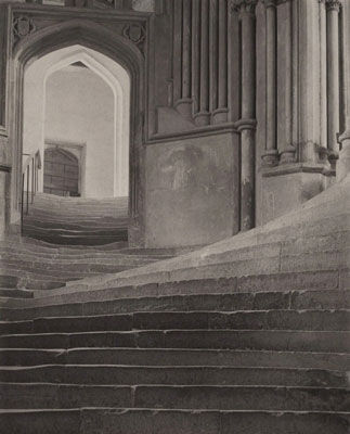
For picture one, a hard contrast of value is shown as the left half of the picture is completely dark, while the other side is purely white, showing a dissimilarity between the two colors. Besides, the shape is also mentioned as two similar, but also different rectangles are described and shown.

This is my first photo used to compare the previous one, containing a dark, black sponge placed on a white table. It has similar elements to the tone applied in the previous one, having a dark object (rectangle for a specific shape) on the left corner and white on the other parts. This can also be connected with the second picture shown above as they share some similarities: for the second picture, the tone/color was applied the same, but just the position was different. The dark square was shown isolated in the middle, without connecting to a particular side.

This is my second photo, compared with the third and twelfth pictures, shot with a short, close position right onto a piece of pillow, showing the details of the patterns and textures of the sham. This photo somehow also shows a combination between the two pictures mentioned, as the texture for the third picture is dotted and not connected, while the twelfth picture is uneven (both in positioning, spacing, and thickness), with horizontal lines. For my photo, both the lines and the dots are shown as the dots “sit” on the lines, while forming the surface of the lines themselves. (some dots are connected and are displayed like lines as they form in a long, straight shape).

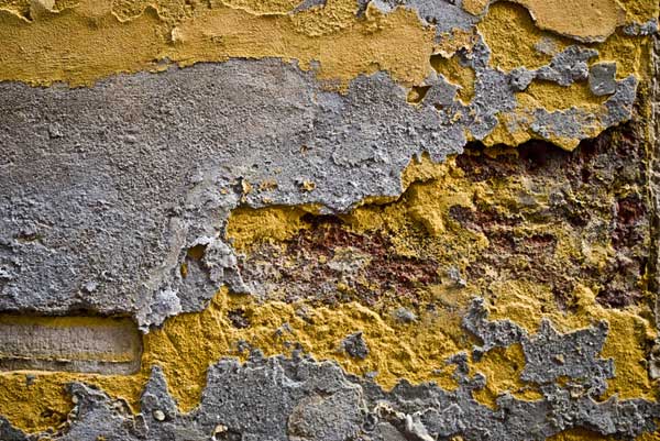
My third photo presented an art tool that has many layers, used to separate papers containing paintings to prevent them from touching each other until they dry out. This has similar links to picture four, with different layers of different colors. Something different would be that the spacing is not the same in my photo while the picture’s spacing is the same.

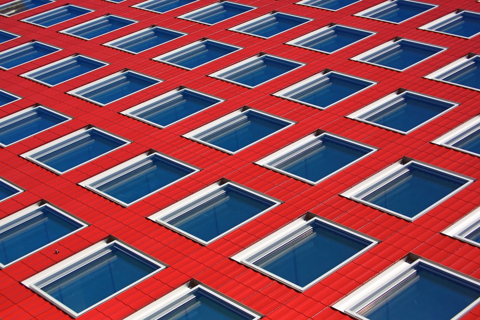
This fourth photo is trying to display the straight, vertical lines in the middle, compared with photo five. Differences are that the spacing in my photo is too much compared to the picture, and that the thickness of the lines here are too thin compared to the picture’s. Lastly, there are variances in quantity (3 vs 2) and color (yellow vs black).

The fifth shot I took was focusing on a VEX Robotics “donut” used as props for its competition, which is connected to the sixth picture shown above. Some connections of this set include the round, circle shape that is placed and portrayed in the middle of the photos, and with a background under with another color to show contrast. The difference, on the other hand, is that the colors are different (this is red while the photo’s black), and that there is a hole in the middle of my shot, while the example photo is a full circle with no hollow inside.

In the sixth shot, I focused on the white spaces in between the dotted squares, creating a really similar shape to picture seven. The only difference would be that the shape shown here is a secondary focus (as the first being the squares, dehighlighing the shape in the middle). Also the angle is shot from the downside and not straight top.

The seventh shot I took can be linked to picture eight from above. For picture eight, a significant pattern of circles is displayed with equal spacing and the same size. For the seventh shot of mine, I focused on the reflections of the lights on the ground, creating a pretty similar shape overall with picture eight. Differences include shape (where my shot contains squares while the picture is circles), color (white vs black), and angle (tilted for my shot, straight up and down for the picture).

The eighth shot I took shows the ceramic tile on the ground, with the black lines in between each tile being similar to picture nine. The difference will be that the space in between (the tiles, in the case of my shot) is too much compared to the picture and that the image is a bit tilted. Lastly, the lines are not exactly the same in tone as some are lighter and some are darker.

This ninth shot I took shows a set of handrails, with a special angle indicating the outline similar to picture ten. Some differences are that, there isn’t anything in the middle for my shot, while the picture is filled in between, and that the color is different.

My tenth shot shows the edge of a wooden table, just displaying a triangle shape overall used to compare to picture eleven. Something different would be that in the picture, the angles on the lines’ meeting point are “cut off”, while mine still remains the same. Also, the color (wood vs black) and the angle (from the side vs straight) are different.