
Since all of the photos are black and white, the tone is present in all of the photos, so we’re going to consider them all revealing. The first and fifth photos are composed of lines, so I assume they are the ones that highlight the lines the most. The second, sixth, tenth, and eleventh photos are the ones where a single shape exists in a specific location with no continuity of shapes, and they seem to be the ones where the shape is most noticeable. The third and twelfth photos seem to emphasize texture the most, as they are made up of non-coordinated but identically shaped dots and lines, but they also seem to form a pattern of non-coordinated shapes in their respective locations. The fourth, seventh, eighth, and ninth photos are a series of continuous, repeating shapes, so the pattern is most prominent.
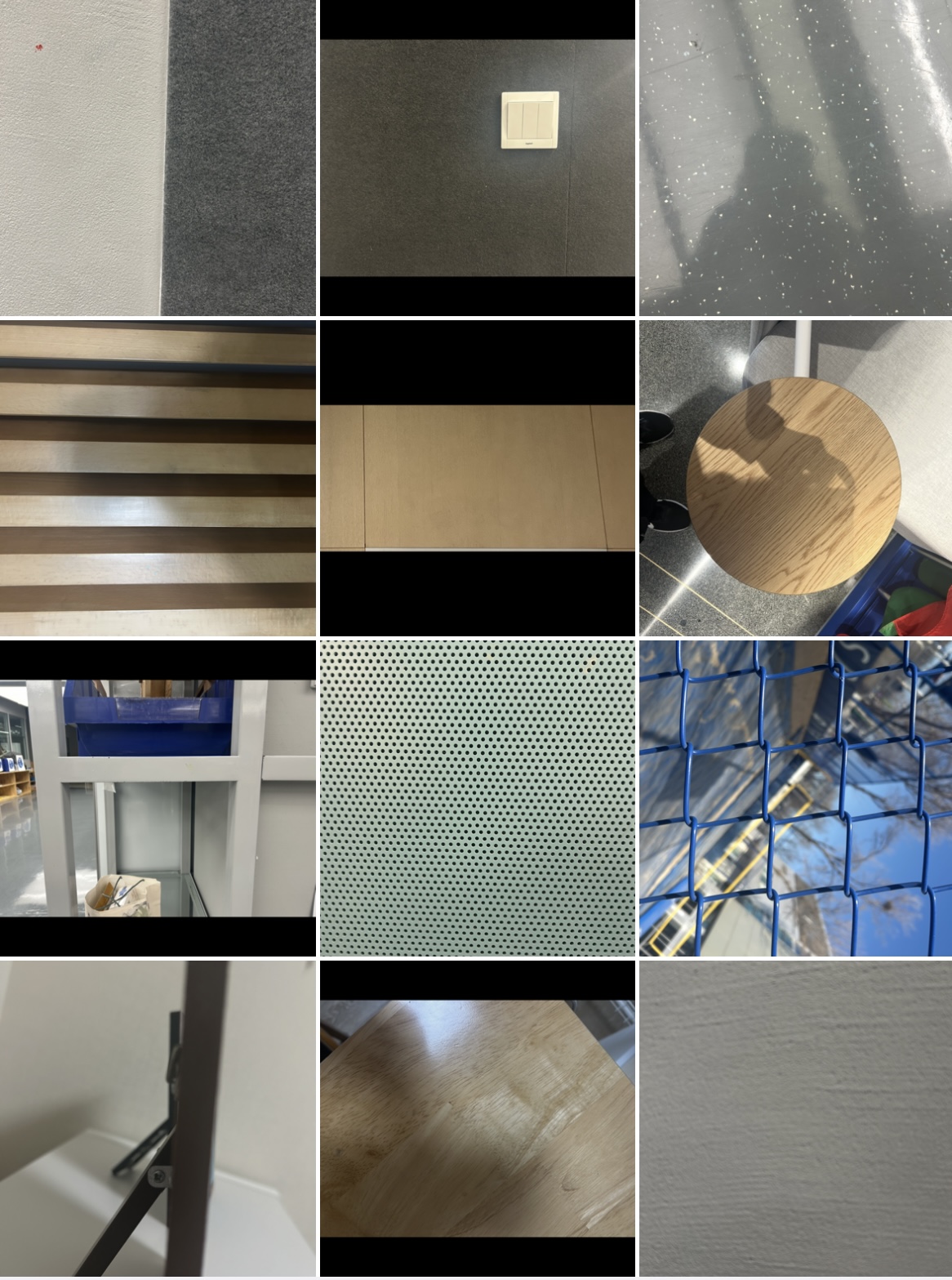
The first photo works as intended due to the sharp contrast between white and gray, and the second, sixth, and eleventh photos appear to achieve similar results to the original by focusing on specific shapes. The fourth photo shows a clear pattern of contrasting beige and brown colors, the eighth photo highlights the shape of the circle hole on the green background, and the ninth photo shows a strong color difference between the blue and the background, which worked as intended. However, I don’t consider the third and twelfth photos to have worked well, as the texture and color of the lines and shapes don’t show up well, and the seventh photo is too focused on the background to show the intended pattern. The fifth photo didn’t work as intended because the black lines were too small against the beige color, and the tenth photo I didn’t know how to make it look like the actual image.
Leave a Reply
You must be logged in to post a comment.