Top 3 photographs from 798

Top 3:

As I stated in my statement of intent, I primarily focused on depicting the infrastructure and exterior of the building, particularly highlighting the glass elements. Although this photo was not taken on 798 Street, it captures both the building’s exterior and the sky, showcasing similar colors but evoking different moods. Through various usage of composition—specifically the use of perspective, symmetry, pattern, depth of field, and negative space—I aimed to create visual weight in the image while emphasizing the glass’s qualities of reflection and distortion.

The low-to-high angle perspective or long shot compels viewers to look up from the street, which emphasises the building’s grandeur and height. This viewpoint evokes feelings of awe, making the viewer feel small in comparison to the structure. The symmetry and patterns on the building create a distinct division between the right and left sides of the photo: the left side captures the sky and smaller buildings, while the right showcases the glass-covered facade. This symmetry highlights the stark contrast between nature and man-made structures, clearly separating the two elements. Moreover, the use of negative space enhances this contrast, inviting the audience to reflect on the relationship between the organic and the constructed. And this interplay between the natural and the artificial underscores the theme of duality in urban landscapes, exploring how architectural design interacts with its environment.

Furthermore, the use of a high shutter speed combined with a low ISO enhances the overall mood and quality of the photograph. The high shutter speed captures intricate details, such as the distorted reflections on the glass building, while the clear reflections provide a sharp contrast.

Top 2:

In this photograph, I aimed to capture my original intent, which focuses on the element of glass and the building’s exterior. While many people concentrate on photographing the entire shiny sculpture, I chose to highlight how it is reflected in the glass facade of the building. The exterior is composed of toughened glass with multiple sheets, creating a double reflection that feels almost hallucinatory. By positioning the reflection as the focal point in the center of the image, I emphasized the theme of duality: the real steel sculpture is clearly visible, while its reflection appears multiplied and highly reflective. Additionally, the contrasting colors between reality and reflection further accentuate this duality, inviting viewers to explore the relationship between the two.

Moreover, using a lower shutter speed and a high ISO (around 800) enhances the theme, as the reflection becomes more pronounced in brighter lighting conditions.

Top 1:

Although this photo doesn’t capture the exterior of the building, it captivates attention by showcasing the reflection and distortion of glass. With some editing, I increased the saturation to enhance these glass elements. The cup reflects light from the window, causing the waves on its surface to create reflections in various directions, producing hues of white, purple, and blue. This interplay of colors and light from a single cup generates a unique mood and tone, suggesting viewers to the beauty in everyday objects. It also connects to the different personality traits that we possess as one cup can reflct multiple aspects and yield diverse outcomes.

Additionally, by controlling the depth of field, I focused on the glass in the foreground while blurring the background to enhance the viewer’s concentration. I used a high ISO and mid-range shutter speed to further highlight the themes.

Statement of intent

For this unit, I want to frame the reflection through the interplay of light and surfaces in urban environments. My focus will be on capturing the intricate reflections found in windows, glasses, and the exterior of buildings. The way light bends and distorts as it interacts with these surfaces fascinates me, creating dynamic compositions that can challenge the viewer’s perspective.

For this 798 trip, by capturing the contrasting shadows and light reflection from the flexation of glasses and outside of buildings, I want to explore the juxtaposition of the outside world and the interior spaces, highlighting contrasts between light and shadow, clarity and distortion. The buildings and infrastructure along 798 Street inspired me to emphasize high contrast and reflections, making a greater concentration of light enhances clarity and depth in the visuals.


reflection photographs

-Perspective (bottom to top)

-negative space (cropped)

-reflection of water drop

-Low ISO

-Long shot

-Negative space

-Low ISO and low shutter speed

– Focus on the water drops.

-Shading (only dark or white colours)

-Framing (cropped)

-Reflection of light

-Repetition

-The texture of wood and grass

-Natural light; light contrast

-Depth of Field

-Patterns and symmetry

-Balance (cropped)

-High ISO and high shutter speed

-Focused on the blocks in the mirror; blurring other visual elements

-Balance (cropped)

-Focusing on the mirror; Bluring the exterior parts

-colour contrast of brown and blue

-Perspective from a high angle

-Focused on the mirror

-Two different textures of tree and wood bench

-colour contrast between the sky and the bench

-Low ISO and high shutter speed

-the contrast between the two aspects, one that only shows the floor and the other showcases the field

-colour contrast

-Shading (edited)

-colour contrast

-High shutter speed; low ISO

Focused on the tree in the mirror

-Long(wide) shot

-Highlighted color(edited)

-High ISO and shutter speed

-Shading(edited)

-reflection on the window

-leading line


Reflection of 2 artists

1st photographer: Lee Friedlander

Lee Friedlander is an American photographer and artist who influenced by Eugène Atget, Robert Frank and Walker Evans in his early age of creating arts and photographs. “America by Car” is one of his series of reflection from September 4th to November 28, 2010  that showcases the collection of photographs of Friedlander’s journey of visiting country’s fifty states in an ordinary rental car that inspired me with several different reasons. The series captures a variety of landscapes, urban areas, and scenes from everyday life which viewed through the windows of his car. Also, the series is about the exploration of American culture and identity through the lens of the automobile, which has been a significant symbol in the U.S.  And this reflects on themes of mobility, freedom, and the complexity of modern life as the images often feature reflections in the car windows, which could be interpreted as metaphor for how we perceive the world around us.

America by car:

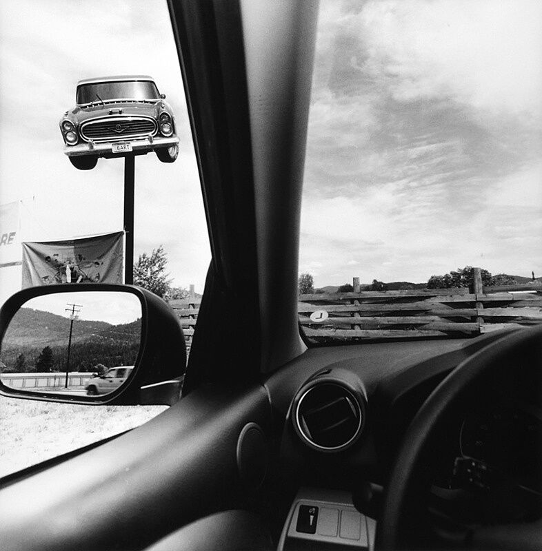
Inspired photo from the series:

The view from the driver's seat in a car looking at another car on a pole.

This photograph, part of Lee Friedlander’s collection displayed from 1995 to 2009 at the Fraenkel Gallery in San Francisco,  inspires me due to its use of composition, white balance, and line. Friedlander’s composition employs leading lines, perspective, and contrast to enhance the effect of reflections and emphasize the symbol of the car with a fast shutter speed(1/500?). The point of view from inside the vehicle grabs the audience’s attention to the elements of the car itself, and the lines created by the door frame and the top of the handle guide the eye heads the corners of the image, using leading lines to focus attention on the automobile. Additionally, the contrast between the upper right and lower left corners of the photograph not only highlights the interaction of light but also reinforces the significance of the car as a symbol, for the upper section reveals the entire part of car, while the lower section presents only fragments of its interior. And this juxtaposition underscores the duality of the experience Mthe exterior world seen through the vehicle and the intimate space within it. Moreover, the light balance he employs in the photograph captures details in both highlights and shadows while adding depth and texture which make the subject more interesting. Furthermore, by capturing the thick curved lines of the automobile, Friedlander aimed to evoke softness while emphasizing the distinction between the interior and exterior of the car.

2nd photographer: Antonio Gutierrez Pereira

Antonio Gutierrez Pereira is a photographer who came from Portugal and born in 1948, inspired to use glass of water and facial expression to create reflection photographs. It’s quite hard to determine the exact name of her photo series and the dates that created, but there are various amount of photograph of her which inspired me to use facial expressions and motions. Using water as a main concept of reflection photos are quite common; however, Pereira uses both of the traits of water and glasses to create trick of distorted reflection and impressiveness, which is flextion. By using the flextion of water in glasses, she collaborate that with the some parts from our face to give different perspective from other reflection photo, and this facsinated and inspired me to use the flexation of glasses with various materials in my practice photos.

Inspired photo from her:

Analysing Photographers – Renuka Mehmi GCSE Photography


While I was researching, I couldn’t find the exact name of this photograph but it stands out as one of her most inspiring works due to its composition, focus, and the use of slow shutter speed (1/125) that created distorted reflections. By utilizing a glass of water to distort the model’s face, the arrangement of the face and glass results in a harmonious collaboration that splits the face in half, tricking the audience’s eye with the effect of refraction. This distortion makes the reflection  special, symbolizing the contrast between our exterior and interior selves; the reflected face representing the inner self, while the unreflected side represents the outer part.

Furthermore, Pereira utilized a board in the middle of the photograph, introducing a second reflection. This not only emphasizes the smooth curves of the glass and the model’s facial lines but also highlights the sharp lines created by the light reflecting off the bottom of the glass. Her use of distorted reflection not only adds uniqueness to the photograph but also symbolizes the distinction between inner and outer beauty in our minds.


Tatsuya Tanaka inspired images

Top 1:

(edited version)

In this unit, I was inspired by Tatsuya Tanaka and his usage of little figures and big figures as the materials decorated the setting of the photo, creating different moods and atmospheres. As he uses more professional and detailed figures, I used figures and miniatures that are easily found around us, such as books, real-sized food(desserts), and little veggies to convey my own theme and inspirations. Before I thought of taking photos of the book, I was going to use the little figures, which are also called miniatures that are used by Tatsuya Tanaka, by putting them on the keys on the laptop keyboard; however, I turned my attention to the book as it seems more interesting material.

This change in direction led me to deeply consider the themes I wanted to convey through my photographs. I aimed to visualize the idea that “different books have different stories,” emphasizing the unique narratives and experiences that each book can offer. Each photograph would serve as a window into diverse worlds, inviting the audience to reflect on the myriad interpretations and emotions that literature can evoke. Additionally, I sought to highlight the duality of books as not only “a source of knowledge” but also as “a source of differing perspectives.” This theme underscores the multifaceted nature of books—they are windows of wisdom, gateways to imagination, and catalysts for creativity.

leading line:

In this unit, I explored the use of leading lines in my composition by arranging the books in a way that guided the viewer’s eye toward a specific focal point: the top left corner of the photo. This technique not only draws attention to the books and the miniature figures placed atop them but also creates a smooth and natural visual flow. By superimposing the books, I aimed to achieve a sense of organization and balance in the image, enhancing the overall aesthetic. The deliberate arrangement allows viewers to easily recognize the progression of the books, making the composition feel cohesive and harmonious.

Perspective:

By using a high-angle perspective to look down on the scene, I aimed to capture all the objects and miniature figures I arranged. This viewpoint allows viewers to see the entire composition clearly, showcasing how each element interacts within the setting. The high-angle shot emphasizes the leading lines created by the arrangement of books, guiding the viewer’s gaze and enhancing the overall sense of movement. This approach not only highlights the thematic elements I intended to convey but also adds organization and balance to the photograph, making the visual narrative more engaging.


Others:

Composition practice

Rule of Thirds:


These two photos are taken with the rule of thirds, and one on the left-hand side is taken with a blue and white background that contrasts with the colour of the figure, creating horrible colour matches, also, because I used the rule of third to focus the figure as main of this photograph, the position of the figure makes the photo looks active or energetic.

The photo on the right-hand side is quite similar to the right one, as it not only uses the rule of thirds to emphasise the figure but also there are lots of techniques that are used to highlight the active and lively mood, for example, the natural factors as background and the brighter light usage underscore the mood.

Leading Lines:


For these two photos, it is quite obvious that there is usage of leading lines, as both of the photographs have invisible lines that head to the same spot. By intending to use the objects in the library as background to create the leading line in the first photo, I tried to create a contradicting mood as the size difference between the right side and left side of the photo is quite contradicting.

For the second photograph, I used all three primary colours: blue, yellow, and red, to emphasise the lively or active atmosphere within the photo. Not only that, but also the leading line in the photo draws a diagonal, taking important aspects as it divides the photo into two sections and the figure is in the middle of the leading line to make sure that the focus is going to be on the figure, not the red couch.

Symmetry and Patterns:

As I used the stickers in the library, I intended to create patterns with different visual techniques, such as low-angle and colour matches with stickers and my figure. By using a low angle, I put a different focus from other photographs, as I didn’t put focus on any other visual factors, but in this case, I focused on the stickers or the patterns because I thought the colour matches were interesting and creating some sort of calm mood that made the overall tone of this photograph.

Framing:

In these two photographs, I used composition: framing to create a sense of isolation of the figure and draw attention to it.

Negative Space:

In this photograph, I tried to use negative space as I composted some empty space in my composition around the figure, and this created a sense of balance and gave the figure room to breathe. Moreover, the tone of this photograph’s tone is quite depressing or dark, as I used a lower ISO compared to other photos and this intention matches with the negative space, creating a sort of depressing mood in this photograph.

Balance:

Through homaging famous anime poster, I used visual and conceptual balance by putting the figure in the middle of the photo and not putting too much weight on both up or bottom sides of the image. Not only for that but also the usage of natural factors as background and high ISO, I created an energetic or lively mood in the photo.

Perspective:

By using extremely low angles, I used perspective to create unique and interesting compositions as there are lots of other visual factors like reflection and usage of other visual factors( like the clear plastic ball).