Gursky, Andreas “Hors Les Murs”. Photograph. Fondation Louis Vuitton. 2/12/2019. https://www.fondationlouisvuitton.fr/en/events/andreas-gursky-photographs-1995-2007, 2/15/25
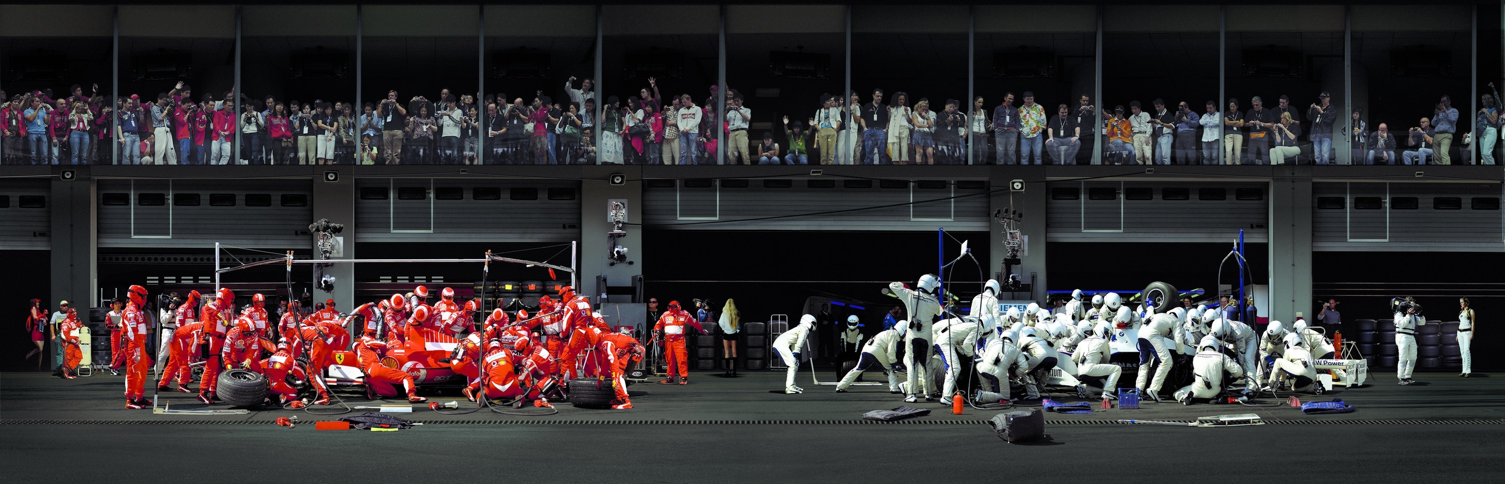
In this photo, it seems like Gursky was interested in capturing all these teams at work around the racecars. I think its striking how busy everyone in the foreground looks. The people in the back all seem busy watching them. It’s interesting how none of the racecar people show their faces. This makes it seem more like they are robots, consumed by the one objective of preparing the car. I think Gursky was aiming to capture singlemindedness. The fact that the two groups of people are wearing two different colors implies that these are two competing groups, but with the same purpose and motivation. The people in the background also make this feel much more important. Realistically, they are here to watch the cars in action. But here, isolated in the frame of the photo, the crews look like they are participating in a monumentous event. I think this all contributes to the theme of the photo.
If I were in charge of giving this photo a name, it might be “Ergates.” It is another word for worker ant, and I think it is appropriate because like the ants, the workers here are all focused on helping one thing: the team, or the queen (which might be the reacecar driver). It also makes them seem less significant as individuals. This aligns with how the people are depicted, so close together and singly focused that they don’t seem like separate people, more like parts of a whole- or a colony.
As for the six elements of photography, I’d say they are all present, with varying levels of importance. Lines appear, mostly in the background. Their purpose is mostly as a support or context for the foreground. Some shapes that appear are the squares in the background. The two groups also form sort of loose rectangles or semicircles. Some of the squares in the back make up the pattern of the windows in which the crowds appear. A lot of the texture in the background seems smooth or stony, while the people up front look like they are wearing somewhat puffy clothes, as well as hard helmets. The entire photo looks pretty clear focused, though the people in the back are harder to see. That may just be a result of them being further away, or maybe they are blurred out a little. I’d say that the most important element is the values/tones. The crews are much have much brighter tones than the background, making it clear that they are the subjects of this photo. The background elements are more muted, so the viewer will most likely notice them after taking a good look at the foreground elements.
(I may have misunderstood the prompt? Gursky is one of the artists that I could choose photos from, but this isn’t one of the photos provided. However, I saw this while doing some searching and liked it.)
Leave a Reply
You must be logged in to post a comment.