Street photography is capturing natural moments of people or evidence of people in a photo.
Penny
"Cur Non" - Marquis de Lafayette
Author: Penny (page 1 of 2)
“Truth Beauty: Pictorialism and the Photograph as Art.” Www.phillipscollection.org, www.phillipscollection.org/event/2010-10-08-truth-beauty-pictorialism-and-photograph-art.
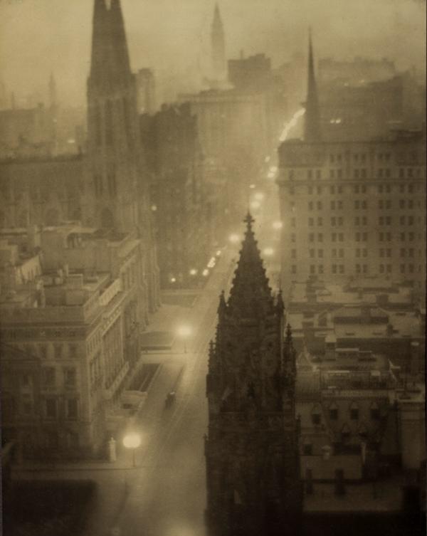
Pictorialism rose to popularity in the late 1800s, largely motivated by photographers wanting to prove photography as an art form. The style has the artist work with the photo while it is being developed. They often applied chemicals on to the photos with brushes for a painterly effect. Pictorialist pictures look dreamlike and out of focus, sometimes tinted in a color. Composition and storytelling were key. I like the dreamlike aspect of pictorialism, but photography’s main draw for me is the fact that the subject exists in the real world, so this isn’t for me.

Ltd, 100ASA. “The Straight Photography Movement: Capturing Reality through the Lens.” 100ASA, 100asa.com/blog/the-straight-photography-movement-capturing-reality.
Straight photography emerged in the early 1900s. It focused on keeping everything in sharp focus and fairly unchanged from the image the camera captured. Photographers in the movement wanted to distinguish photography from painting. This made it a pushback against pictorialism, which made the photographs look more like paintings. This would be more my style, though I would be using brighter colors than I’ve seen.
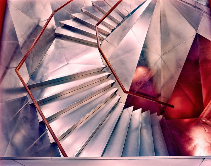
The photos in my triptych are connected because they show a grey, textured background with a bright, warm-colored subject. I formed the whole triptych around the lantern image. I particularly like that one because the lines line up with each other, and the background has lots of different values. The center photo may be my least favorite of the bunch, partially because the subject is easily recognizable for members of this school, making it more mundane. The background doesn’t have much variation in value, but there are a lot of shapes. I would have preferred if the background was closer to the pictorial style, more contrast and sharp lines would have been nice. The right photo is less connected to the other two but still fits because of having one bright color- yellow instead of red with some yellow- and a gray background. The reflections and the bright color make it look far out, and the water droplets hint at its true nature (being a water fountain) and add more texture. I don’t like the stains on the fountain; they clutter the image. If I trusted my Photoshop skills enough, I might have removed them.
The photos are similar to Ola Kolahmeinen’s work because there are some color and architectural elements. More color and/or broader shots would make my photos stronger connections to his work. His work gave me a few ideas, such as incorporating reflections, which appeared in my water fountain photo.
I brightened the color of the original photos in Photoshop because I thought it looked better and more closely resembled Kolahmeinen’s work. All images are cropped from the original image, covering only a fourth. This allows the images to focus on the interesting parts.
My goal for this triptych was to create photos that looked out of this world. These images all have strange angles or reflections, which were a part of that goal. However, I can understand what these images are. Perhaps that’s because I was there when I took them, but in the future, I would like to experiment with framing to make the photos even more abstract.
I chose these photos because they are united by having bold warm colors and neutral tones in the background. Most of them have sharp angles. A lot of them also have light sources or reflections in them.
Since I missed the gib 798 trip, I had limited time to collect photos- about 24 in all. that’s at the lower end for a yellow post, and since I thought fewer photos meant less need for selection, I made this both the red contact sheet and the yellow one.
My original intent was to put a mask that I thought matched the subject’s personality onto the subject. In this portrait, I also added other elements in Photoshop that further show my personality. When it comes to growth, I have improved in using Photoshop. My struggle to create my Triptych is fresh in my memory, and the experience of making this piece was much smoother. I used my skills in drawing to help make my photography more interesting. That also helps me like my photography more because drawing is something I really enjoy. I’m glad that I did research for this photograph because I wouldn’t have come up with this idea without seeing it done by others. I’m also glad that I was able to add some color, as my two main inspirations used black and white photos.
Portraiture is interesting because it offers a window into the subject’s story. My goal is to expose a side of a person you wouldn’t expect by introducing elements from another photo, for example, a photo or a drawing. This will tell the viewers more about my perspective, but that’s an interesting story too. My subjects will probably be my family because they are the people I know best and have the most access to.
A portrait is a photo depicting a person and showing something about their character. Good portraits are intentional. By this, I mean that a viewer can get a general meaning from a quick look over but can find deeper meaning if they look closer. Since photos can have different meanings from person to person, the same photo may be called ‘good’ by one person and ‘obsolete’ by another. This may be harder to express through a smaller object, but close-ups may be just the method for an artist’s vision. Abstraction also makes meaning harder or easier to express. However, abstraction ceases to be a portrait if it is no longer clear what the viewer is looking at.
A portrait needs to contain a person. The implied existence of one does not make the cut. The line between implied existence and a person being in a photo is clear. For example, if a person’s shadow was in the photo, it would depend on the context of the photo to make it a portrait or not.
A sequence of images would not be one portrait. Instead, it would be several portraits with a common goal.
1. 2.3.
2.3.
4. 5.
5. 6.
6.
7. 8.
8.
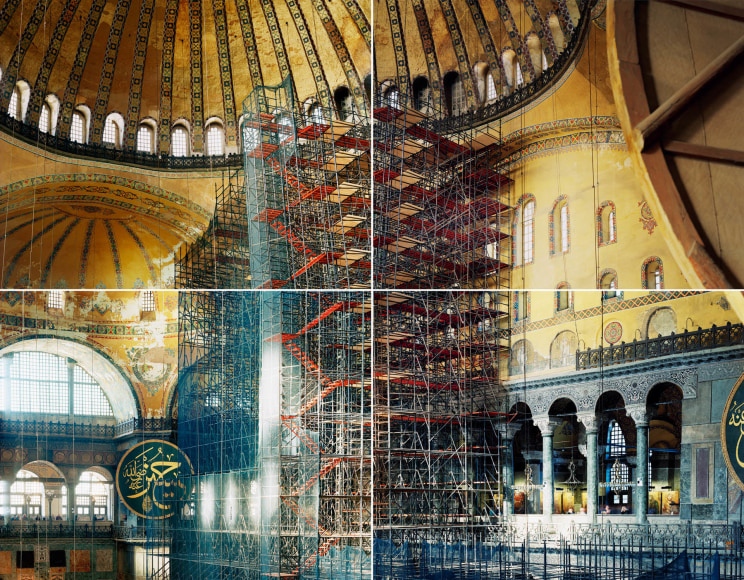
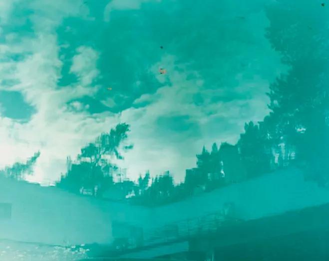
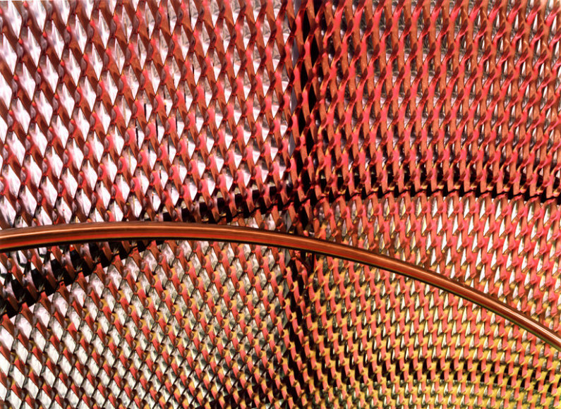
Ola Kolehmainen takes colorful abstract photos of buildings. One characteristic I noticed was that photos 8, 7, 5, and possibly 2 (I’m not sure what is in that picture) all include reflections. The reflections make the subjects look more surreal. In 8 and 7, buildings are used to reflect either other buildings or trees. These buildings make the photos particularly interesting because they are curved, distorting the reflections further. Number 5 features a reflection in bright turquoise water. I think the color of the reflection stands out most in this picture, though that may just be that the white of the clouds offers a much higher contrast than the other reflections. The first three images all have very blocky, bright colors. I’d say number one is them dimmest, with some red panels in the corner being the real pop of color. The rest of the panels are pinkish, but they look almost blue in contrast. Photo two has orange, green, yellow, and blue. As I mentioned, I’m not sure what they come from. It’s likely that they are lights, perhaps from tinted skylights. The photos also have unusual perspectives, geometric patterns, and architecture. The photos are abstract because they don’t show things in a typical way. All of the photos either have creative angles or crop out context that would ground the image more closely in reality. I really enjoy the bright colors and that the images take buildings- which are often depicted as dull and static- as fanciful, bright artworks. I’m hoping to use bright colors and to exclude the any context of the ‘dull’ world in my photos, like I think these photos do. I hadn’t considered photographing reflections, but now I think that would be a phenomenal way to capture that otherworldly atmosphere.
Of these photographs, photo 7 might align the most with my vision. I like how the organic shapes of the trees contrast with the geometric pattern of the building. I also like the bright colors. I might aim for more contrasting colors- the ones in this image are all pink or purple. The lines of this piece are probably the most important element. The two kinds of lines are the ones that make up the tree and the ones that make up the building. The lines allow the viewer to identify what is in the picture, and they contrast each other. One bends and overlaps and has different thicknesses, while the other stays mostly constant and has a recognisable pattern. But these ‘constant’ lines also bend, which adds more drama to the photo. The upward curves make the building look taller, which adds to the scale of the piece.
My vision is to show how extraordinary everyday things can be. I believe taking photos in the style of Ola Kolehmainen will accomplish this. I am particularly inspired by 144, White Pink Yellow Green, and Autumn Leaves.
the second picture won’t show up for some reason, take my word for it or look at the source please
Works Cited:
de, L’Œil. “Christophe Guye Galerie : Ola Kolehmainen.” The Eye of Photography Magazine, L’Œil de la Photographie, 9 Apr. 2021, loeildelaphotographie.com/en/christophe-guye-galerie-ola-kolehmainen-dv/. Accessed 19 Feb. 2025.
HaW Admin. “Ola Kolehmainen – Geometric Light · HAUS AM WALDSEE.” HAUS AM WALDSEE, 7 Aug. 2018, hausamwaldsee.de/en/ola-kolehmainen-geometric-light/. Accessed 19 Feb. 2025.
“Lot – OLA KOLEHMAINEN (FINNISH, BORN 1964) See What You See, 2006.” Gibsonsauctions.com.au, 2019, www.gibsonsauctions.com.au/auction-lot/ola-kolehmainen-finnish-born-1964-see-what-you_D1C4B9C9C5. Accessed 19 Feb. 2025.
“Ola Kolehmainen – Artists – Contemporary Art Gallery in Oslo, Norway.” Brandstrup.no, 2017, www.brandstrup.no/artists/ola-kolehmainen?view=slider#6. Accessed 19 Feb. 2025.
“Ola Kolehmainen – Artist, News & Exhibitions – Photography-Now.com.” Photography-Now.com, 2017, photography-now.com/artist/ola-kolehmainen. Accessed 19 Feb. 2025.
“Ola KOLEHMAINEN – Dominique Fiat.” Dominique Fiat, 30 July 2021, dominiquefiat.com/artists/ola-kolehmainen/?lang=en. Accessed 19 Feb. 2025.
“Ola Kolehmainen – Exhibitions – Galerieforsblom.com.” Galerieforsblom.com, 2015, www.galerieforsblom.com/exhibitions/ola-kolehmainen. Accessed 19 Feb. 2025.
Space, Light and Colour by Ola Kolehmainen | OEN. 14 May 2014, the189.com/photography/space-light-and-colour-by-ola-kolehmainen/.

© 2025 Penny
Theme by Anders Noren — Up ↑
Recent Comments