1.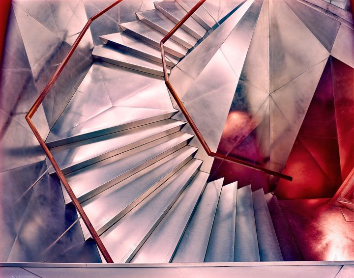 2.3.
2.3.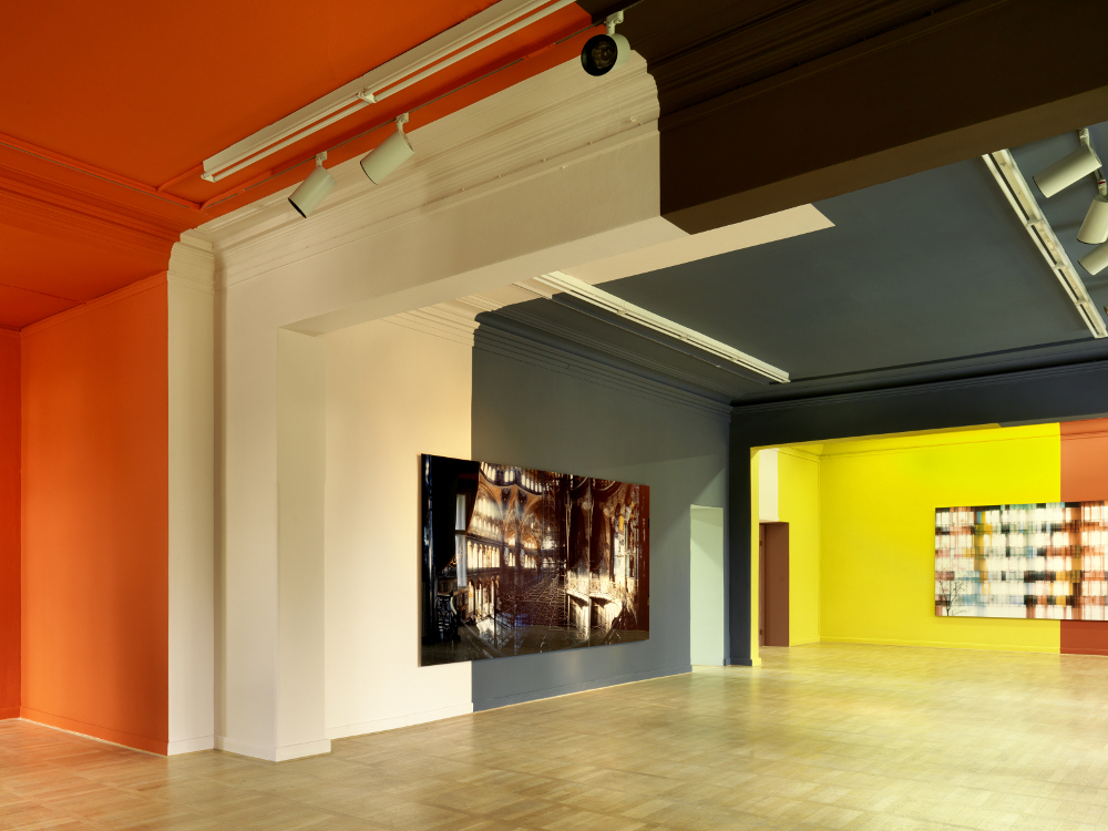
4.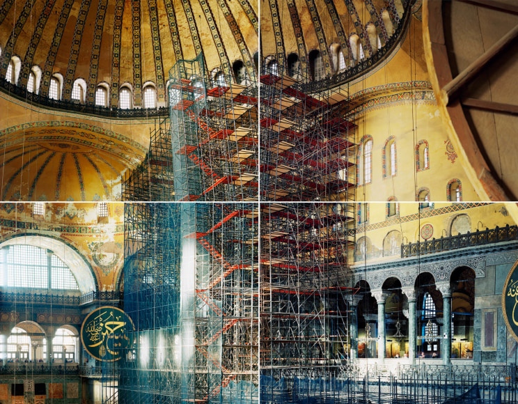 5.
5.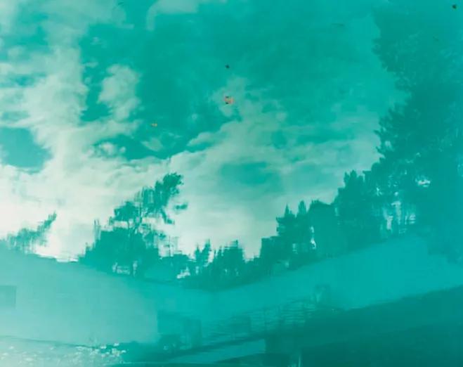 6.
6.
7. 8.
8.
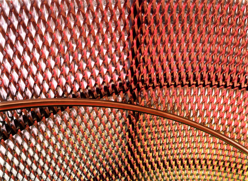
Ola Kolehmainen takes colorful abstract photos of buildings. One characteristic I noticed was that photos 8, 7, 5, and possibly 2 (I’m not sure what is in that picture) all include reflections. The reflections make the subjects look more surreal. In 8 and 7, buildings are used to reflect either other buildings or trees. These buildings make the photos particularly interesting because they are curved, distorting the reflections further. Number 5 features a reflection in bright turquoise water. I think the color of the reflection stands out most in this picture, though that may just be that the white of the clouds offers a much higher contrast than the other reflections. The first three images all have very blocky, bright colors. I’d say number one is them dimmest, with some red panels in the corner being the real pop of color. The rest of the panels are pinkish, but they look almost blue in contrast. Photo two has orange, green, yellow, and blue. As I mentioned, I’m not sure what they come from. It’s likely that they are lights, perhaps from tinted skylights. The photos also have unusual perspectives, geometric patterns, and architecture. The photos are abstract because they don’t show things in a typical way. All of the photos either have creative angles or crop out context that would ground the image more closely in reality. I really enjoy the bright colors and that the images take buildings- which are often depicted as dull and static- as fanciful, bright artworks. I’m hoping to use bright colors and to exclude the any context of the ‘dull’ world in my photos, like I think these photos do. I hadn’t considered photographing reflections, but now I think that would be a phenomenal way to capture that otherworldly atmosphere.
Of these photographs, photo 7 might align the most with my vision. I like how the organic shapes of the trees contrast with the geometric pattern of the building. I also like the bright colors. I might aim for more contrasting colors- the ones in this image are all pink or purple. The lines of this piece are probably the most important element. The two kinds of lines are the ones that make up the tree and the ones that make up the building. The lines allow the viewer to identify what is in the picture, and they contrast each other. One bends and overlaps and has different thicknesses, while the other stays mostly constant and has a recognisable pattern. But these ‘constant’ lines also bend, which adds more drama to the photo. The upward curves make the building look taller, which adds to the scale of the piece.
My vision is to show how extraordinary everyday things can be. I believe taking photos in the style of Ola Kolehmainen will accomplish this. I am particularly inspired by 144, White Pink Yellow Green, and Autumn Leaves.
the second picture won’t show up for some reason, take my word for it or look at the source please
Works Cited:
de, L’Œil. “Christophe Guye Galerie : Ola Kolehmainen.” The Eye of Photography Magazine, L’Œil de la Photographie, 9 Apr. 2021, loeildelaphotographie.com/en/christophe-guye-galerie-ola-kolehmainen-dv/. Accessed 19 Feb. 2025.
HaW Admin. “Ola Kolehmainen – Geometric Light · HAUS AM WALDSEE.” HAUS AM WALDSEE, 7 Aug. 2018, hausamwaldsee.de/en/ola-kolehmainen-geometric-light/. Accessed 19 Feb. 2025.
“Lot – OLA KOLEHMAINEN (FINNISH, BORN 1964) See What You See, 2006.” Gibsonsauctions.com.au, 2019, www.gibsonsauctions.com.au/auction-lot/ola-kolehmainen-finnish-born-1964-see-what-you_D1C4B9C9C5. Accessed 19 Feb. 2025.
“Ola Kolehmainen – Artists – Contemporary Art Gallery in Oslo, Norway.” Brandstrup.no, 2017, www.brandstrup.no/artists/ola-kolehmainen?view=slider#6. Accessed 19 Feb. 2025.
“Ola Kolehmainen – Artist, News & Exhibitions – Photography-Now.com.” Photography-Now.com, 2017, photography-now.com/artist/ola-kolehmainen. Accessed 19 Feb. 2025.
“Ola KOLEHMAINEN – Dominique Fiat.” Dominique Fiat, 30 July 2021, dominiquefiat.com/artists/ola-kolehmainen/?lang=en. Accessed 19 Feb. 2025.
“Ola Kolehmainen – Exhibitions – Galerieforsblom.com.” Galerieforsblom.com, 2015, www.galerieforsblom.com/exhibitions/ola-kolehmainen. Accessed 19 Feb. 2025.
Space, Light and Colour by Ola Kolehmainen | OEN. 14 May 2014, the189.com/photography/space-light-and-colour-by-ola-kolehmainen/.


Recent Comments