Artist: Brett Weston
Brett Weston is an American born photographer who mainly took black&white texture photos. He played as a key influence in the f/64 movement where photographs were “characterized by sharply focused and carefully framed images seen through a particularly Western viewpoint.”
Broken Glass (1959)

This photo taken by Brett Weston deeply attracts me because of the black&white detail. The sharp and focused details on the texture of the broken glass creates a “clean” emotion. This emotion grants the satisfaction of “cleanness”, referring to the smoothness of the glass as if it was cut clean flawlessly. In addition, the dark color of the glass presents a great contrast with the background behind it which is white. This generates an additional focus on the broken glasses as subjects and creates an easy focus. Personally I believe this photo could achieve better effects if it had a bit more tilt. Dutch angels could definitely add structure to the dimensional aspect of this picture.
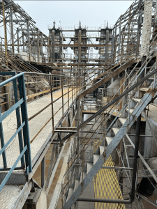
More Examples:
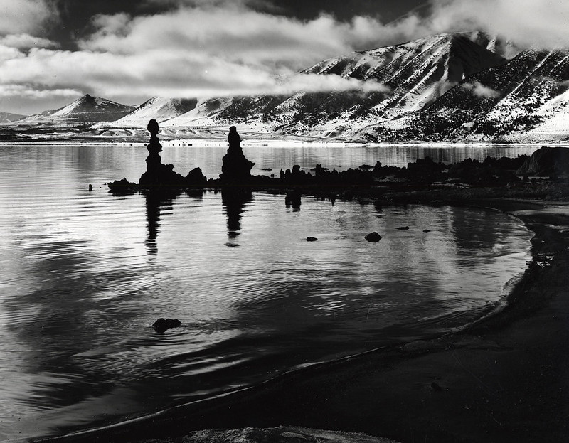


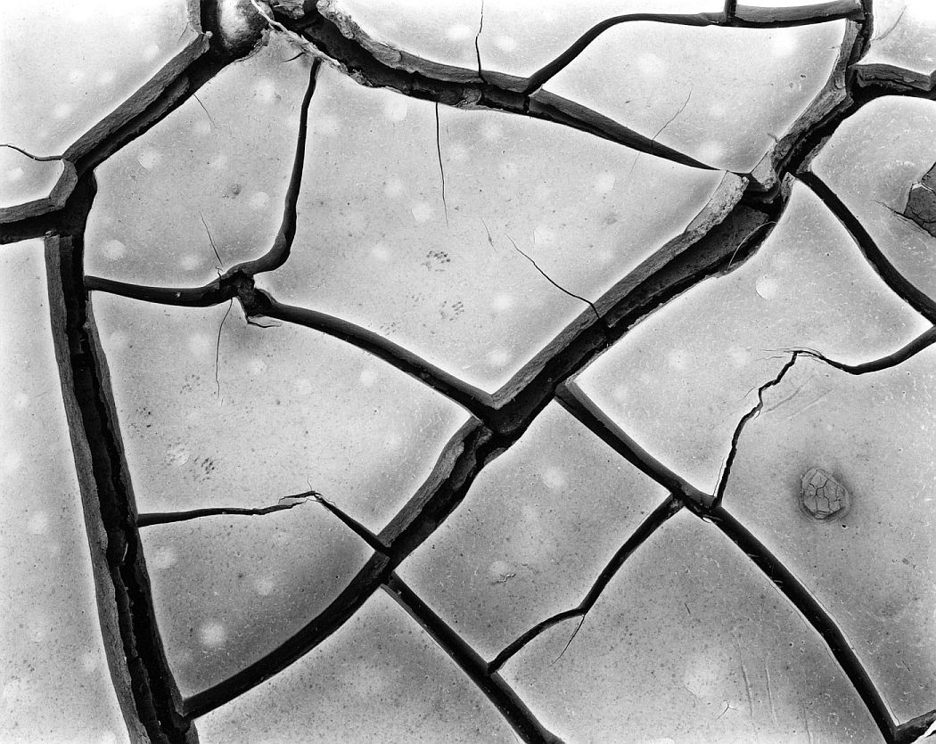
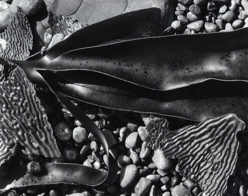
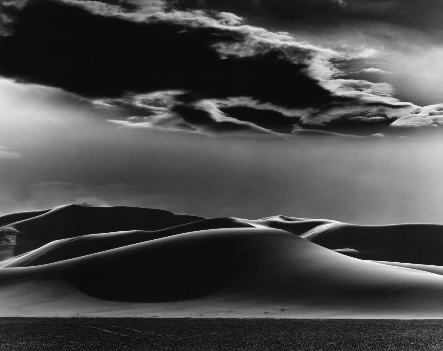
A common pattern we seen from all of these photos is black&white. This creates a significant contrast between different subjects and puts a layer on the photo.
<798 Photos>
[Afternoon] – 午后

The sun shining down at the beautiful gallery wall. This picture is named “Afternoon” because of the golden sunlight that paints the wall in a heartwarming and comfortable way. The intent behind this picture is to bring a relaxing emotion to the viewers. This was done by using extremely warm color tone which provides with a sense of heat even in the coldest of winter. A dutch tilt is also used in-order to stack on the “relaxing” emotion. Different from the color tone however, the dutch angle does this by mimicking scenes in films where the camera pans in and out slowly creating cinematic shots. This worked significantly on this picture because it brings that feeling of “slow and steady” on top of the relaxation and doubles down on the viewer. I believed that all of this was necessary because since the main subjects is a gallery’s title, the photo automatically creates an “invitation” to enjoy art. But I believe that art should and can only be enjoyed in one’s most relaxed and calmed state. Therefore, I threw in all of these methods to create a clean presentation of a gallery, “inviting” the viewer to enjoy art. A more simple way of understanding this all could be: the photo pulls the viewer slowly towards the gallery warming and calming their sprits as they enjoy the true beauty of art. I would almost consider this a masterpiece of perfection, but I messed up the bottom right corner by accidentally having the other part of the wall in the frame. Personally however I believed this aided this image just in time since now thinking back on it, it would be too “dead” and “lame” if it was just a perfect rectangle with a sideways text in the middle. This “messed up” corner even helped with structuring the dimension of this photo better by indication through the corner that this image is tilted. The audience can receive a completely different emotion knowing this photo was tilted than to when they do not.
Original Photo:

This photo went through a lot editing before evolving to its finest. What I did was that I first lowered the brilliance to a certain extend that would match the warm tone and the shadows done through heavy contrast adjustments.
[Painter of Glass] – 玻璃的画家

“Paint splashes across the glass as he waves his brushes across the canvas, leaving behind an imagery sprouting into infinite chances for creativity.” That is the sentence I would use to describe this picture. I named this one the “Painter of Glass” because going from a painter’s perspective, this really seems like a new style of artwork where painters would have a piece of glass as their canvas and smear paint over it to create abstract imagery. The approach of this piece is to demonstrate the abstract and distorted view of reality by expressing a curious emotion that enables people to extent the topic of this image to their own imagination. In simple, this is an abstract photography that enables the viewers to take the meaning behind the photo to their own creativity and imagination, ending up as whatever they desire or wish. Unfortunately however, after some research it seems that glass painting in this form does not exist. Despite that, this photo used the blurring technique to a creative extend where I but a glass cup in-front of the camera creating this blurry shot that achieved my intent. The picture also represents lively hood through the bright and positive colors as well as endless possibilities through what I explained earlier. Overall this photo appealed really creative and fresh to me, definitely one of my proudest works.
Original Photo:

I put a lot of efforts lifting the exposure and brightness on this photo as well as the saturation to create the lively hood. However a certain point of improvement is the bottom part where in the final piece it still looks dark in a “dirty” way and slightly ruins the lively hood. Overall however this in my personal opinion is a magnificent piece of work.
[Across Time] – 时空裂缝

“时空裂缝” means “crack in time”, despite meaning differently from “Across Time”, both expresses the same meaning and emotion behind this picture. This photo is called “Across Time” because of the perfect contrast between colors. The left side of the photo is colored and looks “norma” or rather “modern” with all the glasses and statures. This represents the present, and is symbolized this way because only “modern” films and photography has colors. The right side of the photo is black&white and looks “old” with the factory bumping out smoke and “simple” color tone. This represents the “past” where it is often identified through black&white films or pictures. This hybrid of both past and present creates this “time traveling” theme. However because the image itself has no “time traveling” components that is usually represented by futuristic machines and such, I found that it would be perfect to name this picture “Across Time” where the two eras cross part in one picture seeming rather close yet completely separated by a division line that splits the difference. Therefore, this photo expresses a flashback like emotion where the audiences lingers their feelings between history. To conclude, this is a heavy edited work that I believed was relatively successful but surely relied on editing more than the taking itself.
Original Photo:

It is obvious that a lot of editing was done to this photo to achieve its final effect. The first step was that I lightened and saturated the photo to make it look more lively, I duplicated it into a black&white version before putting both together into one frame and doing a cut in the middle to make a perfect blend/combination. Something that I would definitely attempt to do better next time though is to saturated the left side (present) more so it looks more lively but I failed after multiple attempts to doing so this time. Next time I would seek for more help or suggestions regarding how I should achieve that “alive” effect and emotion.
Top 4: A tiled picture of a spray painted wall, mainly texture and dimensions focused.

Top 5: A low to high shot that looked like the 751 traffic stomps is holding up the sun like a pyramid.

Top 6: Texture photo that focus on the ground and the lines, splitting the image but focuses the audience’s attention.

Top 7: A in-complete “heart” spray painted across the wall, mainly focusing on the lines, color, and texture.

Top 8: A tilted angle just enough to split the frame across in half with the wall with texture being focused and the wall behind as the background.

Top 9: Taken on a wall this was taken from the ground facing this sky that shows the sun-like light bulb shining down the wall as if it was it’s only hope in the dark.

Top 10: The light splits the wall apart leaving one side in brightness and the other in shadows, setting a clear difference between “right” and “wrong” as well as how they never crosses.

Top 11+


Leave a Reply
You must be logged in to post a comment.