Thomas

"I have no special talent. I am only passionately curious" - Albert Einstein

Author: Thomas (page 3 of 4)

Photo Sets 1- Blog

Top 1: Trickster

At first site of this photo, most people will think it is a wall but it is actually not, it is actually the floor. This is also why this photo is named “trickster” because it tricks the eye into believing it is a wall because its “standing up”. This photo referencing this “trick” is a reflection of the biased reality where people choose to believe what they see first, rather than actually thinking into it. I used the presentation and structure of lines with a one point perspective. The photo was also turned 90 degrees to obtain the delusion of looking like a wall. Originally I was going to black&white out this photo, however I ended up deciding to keep the original color tone because it presents a better contrast of the highlight that comes from the left side. This can significantly increase better the presentation of this photo alongside with idealism of reality (has to look “real”, not black and white). A mistake I made is that I did not focus on the floor correctly. I wanted to keep the right side focused leaving the distant left blurred to create a contrast. However it ended up with the middle part being focused and leaves the two sides blurred. But, this mistake actually created a better effect where it pulls the audience’s attention to the middle on the cross of the two lines. This gives the audience an attention point in hope for a potentially more detailed look on the photo. Overall this is one of my most proudest works so far and indeed a good “trickster” that I created.

Top 2: Hope and Despair

Compared to other photos, this one is more direct in the message it communicates. One feeling is hope. The exit sign was designed with the intent to save people’s lives and direct them when they are lost in danger, Therefore most people treat it as a life saver and feels secured and hopeful when they see it. In addition, green has always been a color that represents “correct” or “alive” which furthers the hopeful feeling the sign presents to people. Another feeling is despair. One biggest cause of despair is stress, and this photo communicates that if understood in a different way. his photo uses a side angle to present the exit sign in a way that may be overwhelming certain audiences. When positive things (this sign for example) is presented in a way that it overwhelms the receiver, they gain negative impacts such as stress and fright. This enables some audience to feel despair from this sign because “their survival is being pushed in their face”. A more simple way to explain this is that the image stress the important of “exit” (survival) and stress the audience on it to create a despair feeling. The two potential feelings this image communicates makes this photo a perfect fit for a two-sided artwork. It is also very interesting because the way people accepts it can totally change their impression of this photo upside down. A big mistake I made however is that I did not focus the camera correctly. My original intent was to draw focus on the entire sign but it ended up being only 2/3 focused leaving the left far side blurry. This somewhat ruins the effectiveness of communicating the two messages mentioned earlier. All in all it is still a rather decent photo and I am fine with it.

Top 3: Morning

Despite looking rather simple, the emotion behind this is complicated. This photo is called “morning” because the light shines down on the sofa texture like the sunrise, bringing a new day full of hope and joy. The true emotion in this image however is the fact that only part of the sofa received light while the other part stays dark. This shows a clear contrast of light and dark and the “shape” that the light creates also makes this image look “alive” and naturally formed instead of being a “dead” photo that was staged (this was not). Another big emotional connection the shade in someway resembles a monumental landscape shot from the anime/film “Your Name”. Overall the photo communicates a bright and hopeful feeling through a shade contrast and the sofa texture. This photo is what I like to consider of the only few that is “near perfection”. Some brightness and contrast adjustments could be improved though.

*Images For Reference, Not Originally Taken*

Top 4-10:

-This is a close up shot of a security camera on the wall with adjusted brightness. The point of this photo is to present a different perspective of an object that looks over people in order to protect their safety.

-This is a photo of a light on the celling taken after the brightness was killed. The point of this photo is to present abstraction and make people believe that it is actually a square/shape instead a light.

-This photo is taken while the camera is tilted and placed on the benches with purposed blurs. The point of this photo is to present a distorted perspective of reality where everything is sideways and unclear.

-For this one, I just shoved the camera’s lenses down this plant. This photo was more for experimental purposes but ended up working really well and now shows a close up perspective of nature.

-This photo was taken of the floor at the point where the shadow from the celling crosses with the normal floor under lights. This photo presents a black and white contrast between two completely different parts of one thing

-This is a close up photo taken of the handles on the side of the stair cases with a tilted angle. This is to communicate the perspective of a common object in distinctive angles.

-This is a photo of a celling light where the ISO was absolutely murdered. The point is to build a shape out of something the audience would never expect: celling lights.

Top 11-23:

-This was taken in the dark with a purposed blur.

-This was taken on the wall’s edge from a high angel.

-A purposed shaky shot of a security camera on the celling.

-Taken with the camera on the sofa and focused on the sofa in front with the background blurred.

-A shot of the in between the sofas.

-A shot of the sofa textures with a half rotated angle.

-Extremely close up shot of the rails in the fire wall.

-A shot of the celling surface with black dots.

-Taken with the camera to the side of the wall and blurred background.

-An establishing shot of the chairs.

-To be honest I just got bored and decided to take a photo of a water can.

-A shot of the fire alarm on the celling with slightly adjusted contrast.

-A shot of the wood table surface with adjusted exposure.

Aaron Siskind: Evaluation

I choose this work because the way the camera tilted on the brick tiles really changed its dimensions.

This work appeals as unusual to me because Aaron used a dutch tilt on this image and for a second the brick tiles looked like a rooftop due to the angel.

-Dimensions

This is important because the dimensions of a photo can really change up the whole understanding and concept. This one for example made the group filled with brick tiles look like a rooftop.

The photo is abstract because it distorts the reality behind this photo by tilting it into something that it’s not.

I favor this style of use camera angels to create alter dimensions and twisting the reality behind the photo.

I can adapt this to my own photography style by also using dutch angels to tilt my subject/s and change the concept of the photos.

Aaron Siskind: Gallery

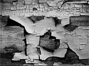
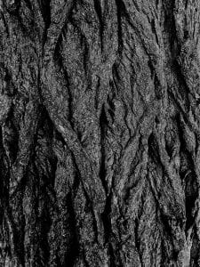
I choose this photographer because his black and white texture photos of surfaces really appeal to me. It relates to my vision because I have similar likings for surface texture photos, I believe they look satisfying.

-Surface

-Deep Contrast

-Black and White

-Abstract

-Urban


“We look at the world and see what we have learned to believe is there.”

-Aaron Siskind

I choose this quote because I can personally relate to what the quote expresses: We believe what we learned is there.

The Starting Point- Blog 3

The Pictorialism movement is a photography revolution that took place between 1885-1915 where Pictorialists “took the medium of photography and reinvented it as an art form”, placing artistic elements like tone, beauty, composition and others above creating accurate visuals. (The Art History) The straight photography movement was a revolution where people focused on the camera’s technical ability to produce images that has “sharp in focus and rich in detail.” (The Art History) It was popular among artists because straight photography allows the photography “to be appreciated for the reality it captures in a pure way.” (Temple University)

Edward Wetson was inspired by the Straight Photography Movement as he “started to sharpen the straight photography way of taking pictures” before traveling to New York. (VOA) Similarly, Aaron Siskind was also influenced by the movement as he offered an important model for other photographers by constructing compositions based on the outside world instead of documenting poignant events.

This photo by of Andreas Gursky shows abstract as we can see that there isn’t a specific subject that is being focused on. In this work specifically, the “random” roads like lines going all over the place is what makes this picture abstract since it losses any possible focus on a specific object/subject.

This photo by Uta Barth shows abstract as we can see that the image is blurred and does not have a specific focus point. In this work specifically, the blurry shot makes it impossible to determine a focus, therefore this picture is abstract, and rather enjoyable from another point of view.

These two artists should not be classified as neither pictorial nor straight. This is because they photos vary a wild range of techniques, therefore making it hard to fit them in a specific group. Looking at these two examples alone however, Andreas should fit as a pictorlalist as his photo although being reality, does not document reality, and rather just shows complicated lines instead, perfecting inline with the concept of pictorialism. For Uta Barth, she fits a straight photographer because she uses the camera’s focus to create a blurry image, which fits into the concept of the “technical ability” of straight photography.

Sources:

https://www.theartstory.org/movement/pictorialism/

https://www.theartstory.org/movement/straight-photography/

https://learningenglish.voanews.com/a/a-23-2006-11-07-voa1-83128062/125522.html#:~:text=In%20Mexico%2C%20Edward%20Weston%20started,true%20nature%20of%20his%20subjects

https://ccp.arizona.edu/artists/aaron-siskind#:~:text=His%20work%20offered%20an%20important,rather%20than%20documenting%20poignant%20events

Formal Element- Photography

Line:

Shape:

Repetition/Pattern:

Texture:

Value/Tone:

Focus:

My definition of “Abstract Photography”

Abstract Photography is when the focus is on the background, foreground, or environment rather than the subject which is purposely distorted and/or adjusted to generate an unusual effect and/or feeling.

Image Source: https://www.widewalls.ch/magazine/abstract-photography

Initial thoughts on “Abstract Photography…” – What does it mean?

“Abstract photography can be defined as capturing images in which the subject isn’t the most interesting element”?

The meaning behind this sentence is to discuss if abstract photography means the capture of subjects that isn’t the most interesting in terms of elements. In my personal opinion I believe abstract photography can be defined but should not be limited by such capturing. Photography being a big part of “art” overall provides a lot of space for freedom and creativity with that being the nature of “art”. Hence, abstract photography should not be limited by a simple definition.

Image Source: https://www.travelphotographyguru.com/travel-blogs/abstract-photography

Wrong – Photography Blog

This photo breaks the framing rule and focus rule. I intentionally put the subject(the painting) out of frame and unfocused the camera to make it blurry. However the dutch tilt was on purpose and does not mean to break any rule.

This photo breaks the steady camera rule and the focus rule. I intentionally made it look like the camera was going to fall out of my hands to generate an unstable shot. I also turned down the focus to make it blurry.

This photo breaks the brightness rule. I purposely set the ISO to 200 which pretty much generated this black screen-like picture in a dark environment. Doing so pretty much ruins the entire picture and make it barely visible.

This photo breaks the focus rule. At first glance it may be an okay photo, but upon taking a closer look it will be obvious that the camera is out of focus, ruining the photo. I purposely unfocused the subject to achieve this blur effect.

This photo breaks the environment rule. Although this may look interesting, it is noticeable that there is a shoe in the shot. I intentionally left my shoe in the frame in order to ruin the environment.

This photo breaks the frame and focus rule. This picture is extremely zoomed in to the point where parts of the subject takes up the entire frame blocking the rest. The picture is also extremely out of focus and barely anything can be seen.

This photo breaks every rule there is to exist. There is no brightness, no framing, no focus, no rule of 3rds, nothing. For those who are curious, I shoved a camera down a water barrel and got this.

This photo breaks the brightness rule. The original intent was an object through object picture where the walls were visible through the leaves. However because I purposely turned down the ISO to the lowest, the leafs turned out to be black sections covering most of the space, ruining this picture.

This photo breaks every rule possible. I intentionally turned ISO to it’s maximum, faced the sun through a water barrel, and got this. Everything I have done to this picture is an example of what not to do.

This photo is not a photo. Although being intentional, this photo was suppose to simulate an accidental photo that as taken by mistake. If rules were to be applied, this would break the steady rule as visible camera shake can be seen. It also breaks the focus rule as the shot has no focus.

Wrong Picture

  1. Can you take a wrong picture?

-No, the term “wrong” does not exist within art. Art is an appreciation rather than judgement so the term “wrong” should not be used to define artworks. It is rather a simple disagreement in perspectives instead.

2. How is context important in photography?

-Context can help with understanding the picture better. This is just like knowing the background information of something. Overall knowing the context behind a photo can boost the understanding of a photo.

French Revolution Journal

Character: Dennis Monique Arnaud

Height: 173cm

Birth to Death: 1779 – 1835

Gender: Male

Brief Intro:

Born into an average family, Dennis lost both of his parents at the age of 7, however he still was an optimistic person. He is absolutely obsessed with the color red and blue. At the age of 18, he met his girlfriend, who was unfortunately killed later in the French Revolution. After the revolution ended, Dennis returned to farming living a normal life until 1835 having a peaceful death at the age of 56.

In conclusion, the French Revolution was a complicated 10 years of history. Many of the people were killed, others were sacrifices for the revolution. We can not certainly determine if that 10 years of bloodshed was worth it or not. After all, Napoleon restored the monarchy right afterwards. Although this is the way of the world, anything can happen and as us historians today, these have great value to study at. By that was can avoid mistakes that people before us may have made that costed sever consequences. I hope you all enjoyed this French Revolution Journal Sway Book.


Older posts Newer posts

© 2024 Thomas

Theme by Anders NorenUp ↑

Skip to toolbar