Daisy

"I have no special talent. I am only passionately curious" - Albert Einstein

Author: Daisy (page 2 of 4)

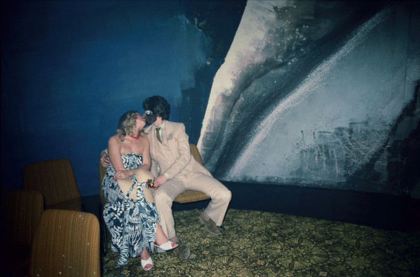
Street Photographer Selection 1 – Harry Gruyaert

Belgium like you've never seen it before — by Harry GruyaertHarry Gruyaert: East / West - The Eye of Photography Magazine

Harry Gruyeart is a Belgian photographer known for his vibrant use of color and for capturing the moments of everyday life in the city. His style was influenced by cinema, especially by directors such as Henri Verneuil and Michelangelo Antonioni. These films have improved his photographic characteristics. Also, because of his extensive travel experience, he can better capture novel things. In late 1960, his work was touted as a “new color” by American critics, along with those of contemporaries Ernst Haas, William Eggleston, and Joel Meyerwitz.

Harry Gruyaert’s street photographs are a mixture of emotions, composition, and lights. His photographs are kind of landscape style because he is not only focused on people but also on the colors and backgrounds. These conditions make his photos more attractive than the other usual street photographs. I like Harry’s works because his photos give us strong visual feelings and abundant emotions. They are very colorful and well-blending, and also let the audience feel comfortable while they appreciate the photos.  Harry’s photo inspired me to think that while we are creating street photographs, only people inside the photos are not enough for a good picture. Just as Harry states: “For me, photography is not only a matter of composition or color, it must also talk about place and time.” The overall tone and light source are also very important for helping us get great photos. And they will make the whole picture look more lively.

This photo is my favorite one. The picture shows two girls holding hands and jumping on a stage, and the other younger girl is standing beside them and led by an adult. The major tone of this picture is basically high saturation red, and the composition is quite active because the photo captured the girls’ movement while they jumped. The photographer must be standing in front of the girls so he could take photos from a head-up view. The frame used the rule of thirds because all the people are not in the center of the picture, they’re mostly in the left half of the picture. The background of this photo is the red curtain with a Russian stamp on it. The red curtain corresponded to the girl’s skirt and shirt, which could make a good mix. The photographer basically only took the photo of these girls, and the distance between him and the girls was not very close (the girls didn’t discover him by looking at the lens), he used gestures, which are the girls’ movements. The highly saturated tones and the main subject of the photo create a strong and original visual impression for the viewer. And the entire picture shows a positive emotion, there is no serious atmosphere in the photo, only a childlike and relaxed atmosphere created by the smiling faces of the two girls. I might name it ‘Red Childhood’ because this picture reminds me of my childhood and memories. And I want to be like Harry, to use my own lens to record other people’s colorful lives. Overall, all those elements’ combinations explain a strong idea about the colorful moments in daily life, they could be very simple but vivid.

The Definition of Street Photography

Street photography is a photography style that records everyday life in public spaces. The setting’s publicness enables the photographer to take candid pictures of strangers, often without their knowledge. Street photography focuses on people and their behavior in daily public life. The most important point in street photography is to focus on the emotions, stories, and dynamics of a diverse range of subjects and situations. The style often includes a strong sense of composition, light, and context,  which encourage the audience to engage with the captured feelings on a deeper level.

Cite:

Wikipedia contributors. (2024, November 16). Street photography. Wikipedia. https://en.wikipedia.org/wiki/Street_photography

Tripditch & Evaluation

While taking these sets of photos, I tried to reach my intention as close as possible. The final works did meet my intentions mostly, and they had the effect I wanted to achieve. The artist I chose gave me abundant inspiration, and from analyzing their photographs and styles, I learned more new and interesting shooting techniques. During my own shooting, I combined multiple elements together: colors, lines, angles, etc. These elements create a stronger version of my photos. I also faced many questions while I was shooting, I always had various problems and challenges with the technology and the use of the camera, but fortunately they were solved, and the photos were satisfactory. I wish my photos could give the audience a strong visual feeling and deep meaning inside the photographs. The photos I take should reflect my own spiritual ideas and thoughts.

Photo Set 2

I aimed to take photos using light sources and blurry motions to create the abstractions in this set of images. My style of this set will show more of Ernst Haas’s style, and the whole tone in the pictures will be more abundant, too. I will combine this shooting method with different periods of nature scenes. This can show the light and night background as well as the background and level of the subject so that the photos will have a deeper level and better feeling. In addition, blurred pictures can make the image more artistic.

Full Contact Sheet:

These are all the photos I attempted to take.

Yellow Contact Sheet:

These are the photos I picked out, and they are pretty much in line with my concept. They sort of show my central idea and also have suitable composition and color.

Green Contact Sheet:

The above 7 photos in the green contact sheet are all photos that I think have effective lens effects and composition. Each composition has a light source, which is a very important part of my plan this time. The processing on the camera is also blurry, which makes them more abstract. The color in the picture is also relatively rich. The contrast was also shown inside this set of pictures, which can make these pictures more attractive.

Red Contact Sheet:

These 3 photos are the final pictures of my red contact sheet because they are the best presentations and combination of my theme and also the most successful photographs. Their blurred images and abstract concepts form a good blend. This makes the whole picture full of hope and vitality. The sequence of backgrounds and scenes in a photograph creates depth for the pictures, and the colors in the photos can show the abstract beauty of nature. These are the reasons why I chose these three photos to represent my set 2: they are hopeful and also mystery.


Artist Selection 2 – Ernst Haas

Ernst Haas’s photographs are usually created abstractions by shutter processing and the reflection of water. The biggest characteristics of his photos are blurry and motions. While he was taking photos of the water, he zoomed in on the camera to get a better view of the other side of the water. The formation of water waves can also make the audience feel vivid in the visual sense. But when he was taking the blurry pictures, he increased his shutter speed. This could help pictures to be more abstract and bring the audience a deep, mysterious feeling. That’s also why I like his picture because I think his photography is full of streams of consciousness and also the expression of feelings inside him, Just as he said:

A picture is the expression of an impression. If the beautiful were not in us, how would we ever recognize it? – Ernst Haas

This picture is the one I am interested in the most, and it shows a water wave. The reason why I think this photo is the most interesting one is because it seems “alive.” The water waves created a dynamic graphic for the whole photograph, and the light refracted on the surface of the water to form different colors. These all make the picture very vivid and creative. I think the most important element in this picture is probably the texture. The texture of the water waves contributes to the dynamic feeling of the work. It makes the picture more realistic while creating a sense of abstraction.

Cites:

Water. (n.d.). TALLIS PHOTOGRAPHY. https://tallisphotography.weebly.com/water.html

Color Abstract | Ernst Haas. (n.d.). https://ernst-haas.com/color-abstract/

ERNST HAAS ESTATE | COLOR: CREATION. (n.d.). https://www.ernst-haas.com/site/creation-8.html

Roberts, J. (2018, March 14). Remembering Ernst Haas – Vantage – Medium. Medium. https://medium.com/vantage/ai-ap-pro-photo-daily-special-report-remembering-ernst-haas-578ce6a73047

Photo Set 1 – 798 Photos

For this set of photos, I prefer to make my photography style close to Keld Helmer Petersen’s, so I choose to use filters to adjust the color of your photos for better consequences. For the compositions, I want to make my photos more abstract, so I avoid the centered composition but more focused on the patterns and the contrast between the scenes.

Full Contact Sheet:

Yellow Contact Sheet:

I think These yellow photos are the most abstract and the closest photos to my topic. The basic composition and style are all reflected in some of these photos.

Green Contact Sheet:

The green photos are more over than the yellow photos. I picked them from the yellow photos because they are the basic representations of my photography style. While I took these photos, I thought about the composition and the light sets for several images. But the other I just took them randomly, and then I found they are actually pretty artistic. The photos have a retro and mysterious vibe.

Red Contact Sheet:

After flipping and adjusting my photos, I chose these 3 pictures as my final red photos. These 3 photos create the most abstractive style and show my modern architectural style very well. (Which is also the theme I focus on this time) The top left one is the clearest and can show the architecture theme; the whole image builds a sense of postmodern industry. And it is also the smiliest one to my artist’s style, which is successful for my topic. The top right one shows more contrast. I used the contrast of black and white to create the abstraction, and during the post-processing, I also added more texture to create the style in the picture. The last one presents a mixture of patterns and contrasts. I considered a lot about the composition, and I also cut and rotated many parts in the post to best achieve this effect during my post-processing. Overall, I have taken some satisfactory photos during this 798 trip. For next time, I may choose a more colorful style to analyze and create my own photos.

Artist Selection – Keld Helmer Petersen

Keld Helmer Petersen’s photography style represents strong contrast, steric, complex patterns, and impactful and Industrial feelings. His photographs focus on the structural aspect of creating abstraction.

it is not the life in the city, I have sought to depict, but the architectonic, in other words, that which frames the everyday life of people– Keld Helmer Petersen.

I like this style of photographs because they are quite realistic and texture-ish. The graphics and composition in some of these photos are very complicated and full of visual impact. The other part of the photos shows the high contrast of the architecture. These photos represent a kind of fierce beauty. The beauty of these photographs is that they are not very artistic and tender but angular and modern. Keld uses the most basic building structure to show us angles and views that we don’t normally observe in our daily lives.

The most inspiring picture for me is this photo just right above. I’m so into this photo because of its spaciousness and patterns in the graphic. The wonderful thing about this work is that it has a strong sense of extension, allowing the viewer’s vision to enter the deeper picture. The repetition of this photograph creates the fantastic composition for it, and it also brings the depth for this creation, which I think is the most important element of this photo.

Cite:

Keld Helmer-Petersen. (n.d.). https://prabook.com/web/keld.helmer-petersen/1719633

https://www.barnesandnoble.com/w/keld-helmer-petersen-keld-helmer-petersen/1135147178

Daniellagolden. (2014, August 10). Keld Helmer-Petersen. Negative Development. https://anegativedevelopment.wordpress.com/2014/06/25/keld-helmer-petersendaniellas-viewpoint/


Statement of Intent

The Combination of Nature and Factories

The message of my triptych could represent the industry society environment in 798. I want my photographs’ audience to realize how the technologies developed so rapidly and what people’s living environment looked like in that period. That means I want them to feel that China’s development speed is inconceivable and that nature and modern technology can survive together. Because they made our society today. For inspiration, I will try to find a photographer with much modern industrial photography experience (Such as Keld Helmer Petersen) and meanwhile find a style that I like from maybe one or two photographers. I also prefer that my photo can be a kind of mixture of nature and technology to show contrast and complement each other. From my perspective, it could be amazing that both natural creation and artifacts can create our lives.

Photo Safari

  • Value/focus/texture

  • Value, line/line/focus

  • Line/pattern/pattern

  • Line/line/texture

Most of these pictures I took them with the frames so mostly they are very similar to the framework. But I think the stair one didn’t fit very well because the lines inside the picture are not clear enough to guide the viewers. These photos still need improvements.


Analyze of a photograph

Albert Renger-Patzsch

Renger-Patzsch Cowper blast furnace Herrenwyk – Art Blart _ art and cultural memory archive

When the photographer was capturing this photo, he might have focused on the value, focus, and pattern in this photograph. These 3 points are the most obvious elements shown in this picture. If I were the photographer, I might call this picture “Up To The Sky.” The main subject of this image is the tower in the center. The Angle of this work is again looking up, and the tower appears to be soaring into the sky. So I think this name is suitable for this piece of work. The leading line in this image is kind of the outlier of the tower. And the pattern is the low towers beside the tallest one. The tone in this photo is also very clear because it shows the contrast between the towers and the sky/background. And the focus must be the main subject of this picture, which is the center tower. The photographer used an upward view to take this picture. This makes the perspective of the viewer (human) very small, while the industrial society (buildings and towers on both sides) is very large. This invisible contrast gives the photo a deeper meaning.

Cites:

“Albert Renger-Patzsch.” Wikipedia, 6 Oct. 2022, en.wikipedia.org/wiki/Albert_Renger-Patzsch.

Artblart.com, 2024, artblart.com/wp-content/uploads/2018/01/renger-patzsch-kauper.jpg?w=650&h=833. Accessed 9 Sept. 2024.

Older posts Newer posts

© 2025 Daisy

Theme by Anders NorenUp ↑

Skip to toolbar