- Looking for things out of place or unusual situations
Some buildings and structures can be out of place, making an interesting shot. If the background was blank and it was centered, I think it would make an interesting composition. Sometimes it would also make an interesting battle against the background in color and shape. Sometimes the “out of place” detail is contrast in color, vibrance, or maybe even foreign impacts like spotlight.
Unusual situations are a little bit subjective, but I think this is a cool concept. Humans often do weird things and I really do enjoy taking photos of some of these. They make the audience question what’s happening and what the story could possibly be behind it, either if it’s a living person or an object.
2. Framing
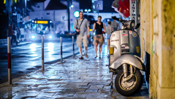
While I don’t know if it’s framing, I want to be weary of when I take photos of either buildings or people. The framing is the trees or any obstruction that would be in the way for the photograph. The frame gives the photo some personality and setting. Like the photo below, the boots makes us think that the place is crowded and covers the mother’s face, making the child the soul subject. It gives a lot more to tell with the foot than not, it also avoids the distraction that the mother poses.
 Sterigos, My Own Little World
Framing can also be why the photo is interesting in the first place. Like the photo below, the color of the bus is cool and vibrant against more neutral backdrop of colors. Despite this, my eyes always drifts back to the man in the framed hole. His shirt is also bright compared to the grays and browns, and the disruption in the dark gray plank is also a nice focal point. In all, the composition is very interesting and the framing of how it’s taken (the bus, the actual frame itself, the bridge at the top) all takes up space and wraps around the man in the center.
 Matt Stuart
3. Perspective and Angles
One of my more favorite street artists, Sally Davies, takes perfect advantage when it comes to angles. The way she took this photo makes it look almost 2d or like a painting. The angle is straight on with the building and the camera isn’t tilted to the left nor the right. Not to mention how interesting the illuminating shop looks like in the pitch darkness. Because it’s so flat and you aren’t mostly comprehending the different angels and shapes, you can really take in each little detail. From the inside of the place to the bike and decorating details on the outside.
 Sally Davies
4. Don’t move — fishing technique
While this technique takes a while to get a shot you really like, it gives the natural flow of daily life. The subject isn’t suspecting anything is happening, or maybe they are. Depending on where you’re fishing. But the look of this technique is satisfying, reminding people of a certain point in time where they might remember a similar scene. There’s no need to rush because to take photos with this concept, you need to wait for the best photo. It’s a lot of trial and error.
 Erik Kim
I do like this technique and try to do it sometimes. I would wait by buildings and wait for somebody to walk by. The only downside is if they see you across the street, they might try to avoid the camera.
5. Capture Gestures
These photos look so fun to capture and can have very interesting results. If you do a capture and somebody on the spot, it might be interesting to see how they panic and get into a pose. Or maybe look at you and the camera directly. Both of these gives off strong emotions, either negative or positive. I would love to have photos like these, either startling people or asking them to post for the camera. I really do like the look of unfiltered emotion or judgement they could or would give off when looking over.

6. Visual Elements – Lines
The dynamic lines in this piece is created by the bars in the subway entrance (or whatever they’re called), making the direction of the photograph attention grabbing. Both the bars right at the camera and the curved bars in the background are both going to the lower right side of the photo, they also catch your attention but don’t block the subject entirely, making you look at the subject (the man) and into the dark shadowy backgrounds. It does distract you a little bit from the man’s face though, but it looks almost intentional.

MY SHOTS
Doesn’t help that the site decreases the quality more… the focus looks even worse
- The decisive moment

I didn’t adapt this very well. I waited until she was mid air to take the photo, but a my problem was it wasn’t interesting with movement and the focus wasn’t good. This is a trend for more of my photos, my focus is usually horrible. What I do like is the contrast of the trampoline rim color to everything else, or the ground vs. the upper part. The green and orange kind of contrast against each other, and the rest is natural coloring. It really makes the colored parts pop.
2. Arm length

I wasn’t very close enough for it to be interesting, but I like the perspective of how close the camera is. I did have to ask for permission, it’s easier to do but also kind of unnatural. I was lucky enough for this shot to be more natural than not, but the cashier lady did notice the big camera pointing at her, LOL.
3. Framing

I like the photo because of the frame of the book return cart. It’s white like many of the pieces in the background, making it blend in pretty well and doesn’t take too much attention away from the main subject/person. It’s also not a very harsh, bright color, which is something I do like. I want to try doing more framing in the future.
4. Visual elements – lines and dynamics

The lines of the corridor/hallway brings the person’s eyes to the two distant humanoid figures. I like the light at the end of the hallway and the contrast of each wall. It makes the photo look almost split in two with two different colors on each side, and the distant shadows of people a dot in the middle to focus on.
5. Capture eye contact

This photo was a complete accident since I was trying to catch her off guard, but my focus wasn’t ready yet. Despite that, I really do like the image. I caught her off guard and she’s looking at the camera, but still giving a smile that doesn’t feel forced. More like a “oh hi!” smile, and that’s something I really do like in these photos. This would be hard to recreate with strangers, so I’m glad I could get this shot (and that Ms. Allison knows me….).
6. Harmony

The many shapes and the glare of hte lights make everything grayed out, except the green of the desk. You can see people wandering and looking around, but that’s not the most interesting part of the photos. The shine of the books, the amount of books even, it makes it more interesting by shapes and colors. Not to mention the strong green of the desk contrasting with the more grayish background, it might have a strong color but the back has more of an interesting shape.
Because this was a test shoot, I didn’t know what I really wanted. After this photo shoot, I realized the importance of color. If everything in the photo is a washed out gray, it blends together. But something I also saw was how shape and direction gives the photo a story and a place you can identify.


 .
.