Intent and Message of the Artist
Olivia Bee’s photographs explore the interplay between human identity and natural elements and nature in general. She uses visual layering and color to express themes of connection vulnerability and emotional depth. Her work often merges portraits with organic stuff like flowers blurring the line between the subject and their surroundings. She almost never shoots in studios (judging from the photos that I’ve seen) instead choosing outdoor settings where nature is the background. Subjects might be holding flowers standing near plants or even with animals nearby. Rather than capturing straightforward portraits Olivia Bee uses different exposure choices and color palettes to convey inner emotions such as serenity, longing… (I really really love Olivia Bee’s work.) Her ability to weave flowers into portraiture to tell emotional stories just seems so cool to me. Her use of floral symbolism directly inspired my Set 2 intent to use flowers and color as a visual language for identity.
Analysis of Artist
Across Olivia Bee’s images two defining patterns stand out. First she uses double exposure techniques to blend human subjects with natural elements especially flowers, plants and animals. Second she controls opacity carefully to balance how clear the subject and floral layers are. She favors soft to saturated color palettes like purples pinks and earthy tones that create a dreamlike atmosphere. Her subjects are often framed in close up with facial features partially obscured by layered natural imagery. This draws focus to emotion over precise detail. The background is typically minimal or merged with the subject eliminating distractions. Her camera work prioritizes visual layering and color harmony over sharp hyper detailed compositions. This results in intimate emotionally resonant portraits. She also uses natural outdoor lighting almost exclusively which adds to the authentic feel of her work. This focus on opacity floral layering and outdoor nature settings is exactly what drew me to her work. I adapted her opacity techniques in my own layered photo using varying transparency levels to make each friend’s portrait and their symbolic flower stand out while still blending into the group composition.
Justification for Choosing this Artist
I chose Olivia Bee because I really admire her artistic vision. Her use of exposure techniques, floral usage, opacity control and outdoor nature settings gave me the idea of what to do for Set 2. In my image I use layered portraits of friends with symbolic flowers. I adjusted opacity to balance the visibility of each figure. This helps me explore group identity and the unique personalities that make up a social circle. Just as Olivia Bee merges subjects with nature to express inner feelings I use flowers to show my friends’ unique traits. Her work inspires me to experiment with visual layering color symbolism opacity and the blurring of boundaries between individual subjects and their collective group. She demonstrates how natural motifs can be used to communicate emotion without relying on explicit storytelling. This directly relates to my focus on personal identity and the link between individual traits and group dynamics. Unlike Olivia Bee who often focuses on single subjects and their connection to nature I expanded her floral layering concept to a group of friends. I wanted to show how unique personality traits represented by different flowers come together to form a cohesive vibrant group. This is something I wanted to add to her core style to reflect my interest in social identity. I know many artists like to add flowers to their work but Olivia Bee’s approach felt the most personal and meaningful to my project.
Favorite Photo (Olivia Bee)
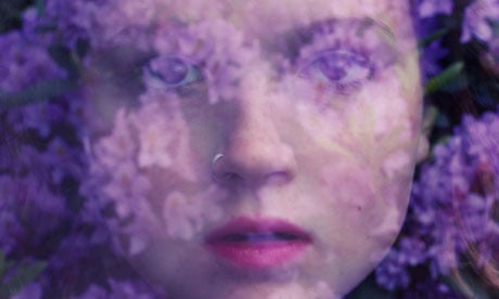
Sweeney, Kathy. “Olivia Bee: ‘People Don’t Take Me Seriously – Until They See Me Work.’” The Guardian, 1 July 2020, www.theguardian.com/artanddesign/2013/feb/24/olivia-bee-interview-photographer-hermes.
This photograph is a close up double exposure portrait of a person’s face merged with purple and pink floral blooms. It was taken outdoors in a natural setting with no studio elements. The subject is centered in the frame with their facial features softly obscured by the layered flowers. This creates a seamless blend between the human form and nature. The background is indistinct consisting only of blurred floral tones. This keeps the viewer’s focus on the merged subject and the interplay of color and texture. The color palette is the most striking element. Rich purples and soft pinks dominate creating a calm introspective mood. The double exposure effect tuned with opacity is subtle yet intentional. The flowers do not overwhelm the subject but instead enhance their features adding depth and a sense of vulnerability. The lighting is soft and diffused coming from natural sunlight rather than artificial sources. This contributes to the dreamlike gentle atmosphere of the image. The subject’s expression is calm and introspective with their eyes partially hidden by the floral layers. This invites the viewer to interpret their emotion rather than spelling it out. The photographer’s close up framing creates an intimate connection. It makes the viewer feel as if they are sharing a quiet personal moment with the subject. This image succeeds because it merges technical skill double exposure and opacity control with emotional depth. It uses nature to make the subject’s inner world more clear and it is exactly this blend of technique and feeling that is hard to describe but like it makes you very comfortable.
Least Favorite Photo (Olivia Bee)
Liberto, Gina. “Olivia Bee’s Personal Images of Her Teenage Years.” The New York Times, 18 Aug. 2015, www.nytimes.com/2014/06/19/t-magazine/olivia-bee-kids-in-love-agnes-b.html.
This photograph is a close up shot of two people one with a cigarette the other with a candy or something. It is set against a bright outdoor background likely during golden hour. I dislike this photo for the visual reasons. First the lighting is harsh and overly natural lacking the soft diffused quality that i prefer more. This makes the subjects look flat and washed out. Second there is no clear focus in the image. When I look at it I do not know where to direct my attention. I could look at the cigarette the candy either of the two people or the busy background. This lack of a clear focal point makes the photograph feel messy and not engaging. The colors are washed out and lack the harmony that is usually shown in her works. This makes the image feel flat and unpolished. The subjects’ poses and interactions feel staged and unauthentic with no clear emotional narrative connecting them. (Like if staged maybe a better pose or else just capture the raw actions of the subjects) The focus on the cigarette and candy feels kind of weird drawing attention away from the subjects’ expressions and creating a shallow composition. While the image attempts to capture a casual candid moment it lacks the artistic depth and opacity control that make Olivia Bee’s strongest work so compelling to me.
What I Want to Use in My Own Photography
From my favorite Olivia Bee photo I want to adopt her double exposure technique use of floral symbolism and precise opacity control. These elements will help me blend human subjects with natural elements in my future work. I especially admire how she uses color palettes like purples and pinks to create mood and emotional depth. I plan to incorporate bold symbolic flower colors to highlight the connection between my subjects and their unique personality traits just as she uses flowers to reflect inner emotion. I also aim to expand on Olivia Bee’s single subject focus by layering multiple portraits of people to show how group identity is built from unique individual traits. This is an important addition to her style that reflects my own interests. To avoid the pitfalls of my least favorite Olivia Bee photo I will keep my compositions focused and uncluttered. I will ensure natural elements enhance rather than distract from the subjects. I will prioritize soft diffused lighting and authentic relaxed poses to maintain emotional resonance in my work. Most importantly I want to use my photography to show that the world is not made of people with the same personality. It is made of different people with different feelings and strengths that give life meaning. By combining Olivia Bee’s layered visual style opacity control and floral symbolism with my focus on group identity I want to create photographs that are visually creative and emotionally authentic. These photos will tell the story of how unique personalities come together to form a meaningful group.
My Created Photograph (Set 2)
My layered picture uses bright colorful flowers standing out unlike the rest of the black and white background. This choice helps me dig into the overlapping personalities of the people in the frame. Small details like braids and blooms add even more depth to their stories. Right in the middle vibrant red roses sit atop Ceci’s head. Their bold flower isn’t just eye catching it represents her warm confident self the kind of energy that draws people in. Wrapping around her in a soft circle each surrounding figure and their flower tells a distinct piece of this group’s shared layered identity. Amber top right holds a sunny yellow sunflower over one eye. Its bright color mirrors her quiet optimism the kind that lightens moments without needing to be loud. Elva left has pale cream flowers woven into her braid and held near her face. The soft gentle hue matches the calm thoughtful side of her personality that isn’t always shown the part that listens closely and moves with quiet care. At the bottom right Emily presses a rich orange bloom near her mouth. Its vivid warm tone speaks to her creative spark the part that turns small moments into something imaginative. I layered these images together and arranged them in a circle because people and the groups we’re part of aren’t just one trait. We’re a mix of confidence optimism calm and creativity all wrapping around each other to make up who we are. The black and white background strips away extra noise so the flowers’ colors and the details like Danielle’s braided blooms become the language that tells their full multi sided story. Even the braid itself matters. Weaving flowers into it isn’t just decoration it shows how these personality traits are tied to who they are not just added on. I used opacity adjustments inspired by Olivia Bee’s double exposure work to balance the visibility of each friend’s portrait. This ensures their individual features and symbolic flowers stand out while blending into the group composition. Set 2 uses flowers with their bright colors popped against black and white to show different parts of a person’s identity. And how the society is made of different people of different personalities and that’s what makes the society interesting and fun.