SET 2 Self Critique

Composition & Technique

1. Focal Point & Eye Movement
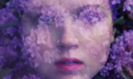
Viewers first notice Ceci’s smile and bright red roses against the rest of the monochrome body and background. My goal was to highlight all the flowers. Danielle’s small roses, Amber’s sunflower, Elva’s cream colored flower, Emily’s orange dahlia and Ceci’s red roses each represent a unique personality in a societal role. Ceci’s central spot pulls too much focus though making other flowers a bit hard to see. The original photo felt a bit boring and had no depth so I boosted each flower’s color saturation for clearer definition and layerd differnt. Faces are not the focus here. I wanted the flowers to be the main story for my societal structure theme.

2. Distracting Elements
Overlapping figures make the photo feel messy. Danielle is top left, Amber is top right, Elva is bottom left, Emily is bottom right and Ceci is center. All overlap in places. Faint grid lines add extra clutter. However without them, the photo seems like it is missing something. These issues made me rely on color editing to make the floral symbols my project’s core stand out.

3. Exposure
The monochrome figures are evenly exposed with no harsh shadows or overexposure. I edited the flowers to be brighter and more saturated so they pop against the gray scale even with overlapping figures. The plain light gray background has no exposure issues keeping focus on the subjects and flowers. This balance helps minimize attention to faces and maximize the floral symbols’ impact.

4. Background
The simple gray background keeps focus on the figures and flowers. It is a neutral canvas that makes the colored blooms stand out especially Elva’s soft cream flower and Danielle’s small roses. The downside is no specific depth, and makes the photo a bit unbalanced and messy. Going to the future I want to try to make everyone in one shot when I take the photo so it wouldnt be hard with the background and making them look connected but not connected at the same time.

5. Composition & Balance
Ceci’s central position creates symmetrical balance but makes the photo feel still and without life. The grid like arrangement of other figures adds structure but amplifies the messy overlap. Using the rule of thirds would have made the composition more dynamic and reduced overlap. Vertical figure lines contrast with round flower shapes adding interest but making the frame feel unbalanced. The bottom half is heavier with Elva and Emily. Danielle’s small roses and Amber’s sunflower are most overshadowed by this layout.

6. Color Accuracy
I chose monochrome figures to shift focus away from faces and onto the flowers. I enhanced each flower’s color beyond its natural hue to make them distinct. Deeper pink for Danielle’s small roses, soft warm glow for Elva’s cream flower and bold hues for the others. This makes the flowers have its natural color but it also helps each flower stand for a unique showing the intention of societal role. It was my main way to fix the messy composition and make my message clear.

Storytelling Quality

• My vision is clear. Flowers are metaphors for how individuals shape society. Each person’s bloom has a unique meaning. Danielle’s small roses equal quiet connection, Amber’s sunflower equals positivity, Elva’s cream flower equals calm stability, Emily’s dahlia equals diversity and Ceci’s red roses equal strong confidence and how that ties many people together. Monochrome figures show how identities can fade into the background while colored flowers highlight unique contributions.

• Subtle expressions add depth to the societal metaphor. Ceci’s smile, Amber’s neutral gaze, Elva’s serious look, Emily’s calm expression and Danielle’s hidden face all matter. Even with faces as secondary flowers and expressions communicate the complexity of community roles. Overlapping figures mirror real world interconnectedness. No one exists in isolation.

• The messy overlap reflects the chaos of society while distinct flower colors show how individual contributions still shine through. Danielle’s small roses and Elva’s cream flower are perfect examples. They are easy to miss but represent essential understated roles in a healthy community.

Emotional Impact

• The contrast between muted figures and bright flowers show hope and individuality. Viewers think about how unique traits can shape the world around them. Elva’s cream flower and Danielle’s small roses add a gentle balance to the bolder blooms of Ceci and Amber.

• Ceci’s central smile creates warmth and connection making the photo relatable despite its stylized look. It gives viewers a human hook to engage with the societal theme even if it pulls focus from the flowers. Danielle’s small roses and Elva’s cream flower add quiet warmth that makes the photo feel more true to real society.

• The messy composition makes viewers pause and look closer encouraging them to notice the flowers’ symbolism. This curiosity leads to a deeper understanding of how individual roles matter in a complex society. Danielle’s small roses and Elva’s cream flower are often the last blooms noticed making their symbolic meaning feel more special.

SET 2 Planning

Intent and Message of the Artist

Olivia Bee’s photographs explore the interplay between human identity and natural elements and nature in general. She uses visual layering and color to express themes of connection vulnerability and emotional depth. Her work often merges portraits with organic stuff like flowers blurring the line between the subject and their surroundings. She almost never shoots in studios (judging from the photos that I’ve seen) instead choosing outdoor settings where nature is the background. Subjects might be holding flowers standing near plants or even with animals nearby. Rather than capturing straightforward portraits Olivia Bee uses different exposure choices and color palettes to convey inner emotions such as serenity, longing… (I really really love Olivia Bee’s work.) Her ability to weave flowers into portraiture to tell emotional stories just seems so cool to me. Her use of floral symbolism directly inspired my Set 2 intent to use flowers and color as a visual language for identity.

Analysis of Artist

Across Olivia Bee’s images two defining patterns stand out. First she uses double exposure techniques to blend human subjects with natural elements especially flowers, plants and animals. Second she controls opacity carefully to balance how clear the subject and floral layers are. She favors soft to saturated color palettes like purples pinks and earthy tones that create a dreamlike atmosphere. Her subjects are often framed in close up with facial features partially obscured by layered natural imagery. This draws focus to emotion over precise detail. The background is typically minimal or merged with the subject eliminating distractions. Her camera work prioritizes visual layering and color harmony over sharp hyper detailed compositions. This results in intimate emotionally resonant portraits. She also uses natural outdoor lighting almost exclusively which adds to the authentic feel of her work. This focus on opacity floral layering and outdoor nature settings is exactly what drew me to her work. I adapted her opacity techniques in my own layered photo using varying transparency levels to make each friend’s portrait and their symbolic flower stand out while still blending into the group composition.

Justification for Choosing this Artist

I chose Olivia Bee because I really admire her artistic vision. Her use of exposure techniques, floral usage, opacity control and outdoor nature settings gave me the idea of what to do for Set 2. In my image I use layered portraits of friends with symbolic flowers. I adjusted opacity to balance the visibility of each figure. This helps me explore group identity and the unique personalities that make up a social circle. Just as Olivia Bee merges subjects with nature to express inner feelings I use flowers to show my friends’ unique traits. Her work inspires me to experiment with visual layering color symbolism opacity and the blurring of boundaries between individual subjects and their collective group. She demonstrates how natural motifs can be used to communicate emotion without relying on explicit storytelling. This directly relates to my focus on personal identity and the link between individual traits and group dynamics. Unlike Olivia Bee who often focuses on single subjects and their connection to nature I expanded her floral layering concept to a group of friends. I wanted to show how unique personality traits represented by different flowers come together to form a cohesive vibrant group. This is something I wanted to add to her core style to reflect my interest in social identity. I know many artists like to add flowers to their work but Olivia Bee’s approach felt the most personal and meaningful to my project.

Favorite Photo (Olivia Bee)

olivia bee purple haze

Sweeney, Kathy. “Olivia Bee: ‘People Don’t Take Me Seriously – Until They See Me Work.’” The Guardian, 1 July 2020, www.theguardian.com/artanddesign/2013/feb/24/olivia-bee-interview-photographer-hermes.


This photograph is a close up double exposure portrait of a person’s face merged with purple and pink floral blooms. It was taken outdoors in a natural setting with no studio elements. The subject is centered in the frame with their facial features softly obscured by the layered flowers. This creates a seamless blend between the human form and nature. The background is indistinct consisting only of blurred floral tones. This keeps the viewer’s focus on the merged subject and the interplay of color and texture. The color palette is the most striking element. Rich purples and soft pinks dominate creating a calm introspective mood. The double exposure effect tuned with opacity is subtle yet intentional. The flowers do not overwhelm the subject but instead enhance their features adding depth and a sense of vulnerability. The lighting is soft and diffused coming from natural sunlight rather than artificial sources. This contributes to the dreamlike gentle atmosphere of the image. The subject’s expression is calm and introspective with their eyes partially hidden by the floral layers. This invites the viewer to interpret their emotion rather than spelling it out. The photographer’s close up framing creates an intimate connection. It makes the viewer feel as if they are sharing a quiet personal moment with the subject. This image succeeds because it merges technical skill double exposure and opacity control with emotional depth. It uses nature to make the subject’s inner world more clear and it is exactly this blend of technique and feeling that is hard to describe but like it makes you very comfortable.

Least Favorite Photo (Olivia Bee)

Olivia Bee's Personal Images of Her Teenage Years - The New York Times

Liberto, Gina. “Olivia Bee’s Personal Images of Her Teenage Years.” The New York Times, 18 Aug. 2015, www.nytimes.com/2014/06/19/t-magazine/olivia-bee-kids-in-love-agnes-b.html.

This photograph is a close up shot of two people one with a cigarette the other with a candy or something. It is set against a bright outdoor background likely during golden hour.  I dislike this photo for the visual reasons. First the lighting is harsh and overly natural lacking the soft diffused quality that i prefer more. This makes the subjects look flat and washed out. Second there is no clear focus in the image. When I look at it I do not know where to direct my attention. I could look at the cigarette the candy either of the two people or the busy background. This lack of a clear focal point makes the photograph feel messy and not engaging. The colors are washed out and lack the harmony that is usually shown in her works. This makes the image feel flat and unpolished. The subjects’ poses and interactions feel staged and unauthentic with no clear emotional narrative connecting them. (Like if staged maybe a better pose or else just capture the raw actions of the subjects) The focus on the cigarette and candy feels kind of weird drawing attention away from the subjects’ expressions and creating a shallow composition. While the image attempts to capture a casual candid moment it lacks the artistic depth  and opacity control that make Olivia Bee’s strongest work so compelling to me.

What I Want to Use in My Own Photography

From my favorite Olivia Bee photo I want to adopt her double exposure technique use of floral symbolism and precise opacity control. These elements will help me blend human subjects with natural elements in my future work. I especially admire how she uses color palettes like purples and pinks to create mood and emotional depth. I plan to incorporate bold symbolic flower colors to highlight the connection between my subjects and their unique personality traits just as she uses flowers to reflect inner emotion. I also aim to expand on Olivia Bee’s single subject focus by layering multiple portraits of people to show how group identity is built from unique individual traits. This is an important addition to her style that reflects my own interests. To avoid the pitfalls of my least favorite Olivia Bee photo I will keep my compositions focused and uncluttered. I will ensure natural elements enhance rather than distract from the subjects. I will prioritize soft diffused lighting and authentic relaxed poses to maintain emotional resonance in my work. Most importantly I want to use my photography to show that the world is not made of people with the same personality. It is made of different people with different feelings and strengths that give life meaning. By combining Olivia Bee’s layered visual style opacity control and floral symbolism with my focus on group identity I want to create photographs that are visually creative and emotionally authentic. These photos will tell the story of how unique personalities come together to form a meaningful group.

My Created Photograph (Set 2)

My layered picture uses bright colorful flowers standing out unlike the rest of the black and white background. This choice helps me dig into the overlapping personalities of the people in the frame. Small details like braids and blooms add even more depth to their stories. Right in the middle vibrant red roses sit atop Ceci’s head. Their bold flower isn’t just eye catching it represents her warm confident self the kind of energy that draws people in. Wrapping around her in a soft circle each surrounding figure and their flower tells a distinct piece of this group’s shared layered identity. Amber top right holds a sunny yellow sunflower over one eye. Its bright color mirrors her quiet optimism the kind that lightens moments without needing to be loud. Elva left has pale cream flowers woven into her braid and held near her face. The soft gentle hue matches the calm thoughtful side of her personality that isn’t always shown the part that listens closely and moves with quiet care. At the bottom right Emily presses a rich orange bloom near her mouth. Its vivid warm tone speaks to her creative spark the part that turns small moments into something imaginative. I layered these images together and arranged them in a circle because people and the groups we’re part of aren’t just one trait. We’re a mix of confidence optimism calm and creativity all wrapping around each other to make up who we are. The black and white background strips away extra noise so the flowers’ colors and the details like Danielle’s braided blooms become the language that tells their full multi sided story. Even the braid itself matters. Weaving flowers into it isn’t just decoration it shows how these personality traits are tied to who they are not just added on. I used opacity adjustments inspired by Olivia Bee’s double exposure work to balance the visibility of each friend’s portrait. This ensures their individual features and symbolic flowers stand out while blending into the group composition. Set 2 uses flowers with their bright colors popped against black and white to show different parts of a person’s identity. And how the society is made of different people of different personalities and that’s what makes the society interesting and fun.

SET 1 SELF CRITIQUE

Composition & Technique

1. Focal Point & Eye Movement

  •  The viewer’s eyes are immediately drawn to the subject’s face, lit by the red stage light, and the bright blue lens flare cutting across the frame.
  • My intended focal point is the subject’s smile and the mix of red and blue light on his suit, but the lens flare competes with this focus.

2. Distracting Elements

  • A chair with a gold ribbon in the bottom right corner partially covers the subject’s torso, creating a small visual interruption.
  • The background has cluttered tables with glassware and floral arrangements that are slightly in focus, pulling attention away from the subject.
  • The blue lens flare covers a small part of the subject’s hair and shoulder, obscuring those details.

3. Exposure

  • The red stage light causes slight overexposure on the subject’s right cheek (viewer’s left), and fine skin tone details are lost in this area.
  • The darker parts of the background (like the tables on the far left) are underexposed, but this choice keeps the subject as the main light focus.
  • The stage light bulbs in the upper part of the frame are blown out, with no visible detail in the light sources this is a natural outcome of shooting in low light with direct bright lights.

4. Background

  • The background shows a formal event space with decorated tables and stage lighting, which provides context for the setting (a banquet or gala) but is not blurred enough to stay secondary to the subject.
  • The mix of bright stage lights (yellow, red, blue) in the background adds to the event atmosphere but creates extra visual noise around the subject.

5. Composition & Balance

  • The subject is centered in the frame, which creates symmetrical balance but lacks visual dynamics. Placing him slightly off-center (following the rule of thirds) would have made the composition more engaging.
  • The horizontal lines of the tables and stage lights in the background contrast with the vertical shape of the subject, which adds some visual interest but also makes the frame feel a little unbalanced.

6. Color Accuracy

  • The red light from the stage creates a strong color cast on the subject’s skin and suit, which is not natural skin tone but is an intentional choice to highlight the color’s symbolic meaning.
  • The blue lens flare and background lights add cool tones that clash with the warm red, which supports the statement of intent about color contrast and societal perception.

Storytelling Quality

• The vision of exploring color as a visual language for identity and societal perception is clear in the photo. The red light (symbolizing joy, celebration, and boldness) on the subject’s formal black suit (linked to formality and social conformity) directly shows the clash between personal expression and societal expectations.

• The casual smile of the subject, paired with the formal suit and dramatic colored light, tells a story of staying true to personal identity in a socially structured environment (a formal event).

• The cluttered, real-world event background grounds the story in everyday life, which supports the intent to show how color shapes identity in ordinary spaces.

Emotional Impact

• Feedback from peers shows the image evokes feelings of warmth and relatability the person’s genuine smile makes viewers connect with the moment of personal joy in a formal setting.

• The contrast of red and blue light makes viewers notice the tension between societal norms (black suit, formal event) and personal expression (smile, red light’s warmth), which sparks curiosity about the person’s identity.

• The image aligns with the statement of intent because it uses color to communicate emotion (joy from red) and societal perception (the black suit’s link to formality, blue’s hint of distance from social expectations). Viewers easily recognize how color can change the way we see a person’s identity in a social context.

PLANNING SET 1 IDENTITY

The photographer I have chose: Brandon Woelfel

Intent and Message of the Photographer

Brandon Woelfel’s photographs explore how light and color can be used to express emotion, identity, and atmosphere. His work often focuses on people in everyday or social environments, but he transforms these moments through the use of strong artificial lighting. Rather than documenting reality exactly as it appears, Woelfel uses color to suggest feelings such as confidence, calmness, joy, or emotional tension. His photographs reflect modern youth culture and how identity can be communicated visually through mood and lighting rather than words.

Analysis of Artist

Across Brandon Woelfel’s images, there is a clear pattern in his use of bold, saturated colors such as red, blue, and pink. He frequently uses artificial light sources like neon lights, LEDs, or stage lighting to shape the mood of the photograph. His subjects are usually placed clearly within the frame and are well lit, while the background is often darker or softly blurred. Light flares and reflections appear often in his work, adding a dreamlike or cinematic effect. His camera technique prioritizes lighting and colour contrast over detailed backgrounds.

Justification for Choosing this Artist

I chose Brandon Woelfel because his use of dramatic colored lighting closely connects to my photograph. In my image, red and blue stage lights play a major role in shaping how the subject is seen and felt. Like Woelfel’s work, the lighting in my photo creates emotion and meaning rather than simply illuminating the scene. His photographs inspire me to experiment with color contrast, artificial lighting, and atmosphere. He shows how color can influence how a person is perceived, which directly relates to my focus on identity and societal expectations.

Favorite Photo

This may contain: a woman holding an umbrella with lights on it and the words photo above her head

“Pinterest.” Pinterest, au.pinterest.com/pin/AdY-UPgV6ZXnt7gMTpOQU28qWRcdxBl56IM4drmIpWELKr0PXppv9XI.

This photograph shows a young girl standing outside at night holding a neon umbrella that glows in bright pink and purple colours. The subject is placed near the centre of the frame, which immediately makes her the main focus. The background is dark and blurred, suggesting an urban environment, possibly a street or city area at night. The modern clothing and artificial lighting show that the photograph is set in a contemporary time period.

The lighting is the most important element in this image. The neon umbrella creates a soft glow that lights up the subject’s face while the background stays mostly in shadow. This strong contrast between light and dark draws the viewer’s eye directly to the subject. The colours are vibrant but not overwhelming, which helps create a dreamy and calm mood. The light feels controlled and intentional, rather than harsh or random.

The subject’s pose and expression feel relaxed and natural. She is not doing anything dramatic and appears comfortable, which makes the image feel genuine and emotionally engaging. The photographer’s point of view is at eye level, which helps the viewer feel connected to the subject, as if they are sharing the same space. This image is effective because it combines bright colour with a sense of realism and emotion.

Least Favorite Photo:

Fairy Lights - CVHS Photography

McElfish. “Fairy Lights.” CVHS Photography, 30 Nov. 2021, cvhsphotography.com/fairy-lights.

(Some sources say this is Brandon Woelfel’s photos others say the artist is unknown I am not exactly sure but hopefully it is his work)

This photograph features a subject holding or surrounded by fairy lights inside a jar. Like many of Woelfel’s portraits, the focus is on a single person, but in this image the lights become the most noticeable element rather than the subject’s face. The background is again blurred, but the image feels more cluttered due to the brightness of the lights.

The lighting in this photograph is very strong and heavily edited. The fairy lights are extremely bright and the colors are highly saturated, which causes some areas to lose detail. Because of this, the image feels less natural compared to the favorite photograph. The glow effect is interesting at first, but it distracts from the subject instead of enhancing them.

The pose feels more staged and less spontaneous. The subject appears to be posing specifically to show the effect of the lights rather than expressing a natural emotion. This makes the photograph feel more like an experiment with visual effects instead of a captured moment. While the technique is creative, it feels less emotionally engaging.

What I Want to Use in My Own Photography

From my favorite photograph, I want to use bright colors and creative lighting to create a strong visual impact. I especially like how colored light can be used to highlight the subject while still keeping the image soft and balanced.

However, I also want my photographs to feel natural and genuine. I will focus on relaxed poses, real expressions, and minimal editing so the subject remains the main focus. By combining bright color with a natural feeling, I want to create photographs that are visually interesting but still emotionally authentic.

Blog 8 SET 2! Identity Project

This layered photograph from Set 2 uses bright saturated flowers against a monochrome background to explore how individual personality traits shape the larger structure of society. My core vision is simple. Every person contributes a unique role to their community and these roles overlap intersect and sometimes get overshadowed just like the layered figures and flowers in this image.

At the center sits Ceci with bold red roses. Their vivid color symbolizes her strong confidence a unifying force in any group. Surrounding her in a circular grid are four other figures each with a flower tied to their distinct societal role. Amber in the top right holds a sunny yellow sunflower for quiet optimism the kind of positivity that lifts up groups without drawing attention. Elva in the bottom left has a soft cream flower for calm stability an essential understated role that keeps communities balanced. Emily in the bottom right presses a rich orange dahlia near her mouth its warm tone representing her creative diversity the spark that brings new ideas to society. Danielle in the top left has small delicate roses that stand for quiet connection the subtle bonds that hold communities together behind the scenes.

The monochrome color of the body and background is one of my most important choices. It strips away the distraction of facial features forcing viewers to focus on the flowers as the primary language of the photo. I boosted each flower’s saturation a bit more than natural settings to make them stand out against the gray scale. This editing made the photo less messy and ensure each flower’s symbolic role was clear. My project is ultimately about showing that society thrives on its diversity of roles. Even the ones that are easy to miss are essential to the whole.


Blog 7 SET 1! Identity Project

This photograph explores how color acts as a visual language for identity, emotion, and societal perception. Here, the warm red stage light washing over the subject’s face and suit carries dual meaning. Culturally, red often symbolizes joy, celebration, or pride, echoing traditions that use the hue to mark lively gatherings, while socially, it’s tied to perceptions of boldness or vibrancy, traits the person (my brother’s) smile. Contrasting this, the cool blue light cutting across the background signals calm or distance, clashing with the red to mirror how societal expectations (such as associating formal black suits with “seriousness” or “conformity”) can collide with personal expression.
His black suit, socially linked to power, formality, or “fitting in” at formal events, is softened by the red glow. This shows how color can both align with social norms and disrupt them to reveal individuality. The hazy, unpolished backdrop, everyday event decor, mismatched lights, grounds the moment in real life, emphasizing that color’s meaning isn’t just staged: it’s woven into the unscripted spaces where we move through society.
This image hopefully can highlights how red (here, the light) expresses personal joy and cultural celebration, while carrying societal stereotypes of “loudness.” Black (the suit) reflects social pressure to “present seriously” at formal events, yet is redefined by the subject’s relaxed smile. Blue (the background light) adds a layer of societal distance, contrasting the warmth of the moment to show how external perceptions (tied to color) can misalign with internal emotion.
My set 1 work aims to unpack how color both chosen and imposed shapes how we see ourselves, how others judge us, and how cultural and personal identity are communicated without words in the spaces we occupy daily.
Contact Sheet

Blog 5 Identity Project

    1. Young girl in a red hood (top left):This photo features a girl with striking green eyes, wrapped in a deep red hooded garment against a muted green background. Her intense, direct gaze conveys quiet resolve, while the rich red fabric anchors the image echoing Steve McCurry’s use of bold color to highlight personal identity and cultural clothing.
    2. Women in a green-walled room (top right):Set in a space with faded turquoise walls, this scene shows women engaged in daily life: one sews at a machine, others stand nearby, with a figure visible through a distant doorway. The soft, worn colors and calm interactions capture the quiet rhythm of community and routine.
    3. Portrait with sunbeams (left middle):A moody, artistic portrait where dramatic light beams fan across the subject’s face, casting sharp shadows. The high-contrast lighting adds depth and mystery, framing the image as a stylized exploration of identity (tied to creative portrait photography ideas).
    4. Flower seller in a boat (right middle):A vendor tends to vibrant, multicolored blooms piled high in a small boat, floating on dark green water. The bright flowers pop against the muted surroundings, blending everyday work with natural beauty.
    5. Man on blue steps (bottom right, upper):An older man in traditional white clothing and a colorful turban sits relaxed on bright blue stairs, with a bare foot visible nearby. The bold blue background emphasizes his cultural dress, creating a vivid, peaceful snapshot of daily life.
    6. Elderly man with a long beard (bottom left):This close-up portrait shows an older man with a thick, white beard, holding a thin stick near his mouth. His weathered features and intense gaze tell a story of lived experience, leaning into portrait photography’s focus on capturing personal history.
    7. Fishermen in choppy waters (bottom right):Several men fish in rough, blue waves, some balancing on poles, others wading. The dynamic scene (wild water, active figures) highlights the physicality and resilience of their daily work, set against a dramatic, cloudy sky.

Blog 4 Identity Project

My project is inspired by photographers and photography styles that use color in a meaningful way to communicate emotion, identity, and culture. One major inspiration is Steve McCurry, who is known for using strong, rich colors to tell human stories. His photographs often use color to highlight emotion and cultural identity, showing how color can make a subject feel powerful or vulnerable.

Discovering the World Through the Lens of Steve McCurry - Masters Of  Photography

Team, MoP Creative. “Discovering the World Through the Lens of Steve McCurry.” Masters of Photography, 14 Aug. 2024, mastersof.photography/photography-blog/discovering-the-world-through-the-lens-of-steve-mccurry.

This photo reflects my idea because the strong red and yellow colors show cultural identity and emotion. The red clothing stands out and can represent strength, tradition, and pride. The warm colors help show the subject’s life experience and background without using words. The deep lines on the face combined with the bright colors show wisdom and resilience. This connects to my project because it proves that color can tell a story about a person’s identity and culture. (through clothing)

Another inspiration is William Eggleston, a photographer famous for using everyday scenes with bold, unusual color choices. His work shows that color alone can change how we view ordinary moments, making them feel important or symbolic. This inspires me to use color intentionally, even in simple settings, to suggest deeper meaning.

William Eggleston: The Democratic Forest | PORT Magazine

Team, MoP Creative. “Discovering the World Through the Lens of Steve McCurry.” Masters of Photography, 14 Aug. 2024, mastersof.photography/photography-blog/discovering-the-world-through-the-lens-of-steve-mccurry.

This photo reflects my idea by showing how color represents society and modern culture. The bright red and yellow colors of the McDonald’s sign grab attention right away. These colors are used by big companies to influence people and make places feel familiar and fast-paced. The bold colors stand out more than the people, showing how brands and society can sometimes be more noticeable than individuals. This supports my idea that color shapes how we see places and how society affects identity. (through setting)

I am also inspired by portrait photography as a genre, especially portraits that focus on clothing, backgrounds, or lighting to emphasize certain colors. This genre helps me explore how color can represent personality, mood, and social identity. Looking at these photographers and styles has helped me understand that color is not just decorative but a tool to communicate ideas, which has directly influenced how I plan to compose and edit my photographs.

Blog 3 Identity Project

The societal and cultural issue I want to explore through my photographs is how color represents identity, emotion, and how people are viewed in society. Color is more than just something we see; it carries meaning, stereotypes, and feelings that can influence the way people are understood and treated. Different colors are often connected to certain emotions, moods, or social ideas, and these associations shape how individuals express themselves and how others judge them.

For example, bright colors like red, yellow, or orange are often seen as bold, confident, or loud, while darker colors like black, gray, or navy can be associated with seriousness, sadness, or power. In society, people are sometimes expected to dress or present themselves using certain colors to “fit in,” and when they don’t, they may be judged or misunderstood. Through my photographs, I want to show how color can both express individuality and reflect social pressure.

I also want to explore how color can represent cultural identity. Many cultures use specific colors in clothing, celebrations, and traditions to symbolize values such as pride, mourning, happiness, or strength. By focusing on color, my photographs can show how culture and identity are visually communicated without words. Overall, my goal is to use color as a visual language to explore how society connects meaning to appearance and how that affects personal and cultural identity.

Gramin Arogya Seva sanstha. “Gramin Arogya Sewa Sanstha – Buy Organic Products Online India.” Gramin Arogya Seva Sanstha – Gramin Arogya Seva Sanstha, 15 Nov. 2023, graminarogya.com/?i=75780476011450.

Meaning Colors To Emotions Chart A Little SPOT And Color Psychology Poster  – Diane Alber

Blog 8 Street Photography

Black-and-white smoking portrait: A moody, shadowed close-up of a man smoking while playing cards.

It’s a quiet but interesting moment. The shadows add a little mystery, the part of life while smoking and playing cards make it very natural.

A colorful, emotional shot of a young boy crying with his mother? in a public square.

It shows the different emotions going around the hutong. The mom I would assume was trying to cheer the boy up, he started crying instead. Gives the viewer the idea that you can hear his cries, like pulls the viewer in to wehn this happened.

A black-and-white candid moment of a local strolling near a bridge.

It captures how hutong life isn’t just busy and boisterous, its peaceful too. The man looks relaxed, like he’s taking time to enjoy the view. Black-and-white keeps it simple and focused on his calm mood.

A colorful shot of a driver relaxing under willow trees, his car’s red popping against the green in the background

t’s a happy, calm moment, him even posing for the photo. The bright colors make it feel cheerful, and the willow trees add that classic Beijing vibe. (this might be a stereotype im sorry)

A wide shot of a traditional alley, capturing pedestrians and old architecture

It gives a “big picture” of where hutong life happens. You can see how people’s life were back then (a glimpse) of course different. And see the more “real” side of life with no sky scrappers or fancy buildings just the everyday moments of life.

A color close-up of a man pausing to smoke in a busy hutong. It’s a genuine, “no-filter” moment. He’s not posing, just enjoying a smoke. d. The color makes the hutong’s details (like the old walls behind him) pop. Gives me the idea like from a scene of a movie.

\

A bright, lively shot of a driver navigating a tree-lined street with tourists.

It shows how hutong life connects people from different places. The driver looks proud to share his city, and i like how the colors contradict.

A street food seller engaging with customers, and because I found the lady really pretty, with “地道味” (authentic flavor) signs in the background. I like because it shows the friendliness of huton life, and how the vendors don’t only sell food but connect with people.


Together these photo show the real side of hutong, how there’s joy, but also sadness. How its loud and crazy, but also a side of it is peaceful and quiet. It shows the real and honest side of the hutong.