Scenic construction:
- Before we started building, I had no idea what a scenic construction actually does even though we made lots of research. But there isn’t any examples or any explanations of what they exactly do. (visual explanation including cutting out piece, assembling them and etc.) So for me personally, everything about a scenic construction was very blurry. After this whole process, now I have a very clear idea of what they actually do as a scenic constructor.
- After the whole unit, we experienced lots and lots of techniques as a scenic constructor. We learned how to use different saws, large power tools and painting techniques. We experienced what a designer, constructor and an artist do in a play.
You as an artist and a theatre maker
- I used to think, minor mistakes are pretty important for a scenic constructer because they are making things that will be presented on stage. Now I think minor mistakes are not that important anymore because the audience can’t see every detail. The closest they can get will be around 5meters, and this is still pretty far. So it is really okay to make mistakes such as sprinkling the wrong color, or didn’t drew a perfect line. All of the small mistakes didn’t bother me and didn’t effect the final look of the project, so this is definitely a change of the way we think after this unit.
- I used to think being an artist and a theatre maker does not need to do that much work. But now I think they held an important role in a play. They need to make sure the product they made looks realistic on stage so the overall look would present better on stage.
Theatre and theatre production
- Throughout this unit, I realized that being part of the theatre production really needs collaboration and communication skills. As a designer, builder, and an artist, you need to be able to communicate your ideas with your peers and make the best solution. When you face problems, you and your partners should communicate and figure out a way to solve the problem. You also need to equally divide jobs within a group so that everyone can get involved rather than letting one or two person does all the things.
- I used to think the builders only have to make based on the information they got. Now I think, a production is more than what happens on stage. It can include the builder’s own interpretation of the scene or the play, and then make the product.
- I used to think all the staffs does not work that closely to each other. But after this unit, I think that they are closely related to each other. The director, the actors, scenic designers, light designers, costume designers and etc. All the staffs in a play is closely related to each other, they need strong communication and collaboration in order to present a play.
Lighting Designers:
- job: manipulate stage lights to define the way the audience perceive the state/actors
- job: what gets lit and what doesn’t get lit
- work condition varies: some travel over the world
- skills: ability to work under pressure, communication skills
- collaboration: director, scenic designers, costume designers
Sound Designers:
- job: art and practice of creating sound tracks for a variety of needs
- responsible: create sound effects -> how long and where in the pace the sound came from
- responsible: audience’s audio journey through a production
- skills: artistically creativity, knowledge of film, understanding of theatre, music
Costume Designers
- job: plan and design the layout the structure of the costumes (create costumes)
- job: in charge of the actors’ stage makeup and their hair style
- responsibilities: research, shop, fit
- responsibilities: aware of deadlines, support the vision of the director
- coordinate: match with the style of the play
- skills: artistic/create: understand of dressmaking, sewing skills, express ideas through their product. communication skills, sense of style, passion
Prop Designers: property master/prop master
- 3 kinds of prop: set prop, hand prop, decorative prop
- education: fine art, design, film degree
- skills: imagination, organization, details
- collaboration: director, scenic designers
- one of the hardest jobs in back stage
Final look of the flat: (marble)

Process + Techniques:

1.This was the first layer that we did. We painted the base color gray.

2.After we let the base color dry, we added multiple colors and used the technique called SCUMBLING.
-We used colors like blue-green, light yellow, dirt yellow, and brown red.
-We used big brushes and “scumbled” onto the flat but did not completely mix up all the colors.

Here is a closer look of the SCUMBLING process.

3.Next, we did SPATTERING.
-We mixed paint and water together then “spattered” on to the flat.
-The colors we used were: light gray and dark gray.

4.Then, we did VEINING by using feather and clothes.
-we did the white strips with feather: we dipped the feather in paint, and then we painted on to the flat
-we did the two black strips with clothes: we also dipped the clothes in paint, then we smashed it on to the flat. We had some problems with the black strip on the right, but we quickly solved with a brush to make is look natural.
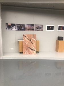
5.Finally, we finished all of the process of making a marble flat. Here is a photo that we took.
What did you do well, what are you proud of?
Our group did well of not afraid of making mistakes. We didn’t design the lines of the marbles, instead, we just randomly paint it with different kinds of techniques that we learned in class. Especially the veining technique with clothes. We weren’t sure how we are supposed to make the lines look like marble, so we just went for it.
We had a lot of fun while adding layers on to the flat. We figure out ways together and corporate well during this project. We enjoyed the time when we worked together as a group and we were very satisfied with the end product.
What would you do to improve the future
I want to improve on keeping everything in balance. For example, by looking at the photo above, we can easily see the black scrips but not the white lines. Although you can see both where you look closer, but the flat is used on stage, we need to be able to let all of the audience see when they are sitting in the back. Additionally, we are so used to complete a work with smaller pieces of canvas or paper, so this is a challenge for me to exaggerate everything on this flat. This is something that I want to work on in the future.

Here is a PDF version: Carina Hong
Here is a video of my drawing process:
Process: (I used Procreate and CANVA )

1)This is my very first draft of the portrait. I didn’t trace it from the picture because I want to create my own style and it would be difficult to set the style if I trace it from the original picture.

2)This is the final outline. I didn’t use black to draw the outline because then it would look to solid and stiff. On the contrary, it would look softer as a whole when I use this red and brown color.

3)Then I added the skin color and the shadow

4)Next, I added the color of the hair. I exaggerated the color of my hair; I made the color browner and lighter. I also added layers and shadows to the hair to make it look 3D.
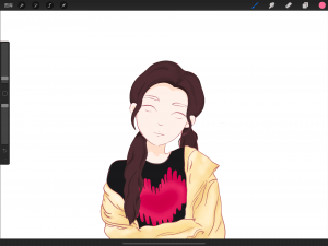
5)I added the color of my cloth, at the same time added the shadow and highlight of my jacket to make it look 3D.

6)I added the details of the face including: eyebrows, eyeballs, eyelashes, blush, and lip.

7)Now I finished the background and finally could move to the writings and layouts of the poster.

8)Finally, I added the title and the questions onto the poster by using CANVA. I used the fonts on CANVA. I chose this font because I think it matches with the texture of this work. The spray paint bottle and the palette at the left bottom corner are some art elements that I drew in Procreate.
How the style of my self-portrait reflects who I am:
At the very beginning of this unit, I was thinking to make a realistic portrait of myself. As you may see in the video, I changed my mind and switched it to a more cartoonish style. The reason why changed to a cartoon style is because I thought it would give me more space for creativity because you don’t have to draw in a very exact way.
The background color and texture especially reflect my personality. At first, I was thinking to use the colors pink, black and white as my background color. However, the colors where too strong and does not match with the figure that is supposed to stand out. So, I changed the color to yellow and pink with made a softer and peachy atmosphere. This reflects that I’m a person who treats people nicely and also connects with the smiley eyes.
Some of the design decisions I made with the poster:
1.Style: Realistic or cartoon:
I stayed with a cartoon style because as I said in the previous paragraph, I could enrich my art based on what I have. This style gave me more space to create art.
2.Background color & texture:
I chose yellow and pink as my background color because these are the two colors that also appeared on my clothes, so it matches and cooperate with each other. I used a crayon textured pen to illustrate the background because the blurred texture made the person stand out.
I didn’t choose my first design of the background because I felt like it didn’t match with the theme and the atmosphere. Additionally, the colors were too strong and didn’t make the person standout. It is also messy and unorganized.
Reflect on the successes of your poster and explain what you would do differently next time.
Success: In my opinion, I like the color that I chose for my poster. The capacity of the color for the person is high and stand out. The capacity of the color for the background is low and increases the sense of present of the person.
Improve: I would like to improve on my drawing skills because I haven’t drawn for a really long time, so my drawing skills needs to my improved. Additionally, I would like to improve on the layout of the poster. If I would do it again, I would leave more empty space, so the poster won’t look too squished up.
Struggles when completing this project:
I had some difficulties when I was using Procreate. This was my first time using Procreate to finish an artwork. I started using Procreate around 2 months ago but never really finish an art piece. I did watch a lot of videos of how people draw and found a lot of reference pictures that were done by using Procreate. But I mostly explore Procreate all by myself. I spent a lot of time on this project because I really enjoy the time drawing especially creating a cartoon style of myself.
Additional reflection (things that I want to say):
I am a person who really cares about small details especially when I am drawing, so this could be the reason why it took me so long to finish an art piece. But I think it was worth it because I’m satisfied with the final look of the project


The picture below is called the Catwalk of the theatre. The catwalk is right above the audience and it is really high up. From the catwalk, we can see the audiences from the top. On the sides of the catwalk, we hang electrics such as light instruments. Since the angle of lights are very important, there are a lot of light instruments on the catwalk just to shine lights in different angle. Sometimes, actors even get on stage from the catwalk to make a special way of entering on stage.
I chose this picture because it was absolutely new for me. Before this theatre tour, every time when I get into the theatre, my friends and I always talks about if people can get up to the catwalk. And this time, I can get up to the catwalk and answer my own question. It was really cool to look at the stage and the audience from a different perspective.

The next two pictures are called the Spotlight. The spotlight is at the very top and back of the theatre. It is used for shining a direct light on stage. It is often used for standing out a particular person, group or etc. I was surprised that the color of the spotlight is changeable. The instrument is heavy and it is hard to control. It needs practices to get a smooth spotlight on stage and it is hard to aim at the person on stage. To start the instrument, you have to start the fan that is connected to the instrument. Then, you can move instrument around by holding the two holders on the side of the instrument and changing the color in front.
I chose this because when we were on stage performing last year during the showcase, I never got the change to see where the spotlight was from, so I was very curious about the spotlight. It was my first time seeing the actual spotlight instrument so I think it is very cool, especially shooting the light on stage in a far distance.


The third picture that I chose is called the lighting control console or the light board. The light board is used for controlling different lightings on stage at once. The light board is placed in the booth where it is behind the audiences and towards the stage. The view is perfect so it could control the stage lights easier.
It is not my first timing being in the booths. The first time was when our group was designing the lightings for our group dance for the showcase. I represented for my group to talk to Mr.Ma about the designs of the lightings. I was shocked when I first saw the light board because it is so sophisticated that there were so many buttons on the controlling board.

My inspiration
1.What is graphic design?
Graphic design in my opinion is a kind of digital design where you express the art through digital tools such as Illustrator, Procreate and etc. You can make posters, cards, logos by graphic design.
Me as a designer
1.What’s my most memorable experience designing (or creating) something? Why?
My most memorable experience was when I was in middle school. I signed up for an elective called street art. I remember we used carving tools and spray paint to complete a piece of art. It was quite challenging for me because the image I chose was a very detailed art, so I have to carve a lot of details in order to finish the art. Some of the details were way too hard for me as a beginner so I changed some of the designs. After carving, We moved on to spray paint. I was a long process because I did it for almost 6 months and I really like the end product. Here are the two images, the first one is the one I found it on google and the second one is the I did it by carving and spray painting. It was very different from other kinds of art and it was also my first time experiencing spray paint.

black and white cat, decorative pattern for a tattoo or stencil
2.What would I like to get better at doing as a designer? (Eg drawing, presenting, digital design, fabrication, photo-editing, sharing, collaborating, etc)
I would like to get better at drawing and digital design. I want to build on to my drawing skills because I have not drawn in a long time. SO, drawing is now one of my challenges. I want to learn how to use digital tools to design because it is very useful for me since I am in the publication group in HFH.
3.What do already do pretty well? (Eg drawing, presenting, digital design, fabrication, photo-editing, sharing, collaborating, etc)
I did well in expressing and presenting my thoughts by art and design. We can put in our own ideas and express it out using lines, shapes, patterns, colors and etc.
What did you find hard about understanding and analyzing the speech?
To understand and figure out the purpose of this speech was something that I find hard. Because it was a timed essay so it was hard to manage my time because I spent a lot of time writing my introduction.
What did you do well and what did you struggle with, in terms of writing the essay?
I did well on writing less notes on the paper and spent more time writing, but I spent more time than I expected to write an introduction.
What do you wish you had done differently OR what would you do differently for the next timed, in-class essay?
For the next timed in class essay, I want to write it in an organized way and make a plan before writing each paragraph. So, I won’t spend too much time thinking while I was writing.
*I would like to learn more about how to outline and how to manage my time.
Book:lord of the flies Author: William Golding
I want to focus on the identity deep inside the character and also reflect on the identity hidden inside people. the Author reflects it from children’s perspective which showed even if they are kids, they still have a deep and dark side inside them.
Reading Journal
when Ralph called the fat boy Piggy
In the few pages before, the author did not mention the name for the boy, the name for him was always the “fat boy”. A detail was, the fat boy said: “I don’t care what they call me,’ he said confidentially, ‘so long as they don’t call me what they don’t call me what they used to call me at school.” This showed that he was bullied in the school before by calling him a name that he did not enjoy.
After “Piggy” told Ralph what other people used to call him, he shouted out “Piggy” and showed he had no difference with the bullies.
——————
when Ralph and Piggy were swimming
At the beginning when Ralph and Piggy were having a conversation about swimming, Piggy said he couldn’t swim because he wasn’t allowed to. But Ralph was not being polite and give respect to Piggy.
But after, when Piggy said his parents died (emotional) and talked about Ralph’s dad would come and rescue them.
Then they realized he’s dead because of the atom bomb that happened, and they survived. Ralph came to a serious emotion.
Piggy: always mention about his auntie, she must be very important to Piggy
Ralph: impolite, always aggressive,
Reflection for formative Socratic Seminar:
What I did well:
-I included some examples by citing the page number
-I give some ideas to the group and participated.
Other students:
-Did well in participation, they participate more and talks more fluently and with more confidence.
-Did well in throwing out ideas
What I should improve:
-participation during Socratic Seminar.
-speak loud and clear and be more confident.
-prepare more notes and cite the specific page number when I’m giving my example.
-prepare more examples of literary techniques.
-speak more and think less, because what I usually do during a Socratic Seminar is, I think about what I should say inside my head first, and then speak it out. It is not a bad thing but sometimes it takes too long for me to organize my sentences while listening to the others speak. So, a lot of time, I missed the chance to express my ideas.
