 For my first portraiture set, my original plan for my photos was to depict marginalized groups and illustrate the discrimination against Asian females, which is a part of my identity. However, after drawing a sketch of what I wanted my photos to look like, I didn’t really like my idea as much anymore or thought it was something that I wanted to do, so I changed my idea. One of the photographers that I took inspiration from originally was Lindsay Adler, an American fashion portrait photographer. One of my favorite photos from her is this photo where there is a circular spotlight behind the subject matter while very little of the subject was actually lit. I thought this was a really interesting concept and wanted to challenge myself to recreate this in my own way, so I decided to try this concept in my set. The vision and message that I want to convey through these photographs are that you should never judge or assume things about someone without knowing the whole story because you never know what someone might be going through.
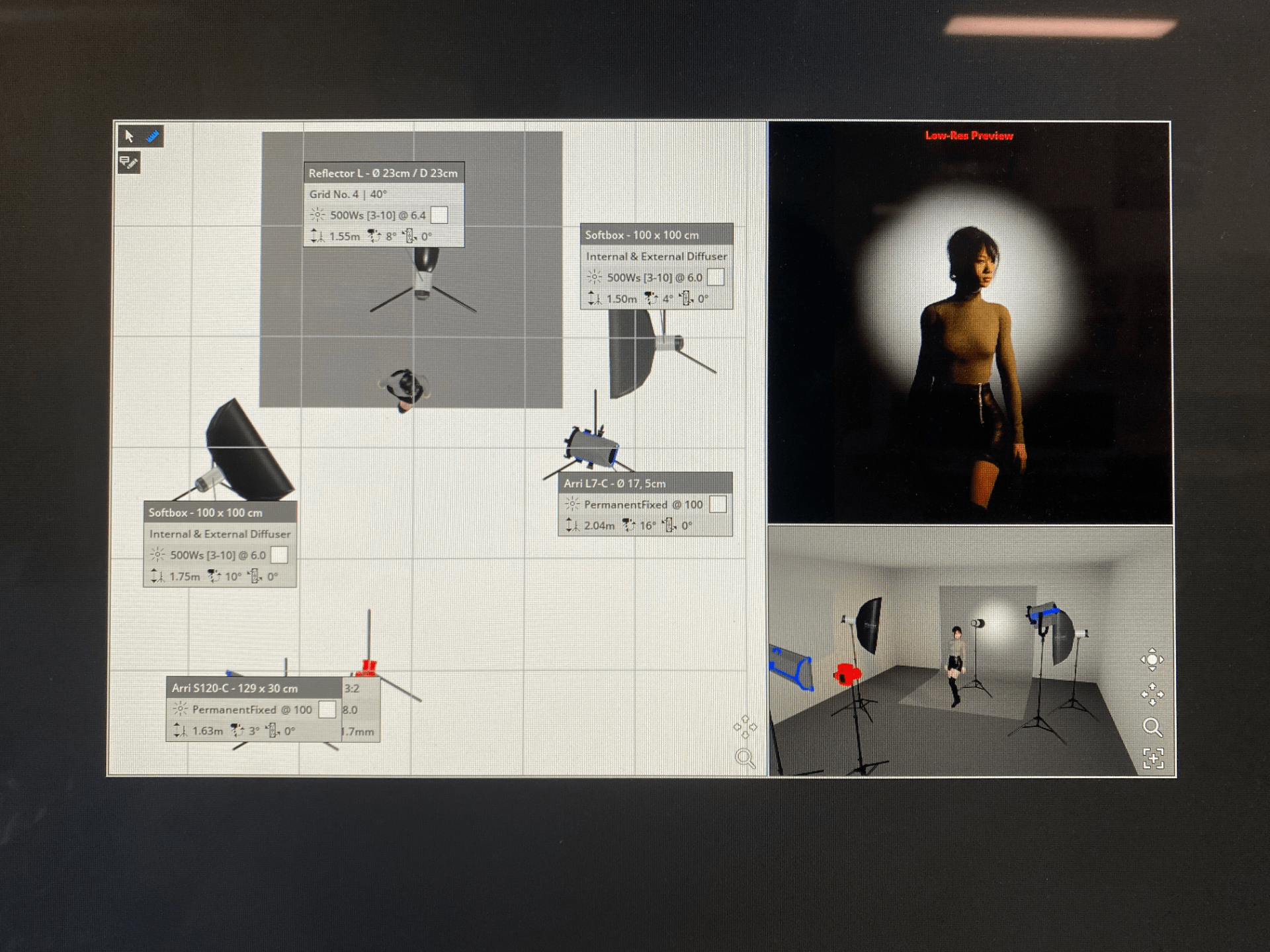
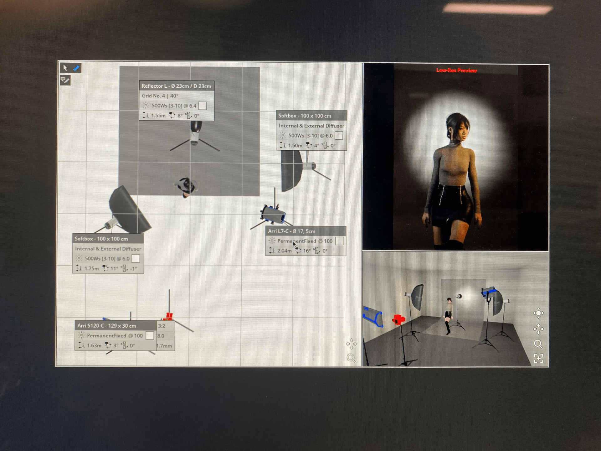
To start, I planned what I wanted my photographs to look like by visualizing them in Set A Light, which helped me know the lighting setup I needed for my photos. To get the spotlight effect on the backdrop, I had to hide the spotlight behind the subject matter so that it only illuminated the backdrop and not the person. I also wanted to incorporate contrast into my photos through lighting, so I also had to make sure the lighting setup created contrast in the light on the subject matter. My idea for the final three photos was to have different brightness levels in each image, so I also showed that in my Set A Light plans.


Blue Photos
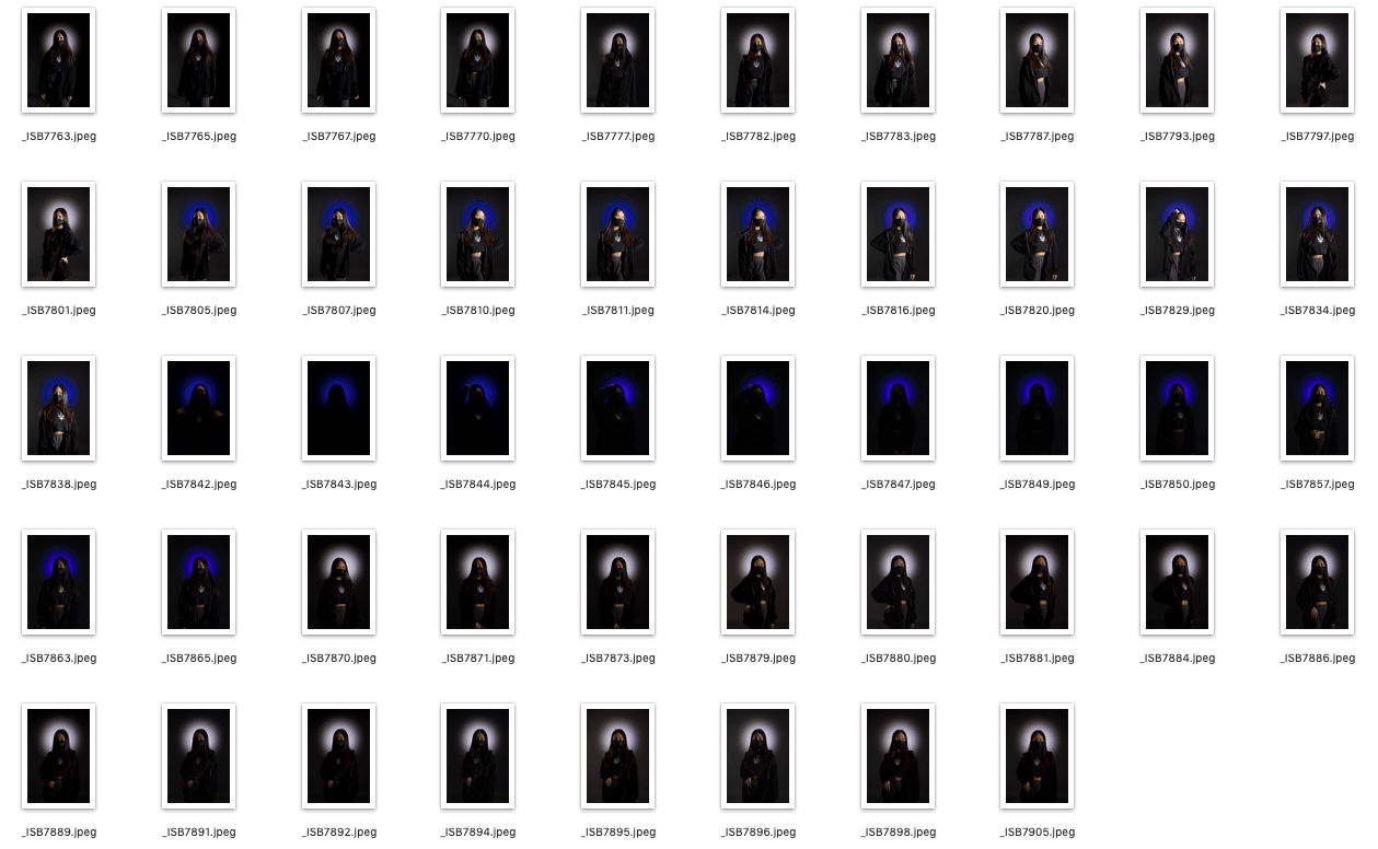
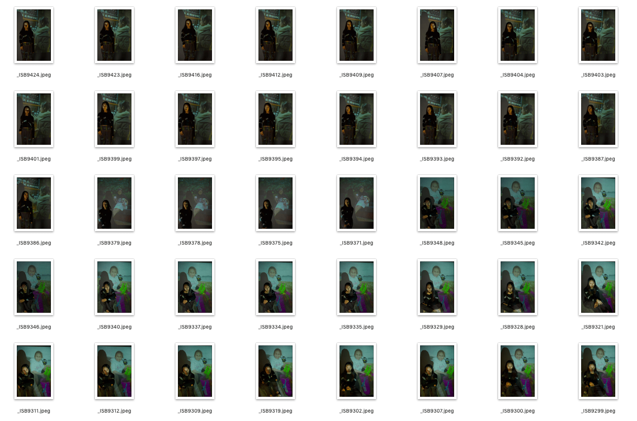
After taking my photos, I narrowed them down to the ones I liked better. I chose about 40 photos that I thought worked the best for my blue photos. I looked through all the photographs that I had taken and deleted the ones where the lighting wasn’t right, I didn’t think it was composed well, or the subject was blinking, etc. and chose a couple of the best photos where the subject matter was also in the same pose. After this, I further narrowed down the blue images even more to the green photos (Green Contact Sheet). To decide which photos to keep, I deleted all photos with the same pose and lighting, so there weren’t any repeating similar photographs. I also looked at which photos were lit and composed the best and how well all the different elements were incorporated together in the pictures, and also how well the image fit my vision and message that I wanted to convey.
For my final three red photos (Red Contact Sheet), I chose the images from my green photos that I thought fit my vision and statement of intent the best as a triptych set. Through my photo set, I wanted to convey the message of not judging someone because you never know their whole story and what they’re going through. To incorporate the component of contrast in the lighting into my photos, I decided to have my first photo not be lit at all, so all you see is the silhouette of the subject, and throughout the second two pictures, the subject matter is lit up more so you can see more and more of their identity throughout the photographs. Hopefully, through the lighting, the message that you shouldn’t judge or assume things because you never truly know the identity of someone is conveyed. After choosing these final three photos, I decided to edit them. First, I made some basic adjustments to the brightness, exposure, black point, saturation, etc., so that the photos would look better and the subject wouldn’t look as washed out. I adjusted it so that the background was more black in contrast to the spotlight, the matter would stand out more and wasn’t overexposed and emphasize the contrast in light on the subject. Next, I then played a bit with the spotlight and edited it to be a different color than the original blue light. I experimented with different colors, the saturation, and the luminance of the spotlight by editing it and eventually landed on the purple color. I also purposefully changed the saturation and luminance of the spotlight throughout the different photos to reflect how much of the subject you see in each picture. Hopefully, this can also depict how one’s true colors are slowly revealed, but even though you can see the subject matter in the final photo, you can still never completely know what they are going through. Through this process, I learned more about the different functions you can use in editing and further developed my editing skills and knowledge. Something I think I could improve on, however, is being able to convey my vision and message through the photos but still making them look more interesting. Although all three images together can convey this message, individually, the first and second photos aren’t extremely interesting and could be improved technically. The first photo is not very interesting because there isn’t much contrast, as most of the background is black while the main focal point, the silhouette, is also black. The spotlight is also not a very vibrant color, so it doesn’t stand out either. The second photo is overall decent, but the entire image is too dark, so the background and the subject matter sort of blend in together. If I could improve on this set, I would try to make sure that the photos work cohesively together as a set and are also interesting and well-composed photos individually.


I’m happy with how my first portraiture set has turned out for these three photographs. Out of the three, my favorite photo is the last one in the set where the subject matter is fully lit. I like how the edited purple color of the spotlight compliments everything else in the photograph and adds a pop of color to a very “dark” image. I was happy with how the lighting came out because even though the background was black and the subject was wearing all black, she still stands out and doesn’t blend in with the backdrop. I also like how the contrast in lighting on the subject’s face turned out, where one side of the face is primarily dark and shadowed while the other side is bright and lit without completely hiding one side of the subject’s face. However, one thing I could further improve on is maybe adjusting the brightness and exposure of the light on the subject’s face, because even though it accentuates the contrast in lighting, at first glance, it almost seems overexposed and really bright, so I could see if I could adjust that to be less bright in editing. Overall, I really like how this photo turned out and how the spotlight very clearly emphasizes the subject matter as the image’s focal point. However, my least favorite image of my set was the first photo, because overall it’s a really bland and uninteresting photo on its own. There are only two tones and values in the image: the really light and faded purple and black. Because the silhouette of the subject and the background are both black, they blend in completely, and you can only see some of the silhouette of the subject in the spotlight.
Furthermore, when I took inspiration from Lindsay Adler’s photo, her subject’s silhouette had a really interesting shape, whereas mine is much less interesting, which I think adds to the overly simplistic quality of the photograph. The color of the spotlight was made faded and unsaturated intentionally to fit the overall messaging, but it makes the photo much less interesting because there’s no pop of color that adds a more interesting quality to the image and draws the audience’s eye. Overall, this photo doesn’t have anything that stands out and catches the viewer’s eye. Because there are really only two tones and very simple shapes in the photo, it results in the image looking very “flat” and two-dimensional”. Overall, I’m really happy with how my final set turned out, but I also feel some improvements could be made to make each individual photo stand out more as well.


 For my third set of portrait photographs, I decided to take inspiration from Lee Kirby, who is a film director and photographer based in London. A project that Kirby worked on, which is what I will be specifically taking inspiration from, is “Pro-ject.” In this set of photographs, Kirby projected images onto his subject matters, which were often landscapes and abstract shapes and patterns. He then photographed this, which results in images in the shape of a person or images that overlay the subject matter and the background. This particular style of Kirby’s photography is very abstract and doesn’t very clearly depict the subject and their identity in the portrait. His pictures are taken in color so that the vibrant and bold colors of the image projected onto the subject are depicted. Kirby’s photos are very bright, glowing, and vibrant from the projected image, contrasting with the dark black or white background behind the subject. Kirby composes his pictures so that you usually only see the subject’s upper body and sometimes photographs in interesting angles. For example, in some photos, he captures them from an angle below the subject’s upper body, which creates a new and interesting perspective compared to his other photographs. Kirby’s sometimes also uses a slow shutter speed when photographing, resulting in a blurry effect. With a slow shutter speed, the subject matter can move, and the camera is able to capture that movement with a blurry image of the subject. Kirby also creates a blurry photo with the image that he projects onto the subject and sometimes uses an out-of-focus
 image or one captured with a slow shutter speed. I decided to choose Kirby as my inspiration for this set because I also wanted to incorporate the concept of a projected image in my photographs. My vision for this third portraiture set is to illustrate and depict the subject’s past, present, and future through the projected image in my final three images. I wanted to use a projector to project a picture of when the subject was older, a picture of the subject in the present, and a picture where the subject looked older onto the backdrop and the subject matter. Through this set, I wanted to highlight how people are dwelling in the past or constantly worrying about the future when instead we should be trying to live in the moment in the present. As high schoolers, there are many things that we continually worry about but have occurred in the past and many things we stress about in the upcoming future. But because we cannot change what has already happened and also cannot control what will happen in the future, we have to try and enjoy the moment we’re living in. Hopefully, by taking inspiration from Kirby’s photos, I can convey this message through mine.


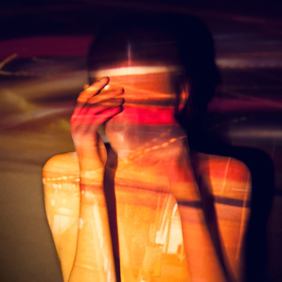 From Kirby’s “Pro-ject” photographs, my favorite one is this one below. This photo is composed to show the upper body of the subject, who is also obscuring their face with their hands and is also the main focal point of the photograph. Projected onto the subject is a blurry and abstract image with warm colors of orange, yellows, reds, and some purples/magentas, and it is not clear what the photo is of. I really like this image because I think the vibrant and bold colors really help make it stand out and be more interesting, and I also really like the artistic choices that Kirby made when capturing the photo. I really like how the image is projected onto the subject so that the colors on them are the bright and bold yellows, oranges, and reds, while the background is the more desaturated and darker colors of purple. I think this really helps the audience’s eyes emphasize the subject matter as the focal point instead of blending the person in with the background, and the subject’s shadow cast onto the backdrop helps separate the two as well. I also really like how the projected image has the soft and light feeling to it because the image is blurry, and it’s almost like they’re just streaks of color blending in with each other that are projected onto the person. The subject matter’s face in the photograph is also blurred out. You can’t see any details about the person, which lets you focus more on the abstract colors and image projected onto the person rather than just the person themself. Finally, I also really like how Kirby chose to make the image dimensions around a square because it allows the photo to really focus in on the subject and frame their upper body really well, while also having the perfect amount of negative space around the subject for the colors to be projected on.
 However, my least favorite image from Kirby is this image below. Although this is my least favorite image, I still really like the abstract patterns, colors, and shapes in this photograph. The background is also completely black, which allows for the focal point and attention to be entirely on the subject matter and the vibrant colors in the image to really stand out. A low shutter speed was used to create that blurry movement effect, which resulted in these different tones of blue and green streaks that move in a uniform direction of how the subject matter moved. However, because of this low shutter speed, the subject matter became very blurry, and it’s a very abstract representation of a portrait because you can’t really see the person or any part of their identity. You can vaguely see the face of the subject and make out where the person’s arm and body should be, but everything is really blurry and unclear, and it just looks like abstract shapes, patterns, and colors. To me, it doesn’t really look like a portrait and is really abstract, which is just a stylistic choice that Kirby decided to make. Although I think the low angle that Kirby photographed this was also really interesting, I think that the blurry and unclear photo takes away from the photograph being a portrait. Overall, I really like the artistic choices that Kirby made in both photos, along with how the bright and bold colors stand out, but I think that the second photo could be clearer in conveying that it’s a portrait and a representation of someone.
 For my second set of portraiture photographs, I decided to take inspiration from David Hockney. David Hockney is an artist and photographer who has created portraits that are collages of pictures depicting the same subject matter but taken at slightly different times with different compositions, resulting in an abstract portrait. I wanted to use the idea of creating a collage of photographs and capturing subjects over the course of three days, editing the photos together to illustrate the different sides of themselves that one may present to the outside world. The message that I want to convey through this set of photographs is that people always look different at different times, in different environments and to other people, so we shouldn’t think that the side we see of someone is their entire identity.


 For my second set of portraiture photographs, I decided to take inspiration from the photographer David Hockney, a British painter, photographer, and artist. Hockney is mainly famous for his paintings that were huge contributions to the pop art movement in the 1960s. However, he was also a photographer, and I will be taking inspiration from his photo collages. Hockney would create photo portraits that he called “joiners,” which were essentially multiple photos of a subject in slightly different positions at different times that were cropped and put together to form an abstract representation of a person. Hockney also created these collages with landscapes, but most were portraits, which I will be taking inspiration from. Hockney photographs in both black and white and color; however, it’s also harder to see his photography style in the photo collages because each portrait is composed of many image fragments, which makes it difficult to see the overall style of each photo. Hockney’s portraits typically feature the subject’s face more up close rather than further away and have edited the collages in a way that the features of the subject matter in different photos don’t line up and look “coherent,” which is part of his style in editing these portraits. I chose Hockey and this particular style
 of his photography as my source of inspiration because for my next set, I wanted to create portraits in this style to convey the message that each person always looks different and have different identities to them at different times when they are in different environments, and we don’t always see those different sides to them. With social media so prevalent in our lives now, people’s perception of someone can be very easily misled, so I wanted to highlight that people aren’t always how they present themselves to the world and have many different sides. For my set, I will photograph three different people on three different days and edit the photographs from each of those days in Hockney’s collage-like style to show the different looks of a person. However, in contrast to Hockney’s photographs, I’ll edit mine so the photos look more cohesive together and less abstract or “messy.”

 My favorite collage-style portrait photograph from Hockney, I chose this photo below. Since this is a portrait, the subject of this photo is the person lying down, and the photograph was taken from an aerial view. The subject also has their hand resting on their face and their tongue sticking out. I chose this photo as my favorite because although Hockney edits photographs that are very different in how they are composed and the posing of the model, he is still able to create a very cohesive image. Although there are multiple image fragments that depict the same body part, such as multiple hands, noses, eyes, eyebrows, etc., that don’t entirely line up with each other, the image still looks coherent and still very much resembles a person. Moreover, on the right side of the portrait, Hockney included the subject’s side profile, which is different from all the other photos. However, this isn’t distracting from the overall portrait because it’s added in very subtly and blends in really well with the other photos. I thought it was really interesting and cool how Hockney connected the edge of the lips in the side profile with the front of the lips in the adjacent photo. I also like how this collage was more unique because the photographs weren’t just all put horizontally or vertically and instead had photos framed at different angles. This makes the portrait more interesting and also helps guide the eyes to the subject’s face because the photos are “pointing” in the same direction.
 However, this contrasts with my least collage-portrait from David Hockney, which is this image. For me, this image is almost the opposite of everything that I liked and thought was interesting in the first image. In this second portrait, although this may be the style Hockney was aiming for, I felt that overall it was too abstract and “messy” and didn’t look like a coherent enough portrait of a person. There’s a drastic difference in the size and scale of the subject in every photo, so when put next to each other, the subject’s facial features don’t match up with each other. The difference in scale of each photo also doesn’t create any kind of cohesive or distinct shape of a person’s head. In addition to the multiple mouths, eyes, and parts of hair, overall, the image just looks very strange and odd, and you don’t really know where to look. There isn’t really any sense of unity or togetherness with this portrait, and it doesn’t resemble a portrait of a person very much. Furthermore, the different brightness and change in tones and values in a few photos also adds to the incoherentness of the portrait. Each of the photos is also arranged horizontally and vertically, which doesn’t make the overall photograph as interesting as the first portrait did. Overall, I really like the small and subtle details in the first image that made it a much more interesting portrait and how the photos were arranged and composed in such a way that a cohesive and coherent collage was created. Although Hockney may have been trying to achieve a particular style, the overall portrait was very abstract and didn’t have an overall togetherness that brought all the individual photos together into one collage.
 For my Set A Light simulation, I first went online to look for inspiration for the post that my model would stand in. After finding this picture that I was happy with, in Set A Light, I created a light setup in the program to simulate the lighting for a photo I could take. I also created a model and the pose that they were in so that I could also see how the light would interact with the subject matter for the photo. When I was happy with my setup and simulation of the photo, we went to the photo studio to recreate it. Although in the simulation the photo was taken vertically, I later changed my mind and took the photo in landscape form, because I thought that looked and fit better with everything else. I also changed the direction the model was looking in because when looking the other way, there was too much shadow covering the model’s face. After testing my original lighting setup, we changed some of the positions of the different lights and got an outcome we were happy with. For example, we moved one of the lights to the back so that it would only light up the backdrop, and create the gradient in values of the background that I thought looked really interesting. We also adjusted some of the other lights so that we could get the perfect lighting that would be projected onto the subject’s face. Overall, I’m happy with how the picture turned out and the contrast in lighting incorporated into the photo.

 For my portrait photographs, I decided to take inspiration from the photographer Lindsay Adler. Lindsay Adler is an American fashion portrait photographer, and her photographs are known to have a clean, bold, and graphic style which is the signature look of her photographs. Adler’s photographs are prominent, bold, and stand out, and the element of light is a significant component in all of her photos. She mainly uses bright, colorful, artificial lights in her photographs that illustrate contrast, especially in colors, through lighting. However, some of Adler’s photos are also taken in black and white, and she also uses light to emphasize specific features of the subject matter. For example, there could be bright lighting on the subject’s eye, while
 the rest of their face is dark and in the shadows, which highlights that specific part and draws attention to it. Most of Adler’s photographs also only feature the upper body of the subject, and the subject is also never directly facing forward to the camera. The most significant element in her photos is tone/value, and I want to be able to take inspiration from her incorporation of this element into my own photography. I decided to choose Adler as my inspiration because I really like the way she incorporates different tones and values, and the contrast of colors into her photographs through lighting, and she is also able to depict how the light can interact with the subject matter in interesting and different ways. Hopefully, this would be something I can take inspiration from and incorporate into my own photographs.
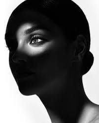


 However, although I don’t have photographs from Adler that I don’t like, there are some that are less favored than others, or that I just don’t find interesting or cool. For example, this simple photo just depicts the subject matter whose hair may be emphasized in the image, in front of a black background. Although there isn’t anything inherently wrong with the photo, there’s also nothing inherently special about the photograph either. Lindsay Adler is a fashion photographer, and on her website, there are different categories of her portfolio of the different styles of photos she has taken and the things she’s taken them of to maybe advertise for something. For example, categories include makeup, skin, and hair, etc. so since this photo seems to be emphasizing the hair of the model, it could have been taken to advertise a hair product. However, since the style of this photo is different from the style of Adler’s other “hair” photos, this could have just been a photo Adler was hired to take of this person. Overall, this is just a pretty generic photo of a model, and there isn’t anything that especially stands out or makes it special and interesting. The background is just a plain black background, so there isn’t anything specific that the audiences’ eyes draw to other than the only other thing in the photograph, which is the model. The model is in focus and there isn’t anything that is out of focus because there’s nothing else in the photograph. This photograph technically hasn’t done anything wrong and has followed the rules of photography, such as the rule of thirds or centering the iris, or putting the eyes in the upper third of the photo, but it’s also not doing anything interesting at all. I think that you can also tell compared to Adler’s other works, that the intention of this photograph wasn’t meant to be anything that stood out or was really interesting, and is just meant to be a simple headshot of a person. Overall, although this is a good photograph, there isn’t anything too interesting or special about it, so that’s why it’s my least favorite photograph from Lindsay Adler.
 A portrait in the genre of photography is a photograph of a person that typically shows their face and may depict a representation of a part of the subject’s identity. I think that a selfie is a portrait because there are no criteria of who takes the picture in order for a photograph to be a portrait, just as long as it’s a photograph depicting a person. Typically, a “good” portrait consists and focuses on a person, mainly their face, and usually represents part of who this person is. The background of a portrait usually is also quite simple and uncluttered or out of focus, so that the focal point of the photograph can be the subject and would be what the audience’s eyes are immediately attracted to. Usually, in a portrait, you wouldn’t want to be focusing too much on the background, foreground, or have any other parts taking up too much of the photo that isn’t the subject because ultimately the subject is the focal point. However, many of these rules can be broken and still have a photograph be a portrait; for example, a photo can only show a hand, but someone may still count it as a portrait because it depicts an aspect of a person’s identity through the photo. For example, Anton Corbijn photographed John Lee Hooker, and although the photograph doesn’t show Hooker’s face and only shows the hand, you are still able to tell a lot of Hooker’s identity and the life he had just by observing what his hands look like. I also think
 that whether a more abstracted representation of a portrait ceases to actually be a portrait can be up to interpretation by anyone. To me, I think that as long as a photograph is specifically focusing on depicting someone and/or displays an aspect of their identity in the photograph, even if the subject matter is blurred, or the photograph had been torn, ripped, or faded, etc, the photo is a portrait. This can also apply to if a person is represented through objects in the photo, or if the portrait is a sequence of images instead of just one. All of these can be up to the interpretation of each individual person and whether they view it as a photo that conveys the identity of a person or not, and it’s also largely up to the photographer and whether they intend it as a portrait or not.
 To get inspiration for my portrait photographs, I created a mind map to organize all my thoughts, ideas, and inspiration, and to see how my different ideas may be connected. To create this mind map, I first looked at photography portraits, and found different elements and aspects of specific photos that I like, and could possibly take inspiration from in my own photos. Some things that I added to my mind map were light, and how light interacts with the subject matter of the photo. I looked at photos where the light was projected onto the subject matter’s face, and specifically the contrast of dark and or light lighting, or lighting that is contrasting in colors. The photos would depict one side of the subject model’s face illuminated by the light, while the other side was dark and shadowed. Some other smaller characteristics that I found interesting were when photographers would use the environment or different objects to frame the face, and one photo I found even used light to frame the face. I also found
  many photographers that I was inspired by such as Lindsay Adler, Marco Grob, or Manny Librodo, but one photographer’s work that I was especially interested in was Diane Arbus.


Recent comments