Reflection on data collection and visual/financial modelling

(If the picture is not visible, click this link->https://isbdragons-my.sharepoint.com/:w:/g/personal/hugo_fong_student_isb_bj_edu_cn/EXUtDl-40V9AoWGH1T6LvbQBz68dfetDeaiu35X52r2Xcw?email=erica.hwang%40student.isb.bj.edu.cn&e=4%3AdQkqUY&at=9&wdLOR=c7B48D5B7-7FD5-D746-BA6D-F0AADAF2C6C7
For data collection, using a consumer survey proved effective by selecting a specific audience and generating printed surveys to efficiently complete the survey within the limited class time. The survey had the advantage of gathering information on preferred flavors, which reflects consumer preferences. Particularly, the questions regarding brand image colors were helpful for visual modeling, as bold colors can attract consumers to the products. Financial modeling involved determining ingredient quantities and categorizing them into grams, which facilitated effective cost calculations for the dumplings.
Reference materials for the product planning:
![Frozen] Happy Belly Dumpling Wrapper (Gyoza Skin, 10x10cm, 38pcs), 30 – A&A Asian Food Store](https://aashop.ee/cdn/shop/files/Frozen_HappyBellyDumplingWrapper_GyozaSkin_10x10cm_38pcs_300g.png?v=1699875284)
Price of Gyoza dumpling skin:
70skins -16.5 RMB
1 skin – 0.24 RMB

KiriKalnd chocolate chips
5000 grams -6.65 RMB
10 grams – 0.01 RMB
For visual modeling, it is a challenge to identify how many pieces are included in one package because there are three dumpling images on the package. Therefore, if there would be modifications to this, I could change to 6 dumplings. ( BUT I intended to use 3 dumpling images for indicating 3 different flavors of whole desert dumpling brand.)
Meeting the goals:
-
Design choices for the target audience:
The design choices were based on the following criteria:
- Did you choose appropriate text styles or graphics for children?
- Did you incorporate preferred designs based on the consumer survey?
To meet these criteria discussed within our team, I used cute and friendly text styles for the logo design to appeal to our target audience, children. The text was in English to cater to both international and local audiences, providing information about the product. The price was specifically displayed in Chinese RMB to emphasize that the product is sold in Chinese supermarkets and highlight its local characteristics.
I also utilized the preferred colors for dumplings and packages, which were brown and white. The main color combination for the logos, packaging, and visual modeling consisted of white, ochre, brown, and black.
If we had more time or resources:
If we had more time to progress with this food product development project, we could invest additional time in conducting kitchen experiments to ensure the flavors are well-developed and appealing to the target audience. We could explore more flavor choices, such as cookie and cream or banana and strawberries, for unique flavor combinations to finalize the dessert dumpling products. Additionally, our team could create physical models using printed materials and plastic boxes, and produce real samples of the product with the models and sample dumplings.
Evaluation of teamwork and my contribution to the team:

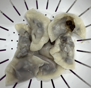


Our team effectively allocated roles within the project and distributed the workload evenly among financial modeling, consumer survey, and visual modeling. We maintained good communication throughout the product development process. The collaboration during the kitchen experiments was particularly noteworthy, as we shared different flavor ideas and created sample products using various cooking methods.
In particular, I dedicated more time to the assigned role of visual modeling and created different versions of packages and logos. The design incorporated our group’s ideas, and I used Photoshop to incorporate their feedback and opinions, such as integrating pricing information and arranging the dumplings.


Recent Comments